1. Issues – A Personal ResponseF486Activity 3 Print Campaign Analysis Dannielle Doyle
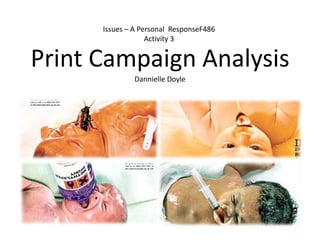
2. The slogan for the silver spoon campaign is ‘If only every child was born with a silver spoon’ or ‘There are no silver spoons for children born into poverty’. The thing most notable in the slogan is the phrase ‘silver spoon’. It means to be born with lots of advantages that other people don’t have, and to be born, really, into a very rich family. I think that the slogan makes the purpose of the campaign very clear. The fact that there are children that are born into the world with nothing at all, no one to care for them and buy them nice things like some children.
3. I think this campaign has been designed to shock the audience, the imagery and the colouring that has been used has a hint of a grim prospect inside. The distorted angle, also the plain looking background showing that they have nothing, and the objects in their mouths, could possibly be showing their future and the world they are being born into. The 3 posters of the crying babies show how these three children will have a completely different life to the poster of a baby, not crying, lay on a golden blanket, and with a silver spoon in its mouth. The audience are shocked by the images and then they want to know more, they can learn this just by looking at the images on the posters.
4. These posters shock the audience because all of them show new born babies, which represents how vulnerable children are when they are born. The most shocking elements of 3 of these posters are the methylated spirit bottle, the needle, and the cockroach in the baby’s mouths. Personally these images on the posters make me feel sad, but also lucky. Its horrible to think about what some children are born into, and how they don’t have any of the luxury's that we do. I think that using newborn babies on their posters was a good idea as it effects the audience emotionally. When people see a newborn baby crying they immediately have sympathy for them, but seeing newborn babies with things like needles and cockroaches in there mouth it also makes them feel sick.
5. In my opinion I think the silver spoon campaign was very successful in communicating their message in a creative way. Light backgrounds have been used to make the images stand out, the main message in the text is larger than the rest of the text, and the photographs have been manipulated so it looks like the objects are actually in the babies mouths. The way the posters have been designed they are guaranteed to catch peoples eyes.