Visual Literacy Design Project
•
2 j'aime•698 vues

Visual Literacy Design Project from Academy of Art University

Recommandé
Contenu connexe
Tendances
Tendances (19)
Similaire à Visual Literacy Design Project
Similaire à Visual Literacy Design Project (20)
Plus de Honey Patel
Dernier
Dernier (20)
Visual Literacy Design Project
- 1. Objectives Part 1 For part 1, we were assigned a specific poster and our goal was to recreate it using 3 different design principles: placement, scale and color. This was a good exercise to get our feet wet with the most interesting design and important design principles. I think I did a good job. At first I struggled to use the vectors, but then I figured out how to replicate them and utilize them. I feel there are so many pos- sibilities with just one of the design principle, let alone three. I made six sketches of placement, and I felt like I could do a lot more. This realization of possibilities increased as I did placement and scale and finally all three. I like my final three posters for their simplicity. I like simple and clean designs and I applied that in my posters. Part 2 For part 2, we were suppose to choose three designers from a pro- vided list and recreate these posters in there style. At first, I basi- cally replicated their designs, which was not a good idea. Then I sat down and picked out few characteristics of their designs and tried to apply that to my creations of the posters in their style. All three of my designers use primary colors and symmetry. To force myself into their style was difficult, no matter how much I tried to not duplicate their design, I kept compelling to it. There are definitely some improvements that need to be made. A little bit of it may seem duplicated, but I tried my best to stay away from mocking and actu- ally using their design standards as key principles in my re-design of the poster. Honey Patel Visual Literacy Fall 2009 Deconstructing the Masters: Part I and II
- 2. Honey Patel Visual Literacy Fall 2009 Deconstructing the Masters: Part I: Placement Sketches
- 3. Honey Patel Visual Literacy Fall 2009 Deconstructing the Masters: Part I: Placement and Scale Sketches
- 4. Honey Patel Visual Literacy Fall 2009 Deconstructing the Masters: Part I: Placement,Scale and Color Sketches
- 5. Honey Patel Visual Literacy Fall 2009 Deconstructing the Masters: Part I: Placement Refine
- 6. Honey Patel Visual Literacy Fall 2009 Deconstructing the Masters: Part I: Placement and Scale Refine
- 7. Honey Patel Visual Literacy Fall 2009 Deconstructing the Masters: Part I: Placement,Scale and Color Refine
- 8. Honey Patel Visual Literacy Fall 2009 Deconstructing the Masters: Part I: Placement Final
- 9. Honey Patel Visual Literacy Fall 2009 Deconstructing the Masters: Part I: Placement and Scale Final
- 10. Honey Patel Visual Literacy Fall 2009 Deconstructing the Masters: Part I: Placement, Scale, and Color Final
- 11. Honey Patel Visual Literacy Fall 2009 Deconstructing the Masters: Part I Final
- 12. Piet Zwart attended school of arts and crafts in Amsterdam, where he studied painting, architecture and furniture design. Working under architects Jan Wils and H.P Berlage he showed awareness of function and clarity of proportion. After that he was influenced by a members of De Stijl movement and other graphic designer. Zwart called himself a typoket because to him it conveyed “equal- ity between his designs for two and three dimensions” The form of the letter in its most simple and abstract shape was really the catalyst and inspiration to Zwart’s typographic achievements. He was strongly influenced by De Stijl perspective, he used rules and other graphic elements to create “dynamic page compositions using Piet Zwart [those] typographic elements alone” and express using “purely abstracted forms [with a] respect for mechanical products”. Some key components of Zwart’s work include strong diagonals, primary 1885-1997 colors, large use of scale, varying typefaces, repetition for strength Birth: Zaandijk, Netherlands and careful asymmetry. His three main goals were function, simplic- Death: Wassenaar, Netherlands ity, clarity. He focused on scale and layout, thus mastering space and composition. Zwart wrote his own copy to fully understand the message meaning and expression. Honey Patel Visual Literacy Fall 2009 Deconstructing the Masters: Part II: Piet Zwart Biography
- 13. At age 17, Max Huber was attending Zurich School of Arts and Crafts where his teachers were Ernst Gubler, Gottlieb Wehrli, Heinri MŸller, Walter , Otto Weber and Alfred Willimann. Huber began his career in Avant Grade Environment. At age 21, Huber moved to Milan and worked under Antonio Boggeri. Huber saw Milan, and studio Boggeri in particular, as the melting pot in which illustra- tion, painting, photography and printing could come together. Huber always mixed unframed flat photographic and typographic elements with strips of color to convey a certain feeling of dynamism and speed. His work concentrated on photographic experiments and clear type combined with the use of bold shapes, strict grid and Max Huber primary colors. Huber favored clarity, rhythm and synthesis. He used succinct texts, composed from different hierarchical groups; a large title with secondary information in a smaller type, a sequence 1919-1992 of levels. One of Huber’s favorite design job was of record covers, Birth: Barr, Switzerland posters and publications for jazz events. He was fond of jazz-music Death: Sagno, Swiss and linked it to his own design by bringing the rhythm into his visu- als.. Max Huber was influenced by many friends, relatives (Japa- nese major designer (Father-in-law) and coworkers, with major emphasis on Avant Grades and Swiss background. Honey Patel Visual Literacy Fall 2009 Deconstructing the Masters: Part II: Max Huber Biography
- 14. Theo Van Dosenburg was a Dutch painter, designer and architect, who was highly influenced by Impressionism, Expressionism and Cubism. In 1915, he met Mondrian and switched his approach to that of total abstraction cofounded the De Stijl movement in 1917 and devoted his career to spreading the group’s ideas. During the 1920’s he traveled across Europe promoting his artistic beliefs, set- tling only for a short time from 1922 to 1924 to teach at the Bau- haus. In the same decade, he switched from his horizontal and vertical line compositions and began incorporating diagonals in his series, Counter-Compositions. Doesburg titled this new style, Elementarism. He moved to Paris in 1929, set up a studio in the Theo Van Doesburg suburbs and published a manifesto of Concrete art a year later. In his final year, he held a meeting in his studio that resulted in the founding of the Abstraction-Creation association. 1883-1913 Birth:Utrecht, Netherlands Death: Davos, Switzerland Honey Patel Visual Literacy Fall 2009 Deconstructing the Masters: Part II: Theo Van Doesburg Biography
- 15. Honey Patel Visual Literacy Fall 2009 Deconstructing the Masters: Part II: Piet Zwart Sketches
- 16. Honey Patel Visual Literacy Fall 2009 Deconstructing the Masters: Part II: Max Huber Sketches
- 17. Honey Patel Visual Literacy Fall 2009 Deconstructing the Masters: Part II: Theo Van Doesburg Sketches
- 18. Honey Patel Visual Literacy Fall 2009 Deconstructing the Masters: Part II: Piet Zwart Refine
- 19. Honey Patel Visual Literacy Fall 2009 Deconstructing the Masters: Part II: Max Huber Refine
- 20. Honey Patel Visual Literacy Fall 2009 Deconstructing the Masters: Part II: Theo Van Doesburg Refine
- 21. Honey Patel Visual Literacy Fall 2009 Deconstructing the Masters: Part II: Piet Zwart Final
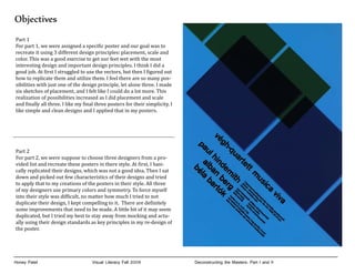
- 22. a v iv sica u m e tt rt q ua paul hindenmith alban berg h ig béla bartók vé 1.Kammermusikabend der tonhalle-gesellschaft zurich, Donnerstag, den 30. okt. 1958, 20.15 uhr kleiner tonhalle-saal paul hindenmith drittes streichquartett alban berg lyrische suite béla bartók viertes streichquartett Karten zu fr. 3.30-7.70 vorver kauf tonhalle-kasse, hug.jecklin, kuoni dep. Kasse aerlikon der schweiz kreditanstalt Honey Patel Visual Literacy Fall 2009 Deconstructing the Masters: Part II: Max Huber Final
- 23. Honey Patel Visual Literacy Fall 2009 Deconstructing the Masters: Part II: Theo Van Doesburg Final
- 24. a v iv a s ic u m e tt art paul hindenmith qu alban berg h ig béla bartók vé 1.Kammermusikabend der tonhalle-gesellschaft zurich, Donnerstag, den 30. okt. 1958, 20.15 uhr kleiner tonhalle-saal paul hindenmith drittes streichquartett alban berg lyrische suite béla bartók viertes streichquartett Karten zu fr. 3.30-7.70 vorver kauf tonhalle-kasse, hug.jecklin, kuoni dep. Kasse aerlikon der schweiz kreditanstalt Honey Patel Visual Literacy Fall 2009 Deconstructing the Masters: Part II Styles