
Recommandé
Contenu connexe
En vedette
En vedette (13)
Dernier
Dernier (20)
Media a2 magazine advert analysis 4
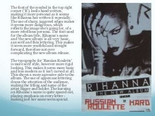
- 1. The font of the symbol in the top right corner ('R'), looks hand written, making it more personal as it seems like Rihanna has written it especially. The use of sharp, jaggered edges makes it seems more dangerous, which reflects the image she's going for, of a more rebellious persona. The font used for the album title, Rihanna's name and 'the new album' is all very basic, san serif and thin lettering. This makes it seem more youthful and straight forward, therefore not over complicating the new album release. The typography for 'Russian Roulette' is more serif style, however more rigid looking. This makes it seem more basic and less modern as it isn't curved at all. This shows a more agressive side to the album. The use of uppercase lettering draws the attention of the audience, making the titling and name of the artist bigger and bolder. The kurning on Rihanna's name is quite spaced out, placing emphasis on every letter - making just her name seem special.