
Recommandé
Contenu connexe
Tendances
Tendances (16)
Similaire à My school mag power point.
Similaire à My school mag power point. (20)
Dernier
Dernier (20)
My school mag power point.
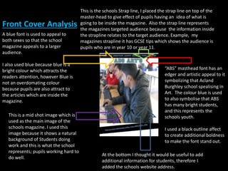
- 1. A blue font is used to appeal to both sexes so that the school magazine appeals to a larger audience. I also used blue because blue is a bright colour which attracts the readers attention, however Blue is not an overdomating colour because pupils are also attract to the articles which are inside the magazine. This is the schools Strap line, I placed the strap line on top of the master-head to give effect of pupils having an idea of what is going to be inside the magazine. Also the strap line represents the magazines targeted audience because the information inside the strapline relates to the target audience. Example, my magazines strapline it has GCSE tips which shows the audience is pupils who are in year 10 or year 11. At the bottom I thought it would be useful to add additional information for students, therefore I added the schools website address. Front Cover Analysis This is a mid shot image which is used as the main image of the schools magazine. I used this image because it shows a natural background of Students doing work and this is what the school represents; pupils working hard to do well. “ABS” masthead font has an edger and artistic appeal to it symbolizing that Acland Burghley school spealising in Art. The colour blue is used to also symbolise that ABS has many bright students, and this represents the schools youth. I used a black outline affect to create additional boldness to make the font stand out.
- 2. Contents Page At the top of the page I added the Master head to show consistency throughout the magazine. This also familiarise the pupils which the magazines type of font to make the magazine recognizable to most students. Here is all the pages which is going to be inside the magazine. I also labelled the pages with numbers to help students locate the correct page and this helps students because they can turn directly to the page which they want to read. Through the magazine I have used the same types of font to also give the feeling of consistency throughout the magazine and this makes the magazine look more professional because the same type of font and layout is used throughout. I also added 3 images onto the contents page. This is to give students a image of what the school has the offer and what different faculties the school has in it. Also by adding photographs to the contents page, it makes it look more interesting and appealing to the students because most students do no like to read a magazine that only has writing with no images.