Mobile email - chasing context
•Télécharger en tant que PPT, PDF•
13 j'aime•2,515 vues

Here's some of what it covers: Mobile context Mobile testing tools Fixed vs. fluid layouts Scalable layouts Horizontal layouts Designing for touch Real-time content

Recommandé
Contenu connexe
Tendances
Tendances (19)
En vedette
En vedette (19)
Similaire à Mobile email - chasing context
Similaire à Mobile email - chasing context (20)
Dernier
Dernier (20)
Mobile email - chasing context
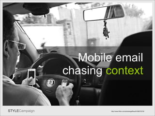
- 1. Title Mobile email http://www.flickr.com/photos/gaffney/6168270379/ chasing context
- 2. Desktopgirl Desktop context http://stylecampaign.com/contextimages.html
- 3. Mob Cont http://stylecampaign.com/contextimages.html Mobile context
- 5. Time of Day Source: Knotice Mobile Email Opens Report, Q4 2010. 155.3 million emails 7am peak mobile email usage 11pm 2 nd peak couch / bed Mobile email opens by time of day
- 7. Alarm2 Who sleeps with their phone? Source: Pew Research Center’s Internet & American Life Project, April 29-May 30, 2010 65% of American adults have slept with their phones on or near their bed. The no. rises to over 90% among ages 18-29.
- 8. Alarm3 Alarm clock iPhone app by iHandySoft Inc. Alarm clock emails Child-proof design for blurry eyed adults: . Targets you can hit swiping at the screen half asleep (left or right handed). . Both targets as far apart as the screen will allow to avoid a mistap. . No need to zoom or scroll with a body lacking co-ordination upon waking . Works in either orientation (important when lying down as tends to flip) . “Just enough” content, high contrast for low light & easy to take in at a glance.
- 9. Screen Size Nokia BlackBerry iPhone 3 Android iPad 176px-768px Kindle Fire 1024 x 600px
- 10. Android Android OS - The first 100 devices 240 x 320px 320 x 480px 480 x 800px 480 x 854px Different resolutions on Android Android OS usage stats Jan 2011 Source: Percent Mobile & Android Developers Blog
- 11. Litmus Source – Litmus 2011 Top mobile email clients
- 12. User Stats Get to know users Litmus / Pivotal Veracity/ Return Path (email analytics) PercentMobile / admob / Bango (mobile web analytics) Ask via survey or during sign up % who click link to mobile version Track mobile opt-ins Website stats – e.g. Google Look at the demographics of each platform e.g. 73% of Android users are male vs. 57% of iPhone users.
- 13. PercentMob Try mobile web analytics with mobile version Gap desktop & mobile identical, gathering mobile web stats?
- 14. By Day Source: Pivotal Veracity, an IBM company , Jan 1 st – March 22 nd 2011 Mobile email usage by day Highest usage = Sunday Highest weekday usage = Wednesday Lowest usage = Saturday
- 15. Temp=stats Mobile usage stats from a template that’s not mobile optimized vs. optimized 1 month later
- 16. Testing Preview tools Litmus Pivotal Veracity Return Path PreviewMyEmail EmailonAcid DeviceAnywhere / perfectmobile iBBDemo /iPhoneTester / TestiPhone/ iPhoney Can’t beat a real device
- 17. Summed up Summed up Mobile context precedes design but hard to nail Helps to use target devices in same context as users If in doubt: design for “at a glance” & partial attention Get to know your users via multiple sources Android & BlackBerry stats are understated Peak mobile email usage is 7am Sunday then Wednesday peak days of the week Test on a real device
- 18. Fluid Fixed vs. Fluid Style vs. accessibility?
- 19. Fluid1
- 20. Fluid2
- 21. Fluid3
- 22. Fixed1
- 23. Fixed2
- 24. Fixed3
- 25. Fluidimg Fluid images Not fluid Fluid
- 26. Fluidtemp IMG style="width:90%; max-width:550px; max-height:237px" 176px 320px 320px 1024px Desktop Fluid template - http://stylecampaign.com/fluid/
- 27. Max Width Max-width capped at 550px Gmail under Firefox
- 28. No Max Width Hotmail under IE 6 No max-width support goes as wide as the screen
- 29. obama Obama 2012 campaign mobile desktop
- 30. Experience “ I just wanted a way for the text of the newsletter to be readable on smartphones without people having to zoom in. As far as I know, readers are happy with it! ” - Mark Hurst
- 31. webversion Full URL early BB Fluid B2B mobile version
- 32. 2 Col Fluid 2 col fluid layout = narrow col of text on mobile desktop
- 33. Width 320px 400px 460px 480px 520px 520px 650px How wide for fixed width?
- 35. 320driod2 Default zoom Min zoom Max zoom Android 2.2, HTC Evo 4G (480px wide res)
- 36. Web Hotmail via a browser Hotmail viewed natively
- 37. 320pac 320px template via browser
- 38. Forced wide 480px wide bg forces it wide Pre-header container forces it zoomed out
- 39. scalble 550px wide 656px wide 700px wide wide scalable
- 40. scalble2 “ Minimizing expense of using your content should be a design goal” - BB 677K worth of images
- 41. Wide scable layouts The W3C advises mobile emails be under 20K research into retail email image sizes
- 42. performace > performance Serve appropriately sized mobile images Use CSS3 for buttons, gradients ect. Use less white to preserve LED battery life – WP7 Use solid colors instead of gradients in images Go metro – typography as a design element If hiding content via @media, ask do you need it at all? Don’t be sloppy with animated Gifs Adapt FPS and resolution to connection speed Embrace coded pixel art (ok that’s just me)…
- 43. Fixed to fluid Fixed to Fluid Using @media to bypass max-width
- 44. Savvy1 mobile = 100% desktop = 640px Redesign = 3x lift in click-to-open rate 12% of those who opened email on mobile clicked / 6% of those who opened on non-mobile clicked
- 45. @media @media = layout fixed to fluid container two column to one column 600px - 300px fixed change font properties line-height hide images or containers swap images change alignment rework navigation
- 46. Dw1 “ Mobile versions” with no viewport defined 980px
- 47. Dw2 <meta name = “viewport” content = “width = 500″> Default – 980px viewport width = device-width width = 500
- 48. Dw3 400px 700px 836px Native email on iOS – with no viewport defined
- 49. Above Fold Optimize for 1 st screen 320x280px or 480x142px
- 50. First screen 12% 600x600px layout 530px visible on 1 st screen Optimize for 1 st screen
- 51. Elevate content 12% 530px visible on 1 st screen Navi & branding above content mistap waiting to happen
- 53. Subject lines subject lines as primary content
- 54. Horizontal No logo but from name always visible Teaser content visible Swipe path Lazy fingers = easier to use with links on same line
- 55. deviceAny Design for newbie and lazy fingers W pattern too much thought
- 56. Horizontalb
- 57. Panorama WP7 Panorama view Source: UI Design and Interaction Guide for Windows Phone 7 with bg solid bg
- 58. Panorama2 WP7 PSD Templates
- 59. Hori1 scaling 2415px wide horizontal layout View horizontal email
- 60. Hori2 scaling dead space View horizontal email scaled to height
- 61. Hori4 scaling 320px device width View horizontal email works in browser
- 62. Hori3 scaling < footer more content high footer stack
- 63. Summed up Summed up Define viewport to avoid zoomed out creative on web Fluid layouts thumb their noses at new devices 320px width for Android / webmail via browser If too skinny go to 480px-520px Do what you can to increase performance Use @media to transition from fixed to fluid Optimize the first screen Reduce footer text with horizontal layouts Design for newbie & lazy fingers
- 64. Touch Design email for touch
- 65. Fingers “ The comfortable minimum size of tappable UI elements is 44 x 44 points” – p.13 iOS Human Interface Guidelines
- 66. edge add padding mistap or zoom?
- 67. Gloves Weather - gloves? http://www.flickr.com/photos/istolethetv/5089765928/
- 68. Patterns pttrns.com androidpatterns.com mobile-patterns.com Mobile design patterns
- 69. UI www.mobilexweb.com/blog/ui-guidelines-mobile-tablet-design UI Guidelines iPhone Android Windows 7
- 70. Navi1
- 71. Circle navi text hints
- 72. Navi2 6 tabs with small text and little horizontal spacing 4 tabs, > spacing but text is still hard to read 5 finger-sized links which are easy to read Gap redesigns navigation for touch
- 73. Navi3 Over-sized
- 74. Navi4 Navi positioning Ignore navi 1 st screen = navi Skip to content
- 75. Gap Navi Navi positioning
- 76. Emphasis different content hierarchy
- 77. Gap filesize Performance: 109KB vs. 38KB
- 78. Cta Can’t miss buttons
- 79. Cta2 CTA button?
- 80. Cta3
- 81. Cta4 SHOP NOW >> CTA graphic CTA URL
- 84. Tactile 3D
- 85. Frame Notifications Keyword ads focused UI clutter Multitasking
- 86. Simple Simplify…
- 87. editorial hard work for mobile & desktop users
- 88. Font BIG FONTS (OR WE’LL CHANGE IT FOR YOU!) style=”-webkit-text-size-adjust:none”
- 89. Scaled up broken navi’s on iPad due to auto-scaling
- 90. Contrast Edit… push the contrast
- 91. Contrast Webmail on Kindle = B&W Webkit
- 92. Summed up Summed up Check out UI guidelines and mobile patterns Rethink your layout for ergonomics Navi is a bottleneck but there are solutions Increase the size of your CTA’s Big fonts – Apple recommends 17-22px Finger-sized product grids in place of buttons 3D = tactile and tappable Do a grayscale test
- 93. What’s next? What’s next? “ In two years or so we are planning for a shift, where we will segment not by device anymore but by behavioral context . Is it at home, is it on the go…” Paul Gelb of Razorfish at Mobile Insider Summit
- 94. DIS DIS time location device browser connection APIs / RSS format, resolution, fps, compression sessions 3D content server-side “Photoshop” open StyleCampaign’ Dynamic Image Server (DIS) image, animated gif, video
- 95. DIS Geo-location = reactive
- 96. DIS2 Lord of the rings video 3D character live video textured onto polygon dynamic text Logo overlays video frame File format, FPS, compression & resolution vary depending on the connection speed or device. Source: StyleCampaign’ DIS video live video mashup
- 97. Thanks Anna Yeaman Co-founder www.stylecampaign.com [email_address] @stylecampaign Thanks!
Notes de l'éditeur
- Shift in user context from the desktop to the mobile environment. Try to find out when and where users are most likely to access our content.
- Desktop environment - sat in front of a large screen, mouse, keyboard, fewer distractions and a reliable connection. Though we’ve oversimplified the desktop context. Varies from workplace to workplace. Software surveillance and internet filters to deter browsing, slow/old PCs, noise, light, co-workers, working from home more flexible. Even so its more predictable than the mobile context.
- Mobile users just as likely to be in a noisy bar, drunk, checking email whilst chatting. Input is via fingers and thumbs, often one-handed. Mobile access not always on-the-go, more varied. J ust recently I was delayed in an airport lounge for 2hrs, spent most of that time reading blog posts on my ipod.
- Sometimes were just bored … Making assumptions about the amount of time someone has to spare or the content they’re searching for based on device, is tricky. Content also needs to be determined by other factors like location. Once you leave the home, environmental distractions demand more of our attention. It doesn’t rain in my apartment, and I can’t get run over (or run someone over) doesn’t require the same level of vigilance. There can be greater consequences to being absorbed in our phones outside. How the heck do we begin to narrow it down if mobile is everywhere?
- Peak usage is at 7am.
- Checking mobile email in bed.
- 65% of American adults sleep with their phones.
- Alarm clock emails - blurry eyes, lack of physical co-ordination, phone flips orientation when lying on your side and time constraints. The two touch targets in app as far apart as the screen will allow, to avoid mistaps when half asleep.
- H uge variety of screen sizes, platforms and browsers all with varying capabilities, from plain text up to HTML5. Prioritize the devices your core users are on.
- Android is nuts…
- 73% mobile email being read on an iPhone. Image blocking on Android & BB = numbers will be understated.
- Mobile usage tools.
- Percentmobile screenshot and Gap mobile version, with identical content to the desktop. Collecting more in-depth stats using mobile web analytics?
- Sunday = highest mobile email usage. What’s with Sat?
- If your template sucks you’re mobile usage no's will be low.
- Preview tools… S hifted a lot of my own testing to real devices. Speed and ease with which users interact with creative is an important design consideration. DeviceAnywhere = awkward keyboard and mouse maneuvers to mimic gestures + u sing devices in everyday life, helps identify usage patterns and design nuances.
- summary…
- Fixed versus fluid
- Fluid emails adapt their layout to different device widths.
- As the browser widens and narrows, the layout adjusts, filling the available horizontal space.
- Container width in %.
- Fixed…
- If you set the width to be 400 wide it’s always 400…
- Container width is defined in pixels.
- Fixed-width image in a fluid layout can cause problems.
- Fluid layout + fluid img are awesome, build once and forgot about them for 2yrs… If you send a large image to the iPhone, mobile browser will have to resize it down. Serve an appropriately sized image to each device, shifting the burden from the mobile browser server-side. Can use responsive images, dynamic images, context-aware img, real-time content all same whatever you call it …
- Minimum / maximum width. This templates max-width is 550px.
- Wide screen monitor the lines of text can become hard to read and the image expands well beyond its actual size. No max-width support in Outlook07 and IE6, which means there’s no way to cap how wide the layout will go.
- Fluid layouts still being used without max-width
- Lend themselves to rich text layouts
- No reason not to use a fluid layout with a separate mobile version, users will be on a small screen.
- One column fluid layouts, lines of text can become too narrow.
- How wide?
- Android users…
- Android doesn’t scale content to fit the screen like iPhone + Min/max zooms are limited.
- Email viewed via the browser, only see a portion of the creative.
- 320px fits perfectly, though one downside is the white space on desktop. If 320px is too skinny try a layout between 480px-520px.
- iPhone scales to the widest container.
- Keep traditional desktop widths, but increase size of the content, so still legible when scaled down.
- Wider the layout, the bigger everything will need to be. Can strain eyes on the desktop. Sending large desktop assets to mobile users is not cool.
- 50 retail emails, 258K average weight of the images.
- Mac email 3 slides back is great example. 700px wide, image-based only 30K. All text in a handful of solid colors.
- Bypass max-width using media queries
- Media queries allow you to serve up different CSS depending on the screen properties of a device, such as width or orientation. Fixed to a fluid layout on the iPhone: if the width is below 480px then switch the container from x no. of pixels wide to 100%. In this email (1 of 3 in a welcome series) hiding the hero image, logo , recovery footer, increasing font sizes, contrast and line-height. In email 2 replacing desktop images with mobile images. See and play with the three emails yourself here: http://stylecampaign.com/blog/?p=119 When you do hide or sometimes swap desktop assets using media queries, they’re still downloaded by the mobile browser, just not visible. Consider performance.
- Media queries allow us to edit the layout, not the content. We can’t edit HTML after send just CSS. Support is spotty…just saying.
- Any template viewed on the web less than 980px wide, will appear zoomed out. To correct this you need to define the viewport.
- How mobile version looks by default, with the viewport set to equal device-width (use with fluid layouts) and viewport set to the width of your template.
- It’s not necessary to define the viewport for email that’s viewed natively, only if you have a separate mobile version. Though I sometimes include it anyway, in case someone shares my newsletter on say Twitter and its then viewed on a mobile on the web…
- 280px magic no., though might be 285px
- First screen on iPhone chart.
- Hard to balance the navigation, branding and content when you’ve only got 280px to spare.
- Elevate the content users care about. Long subject lines take up space on the first screen.
- Subject line as primary content.
- My horizontal layout. From names always visible when you scroll back and forth, acts as a stand-in logo. All the content sits above the fold on the desktop. All the URLs on the same line. See: http://stylecampaign.com/blog/?p=109
- Earlier version urls in a w pattern. Annoying to move my finger up and down, as we scroll so fast. New to touch screens, nervous to swipe over links. Design for newbie and lazy fingers.
- Each section is 320px wide, all elements are in the right position and size for touch.
- A core part of WP7 is the horizontal scrolling, Panorama view.
- two-way scrolling
- Horizontal layouts on mobile…
- If scaled to the width of the iPhone, small strip along the top and dead space underneath. Scales to the height instead.
- Can’t define the viewport to help you out.
- Because it scales to the height rather than the width, use few lines of footer text. Otherwise will appear zoomed out.
- Takeaways
- HIG minimum target area of 44 x 44 points. WP7 34x34 pixels with at least 8 pixels between touchable controls.
- They recommend that you go larger if the touch target is close to the edge of the screen as you risk accidentally hitting other controls. Ideally leave some padding above the toolbar, as it’s an area susceptible to mistaps. Another common problem are stacks of links with little vertical spacing. Users are forced to either mistap or zoom. Your footers, tables of content and pre-headers will likely all need to be reworked paying particular attention to the mobile version link if you're still using one.
- Make your touch targets as big as you can get away with.
- Resources
- Each platforms UI guidelines. WP7 has a very different look and feel from iOS. In their guidelines – “Try and be flat, not glossy. Do not apply lens flares”.
- When reworking email navigation for touch, can use the iPhone tab bar as a guide. 49px high, with a five-button limit (Blackberry also advises 5 max). Positioned at the bottom of the screen, where your thumb rests. Primary controls go left, making them easy to reach with your thumb if you’re right-handed. Less popular links, go right, as it’s awkward to bend your thumb back.
- Right justifying unsubscribe link, out of harms way + “text hints” with icons no reduce confusion.
- Gap increased the font size and spacing while reducing the no. of tabs.
- Slightly overwhelms on the desktop (though kudos to them for trying something new and it may be working well for them).
- Navi is a bottleneck. Scale it up like Gap, ignore it like Neiman Marcus, hide it or reformat it into a list view using @media. Want to avoid ending up with a big stack of navigation on first screen. Techstars added a “Skip to content” jump tag right up top.
- Switching from a traditional navi into a list view that’s positioned below the content rather than above. Designing for touch, doesn’t just mean making things bigger, but reevaluating the placement of each element.
- Compare email on the left with Gaps mobile site on the right. Same creative / different treatment. Navi positioned differently. Store locator increased prominence on the mobile site. Mobile users may benefit from a different content hierarchy or occasionally different content altogether.
- Image used in the email is 109k compared to 38k on the mobile site to account for lower bandwidths.
- All these buttons are 44px high, positioned were the thumb rests and expand across the width of the page. Doesn’t matter if your holding the phone in your left or right hand. right-handed users switch their phone to the left when eating lunch then switch back again when they’re done.
- Compare mobile call-to-actions with tiny touch targets in these emails.
- 600-800 pixel wide template, you’ll need to make jumbo sized buttons in order for them to be 44px high when scaled down. The ones above only ended up around 25px high…
- Expand URL so it covers a larger area than the graphic implies.
- No hover state difficult to know whether an element is linked. 44pixel high buttons take up a lot of room that could be devoted to content. Product grids, convert really well to finger-sized targets. Best examples use drop shadows to create a 3D effect.
- Mobile apps use grids as navigation to make the most of the limited space.
- HIG, “buttons, pickers and sliders should have contours and gradients that invite touches.” + replicate the look of high-quality materials. Such as Wood, leather or metal…. Swirl, Gilt Taste and Joss & Main all adding corner effects.
- Rue La La - 22% sales are coming from mobile. “Our ipad sales are through the roof… with 50 percent of mobile sales going through the tablet”. While there may be fewer environmental distractions, desktop email is packed with interface clutter and we are often multitasking. iPad isolates email creative, can focus whilst relaxing on the sofa.
- Even though mobile email is more likely to be in bed than on the go, simplified layouts are a safer bet. Designing for tired users with little time to spare.
- Smaller screen sizes mean you can view fewer products at a time, compared with the desktop which can accommodate more detailed imagery. Dense, editorial layouts don’t translate well. Desktop users have always spent just seconds scanning emails, so editing down copy and reducing the cognitive load benefits either environment.
- WP7 no smaller than 15 points. Apple 17 - 22 pixel font. I’ve found 14px to be the absolute minimum. If using a small font, the iPhone automatically scales it up to 13px. Add this line of code.
- Make your fonts bigger.
- Poor contrast is heightened on tiny screens.
- Worth doing a grayscale check.
- Touchy section summed up… also check out this post: http://stylecampaign.com/blog/?p=113
- So what ’ s next? Screen size is just one indicator, there ’ s other information we can gather on open. Help us get a handle on context and deliver a better user experience. Yahoo project, “ Clean slate ” - “Imagining what the search experience on a tablet is all about. If your doing a search for SF giants were assuming that your in front of the TV watching the game right now. So you probably want the innings that you ’ ve missed, some stats, how ’ s your fantasy rotisserie doing. These aren ’ t links but modules with content in them that are meant to augment your viewing experience.”
- Diagram shows how we adapt content server-side (via DIS). Every time a user opens an email, content is assembled not only based on device but where they are, the time of day and whichever API were integrated with. (weather feed, Twitter or goggle maps ect can be hooked up to anything even a 3D engine). Sessions - most of what has been done to date I ’ d term as reactive e.g. someone changes location and email content updates.
- Like our geo located Xmas game... Sessions = interactive. One of the things they allow us to do, is track how many times each individual user has opened an email and respond in real-time. Game logic + server-side Photoshop, starts to get interesting…
- Boils down to creative control at the time of open. Determined by a broad list of variables, beyond screen size. Ability to generate real-time content based on location, device capabilities, time of day and even user engagement should become standard. Irrelevant whether its via dynamic images or some other solution. By itself, just knowing a users screen size doesn ’ t give us enough to work with. --- http://stylecampaign.com/blog/?p=101 video showing real-time streaming content into email…
- Cheers everyone!