
Recommandé
Contenu connexe
En vedette
En vedette (10)
Plus de Timmy Litondo
Plus de Timmy Litondo (20)
Dernier
Dernier (20)
Consideratoin of audience
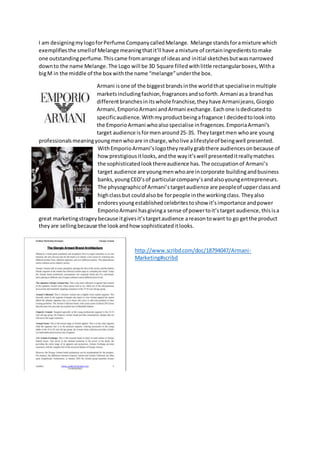
- 1. I am designingmylogoforPerfume CompanycalledMelange. Melange standsforamixture which exemplifiesthe smellof Melange meaningthatit’ll have amixture of certainingredientstomake one outstandingperfume.Thiscame fromarrange of ideasand initial sketchesbutwasnarrowed downto the name Melange.The Logo will be 3D Square filledwithlittle rectangularboxes,Witha bigM in the middle of the box withthe name “melange”underthe box. Armani isone of the biggestbrandsinthe worldthat specialiseinmultiple marketsincludingfashion,fragrancesandsoforth.Armani asa brandhas differentbranchesinitswhole franchise,theyhave Armanijeans,Giorgio Armani,EmporioArmani andArmani exchange.Eachone isdedicatedto specificaudience. Withmyproductbeingafragance I decidedtolookinto the EmporioArmani whoalsospecialise infragences.EmporiaArmani’s target audience isformenaround25-35. Theytargetmen whoare young professionalsmeaningyoungmenwhoare incharge,wholive alifestyleof beingwell presented. WithEmporioArmani’slogotheyreallygrabthere audiencesonbecause of howprestigiousitlooks,andthe wayit’swell presenteditreallymatches the sophisticatedlookthereaudience has.The occupationof Armani’s target audience are youngmenwhoare incorporate buildingandbusiness banks,youngCEO’sof particularcompany’sandalsoyoungentrepreneurs. The physographicof Armani’stargetaudience are peopleof upperclassand highclassbut couldalso be forpeople inthe workingclass. Theyalso endoresyoungestablishedcelebritestoshow it’simportance andpower EmporioArmani hasgivinga sense of powertoit’starget audience,thisisa great marketingstrageybecause itgivesit’stargetaudience areasontowant to go getthe product theyare sellingbecause the lookandhow sophisticateditlooks. http://www.scribd.com/doc/18794047/Armani- Marketing#scribd
- 2. Thismy logoalthoughnoquite similarto Armani I chose to make itdifferentfrom Armani because Iwantedmylogoto have itsown lookandidentity. Mytargeted audience isbothmenandwomenaround the ages of 18-35. Since it’sbothfor men and womenI styledupthe logoto suit bothmenand women.Thismeant changingbothcoloursmakingone blue and the otherred.With the redbeingfor womenandthe blue beingformenthat’s howI depictmyaudience. The designof the logowas made to be formal to the audience because of howsophisticateditlooksandthe stature itholds,fromit beingaFrench manufacture.Ithas some value whichwouldupthe price of the perfume.Iusedthe certaintype of fontto entice the audience,the fontIusedis Vivaldi.The reasonwhyIusedthatfont wasbecause it has a certainstyle thatwas suitedtothe lookof the perfume makingitappealingtothe audience because itshowsa certainlevel of classiness.Thiswill resonate withmyaudience because the type of demographicI’maimingthisatisbothmenand womenwhoare in upperandhigherworking class.Theywork inbigcooperate company’sandare CEO’s.Theyare leaderof theirorganisations.