1. FRONT COVER research:
Background ideas-
Similar artist front cover ideas:
These images clearly allow me to imagine visually
aspects of the front cover. For example having a
medium shot of a young girl lying down on a
natural base such as flowers or leaves. The
different facial expression such as eye contact and
hand posture shown allows me to identify an
effective and appropriate option for my front
cover.
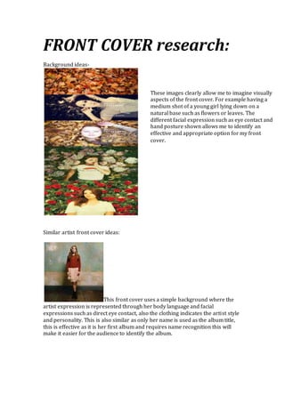
This front cover uses a simple background where the
artist expression is represented through her body language and facial
expressions such as direct eye contact, also the clothing indicates the artist style
and personality. This is also similar as only her name is used as the album title,
this is effective as it is her first album and requires name recognition this will
make it easier for the audience to identify the album.
2. This front cover uses a simple background that also
reinforces the artist songs and the videos. The artist facial expression is effective
as it represents her personality and emotions that are included in this songs. The
medium shot is similar to the shot I am considering, this is effective as the
audience can relate and identify her feeling and meaning behind the image faster
as it can be seen in greater detail. The artist name is also used on the front cover,
I am also considering using this technique, as it would be clearer to the audience
who the new artist is. Further more the clothing compliment the artist
personality as being sophisticated it also compliments the background colours. I
also aim to use clothing that represents the song and video as well as the artist
personality.
This front cover also uses a simple background that is
blurred, this emphasis on the main image being the artist, the shot used is a close
up this is effective as it makes his facial expressions apparent which allows the
audience to view in greater detail and create meaning from. The posture used is
associated with the artist therefore branding is maintained. The grey scale colour
technique added makes the artist genre and song types more apparent. I aim to
use different colour leaves (some dead and alive) as the different colours and
textures would connote and reinforce aspects of the narrative and artist. The
album title is the artist name, I aim to also use this technique, as it is effective for
new artist to use in order to gain name recognition.
3. BACK COV ER research:
Background ideas-
Similar artist back cover ideas:
These images are the different back cover
ideas I had. For example having a drawing
that refers back to the video and the
overall artist identity, or having something
more simple such as a tree background
with song titles against it, this also consist
of connotations I associate my artist with
and the narrative of the music video with.
Furthermore the idea of having a dream
like state such as a swirl with different
earthy colours reinforces the narrative of
the video and also the artist and her
achievements and aspirations.
This back cover image is simple, the background
reinforces the front cover (similar wall used), I aim to use this same effect for
example having a bare tree on the back and fallen leaves on the front relate to
each other. The damaged wall represents the song titles and overall emotion the
artist conveys and is consistent with the video, I also aim to use this effect on my
back cover for example the tree is consistent in the video and album front cover.
The tree will have deeper meaning and connotations such as nature, this relates
to my narrative as the artist is expressing her self in a natural manner that other
her age also go through. Production details are shown on the bottom back cover,
I also will have this text on the back cover, in addition the main typography is
consistent with the album title this is a technique I will also maintain in my
album.
4. This back cover is simple, roses are used in opposite
angles this is consistent with the front cover as flowers and nature is also used. I
also aim to remain consistent with the front cover and back cover. Production
detail and record company name and logo are shown at the bottom part of the
back cover, I also aim to have this information on the back cover also.
This back cover is simple, just an orange colour is
used, this is consistent with the front cover as this colour is dominate in the front
cover, this colour is used to remain consistent but also to represent the overall
album as the audience can identify this colour with particular emotions with
particular songs. The typography size and style is maintained through out, I will
maintain this in my typography as well. This bottom of the back cover also has
the production detail and record company logo and name, I will have this on my
back cover as well.
The track listing on all the back album covers is positioned in the middle,
the reason for this is because the background image consist of a single
colour or some small effects, and they do not have a main image in the
background. For my back cover the positioning of the text will be to the
side of the main image (dependent on the idea).