1. GHOST LIT KINGDOM
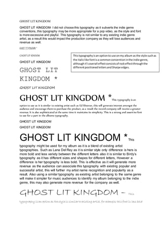
GHOST LIT KINGDOM- I did not choose this typography as it subverts the indie genre
conventions, this typography may be more appropriate for a pop video, as the style and font
is more excessive and playful. This typography is not similar to any existing indie genre
artist, as a result this would impact the production company as they will lose audiences and
revenue as well.
GHOST LIT KINGDOM *
GHOST LIT KINDOM
GHOST LIT KINGDOM
GHOST LIT
KINGDOM *
This typography is an option to use on my album as the style such as
the italic like font is a common convention in the indie genre,
although it’s overall effect consists of rock effect through the
different positioned letters and Sharpe edges.
GHOST LIT KINGDOM
GHOST LIT KINGDOM *This typography is an
option to use as it is similar to existing artist such as Ed Sheeran, this will generate interest amongst the
audience and encourage them to purchase the product, as a result the record company will receive a greater
revenue. It is also sophisticated at the same time it maintains its simplicity. This is a strong and assert ive font
to use for a part in the albums typography.
GHIOST LIT KINGDOM
GHOST LIT KINGDOM
GHOST LIT KINGDOM * This
typography might be used for my album as it is a blend of existing artist
typographies. Such as Lana Del Rey as it is similar style only difference is hers is
more bold and less variety between the different letters also it is similar to Birdy’s
typography as it has different sizes and shapes for different letters, However a
difference is her typography is less bold. This is effective as i t will generate more
revenue as the audience can associate this typography with existing popular and
successful artist, this will further my artist name recognition and popularity as a
result. Also using a similar typography as existing artist belonging to the same genre
will make it simpler for music audiences to identify my album belonging to the indie
genre, this may also generate more revenue for the company as well.
GHOST LIT KINGDOM – This
typography is an option as the style is similar to existing artist, for example, this font is less bold
2. also having different effects on the letters is comparable to birdy’s typography. This is effective as
the audience can identify the genre and resemblances to existing popular artist.
GHOST LIT KINGDOM -
GHOST LIT KINGDOM
GHOST LIT KINGDOM -
GHOST LIT KINGDOM
GHOST LIT KINGDOM – I did not choose this typography as it does not adhere
to the indie genre, this typography is more appropriate for a heavy metal or
hard rock genre. This would not generate an increase in audience interest as
this typography is not similar to existing indie genre artist. Thus the
company would lose profit.
GHOST LIT KINGDOM
GHOST LIT KINGDOM- This typography is simple but less refined, it is
similar to existing typography, however the letters individually are unchanged, and this does not
create an indie genre effect. Although this typography would be appropriate to use for other
aspects of the album, therefore it remains an option.
GHOST LIT KINGDOM
GHOST LIT KINGDOM
GHOST KIT KINGDOM
GHOST LIT KINGDOM
GHOST LIT KINGDOM
GHOST LIT KINGDOM
GHOST LIT KINGDOM *
GHOST LIT KINGDOM *
GHOST LIT KINGDOM
GHOST LIT KINGDOM
GHOST LIT KINGDOM -
GHOST LIT KINGDOM -
GHOST LIT KINGDOM
GHOST LIT KINGDOM