Aerolíneas Argentinas brand identity -Novo-

As the largest domestic and international carrier in Argentina, Aerolíneas Argentinas has been transporting passengers to, from and within this beautiful land since the early 1950s. With a new mission "To connect Argentineans and contribute towards the integration and economic and social development of our country, promoting the national territory as a tourist, cultural and business destination," Aerolíneas Argentinas is introducing a new identity designed by Futurebrand. The new brand image preserves some of the historical elements that position the company amongst world class airlines: the condor symbol of the airline has been redrawn, styling its strokes and providing greater purity to its shape. The distinctive blue colour of the company has been replaced by a light blue, which is closer to that of the national flag, enhancing its presence in its application on the aircrafts of the new fleet. The old typography has been replaced by a more modern, lightweight and agile one, which preserves the traditional italic writing, a symbol of the progress and optimism that represents this new phase.

Recommandé
Contenu connexe
Plus de Ayman Sarhan
Plus de Ayman Sarhan (20)
Dernier
Dernier (20)
Aerolíneas Argentinas brand identity -Novo-
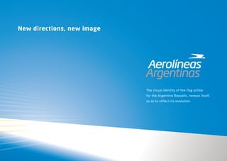
- 1. New directions, new image The visual identity of the flag airline for the Argentine Republic, renews Itself, so as to reflect its evolution.
- 2. Our evolution A new era begins for Aerolíneas Argentinas. A stage where we take up old premises and add new ones, as a result of a learning process of the recent past and the experience gathered throughout a history that is so closely related to our country’s development as is deeply rooted in each of its inhabitants hearts. This new era seeks to regain all the good things we used to have, and achieve that which is still missing so as to reach the top. Our mission To connect Argentineans and contribute towards the integration and economic and social development of our country, promoting the national territory as a tourist, cultural and business destination. Our vision To be the flagship company and pride of the Argentine Republic, renowned for its efficient and transparent public management.
- 3. Our Values Dynamism Permanent movement. Continued improvement. Our premises are proactivity, the search for permanent update and call to serve, so as to offer our clients the best, surpassing their expectations. Commitment With everyone, inside and outside. We are committed with security, the development of this country, Promoting honest communication and teamwork within an efficient and transparent management. This is the commitment we undertake with the will to be a world class airline. Brand Attributes Of all the attributes of the Closeness Aerolíneas Argentinas brand, There are some which are outstanding. Feeling at home, everywhere We are an Argentinean company. A group of people that tries They nurture and define its genetics, hard to be close to its customers, look after their needs, determine a special outlook of Trying to make them feel at home anywhere in the world. the world and a special way to get close to it.
- 4. Our History Upon creating the new identity, the elements that identified our brand were analyzed and each evolved in deference to our history.
- 5. Our symbol The condor is a bird typical of our national territory. However, the Aerolíneas condor is an indisputable part of the brand. It is not a naturalistic representation but a proper and personal symbol, designed with a particular style and instantly recognizable. Born in the middle of last century, this symbol is rescued today more than ever, more stylized and refined in a subtle and respectful manner.
- 6. e A Our typography The new typography of the system of visual identification of Aerolíneas stands t out due to its light, modern style with pure lines and regular traits. iR a Within the chosen family, the Neo Sans in its italic version was the chosen one for the logo, keeping its inclination, it is present in the previous logo, as a sign of advancement, drive, and a clear direction. g ABCDEFGHIJKLMNÑOPQR STUVWXYZ abcdefghijklmnñopqrstuv wxyz 0123456789 ABCDEFGHIJKLMNÑOPQR STUVWXYZ abcdefghijklmnñopqrstuv wxyz 0123456789
- 7. Our Colors In order to pay tribute to our flag, Aerolíneas changes the dark blue for a light one and includes the yellow as a representation of the sun in its color palette, and silver, representing the etymological origin of our country and also as a symbol of the excellence we have set as our goal.
- 8. Our Identity, up high The quintessential contact point between our brand and our customers is the aircraft. The new graphic system emphasizes the light blue color, giving to it a prominent role. Aircraft tails show a unified graphic motif symbolizing our flag. The company’s flag. The country’s flag
- 9. Up high in the sky The phrase that goes with our new brand image is burned into the memories of all Argentineans’ and inhabitants of this country. Up high in the sky (“Alta en el cielo” as is the original phrase in Spanish) evokes the first line of the patriotic song “Aurora” written in 1908 as a tribute to the national flag. The phrase plays with the identification of Aerolíneas Argentinas as a country emblem, and places the company within its element: the sky.