
Recommandé
Contenu connexe
Tendances
Tendances (19)
En vedette
Similaire à Reservoir dogs
Similaire à Reservoir dogs (20)
Plus de A2MediaStudies
Plus de A2MediaStudies (13)
Reservoir dogs
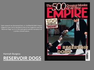
- 1. Upon research we discovered that L.A. Confidential didn’t have a magazine cover and so decided to look at the magazine cover for ‘Reservoir Dogs’ as it is in the same genre and the narrative is of a similar criminal nature. Hannah Burgess RESERVOIR DOGS
- 2. The banner is used to tell the audience important purchase information about the magazine. It states the cost of purchase and the release date. On most Empire magazines this information is quite small, this is because the audience for this magazine is very specific and would by the magazine on a regular basis and so would know the price and which magazine was released at what time. It also shows their website address, this allows the audience to know how they can access more information about the magazine itself but also about what is featured in the magazine for example pod casts, online reviews and video interviews. The Banner
- 3. The Masthead The Masthead is the magazine’s title. As Empire is so well established ‘Empire’ is hidden partially by the mans head and also by the cover line. If the magazine wasn’t so well established then the audience wouldn’t be able to tell what magazine this was if the font was covered up. The use of sans serif font means that the font is clearly visible from a far. However as the font for the magazine is individual, the font is recognisable as an Empire magazine. By having the masthead in red against the black background it ensures that is highly visible when stacked on a shelf next to other magazines.
- 4. In this magazine cover there is only The Image one image. It is boxed in red, however the image is not refrained to this space. The first thing you see is the men in two dark suits aimed at each other. Through their positions, it is clear that one character is more dominant than the other. It also suggest that their criminals through their bloodied suits and their guns. In addition it shows the character on the floor as resilient as he is still trying to fight even though he’s on the floor. It suggests that the film genre is about criminals and so could film into the film noir genre. It implies that there is a lot of violence and confrontation through out the narrative.
- 5. Cover line The main cover line is larger than all the other cover lines yet is smaller than the mast head. It’s used to be eye catching and to draw the audience by informing them about what is in the magazine.
- 6. Lead Article The Lead article informs the reader of what the main feature of the magazine is about. It is done to promote the film but also to attract fan of the film to buy the magazine. The font used is sans serif so it is easy to read and is also reflective of the film noir genre. By having the beige colour it stands out as it contrasts with the image in the background. The bold black outline around the edges of the font also help it to stand out.
- 7. Anchorage The anchorage... “You shoot me in a dream, you better wake up and apologise.” Helps to enforce the criminal aspect of the film, it also shows that the protagonist is a dominant and highly ranked character in the film. Through the use of quotation marks it shows that it is a quote from a film rather than a critics quote or review.
- 8. The Flash Flashes are used to promote the magazine and encourage the reader to read and buy the magazine, unlike other magazines, this one only has one flash. This flash encourages the reader to purchase the magazine so that they can obtain the 100 covers. I think this magazine only has one flash as this magazine cover is from 2009 where as now more flashes would be used.