2. The Narrative &
Colour
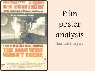
As to clues towards the
narrative, the colour
scheme or yellow and
oranges combined with
the black and white photo
remind me of a „Wanted‟
poster suggesting criminal
activity. This idea is also
enhanced by the
anchorage “The last thing
on his mind is murder.”
This anchorage creates
narrative enigma as it
raises lots of questions in
the audiences mind.
3. Key Images The Key images in this
poster is the black and
white image of the
protagonist and the text
below of the title and
directors.
Through the image
being in black and
white it shows to the
audience that the film is
set in the past.
4. The image in this poster is a close
up showing the protagonists face
which clearly shows his pensive
Camera
look reflecting his emotion adding
drama. By having the character
distance
looking past the camera it makes
the audience wonder what he is
looking at.
Through the black and white the
audience can tell that this is a
black and white film.
Through mise-en-scene of the
hat, hand rolled cigarette and
large car wheel, the audience can
interpret that the film is set in the
1940‟s.
5. The Text
There is a range of colours used in this
posters text; orange, purple, white and
red. Even though all the colours are
different they all fit under the same
colour scheme and stand out well
against the tea-stained yellow as the
background.
The actors names are placed directly
above the image which reinforces that
they‟re in the film. The first name to
appear is the main protagonist which
shows that he is the main star in the
film.
Like with most film posters the title is
of the largest font as this is one of the
most important pieces of information
picked up by the audience. The type of
font used here is sans serif as the
letters are easy to read.
6. The Anchorage
“The last thing on his mind is murder.”
Anchorage‟s are used to enhance the message
trying to be conveyed by the image and enforce
its meaning. The word „murder‟ implies that this
film is about criminal activity but that the main
character is maybe not directly involved.
7. Lighting
The lighting used in this
poster is a cross between
ambient and notan light. I
think it‟s Notan light
because there appear to be
two sources of light, as
shown by the orange
arrows. However the overall
light appears to me to be
softened with shadows
covering parts of the mans
face and upper
body, portraying a sinister
and unnerving feel.
8. The layout
The image isn‟t blended
into the photo, it is just
placed in a mid position.
I think this is done in
order to comply with the
film-noir genre. The
films genre is portrayed
through the tilted hat,
the cigarette and the
black and white key
image.