1a s4 i creating runcharts final
•
0 j'aime•725 vues

A runchart is a tool used to assess improvement progress by plotting data over time alongside changes. It has three main elements - the time period, measurement data, and median line. A runchart is created before and during changes to evaluate effectiveness in real-time. Microsoft Excel can be used to easily create runcharts by setting up a data table and inserting a graph. Key elements like titles, labels and the median line should then be added to complete the runchart.

Recommandé
Contenu connexe
Tendances
Tendances (20)
Similaire à 1a s4 i creating runcharts final
Similaire à 1a s4 i creating runcharts final (20)
Plus de ABCiABUHB
Plus de ABCiABUHB (12)
Dernier
Dernier (20)
1a s4 i creating runcharts final
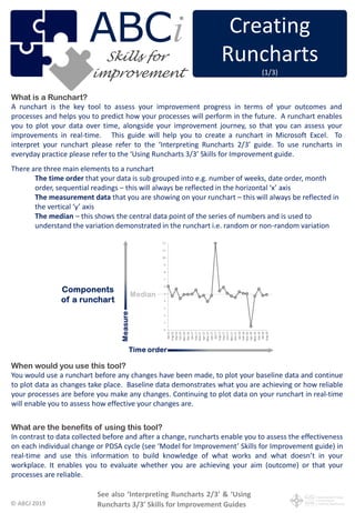
- 1. © ABCi 2019 What is a Runchart? A runchart is the key tool to assess your improvement progress in terms of your outcomes and processes and helps you to predict how your processes will perform in the future. A runchart enables you to plot your data over time, alongside your improvement journey, so that you can assess your improvements in real-time. This guide will help you to create a runchart in Microsoft Excel. To interpret your runchart please refer to the ‘Interpreting Runcharts 2/3’ guide. To use runcharts in everyday practice please refer to the ‘Using Runcharts 3/3’ Skills for Improvement guide. There are three main elements to a runchart The time order that your data is sub grouped into e.g. number of weeks, date order, month order, sequential readings – this will always be reflected in the horizontal ‘x’ axis The measurement data that you are showing on your runchart – this will always be reflected in the vertical ‘y’ axis The median – this shows the central data point of the series of numbers and is used to understand the variation demonstrated in the runchart i.e. random or non-random variation When would you use this tool? You would use a runchart before any changes have been made, to plot your baseline data and continue to plot data as changes take place. Baseline data demonstrates what you are achieving or how reliable your processes are before you make any changes. Continuing to plot data on your runchart in real-time will enable you to assess how effective your changes are. What are the benefits of using this tool? In contrast to data collected before and after a change, runcharts enable you to assess the effectiveness on each individual change or PDSA cycle (see ‘Model for Improvement’ Skills for Improvement guide) in real-time and use this information to build knowledge of what works and what doesn’t in your workplace. It enables you to evaluate whether you are achieving your aim (outcome) or that your processes are reliable. (1/3) See also ‘Interpreting Runcharts 2/3’ & ‘Using Runcharts 3/3’ Skills for Improvement Guides Creating Runcharts (1/3) ABC improvement iSkills for
- 2. © ABCi 2019 Who needs to be involved? Anybody carrying out improvement work should have a basic understanding of runcharts and how to interpret them. However, those responsible for pulling together measurement for improvement data should have the skills to create and interpret runcharts. There are statistical software packages available that can do this for you, however these can be constructed easily in Microsoft Excel. What resources do I need? Computer with Microsoft Excel (this guide has been developed using Microsoft Excel 2013) Using Microsoft Excel to create a runchart – Open Microsoft Excel Step 1 - Create your data table • Before you build your runchart you will need to create a table of data arranged in columns • Each of the three main elements of a runchart (Time, Measure, Median) will be represented by a column within a table of data in Excel • – Type headings in the first three columns in your Excel Spreadsheet (see examples below) 1 - Now you need to enter some data into the columns in your table. Start with the Time/Date column (column A). o – Type in the times that correspond with your data collection intervals e.g. week 1, week 2 OR Jan 15, Feb 15, OR 01/01/16, 02/01/16 until there are about 30 rows of data (see examples below). This will form your horizontal ‘x’ axis OR OR 2 - Next you will enter your baseline data, this is the data that you collected before you make any changes and should be at least 8 data points (Column B). o Type in the data corresponding to each time/date in the measure column (see examples below). This will form your vertical ‘y’ axis (see next page)
- 3. © ABCi 2019 3 – Next you will need to calculate your median, Excel will do this for you. Let’s use the second example (above) from now on to help you do this. In the first cell of the Median column (cell C2) you are going to use the ‘median’ function. This enables you to choose the group of numbers you wish to calculate the median from. • In the first cell of the Median column, type =median( • This will enable you to choose the group of numbers to include in your median calculation and will be included in brackets (). Highlight the numbers in your baseline data then press F4 (or Fn & F4) to insert $ signs, if F4 doesn’t work, type $ before each letter & number manually as below
- 4. © ABCi 2019 • Well done – you have calculated your median. You will use this method to create a median line OR recalculate your median on your runchart. You will need to drag this downwards to correspond with your baseline data. • Move your cursor to the bottom right hand corner of the cell where the median is calculated (cell C2), until it changes to a cross + • Once your cursor is shaped like a cross drag it down to correspond with your measurement data in column B Step 2 - Creating a Runchart • You now have enough data to start building your runchart – We will do this in stages as it will help you to learn more about how Excel works. • You are going to use the time/date (column A) and measurement data (column B) to create a basic graph. • Highlight all the data (columns A and B), including the header, in from cell A1 to cell B31
- 5. © ABCi 2019 • Congratulations – you have started to build your runchart but you still don’t have your median on the runchart • Now you are going to add your median You are going to do this by adding another series of data to your runchart, so you will have two series of data in your runchart, the measurement data (column A) and your median (column B) • Right Click anywhere on your runchart, this will produce a new menu. Click on ‘Select Data’. • This will produce a ‘Select Data Source’ box below • You can see that your measure ‘Turnaround time’ is already included. Now you need to add the ‘median’ as another data source • Click on ‘Add’ The following ‘Edit Series’ box will appear. • Using the ‘Edit Series’ box you can add the ‘Series name’ and the ‘Series values’. • To add the series name – first click in the white area of the ‘Series name’ box and then click on the title ‘Median’ in your table of data • To add the series values – click in the white area of the ‘Series values’ box first, delete what is already in there, and then highlight all the cells in the ‘Median’ column from the top of the table all the way down to the bottom so that they are included in the green dashed line (do not include the title) • Click OK in the ‘Edit series’ box, then Click OK in the ‘Select Data Source’ box
- 6. © ABCi 2019 Step 3 – Labelling your Runchart You are almost there – this is looking more like a runchart But as it is, we really don’t know what the runchart is all about. You need to add a chart title, axis labels or legends to help us understand what the runchart is all about. There is a very useful tool in Excel that will help us to do this. • You will need to access the ‘Chart Tools: Design’ menu • Click anywhere on your runchart. This will enable the ‘Chart Tools’ menu to appear at the top of your screen • Under the ‘Chart Tools’ menu, you will see two further menus that will help you to change the look of your chart. Click on the ‘Design Tab’ • This will open the ‘Design’ menu on the menu bar. Look for ‘Add Chart Element’. This is a great tool to help you add or change lots of elements on your run chart. Click ‘Add Chart Element’ to open a dropdown menu of options to change your runchart • You need to add a chart title. Click on ‘Chart Title’ in the drop down menu Click on ‘Above Chart’ to produce a title above your runchart. This will produce a text box that you can type into. Highlight & delete ‘Chart title’ and add your own runchart title Congratulations! You have created your first runchart Click on ‘Axis Titles’ to add a label to your horizontal and vertical axis See also ‘Interpreting Runcharts 2/3’ & ‘Using Runcharts 3/3’ Skills for Improvement Guides