Analysis and interpretation of surveillance data
•Télécharger en tant que PPT, PDF•
8 j'aime•6,540 vues

This document discusses analyzing and interpreting surveillance data. It outlines key steps in the process including counting cases, dividing by population to calculate rates, and comparing rates over time, place, and person. Common reports generated from surveillance data are described such as timeliness, descriptive analyses, trend analyses, and comparisons between reporting units. Interpretation of results involves looking for missing or invalid data, considering disease profiles and rates, and taking action based on the information. Technical committees regularly review analyses to guide public health responses. The goal is to transform raw surveillance data into useful information that can inform program implementation and action.

Recommandé
Contenu connexe
Tendances
Tendances (20)
En vedette
En vedette (20)
Similaire à Analysis and interpretation of surveillance data
Similaire à Analysis and interpretation of surveillance data (6)
Plus de Abino David
Plus de Abino David (20)
Dernier
Dernier (20)
Analysis and interpretation of surveillance data
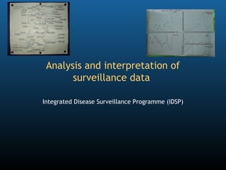
- 1. Analysis and interpretation of surveillance data Integrated Disease Surveillance Programme (IDSP)
- 2. Preliminary questions to the group • Have you been involved in surveillance data analysis? • What difficulties have you encountered in analyzing surveillance data? • What would you like to learn about surveillance data analysis? 2
- 3. Outline of this session 1. The concept of data analysis 2. CDC for TPP 3. Reports 4. Interpretation of the information 3
- 4. What is data analysis? • Data reduction Reduces the quantity of numbers to examine Because the human mind cannot handle too many bits of information at the same time • Transforms raw data into information A list of cases becomes a monthly rate Data Information Action Analysis Interpretation 4 Today we will focus on analysis Why analyze?
- 5. REC SEX Distribution of cases by sex --- ---- 1 M 2 M Table 3 M 4 F 5 M Data 6 F Sex Frequency Proportion 7 F 8 M Female 10 33.3% 9 M 10 M Analysis Male 20 66.7% 11 F 12 M 13 M Total 30 100.0% 14 M 15 F Information Graph 16 F 17 F 18 M 19 M Female 20 M Male 21 F 22 M 23 M 24 F 25 M 26 M 27 M 28 F 29 M 30 M 5 Why analyze?
- 6. 1. Count, Divide and Compare (CDC): An epidemiologist calculates rates and compare them • Direct comparisons of absolute numbers of cases are not possible in the absence of rates • CDC Count • Count (compile) cases that meet the case definition Divide • Divide cases by the corresponding population denominator Compare • Compare rates across age groups, districts etc. 6 CDC for TPP
- 7. Exercise • How would you find out if diphtheria is more common among people who are below the poverty line? 7 CDC for TPP
- 8. Is diphtheria more common among poorer people? • Count Count cases of diphtheria among families with and without a Below Poverty Line (BPL) card • Divide Divide the cases of diphtheria among BPL people by the estimated BPL population size (e.g., census) to get the rate Divide the cases of diphtheria among non BPL people by the estimated non BPL population size (e.g., census) to get the rate • Compare Compare the rates of diphtheria among BPL and non BPL people 8 CDC for TPP
- 9. 2. Time, place and person descriptive analysis A. Time Incidence over time (Graph) A. Place Map of incidence by area A. Person Breakdown by age, sex or personal characteristics Table of incidence by age and sex 9 CDC for TPP
- 10. A. Present the results of the analysis over time using a GRAPH • Absolute number of cases Avoid analysis over longer time period as the population size increases • Incidence rates Allows analysis over longer time period Analysis by week, month or year 10 CDC for TPP
- 11. Absolute number of cases for analysis over a short time period Acute hepatitis (E) by week, Hyderabad, 120 AP, India, March-June 2005 100 Number of cases 80 60 40 20 0 1 8 15 22 29 4 12 19 26 3 10 17 24 31 7 14 21 28 March April May June First day of week of onset Interpretation: The source of infection is persisting and continues to cause cases 11 CDC for TPP
- 12. December November Reports October Interpretation: There is a seasonality in the end of the year and a trend towards September August July 2004 District, West Bengal, India, 2000-2004 June May Malaria in Kurseong block, Darjeeling April March February January December November October September August July 2003 June May increasing incidence year after year Incidence rates for analysis over a longer time period April March February January December November October September August July 2002 June Months May April March February January December November 12 October September August Incidence of Pf malaria July 2001 Incidence of malaria June May April March February January December November October September August July 2000 June May April March February January 5 0 45 40 35 30 25 20 15 10 Incidence of malaria per 10,000
- 13. 2. Present the results of the analysis by place using a MAP • Number of cases Spot map Does not control for population size Concentration of dots may represent high population density only May be misleading in areas with heterogeneous population density (e.g., urban areas) • Incidence rates Incidence rate map Controls for population size 13 CDC for TPP
- 14. Incidence by area Incidence of acute hepatitis (E) by block, Hyderabad, AP, India, March-June 2005 Attack rate per 100,000 population 0 1-19 20-49 50-99 100+ Open drain Interpretation: Blocks with hepatitis are those supplied by pipelines Pipeline crossing open sewage drain 14 crossing open sewage drains
- 15. 3. Present the results of the analysis per person using an incidence TABLE • Distribution of cases by: Age Sex Other characteristics (e.g., ethnic group, vaccination status) • Incidence rate by: Age Sex Other characteristics 15 CDC for TPP
- 16. Incidence according to a characteristic Probable cases of cholera by age and sex, Parbatia, Orissa, India, 2003 Number of cases Population Incidence Age group 0 to4 6 113 5.3% (In years) 5 to14 4 190 2.1% 15 to24 5 128 3.9% 25 to34 5 144 3.5% 35 to44 6 129 4.7% 45 to54 4 88 4.5% 55 to64 8 67 11.9% > 65 3 87 3.4% Sex Male 17 481 3.5% Female 24 465 5.2% Total Total 41 946 4.3% Interpretation: Older adults and women are at increased risk of cholera 16 CDC for TPP
- 17. Distribution of cases according to a characteristic Immunization status of measles cases, Nai, Uttaranchal, India, 2004 19% 81% Immunized Unimmunized Interpretation: The outbreak is probably caused by a failure to vaccinate CDC for TPP
- 18. Seven reports to be generated 1. Timeliness/completeness 2. Description by time, place and person 3. Trends over time 4. Threshold levels 5. Compare reporting units 6. Compare private / public 7. Compare providers with laboratory 18 Reports
- 19. Report 1: Completeness and timeliness • A report is considered on time if it reaches the designated level within the prescribed time period Reflects alertness • A report is said to be complete if all the reporting units within its catchment area submitted the reports on time Reflects reliability 19 Reports
- 20. Report 2: Weekly/ monthly summary report • Based upon compiled data of all the reporting units • Presented as tables, graphs and maps • Takes into account the count, divide and compare principle: Absolute numbers of cases, deaths and case fatality ratio are sufficient for a single reporting unit level Incidence rates are required to compare reporting units 20 Reports
- 21. Report 3: Comparison with previous weeks/ months/ years • Help examine trend of diseases over time • Weekly analysis compare the current week with data from the last three weeks Alerts authorities for immediate action • Monthly and yearly analysis examine: Long term trends Cyclic pattern Seasonal patterns 21 Reports
- 22. Report 4: Crossing threshold values • Comparison of rates with thresholds • Thresholds that may be used: Pre-existing national/international thresholds Thresholds based on local historic data • Monthly average in the last three years (excluding epidemic periods) Increasing trends over a short duration of time (e.g., Weeks) 22 Reports
- 23. Report 5: Comparison between reporting units • Compares Incidence rates Case fatality ratios • Reference period Current month • Sites concerned Block level and above 23 Reports
- 24. Report 6: Comparison between public and private sectors • Compare trends in number of new cases/deaths Incidences are not available for private provider since no population denominators are available • Good correlation may imply: The quality of information is good Events in the community are well represented • Poor correlation may suggest: One of the data source is less reliable 24 Reports
- 25. Report 7: Comparison of reports between the public health system and the laboratory Elements to compare Public health system Laboratories Validation of •Number of cases •Number of laboratory reporting seen by providers diagnoses Water borne •Cases of diarrheal •Water quality disease diseases Vector borne •Cases of vector •Entomological data disease borne diseases 25 Reports
- 26. Making sense of different sources of information (“S” and “P” forms) It is not possible to mix data from different case definitions One cannot add cases coming from “S” and “P” forms (syndromic and presumptive diagnoses) It is not possible to add apples and oranges Use the different sources of information to cross validate (or “triangulate”) If there is an increase in the cases of dengue in the “P” forms, check if there is a surge in the number of fever cases in the “S” forms 26 Interpretation
- 27. What computers cannot do Skills Attitudes • Contact reporting units • Looking for missing information • Thinking • Interpret laboratory tests • Discussing • Make judgment about: • Taking action Epidemiologic linkage Duplicate records Data entry errors • Declare a state of outbreak 27 Interpretation
- 28. Expressed concerns versus reality Concerns Mistake commonly commonly expressed observed • Statistics are difficult • Data are not looked at • Multivariate analysis is complex • Presentation of data is challenging 28 Interpretation
- 29. Review of analysis results by the technical committee • Meeting on a fixed day of the week • Search for missing values • Validity check • Interpretation of the analysis bearing in mind The strength and weakness of data The disease profiles The need to calculate rates before comparisons Meeting on a fixed day of every week • Summary reports for dissemination • Action 29 Interpretation
- 30. Take home messages 1. Link data collection and program implementation • Data > Information > Action 1. Count, divide and compare for time, place and person description 2. Share information through reports 3. Interpret with the technical committee to decide action on the basis of the information 30
- 31. Thank you. 31
Notes de l'éditeur
- Few ice breaking questions. Do not spend too much time.
- Outline of the session.
- You can connect this slide to the one we showed earlier in the course. We worked on the data collection side before. No we are working on analysis to transform data into information.
- This is the difference between data and information. The process between the two is analysis, or data reduction.
- The major concept behind epidemiological data analysis is CDC- Count, Divide and Compare. This slide was shown earlier. It is a revision.
- This exercise is to help the participants understand the denominator they need to work with. Sometimes, people have a hard time identify the denominator they need to use before a comparison. So In this exercise, by comparing the incidence of diphtheria among people below and under the poverty line, we will help participants understand the denominator they need to work with. Ask the participants what they should COUNT, denominator they would use to DIVIDE and what they would COMPARE (Answers on next slide).
- Answers to the questions on the previous slide. Try to understand the misconceptions among participants who did not identify the right denominator. That will help you understand your audience.
- The CDC process will be repeated three times for the three basic types of epidemiological analyses. Time Place Person
- For time, we use graphs. We can either use direct numbers or rates, depending on whether a comparison is needed.
- For this outbreak of a short duration, the population does not have time to change substantially. We can use the absolute numbers.
- In contrast, here, for a five year analysis, the population size increased so we need to divide by the denominators to allow comparison (CDC).
- Now we will discuss maps. These slides repeat the lectures on graphs, tables and maps. Make sure that people have the reflex of using maps to present the information by geographical area. It is too common to see it in tables, which constitutes a loss of information.
- This is an example of a map of analysis by geographical area. Ask the participants what were the step that were followed to prepare this map.
- For the third type of analysis, by person, we usually report the data in tables.
- That is the table to remember and to replicate when doing surveillance data analysis.
- This graph present more information about the person (I.e., immunization status).
- In the context of IDSP, we routinely prepare seven different types of reports.
- First is about completeness and timeliness.
- Second is the weekly / monthly summary report.
- Third is on trends.
- Fourth is about crossing threshold values.
- Fifth is about comparing reporting units.
- Sixth compares the private and the public sector.
- Seventh compare the results of the reporting in the pubic health care system and the laboratory.
- Some people may be confused about the way we examine data with information collected using different case definition from different reporting sources. Because the case definitions are different, we cannot simply add. But we can look synoptically at both types of reporting to see if trends emerge.
- Computer can help as tools but do not replace thinking.
- Epidemiologist may be inhibited by all kind of technical considerations. But often they have not even started to look at the data. Once there is a willingness to look at the data, the technical hurdles can be addressed.
- After analysis we have gone from data to information. Now, beyond that stage, the information needs to be INTERPRETED to decide on any relevant action. This interpretation for decision making should take place in the context of a technical committee.
- The take home messages of the session.