SlideShare une entreprise Scribd logo
1  sur  59
Point of Contact:
Presentations
Alexei Kapterev
Alexei Burba
Point of Contact:
Presentations
Alexei Kapterev and Alexei Burba
Moscow, 2016
You can buy this book at Amazon for $2.49
Alexei Kapterev, Alexei Burba
Point of Contact: Presentation / Alexei Kapterev, Alexei Burba
ISBN 978-5-9908349-0-3 (Alexei Burba)
ISBN 978-5-9908350-0-9 (Alexei Kapterev)
Presentations are one of the most common and powerful communication
mediums. The purpose of this book is to educate you about the structure,
design and technique of successful presentations, including how to adjust
your presentation for different venues and contexts. By the end of this
book, you will have a variety of tools and information to help you become
an engaging and persuasive speaker who can achieve the greatest results
in your presentations.
The book is printed in the Open Sans typeface designed by Steve Mattheson.
All rights reserved.
No part of this book may be reproduced for any purpose in any form or by any
means whatsoever without express written permission from the copyright
holders.
© Alexei Kapterev, Alexei Burba, 2016
© Design SP A. Burba, 2016
To our parents
Table of contents
Chapter 1 — p. 9
What is a Presentation?
Chapter 4 — p. 29
Slides
Chapter 2 — p. 18
Why Do We Need
Presentations?
Chapter 5 — p. 44
Stage Presence
Chapter 3 — p. 22
Creating the Script
Chapter 6 — p. 53
Strategic Positioning
Introduction
In 2009, BSSL, a Russian startup was entering
the market with a new, unique tool for personnel
evaluation and organizational diagnostics. Within
a year of its launch, the company still did not have
a single order. The market did not understand why
the new tool was needed or how it could be used.
After a thorough analysis, the main
investor, Andrey Skvortsov, and the founder
of the company, Andrey Larionov, decided that
it’s time to do some marketing. They started
giving “sort of lectures” for “sort of students”
at universities. Why did they call them “sort
of lectures”? Because there was an element
of marketing in the lectures. While the overt
content of the lectures had to do with the theory
of personnel evaluation and organizational
diagnostics, the lectures also provided exten-
sive detail on the new psychometrical products
that the company had developed. Why did they
call the audience “sort of students”? Because many
academic institutions were pleased to provide free
classroom space for the lectures during evening
hours, and to encourage their students to attend.
In addition to the students, Mr. Larionov and Mr.
Skvortsov invited journalists and potential clients
to these events.
This is what a presentation looked like:
Larionov — a psychologist and a mathema-
tician by training — would open the lecture
by talking about the theory of social network
analysis. Then Skvortsov, the CEO of a medi-
um-sized company would take the stage
to explain how the theory might play out in real-
world business contexts. Real-world scenarios
might include: how to predict the consequences
of the dismissal of a top manager; how to sepa-
rate out ineffective employees from workaholics;
and how to reveal hidden conflicts in the team.
This combination of theory and practical applica-
tion turned out to be quite exciting. A journalist
from The Trade Secret — a monthly business
publication with a circulation of 65,000 copies —
attended one of the lectures. Inspired by what she
heard, the journalist wrote a substantial article
about BSSL methods.
As the founders put it, “That’s when we really went
on a roll”. Today, Russian giants such as Sberbank,
Gazpromneft, VTB24, and dozens of other compa-
nies are among BSSL’s clients. This was achieved
without anyadvertising, any PR — or even flyers
in the subway. Even though we are talking about
Russia, no kickbacks were involved. Everything
was done almost for free and almost exclusively
through presentations — that “sort of lectures”
thing.
What is a 
Presentation?
CHAPTER 1
Another synonym of the word “presentation”
is “proposal” or “offer”. The purpose of a presen-
tation is to offer the audience a certain product,
strategy, or vision in order to convince the audi-
ence to “buy” the proposed solution. Thus,
a presentation is directly related to sales
and marketing.
We didn’t put the word “buy” here in quotation
marks by accident. In the context of a presen-
tation, to “buy” does not necessarily mean,
“to buy for money”. A presentation often seeks
to encourage buy-in to (adoption or acceptance
of) an idea or a course of action. In many cases,
buy-in may be more valuable in the long term
than a single purchase. For example, if a jour-
nalist attends a presentation on the new BMW
car, a favorable magazine article on the new
model may result. The article would indi-
cate that the journalist bought
in to the subject of the presen-
tation (i.e. this is a great car
and people should buy it).
A presentation  is a form of communication
between you and a group of people. It is usually
conducted with the use of visual aids: slides,
prints, flipcharts, or sample goods. The word
“presentation” could be treated as a synonym
to the word “introduction”. For example, “BMW
introduced a new model at an auto show”. You can
rephrase it as “BMW held a presentation of a new
model”.
It is important to understand right from
the start what the subject of the presenta-
tion is. What are we presenting? In the above
example, the subject is a new model of a car.
What is it in YOUR case? A common problem with
presentations is that the presenter cannot artic-
ulate the subject of the presentation in a concise
and clear way. For example, if a speaker is giving
a presentation on the status of a project, he
or she should be able to define the project
status — the topic of the presentation — in just
a few words. Is the project going ok? If he or she
is not able to boil down the subject of the presen-
tation to that level of specificity and conciseness,
then we are likely to be subjected to a long conver-
sation about nothing.
Let’s start with a definition
9What is a  Presentation?
Types of Presentations
Presentations can be divided into those with and without a speaker,
and organized into four general types:
Narrow audience Wide audience
With
a speaker
Without
a speaker
Conference room Conference
E-mail Web-site
10What is a  Presentation?
Presentations for the Conference Room
Conference room presentations usually take
place at the (potential) client’s office or corporate
campus. It is customary to accompany your verbal
presentation with visual aids such as PowerPoint®
slides projected on a screen or printed handouts.
Usually there is a Question & Answer session,
or discussion, included after your speech, often
followed by an attempt to close the sale or other-
wise move the execution of the project forward.
Reasons for holding a conference
room presentation
A conference room presentation may serve
as the first contact with a new or potential
client. It may provide a roadmap at the begin-
ning of a project, or provide a status report
for an ongoing project. It may be the format
in which you deliver a project design
to a customer.
Typical errors
•	 Monologue: A common mistake in this kind
of presentation is to talk at the audience
for too long, making the presentation into
a monologue. It is better to arrange for more
information to be communicated in the Q &
A period, which makes for a more interactive
presentation.
•	 Overuse of Supporting Materials: Visual aids
should support your presentation. Too many
will overload the viewers and undermine inter-
action among presenter and viewer.
•	 Lack of a Clear & Concise Message. If your
presentation lacks a clear overall message
then it will be unsuccessful in convincing
your audience. Make sure that you are able
to articulate the message of your presentation
in a thesis statement of just a few words.
11What is a  Presentation?
Presentations at a Conference
A presentation at a conference usually addresses
a large and diverse group of people. Generally,
there is much less dialogue between the presenter
and the audience, and a very brief (if any) Q &
A session, as compared to a conference room
presentation. It may be a speech at a conference
where the majority of people do not know you;
it may be a room assembled specifically for you.
All the famous presentations by Steve Jobs were
held in this format.
Reasons for holding
a presentation at a conference
To introduce a new product or share unique
knowledge.
Typical errors
•	 Poorly formatted visual aids: some presenters
put so much information on a single slide,
that audience members sitting in the second
row are already unable to read the text. Make
sure that all visual aids are legible throughout
the conference room.
•	 Imbalance between the theory and marketing
aspects of the presentation: if there is
too much theory or audience education,
then the marketing goals are undermined.
If on the other hand, the presenter shares too
little valuable information (perhaps out of fear
that the data will be “stolen” by competitors),
then the audience may feel short-changed
or disrespected, and be less likely to buy
the product.
12What is a  Presentation?
Presentations by E-mail
In some cases, the presence of a speaker
is not necessary. You may be able to deliver your
message by sending a series of images accom-
panied with some text — a task that comic books
accomplish with great effect.
Reasons to use an email presentation
An email presentation may serve as a follow-up
after a first call or meeting with a potential client,
or you may send an email presentation on a new
product or service to your existing client base.
Typical errors
The presentation doesn’t look like comic book
at all. It looks like an unholy marriage of Excel
spreadsheet and Word document. It is both badly
designed and badly written, dull, boring and mean-
ingless.
13What is a  Presentation?
Website presentations are similar to the email
presentations discussed above — there is
no live presenter here as well. The difference
is that website presentations are available
to a much wider audience. A presentation
may be hosted on the company’s website,
or embedded from a separate website whose
function is to host presentations (slideshare.com
or prezi.com, among others).
Reasons to use a website presentation
A website presentation may describe a compa-
ny’s work process or present a successful case
study. In general, the goal is to convince the viewer
of the company’s experience and emphasize
its competences.
Typical errors
If you are designing a presentation to be included
in a website, look out for the same mistakes
covered in the Email Presentations section above.
Presentations on Websites
14What is a  Presentation?
Key differences between presentations
with or without a speaker
Without a speaker
In an email or web presentation, the slides “speak”
for themselves. Therefore, you have to include 2-3 times
as much text per slide as you would in a verbal presen-
tation. It would be a mistake to sacrifice images, since
their simplicity and vibrancy are extremely important
in communicating the message. In order to keep
the presentation to a reasonable length, cut out any
excessive or unnecessary text from the verbal version
of the presentation.
With a speaker
The speaker’s words and presence are key, with visual aids playing
a supporting role. Slides should be simple, visual, and colorful. “One picture —
one sentence” is a good rule.
During an on-site presentation, the main protagonist is you or the company
you represent. By speaking about your experience (or the company’s), you
should aim to get the audience to identify with you, and to see that they may
use the same solution that you would use (the company’s product or service)
to solve their problem.
The tower of Babel
collapsed because
it had too many
EDITORS!
The tower
of Babel
collapsed
because it had
too many
editors!
15What is a  Presentation?
Why Do We Need
Presentations?
CHAPTER 2
Marketing
Speaking at conferences or in conference rooms,
email presentations, publications on company
websites or on slideshare.com, webinars,
and content marketing.
Presentations are central to the process
of attracting, serving and retaining clients
Pre-sale Presentations
These include any communication with a potential
client before the negotiations and closing of a sale.
They may include an introduction to products
or services, a follow-up letter after the introduc-
tion, or a story or case history about the product
or service.
Presentations as Reports
These include communications with the client
regarding ongoing projects: reports on project
implementation, the results of a completed
study or data from an ongoing one, the results
of an advertising campaign, or the results
of the project itself. These presentations may be
the most difficult because there’s often no clear
goal or key message
They can be used for:
17Why Do We Need Presentations?
We polled a few of our clients
to get their views:
Yuliya Ivanchina,
Director of Business Development, ADLABS:
Our market, the market of internet advertising,
emerged very recently, and it is still growing.
We see new products and services appearing all
the time. We have to educate clients and serve
as “evangelists” [by bringing new products
and technologies to their attention]. We cannot
imagine how we can do this without presenta-
tions.
Ivan Borovikov,
Managing partner, Mindbox:
We do 70% of our presentations for the purposes
of marketing. The rest are pre-sale presentations
and reports for the clients. If we were to stop
making good presentations, I think we would fail
to convert at least half of our leads to customers.
Business development is, in principle, impossible
without properly designed promotional materials
and presentations.
Vsevolod Ustinov,
General Director, IT-Agency:
Presentations are the basis of our marketing
communications. We use them both to attract new
clients and to increase market share overall. They
are a crucial component of our educational efforts.
Without presentations, we would have lost almost
all of the potential clients who did not come to us
through recommendations. These potential clients
account for almost half of our clientele.
18Why Do We Need Presentations?
The most fundamental mistake that speakers
make is inadequate preparation. There are
no miracles. Great presentations require signifi-
cant time, energy, and emotional investment. Poor
presentations are prepared hastily just to get them
“off one’s back”.
While sufficient preparation does not give you
a 100% guarantee of success, it vastly improves
one’s success rate. Improvisation might work,
but it is always better to come prepared.
Typically, the preparation consists of three stages:
creating the script, creating the slides, and,
in the case of a live presentation, a rehearsal.
The Most Common Mistake
19Why Do We Need Presentations?
Crafting the Script
CHAPTER 3
Most people skip this step. They believe
that the purpose of the presentation is self-evi-
dent: to inform or to sell. Let’s face it (and we’d
rather that you hear it from us): to inform
and to sell are pretty lame goals.
Setting the goal of your presentation
as “to inform” is like setting yourself a goal
“to wake up in the morning” when you go to bed
at night. Unless you’re dying, you are sure
to wake up. It is not a goal. A goal should contain
a challenge, a risk of failure. It is hard to fail
in informing. You show up, talk for a while about
something, and leave. Is there any chance to fail
here?
Defining your goal as “to sell” is way too general
and vague to be helpful in preparing your
presentation. “To sell” is pretty much the goal
of every single presentation that ever takes place
anywhere. The process of selling complex prod-
ucts is long and thorny. A successful presentation
seeks to move the sales process along to the next
stage. The presenters should be quite clear
about what that next stage is, and how success
will be measured. As a rule, a successful sales
process depends on certain changes in your
clients’ thinking and understanding. For example,
you want them to come to agree with the idea
that your product or service can solve a problem
that their company is experiencing. If you
are not trying to change their thinking, then
perhaps you do not need to give a presentation.
Define Your Goal
21Crafting the Script
Ask yourself specific questions about the purpose of your presentation. For example,
“What changes in the beliefs of my audience do I want to inspire through this presenta-
tion?” or “What do I want people to start or stop doing as a result of this presentation?”
The answer is probably a good goal for your presentation.
A good goal
Nadezhda Shilova,
director of ADLABS agency:
In fact, we do not have any salespeople
in the conventional sense. We have salespeople who
are experts in our field, who educate clients. When
an expert makes a presentation, the client feels more
confident, he feels he is being heard and is being
offered something that will help him achieve
the desired results. It is precisely after such a sale
that the client works with us for years. If we simply
“sell” him something, he will keep working with us
until the first mismatch between results and (often
unfounded) expectations. This is the problem with
“professional salespeople” — they sell that which
cannot be implemented afterwards.
Belief:
Doing:
With Tesla PowerWall
battery, the sun is a source
of stable energy.
The purpose of the presentation Elon Musk “Tesla Powerwall”. Los Angeles, April 30, 2015
T
One cannot rely on solar
power because the sun
does not shine at night.
Pre-presentation After-presentation
22Crafting the Script
Examples of good goals
from well-known presentations
To persuade viewers that global climate
change is real, and to suggest that everyone
work to prevent its consequences.
Al Gore, “An Inconvenient Truth”
To persuade the audience that our educational
system destroys creativity — which is currently
as important as literacy — and to encourage
everyone to reform schools.
Ken Robinson, a speech at TED2006
To persuade the audience that a phone with
a big screen and no physical keyboard is a great
idea and the future of phones, and to make jour-
nalists publish positive reviews about the device.
Steve Jobs, the presentation of iPhone, 2007
23Crafting the Script
A much better structure for a presenta-
tion would be a story: a statement of facts
and a highlight of key points presented in such
a sequence as to lead the audience through
a change of emotional states, just like books
and movies do.
Structure
When you have defined a goal, it is time to prepare
the structure of the presentation. Rather than
attempting to write the speech word for word,
choose the most important points that you want
to make, and decide in what order you would like
to address them.
If there is no structure, you will end up rambling,
with your mind wandering out loud. Many of us
have seen this in real life. Some of you have prob-
ably even done it yourselves. A ramble is just a long
list of diverse things presented randomly, without
any sequence, logic, or meaning. When you listen
to a rambling presentation you have but two ques-
tions: “Lord, why am I listening to this?” and “I wonder
when it will end”. Please, don’t ramble.
Once bitten, twice shy. After people witness such
a mess, they focus on creating a Complete, Defin-
itive and Orderly list of facts and figures related
to the subject. The mess disappears but then another
problem manifests itself — it is difficult to empa-
thize with facts and figures. People get bored,
and it becomes hard to retain their attention. Face-
book is more fun. They came to see a performance,
but instead some dude is just reading them a laundry
list of things. Please don’t do this either.
1. My name is...
2. As I was driving here ...
3. You see, in Africa ...
4. My company does X
5. My dog ...
6. Thank you
7. Any questions?
1. Current market
2. Our share on the N market
3. Market share of the competitors M
4. The potential of XXX regions
5. We’re investing Z in them
6. We plan an X increase
7. Thank you
8. Questions?
1. Current market
2. A competitor appeared
3. Sales decreased
4. Revenue decreased
5. However, there are oppor-
tunities in the regions
6. We are investing Z in them
7. We can forecast X growth
8. Give us some money
A rambling
presentation
An overly factual
presentation
A presentation
in the form of a story
24Crafting the Script
In contrast to a set of facts, a story contains
subjective emotional descriptions (bad, good,
cool, fast, slow, etc.) and connectors that explain
the reasons for actions and events.
Facts
“We are releasing the second version of an appli-
cation for merchandisers where user interface
has been significantly redesigned.”
The story
“When we released the first version of our revolu-
tionary application, we thought the interface was
just perfect. But then we faced something that we
somehow had not thought of earlier: the users.
Apparently, things that were convenient for devel-
opers were not very convenient for merchandisers,
who (surprise, surprise!) are the ones that mostly
use the application. Thus, we had to fundamen-
tally retool the user interface. Today, we bring
you the second version of our application, with
a completely redesigned user interface, featuring
[x, y, and z improvements…]
Stories are more susceptible to criticism than dry
facts. It is impossible to find fault with dry facts.
A fact is a fact, right? There is just one problem:
most facts don’t really speak for themselves. One
has to interpret them, put them into context, make
them actionable. A story provides that informa-
tion, answering questions like “What do we do?”
and “Why that, exactly?”
A story is longer than a set of facts. A story
contains many seemingly unnecessary
and subjective words. Take, for example,
the word “screamer”, the word Steve Jobs
frequently used to describe fast processors. You
can just say, “The CPU frequency is 2 GHz”. It’s
a fact. You can also say, alternatively, “The CPU
frequency is 2 GHz. That’s a screamer!”. The first
example is impossible to find fault with. It is dry
and accurate. However, the second example
makes it clear why I needed to know about CPU
frequency in the first place and what I can do
about it now (run out and buy that processor,
of course!).
“A screamer” is not a very accurate word.
It is a subjective assessment. It is fast compared
to what? While it is fast for some, it may
not be really fast for others. But until you utter this
Tell a Story
word, the audience does not understand what you
feel about the numbers and what their take should
be about this figure.
Many people think that subjective assessments
can be waived since “brevity is the soul of wit.”
But it is not always the case. The vast majority
of people do not need excessive precision. Natural
language is not mathematics. Be emotional. Tell
a story.
25Crafting the Script
Presentations need a protagonist — someone
with whom the people in the audience can iden-
tify. When Steve Jobs was presenting the first
iPhone, he asked, “How are we going to commu-
nicate (meaning: operate a phone without any
buttons), we’re not going to carry around a mouse,
right? Oh, a stylus, right? We’re going to use
a stylus! No! (laughter) Who wants a stylus? You
have to get them and put it away, you lose them…
Ew! Nobody wants a stylus”.
At that point, Steve is the protagonist
of the presentation. Like millions of other users,
he has suffered from the problem of inconvenient
styluses that constantly get lost.
In the case of a non-speaker presentation
of a product or service (i.e. an email or web
presentation), we recommend making your
client the protagonist of the presentation. “This
is Michael. He is a logistics specialist and he has
a bit of a problem...” Then you can describe his
problem and how he solved it with your help.
In this story, you play the role of an adviser
or a fairy godperson.
Who is the
Hero?
26Crafting the Script
A script is the basis for a good presentation or performance. Even a decent
actor will look bad in a poorly written play. It is very difficult to present
a jumble of thoughts and leave your audience with the intended message.
Even if you succeed in getting some message across, the audience would still
be left with the impression, “Cool, but what do we do?”. This chapter gives
you some ideas for structuring your presentations effectively. We cannot
cover all the nuances in one chapter. If you would like to continue learning
about the structure of successful presentations, we recommend that you
check out the book Presentation Secrets by Alexei Kapterev.
The Structure of a Presentation-Story
1. Introduction
The purpose of an introduc-
tion is to establish emotional
and intellectual contact, make
sure that everyone understands
the background and the vocabulary
of the subject in question. It should
be short; don’t stretch it.
2. Motivation
The purpose of the motiva-
tion is to lay out the challenges
that the presentation will address,
and to articulate the goal of over-
coming these challenges. On second
thought, the purpose is not just
“to articulate” these challenges
and goals, but rather “to sell” them
— to make sure that people truly
feel and understand them, not only
on the intellectual level, but at a gut
level. This is an absolutely essential
part of the presentation yet many
people omit it. This part answers
the question, “Why should the audi-
ence listen to all this talking?”. If you
don’t have an answer to this, no one
listens.
Remember:
Goals are positive motivation
Challenges are negative motivation.
We need both positive and negative
motivation — goals and challenges.
The absence of a challenge is one
of the most common errors
in presentations. The fact that there
are challenges makes the subject —
and your presentation — interesting.
Definitely articulate the challenges.
Your presentation will be boring
without them.
27Crafting the Script
3. Solution
The purpose of this part is to offer concrete solu-
tions to the challenge(s) that you articulated
in the motivation section. The solution section
of the presentation contains the description
of the change, product, or service that can address
the challenge(s). The adoption of this change,
product or service is what you are trying to “sell”
to your audience. Depending on the presen-
tation, you may be trying to get them to buy
a product or service, or just trying to get them
to “buy into” the idea that your solution can work.
Typically, the solution section is the longest part
of the presentation and is divided into several
sub-sections to help the audience process
and remember the information more easily.
4. Conclusion
The purpose of the conclusion is to make sure
people leave the presentation with a clear sense
of what to do next. Summarize the story that you
have just presented; stress the challenges
and the goals that you have already articulated.
Ask the audience to do something: offer them
a concrete first step that they can take.
28Crafting the Script
Slides
CHAPTER 4
People Have Had Enough of Bad Slides
People are really sick of bad presentations,
and this fact has even caught the attention
of academic science. In 2012, the “Frontiers
in Psychology” journal (a highly-respected publica-
tion that is included in the top twenty psychology
journals worldwide) published an article “Power-
Point® Presentation Flaws and Failures”.
One of the authors of the article is Stephen
M. Kosslyn, a highly respected psychologist
and a former Professor at Harvard and Stanford.
Having interviewed a few hundred managers
in the US, a team of researchers under his lead-
ership identified the most frequent and the most
annoying problems with presentations.
Drum roll... And here are three most common
and most annoying problems:
1. The main point was obscured by lots
of irrelevant detail.
2. One visual aid contained more information
than could be absorbed before the next slide
was presented.
3. The presentation was read word-for-word
from notes or from the slides themselves.
As you can see, problem No 1 has to do with
the structure. There are too many unnecessary
details — it’s a mess. Let’s assume that we have
covered this. Now, do take a note of the other
two points, which both contain the word “slide”.
Both of these problems have the same root: there
are too many words on a single slide. Please try
not to put everything you have on a single slide.
This is the key mistake. The information should
be sparse enough on each slide that people have
no problem reading it.
30Slides
1. An explanation of complex concepts where
people need to see the entire “big picture”
on the same page. Always ask yourself whether
it is really necessary to articulate the “big picture”.
It is likely that, since your goal is quite specific,
you may only have to tell part of the story in your
presentation.
2. A report that must include large amounts of data
(for example, a report from a market research
firm on consumer behavior). A report is not quite
a presentation; it is a slightly different genre.
Its purpose is not to persuade people to make
any changes in their lives but to report information.
Obviously, the more information that the report
contains, the better. Makes it easier to understand
what all the money has been paid for.
Before you prepare a presentation that is filled
with text — even if you e-mail it! — please ask
yourself whether it is really necessary.
We have clarified the issue about how much text
to include. Now let’s move on to its appearance.
According to SlideShare.com, the average
number of words on a slide in 2012 was 41, while
in popular presentations the number was consid-
erably lower only 32 words per slide. In 2013,
the average number of words dropped to 29.
Count the number of words on some of your
slides. Is it more than that? Less? Twenty-nine
words is really not a lot of words.
The decrease in the number of words is a response
to the general increase in the amount of informa-
tion that we are bombarded with, the reduction
in average attention span, the increase in multi-
tasking, which makes it hard to hold someone’s
complete attention, and of course, the rise
of smartphones, which are always threatening
to steal away our audience’s attention. It is very
difficult to read small letters on a projection screen
from across the conference hall. In general, keep
the number of words low on each slide.
We understand the urge to put a lot text but there
are very few contexts in which it would be appro-
priate. Here are a couple of them:
How Much Information
is Enough?
The ability to take
in the slides
The number of words
on a slide
31Slides
The Purpose of Slides
Why do we need slides? Most people use slides
only for one purpose — as a “cheat sheet”.
This is a very important function indeed, but
it is not the only one possible. If you use slides
only as a “cheat sheet” then you are depriving
yourself of a lotof opportunities to influence
your audience. We believe that slides have four
main functions: to remind, to impress, to explain,
and to prove.
You may present the same information
on a slide in many different ways, depending
on the function of that slide, and the result
that you are looking for.
To remind
A slide’s purpose may simply
be to remind the speaker what
to say.
To impress
The purpose may be to make
an impression on the audience.
Large colorful photos or illustrations
work great for this.
To explain
The slide may serve to explain
important points through diagrams
and charts.
To prove
The purpose of the slide may
be to present statistics that prove
the speaker’s point. In some
contexts photographs work
as a proof too.
32Slides
The Hierarchy of Thoughts
A messy slide is a slide without a focal point.
It should be immediately clear what the audience
is supposed to see first on a slide. There should
be one focal point that naturally draws the eye.
The subject line is often the main focal point: make
sure it is bright and clear.
33Slides
Where to Look?
The subject line is an obvious focal point, but you
should also seek to control the way the viewer
moves through the rest of the slide. For example,
if your header is purple while the rest of the text
back, you can have another 3-4 smaller purple
highlights on the slide.
Color is not the only way to draw the viewer’s
eye to the focal point. This could be achieved
by manipulating sizes of the objects (bigger
— more important), the font (bold — more
important, and italics — less importance),
and the position on the page (higher — more
important if the slide’s composition is aligned
to the left, center of the slide is another obvious
focal point if the slide is centered).
Where should one look? I see it right away!
34Slides
Order
In a sense, a slide is a picture and one should
observe at least basic principles of composition.
Unfortunately, people rarely do this, which is why
slides often appear sloppy.
Sloppy Neat
35Slides
The Rule of Thirds
The easiest way to create a composition on 
a slide is through observing the “rule of thirds”.
Draw lines that divide the slide horizontally
and vertically into three equal parts — you will get
a grid.
Then arrange the objects by placing them:
1. Along the guide paths.
2. At the points of intersection of the guide paths.
3. Along the guide paths but so that the key point
of the object would be at the point of intersection
of the guide paths.
36Slides
Corporate Identity
Templates are not sacred, but the key elements
of corporate identity: colors, fonts, and logos are.
Slides may appear sloppy if you do not respect
these elements of corporate identity.
37Slides
Colors
Stick to your brand colors and resist the temp-
tation to use any other colors. Try to use as few
colors as possible even within your corporate iden-
tity guidelines. Watch out for PowerPoint®, which
constantly offers you elements in its own colors.
Charts and graphs are especially prone to this.
Fonts
As a rule, corporate identity guidelines specify two
typefaces. The main typeface (e.g., FF DIN) is typi-
cally not supplied with your operating system.
One needs to buy and install it separately. This
gives your printed materials an aura of exclusivity,
but it also has its dark side. Since most people
don’t have this typeface an additional substitute
font is specified (e.g., Arial). The secondary font is,
in fact, part of a standard package and that is used
when the primary font is not available. Try
to use only your corporate identity font — either
the primary or the substitute one. There again,
watch PowerPoint® as it defaults to Calibri wher-
ever possible.
A logo
It is important not to distort the logo, or change
the proportions and colors in any way. Do not
place the logo close to other elements; there
should always be some free space around
the logo.
It is common to see the corporate logo on every
single slide of a presentation. This creates
a number of problems: the logo takes up space,
draws unnecessary attention to itself, and has
to be taken into account in the composition
of every single slide. Unless there’s a specific
reason to have a logo on every slide, our advice
put it on the first and the last slides only. Adding
a logo does not work as copyright protection;
it is very easy to remove it. As a rule, corpo-
rate typeface and and color palette are sufficient
for the purposes of branding.
Elements of Corporate Identity
38Slides
What if There is No Corporate Identity?
We recommend that you solve the problem
of font choice and color palette once and for all.
Hire a graphic designer and ask them to define
these elements of corporate identity for you.
It is very affordable. This is a one-time invest-
ment and it saves all the employees who need
to prepare letters, proposals, presentations,
or New Year’s greeting cards a huge headache.
If you don’t have your own corporate identity
yet, here’s a really quick fix: use white back-
ground, black text, and one of these typefaces:
PT Sans or Myriad on Mac OS X 10.8 or later,
or Segoe UI on Windows 7 or later. As an accent
color, use the eye color of the business owner
(red, right?).
39Slides
Photos and Icons
Try to use photos for the illustration of specific
events, images, objects, places, and human
emotions. Use icons for diagrams, charts, graphs,
and as bullet points.
Size
Photos work better when they are of good enough
quality to display without pixilation on a big
screen. It is always worth investing the time to find
a photo that will display properly.
Integrity
Please do not use cliché stock photography
or photos that you do not really believe in yourself.
Ask yourself: “Which of the two photos really looks
like teamwork to me?” Or: “Which photo portrays
a manner in which I might behave in real life?”
Teamwork? Really?
Now this looks more
like the truth
40Slides
Diagrams
Schematic diagrams are used to simplify the view-
er’s understanding of complex concepts which
include multiple steps or elements. Examples of such
complex concepts are technological processes, chem-
ical reactions, and chains of employee engagement
in the company. Diagrams look really cool, and leave
speakers bursting with pride, but watch out because
these slides are often the most incomprehensible
and boring for audiences.
In the top slide on the right, it is difficult to immedi-
ately understand the payment process for health care
workers because the graph is presented as a model
of cooperation between the funds, a health care
worker, and health authorities. But the second
diagram is presented as a process, which makes
it much more simple.
Step-by-step introduction through animation will further
simplify the perception of the diagram. In the beginning,
there is a provider, then the contract and the hospital...
Therefore, when you want to insert a diagram, ask
yourself, “What process (change) do I want to show
step-by-step?” Then try to draw this process specifically,
rather than a general model.
T.Golikova’s Presentation
«On the Results of the Work
of the Ministry of Health
and Social Development
of the Russian Federation
in 2011 and on the Tasks
for 2012.»
41Slides
Charts (Data Visualization)
Diagrams and charts
should be made as simple
as possible. They should
display the result
and not necessarily all
the analysis that led
to that result.
Simplicity is the absence of the unnecessary.
On the first charts, you can see how the head-
lines are duplicated. The phrase “number
per 1000 people” is duplicated, while in fact
it is the common name of the Y scale. Then
there’s the gray shading. The borders of the graph
create the effect of “a picture inside the picture”,
which increases the overload. Elements of corpo-
rate identity in the form of the blocks at the top
and at the bottom are of questionable importance.
Will the chart lose its meaning if those elements
are removed?
Focus on visualizing your point, your conclusion
— not the data. The initial chart shows the values
during the period of 10 years of statistical
coverage. Are you sure you need to include all 10
years for the relation to be clear? Perhaps just five
years would be sufficient?
A slide from a presentation
by the company Arbat Capital
“Track Record of Moderniza-
tion in China: the Possibility
of its Application in Russia”
42Slides
We recommend that you restrict yourself
to a limited number of simple effects and make
the speed of the effects faster rather than
slower. As you gain more experience creating
presentations, you can add other effects to your
toolbox. The acceptable speed for slide tran-
sitions is 0.8-1 seconds; the animation speed
within one slide should be 0.4-0.5 seconds (“fast”
or “very fast” in PowerPoint).
Animation
Animation can be a good way to show changes
and to focus the attention of the audience.
Please don’t use animation in a way that suggests
that you are just trying to use all available effects.
Also, please make sure that the animation is fast
enough so that it does not take unnecessary time.
Perhaps unsurprisingly, many people express
great dislike for animation. However, we believe
there are situations when animation is allowable
and even necessary:
1. A complex graph. Animation allows you
to present a complicated slide step by step,
and to direct and hold the attention of the audi-
ence in the right place at each moment. At the end
of such an animated scheme, the audience will
see the whole image in one single slide. Without
the animation, you will have to show every-
thing at once, lose the attention of the audience,
and then focus their attention with a laser pointer.
Who needs this torture?
2. Demonstrate the change. This is how it was,
this is how it is. An object moves from one place
on the slide to another. Or it disappears. You can
do this without animation, just using two different
slides. But then you run the risk of getting a “What
has changed?” question. Animation visually high-
lights the change.
43Slides
Stage
Presence
CHAPTER 5
Developing Confidence
The “traditional” approach to public speaking —
which we think descends from the ancient Greek
Sophists — considers confidence to be the key
to success. “The main thing is to speak confi-
dently. People mainly react to how you
look and how you sound. What you say
is not as important!” This is the basic law
of sophism.
The “7-38-55% rule” is usually brought
in to support that theory. According to that rule,
“only 7% of information is transmitted through
words, 38% through the tone of voice, and 55%
through facial expressions and gestures”. Did
you hear about this? We have seen a number
of different variations on this rule. The figures may
vary, but the essence remains: what is important
is the form, not the content.
It should be noted that, in contrast to the vast
majority of urban legends, this one does indeed
have a scientific source. There are two articles:
“Decoding of Inconsistent Communications”
and “Inference of Attitudes from Nonverbal
Communication in Two Channels” published
by American scientist Albert Mehrabian in 1967.
However, there are a few “buts”. As you can
see from the title of one of the articles, the rule
applies only to inconsistent communication, situ-
ations where messages transferred through
different means do not coincide — for example,
when a person says that everything is ok, and then
undermines that statement by simultaneously
turning his eyes away and frowning. In such
a case, people will tend to believe the nonverbal
indicators (gestures and facial expressions) over
actual words.
Secondly, the experiments focused only rela-
tionships between people. In similar studies
of American psychologist Nalini Ambady, students
were able to accurately predict how studying with
a particular teacher over a semester would appeal
to them based on just 6 seconds of viewing a video
of one of his or her lectures. Incred-
ibly, the videos were shown without
sound; so the students were basing
their predictions on visuals alone.
Only six seconds without sound
and the students already knew with an accu-
racy of more than 70% whether they would
like this teacher or not! What they do not know
is what they will learn during this semester
and how this course will change their lives.
All of these studies are really only about
subjective perceptions and emotions; their
applicability to presentations that seeks
to impart factual information is questionable.
45Stage Presence
It is true that we tend to buy from people whom
we like. It is true that people are not entirely
rational, and that emotions are often more
convincing than facts. However, there are also
ethics. If I believe I am talking nonsense,
and if I am only feigning confidence, what kind
of a person does it make me? (Successful, yes.)
Learning to fake confidence is like buying a replica
Rolex watch to make your business partners
take you more seriously. We often hear, “So,
what’s the problem? It works”. But not everything
that works is worth doing. In addition to short-
term results, there are long-term consequences
as well. Is it possible to live a happy life while
constantly deceiving others? We don’t think so.
Sometimes people would say, “No, I truly believe
in what I am saying. I’m just nervous and it makes
me look insecure. That is my problem”. But what
a strange coincidence — these are the same
people who do not understand the subject well
enough, are unable to answer questions about
the sources of their information, and who never
rehearsed their presentations. For some reason,
it does not surprise us that they look insecure.
Our idea is simple: in the long-term it doesn’t
pay to fake confidence. True confidence comes
when you know the subject well, and have
answers to most of the important questions
that may come up. Confidence comes when your
knowledge is based on well-established facts
and not on stories told by a friend of a friend.
Confidence comes when you have rehearsed
your presentation many times.
Sincerity
46Stage Presence
How to cope with stage anxiety?
This is one of the most common questions people
ask and it is directly related to the previous ques-
tion about confidence. People who want to “cope
with anxiety” are also trying to “present with confi-
dence”. We suggest you think of it in a different
way: not as “anxious vs. confident” but as “fake vs.
authentic”.
To look natural is not the same as to look confi-
dent. Very often, it would actually be natural
to be anxious because there are some real
grounds for that. If the presentation is important,
you actually should be anxious. You do care,
right? Go ahead and be anxious. Once you
think about the anxiety that way, you aren’t
going to be overly anxious, just a little bit —
which is perfectly ok. The problem with anxiety
is not anxiety per se, but rather irrational anxiety.
If you’re not prepared, you should be anxious
and the audience deserves to know the truth.
This is not a problem. However, if you are well-pre-
pared but still hanging on the brink of a nervous
breakdown, this is a problem.
Here’s the first rule of coping with anxiety:
accept that anxiety is normal. It is even helpful.
Anxiety makes you more emotional and thus
more interesting (please don’t fake the anxiety).
The problem is that many people fall into
an anxiety spiral: they notice that they are anxious,
and so they start being anxious about being
anxious. This is silly. Have you noticed that you
are anxious? Remind yourself that being anxious
is perfectly normal. What if it doesn’t help? Repeat
it ten more times; some people need that.
The second rule of working with anxiety: try
to understand the reason for your anxiety. It may
actually help you to improve the content of your
presentation.
One of the authors, Alexei Kapterev, was
coaching a top executive for the important
presentation to the Board of Directors. The exec-
utive was way too anxious and at certain point
asked:
Client: Alexei, how do you deal with anxiety?
AK.: It depends. Why are you anxious? What
are they, your enemies or something?
Client: No, I don’t think so.
AK.: Well, what then?
Client: I don’t know.
AK.: Ok then, could you list me all the people
who will be there.
Client: Well, Rodionov, Rabinovitz, Zalihvatsky ...
Oh, here. I may have a problem with Zalihvatsky.
AK.: What’s the problem?
Client: Well, you know, he ... etc.
47Stage Presence
If you notice that you are very anxious, ask your-
self, “What would be a Big Fatal Mistake in this
case?” and write down the answers. You will
very quickly find out that most of the possible
errors are actually quite reparable. More-
over, they are not even reparable sometime
in the distant future. They are reparable imme-
diately, on the spot, during the presentation.
It is important to know what errors could happen,
and how you could address them.
Before truly-super-important presentations,
experienced presenters actually rehearse
the mistakes. What would I do if my soft-
ware crashes? What if there were no Internet?
What if the projector broke down? “The Only
Chance” and “A Fatal Mistake” are terrible
enemies of good presentations. Try not to go
to the presentation where you will have
“The Only Chance”. You will most likely make
a Fatal Mistake there. Always create additional
chances for yourself, and try to do so in advance.
Lack of confidence in your text
This is a situation where the speaker himself
is not sure that his story is the truth and that he
A conflict between the audience
and the presenter
Any conflict between the presenter and the audi-
ence, whether overt or covert, should be identified
and “worked out” on the story level. If the audi-
ence is already disposed to have a negative view
of the presenter or the presentation, it might
be a good idea to start with that.
For example, “I know that many of you are suspi-
cious about marketers because you think
that marketing is about selling snow to Eskimos.
In winter. That does happen. However, a some-
what opposite approach to marketing is also
possible. It is precisely this difference I would like
to talk about today”.
The fear of making a big mistake
If you find yourself thinking something like,
“So, this is my Big and Only Chance, I just need
to make sure I don’t miss it”, then it is immediately
clear why you are anxious. The fear of making
a mistake generates the “fear-of-losing” mindset,
and as is well-known to athletic trainers, this
mindset often leads to losing.
Most frequent reasons for anxiety
will be able to tell it. What can one do here?
The answer is too simple: rehearse and check
the information sources. If it is impossible
to determine the veracity of certain statements,
then just admit this. You will feel better immedi-
ately. “I do not know if this is true — but I heard
that sharks do not get cancer because... etc.”.
(This is nonsense, sharks do get cancer, please
check your sources.)
If you are not 100% certain about something, this
is normal. Doubts are a sign of a thinking person.
The full version of Descartes’ famous saying,
“I think, therefore I am” actually reads as “I doubt,
therefore I think, therefore I am”. Thus, it comes
to “I doubt, therefore I am”.
Do have doubts — this is good for you. But try
to achieve at least some certainty. How much do
you doubt? OK, you’re not 100% certain, but what
about 70%? Are you 70% certain? Yes? Really?
That is great. The same Descartes was absolutely
certain that he was in doubt. This is precisely what
made him famous.
48Stage Presence
Contact with the Audience
In our opinion, the main problem during presen-
tations is not that the speaker talks too hesitantly,
or that he is not waving his arms vigorously
enough, or that he aims his laser pointer poorly.
The main problem is the loss of contact.
Most people treat presentation as mono-
logue. The greatest risk of a monologue genre
is that people do the monologue but lose
the audience. No one has been listening
to the speaker for half an hour already, but he
keeps talking, and talking...
One must always maintain contact with the audi-
ence. What does “maintain contact” mean?
It means that you need to continuously receive
signals from the audience about their attitude
to what you’re saying. People usually send you
these signals. You just need to see them. They
can be nodding, uh-huhing, smiling, and exhib-
iting other forms of approval or disapproval. Even
if this is absent, you can still see people’s facial
expressions and postures. Usually the responses
are mixed, but if the whole audience is sitting
and looking down into their phones, then
they are most likely not listening to you. If this
is the case, you need to do something about it.
It is very difficult to focus on receiving feedback
from the audience if you do not know the content
of the presentation very well. This is why it is vitally
important to practice. In a well-practiced presen-
tation, you will be less reliant on your notes,
and have more free time to look around the audi-
ence and read their feedback.
If you do not have enough feedback or if you
are unsure whether you are reading it correctly,
ask. It would be a good idea to ask questions
to the audience. “Do you agree?”. “Please raise
your hands if you feel the same”. “Yes ...?” etc.
It is easiest with closed questions that provide
for “yes” or “no” answers. As for open questions
that require detailed answers, they are a risk
because you may lose control of the way your
presentation unfolds, and find it devolving into
chaotic discussion. Discussions are not bad,
but one needs to have the skill to manage them.
Don’t let a discussion develop if you feel that you
don’t have the strength and authority to control it.
49Stage Presence
to honestly admit that this question should
not be addressed to you.
The second filter  is whether the question
would be interesting to the group. If the group
would not be interested, why waste their time
on something that is interesting to just the two
of you? If you are not sure, ask the group. “Let
me just check: who else is interested in hearing
the answer?” If you don’t see any hands, tell
the person, “I think this question is not very
relevant to the larger group. Please come
up to me during the break and we’ll talk about
it then”. If the question appears to be inter-
esting and important to you but the group does
not appreciate it, try to “sell” it to the group
and explain its importance.
Answers to the Questions
A presentation is often — though not always —
concluded with a Question & Answer session.
Questions are not usually asked during the
presentation itself but saved for a Question &
Answer session (Q&A) at the end. This part may
make you particularly anxious because this part
is largely improvisational and it is very difficult
to prepare for the Q&A. But “it is very difficult”
does not mean “it is impossible.” Serious press
conferences are rehearsed and the rehearsals
are filmed for later analysis. During the rehearsal,
the speaker is bombarded with the most uncom-
fortable, loaded, and aggressive questions.
Afterwards, the video is analyzed and a strategy
is developed in case similar questions come
up during the real press conference.
But the most difficult task during
the Q&A is not answering the questions. Most
of the time the questions are rather friendly
and benign. The challenge is to keep the atten-
tion of the rest of the group. The big mistake
speakers make when responding to ques-
tions is that they answer the person who
asked the question. Instead, the answer should
be directed at the entire group. It would
be disrespectful towards the other 30 (or 300)
people to make them wait while you answer
a boring question. Instead, make the information
in your answer relevant to the group as a whole.
How do you do this? The first thing to under-
stand is that you do not need to answer every
question. Keep thinking about what the group
as a whole is interested in (the group is not inter-
ested in everything). This is not about how
to evade the question. This is about the fact
that not all the questions that you might be asked
would advance the debate. Many people — it’s
about time we admit it openly — ask boring ques-
tions or they ask just to show off or to humiliate
you. It happens.
Thus, the first decision you need to make
is whether you are ready to answer the ques-
tion. The first filter is whether the question
is interesting to you. By “interesting” we do
not mean one that sparks your immediate
interest but one that is in the field of your inter-
ests (such as strategic interests) in general.
If the question is not interesting to the speaker,
the answer will be weak. It is better
50Stage Presence
The third filter is whether you can provide
a good answer to this question. “Good” means
one that would be useful for the whole group.
If you can, then by all means answer it. But you
don’t have to know everything. If in doubt, tell
them that you do not know the exact answer
but if they’re interested, you can try to think
out loud. Or just tell them that this is an important
question but you do not know the answer and you
will get back to them with it. You do not have
to answer right away. If you feel that you must
answer right away, then you are putting your-
self in the situation of The Only Chance, and this
is exactly the situation that we are trying to avoid.
Please remember this as it is the most important
thing.
51Stage Presence
Do I have to answer the question?
Who is inter-
ested in this issue
in the group?
Can I provide
the answer
right away?
Can I think
out loud?
This is an important
question, I do not
know the answer,
I will get back to you
Answer!
Is it my
topic?
Sorry, this is 
not my topic
I will answer you
during a break
Can I «sell»
this question
to the group?
52Stage Presence
Strategic
Positioning
CHAPTER 6
Not Everything is Measured
in Numbers
Presentations are always very easy to prepare
if the company has a clear strategic positioning.
Please forgive the hackneyed example but here’s
strategic positioning of Apple Company: “We
make consumer electronics that are easy to use,
with innovative technology and great design
that change the world”.
This is why most of Apple’s hardware presen-
tations follow the same pattern: start with
the problem and then: the industrial design,
the hardware design, the user interface. Most
of them end with the same statement: only Apple.
“Only Apple has this expertise”.
Is this the only way? It is not. But if you don’t focus
on your strategy, the perception of the product
will be different: “It is yet another mp3-player,
cell phone, or laptop”. And then there’s a very
reasonable question, “If this is a cell phone,
why not Motorola?” They’ve been making cell
phones for ages now. “If this is a laptop, why
not Dell?” After all, Dell is a computer company,
just like Apple. Both companies produce laptops
and desktop computers.
But when we talk about Apple, we talk about
things like attractive design, ease of use and inno-
vation, while Dell simply makes affordable
computers.
When you strip away your strategic posi-
tioning, the product becomes just “one of many”
and differentiates in technical characteristics:
more gigahertz, more memory, wider screen,
lower weight and price. The story of the product
is reduced to numbers, which means
that the winner is the one who simply provides
more gigahertz for fewer dollars.
On the one hand, this is the way it should
be, right? On the other hand, not everything
that is valued by people can be measured.
In the end, people do not pay money for the giga-
hertz but for the subjective user experience,
for the emotions that devices bring, for the feeling
that when they buy the product, they become
involved in something more than just hardware
manufacturing.
“I don’t think there’s another
company that could do this,
that could bring hardware design,
industrial design, and application
software design… all under one
roof together”.
iPod Presentation, 2001
54Strategic Positioning
Simon Sinek who teaches a course in Stra-
tegic Communications at Columbia University
and is the author of the book Start with Why puts
it this way: “Clients do not buy WHAT you do.
Clients buy WHY you do it”. “Why” is a conver-
sation about strategic positioning, about
the company’s mission, its values and vision.
Wait, but what if we are not Apple? Here
is an example of a smaller company. A Russian
developer needed a presentation to be sent
via e-mail to potential clients. The purpose
of the presentation was to convince compa-
nies in the United States to outsource their
programming work to Russia. However, this
is what teams from India, Indonesia and China
were doing as well. It did not make any sense
to play on the field called “who is cheaper,
faster, and more professional”.
Therefore, they started to analyze the compa-
ny’s expertise. It turned out that the team did
a really great job with “problem” projects that were
inherited from other teams (those with missed
deadlines, or where the intended features had
not been fully or properly implemented). Actu-
ally, this was the way one of the Account Managers
introduced the company to potential clients
at trade shows and conferences: “We are a Rescue
team for software development projects”. Thus,
their point on strategic positioning became
very simple: We are the ones who save projects
that other companies cannot.
The presentation also went on to demonstrate
“how we do it”. Do you see the difference between
“We’re just a good outsourcing team” and “We
are the ones who rescue projects?”
It is a lot easier to create a presentation from
the vantage point of strategic positioning than
create a “traditional” product presentation.
You also don’t have problems with motivation
and delivery: strategic presentations feel right,
they feel worthy of being presented.
Start with “Why”
55Strategic Positioning
Presentations are a very democratic commu-
nication channel. They require relatively little
investment of time and money, as compared
to other marketing strategies. Almost anyone
can create a presentation. Unfortunately,
it does not work well to delegate presentations
and expect the underlings to crank them out.
Designing and giving presentations is a creative
activity with a high degree of emotional involve-
ment. For the presentation to really work,
the preparation process has to involve top
managers or the company’s owners.
Compared to TV ads, presentations are long-
form. Presentations require the audience to give
the most expensive things they have — time taken
out of their lives and their undivided attention.
Those are exactly the same things that presenta-
tions require of those who prepare them.
The key to creating a successful presenta-
tion is to define its purpose and structure.
Our authors’ experience has been that low-level
employees are usually incapable of tackling
the big-picture questions that a presentation
designer must grapple with. If the structure
and purpose of the presentation are not defined,
you are likely to get a beautiful, albeit senseless,
presentation at best. In the worst case, the presen-
tation will end up being both senseless and ugly.
The relative cheapness of presentations
is largely an illusion. Presentations are expen-
sive. Their costs are not always measured
in money but always in time and effort, both
intellectual and emotional. You may ask, “Then
what’s the point of investing in them?” There
is only one reason — a huge return on invest-
ment. Yes, you invest a lot, but the return
on the investment is big enough to warrant it.
For one thing, good presentations make sales
and marketing sincere by giving them a human
face. Clients appreciate this enormously. If you can
master sincere, authentic marketing, it will be easy
to stand out among your competitors. Secondly,
talking about how your business works gives you
a better understanding of what you are doing.
It has been said that, if you want a better under-
standing of something, you should try to teach
it to somebody else.
Finally, great presentations “charge” us with energy
and motivation. Applause, people’s enthusiasm,
and thoughtful questions give us exactly what
we so often miss — the feeling that the world
needs us. The feeling that we are doing something
worthy of people’s attention gives us a reason
to get up in the morning. Given all this, we believe
that creating and delivering presentations is abso-
lutely worth it.
Conclusion
Alexei Kapterev Alexei Burba
www.kapterev.com www.alexeyburba.com
Alexei Kapterev, Alexei Burba
Point of contact: Presentation
Layout designer: Igor Shtang
Desktop publishing engineer: Dmitry Arkhipov
Photographers: Sergey and Katerina Mazin
Illustrator: Svetlana Tokarenko
Retoucher: Vladimir Beroev
Translated by: Ekaterina Pukhovich
Copy editor: Meredith Klein

Contenu connexe

Tendances

Job Hunting - how to give a great presentation
Job Hunting - how to give a great presentationJob Hunting - how to give a great presentation
Job Hunting - how to give a great presentationMalcolm Hornby
 
Stop Killing Students With PowerPoint
Stop Killing Students With PowerPointStop Killing Students With PowerPoint
Stop Killing Students With PowerPointsheldonict
 
Principles Of Power Point Design- Readability Improvement
Principles Of Power Point Design- Readability ImprovementPrinciples Of Power Point Design- Readability Improvement
Principles Of Power Point Design- Readability ImprovementJohn Fallon
 
Copywriting Tips for the Three Most Important Pages on Your Website
Copywriting Tips for the  Three Most Important Pages on Your WebsiteCopywriting Tips for the  Three Most Important Pages on Your Website
Copywriting Tips for the Three Most Important Pages on Your WebsiteBarry Feldman
 
Customer Service Excellence Programme (Email)
Customer Service Excellence Programme (Email)Customer Service Excellence Programme (Email)
Customer Service Excellence Programme (Email)DavidGMontague
 
Free Google slides and powerpoint template - Cloud
Free Google slides and powerpoint template - CloudFree Google slides and powerpoint template - Cloud
Free Google slides and powerpoint template - CloudSlidesboss
 
Vision Powerpoint Presentation Template
Vision Powerpoint Presentation TemplateVision Powerpoint Presentation Template
Vision Powerpoint Presentation TemplateTrust Design
 

Tendances (11)

How make presentation_mir_2014
How make presentation_mir_2014How make presentation_mir_2014
How make presentation_mir_2014
 
Effective presentation
Effective presentationEffective presentation
Effective presentation
 
Job Hunting - how to give a great presentation
Job Hunting - how to give a great presentationJob Hunting - how to give a great presentation
Job Hunting - how to give a great presentation
 
Stop Killing Students With PowerPoint
Stop Killing Students With PowerPointStop Killing Students With PowerPoint
Stop Killing Students With PowerPoint
 
Principles Of Power Point Design- Readability Improvement
Principles Of Power Point Design- Readability ImprovementPrinciples Of Power Point Design- Readability Improvement
Principles Of Power Point Design- Readability Improvement
 
Presentation1comp
Presentation1compPresentation1comp
Presentation1comp
 
High impact presentation tru powerpoint
High impact presentation tru powerpointHigh impact presentation tru powerpoint
High impact presentation tru powerpoint
 
Copywriting Tips for the Three Most Important Pages on Your Website
Copywriting Tips for the  Three Most Important Pages on Your WebsiteCopywriting Tips for the  Three Most Important Pages on Your Website
Copywriting Tips for the Three Most Important Pages on Your Website
 
Customer Service Excellence Programme (Email)
Customer Service Excellence Programme (Email)Customer Service Excellence Programme (Email)
Customer Service Excellence Programme (Email)
 
Free Google slides and powerpoint template - Cloud
Free Google slides and powerpoint template - CloudFree Google slides and powerpoint template - Cloud
Free Google slides and powerpoint template - Cloud
 
Vision Powerpoint Presentation Template
Vision Powerpoint Presentation TemplateVision Powerpoint Presentation Template
Vision Powerpoint Presentation Template
 

Similaire à Point of Contact: Presentations

Angela Vigil presentation
Angela Vigil presentationAngela Vigil presentation
Angela Vigil presentationAngelaDeanVigil
 
Exploring Public Speaking Chapter 9 Presentation Aids in Spea.docx
Exploring Public Speaking Chapter 9 Presentation Aids in Spea.docxExploring Public Speaking Chapter 9 Presentation Aids in Spea.docx
Exploring Public Speaking Chapter 9 Presentation Aids in Spea.docxlmelaine
 
Smart Presentation
Smart PresentationSmart Presentation
Smart PresentationBaharehNouri
 
Pres.course
Pres.coursePres.course
Pres.coursesabary_r
 
preparing for technical talk
preparing for technical talkpreparing for technical talk
preparing for technical talkNguyen Minh Thu
 
Types of speeches
Types of speechesTypes of speeches
Types of speechesanvirmil
 
VDIS10015 Presenting a body of work - Lecture 5
VDIS10015 Presenting a body of work - Lecture 5VDIS10015 Presenting a body of work - Lecture 5
VDIS10015 Presenting a body of work - Lecture 5Virtu Institute
 
Innovative Business Plan Presentations Turning Ten Minutes
Innovative Business Plan Presentations Turning Ten Minutes Innovative Business Plan Presentations Turning Ten Minutes
Innovative Business Plan Presentations Turning Ten Minutes KiyokoSlagleis
 
Lethbridge educ3508 tech - powerpoint
Lethbridge   educ3508 tech - powerpointLethbridge   educ3508 tech - powerpoint
Lethbridge educ3508 tech - powerpointryanthomasclarke
 
Dynamics of Professional Presentationpdf
Dynamics of Professional PresentationpdfDynamics of Professional Presentationpdf
Dynamics of Professional Presentationpdfravleel42
 
Innovative Business Plan Presentations Turning Ten Minutes .docx
Innovative Business Plan Presentations Turning Ten Minutes .docxInnovative Business Plan Presentations Turning Ten Minutes .docx
Innovative Business Plan Presentations Turning Ten Minutes .docxcarliotwaycave
 
Jwi 505 business communications and executive presence week
Jwi 505 business communications and executive presence weekJwi 505 business communications and executive presence week
Jwi 505 business communications and executive presence weekniraj57
 
Presentations good & bad
Presentations good &  badPresentations good &  bad
Presentations good & badArise Roby
 
Presentations good & bad - arise roby
Presentations good &  bad - arise robyPresentations good &  bad - arise roby
Presentations good & bad - arise robyArise Roby
 
How to create a basic concept
How to create a basic conceptHow to create a basic concept
How to create a basic conceptIDF761
 
Practical Public Relations & Communication Tools for Public Librarians
Practical Public Relations & Communication Tools for Public LibrariansPractical Public Relations & Communication Tools for Public Librarians
Practical Public Relations & Communication Tools for Public Librariansjgriffing
 

Similaire à Point of Contact: Presentations (20)

Angela Vigil presentation
Angela Vigil presentationAngela Vigil presentation
Angela Vigil presentation
 
Exploring Public Speaking Chapter 9 Presentation Aids in Spea.docx
Exploring Public Speaking Chapter 9 Presentation Aids in Spea.docxExploring Public Speaking Chapter 9 Presentation Aids in Spea.docx
Exploring Public Speaking Chapter 9 Presentation Aids in Spea.docx
 
Presentation tips by Garr Reynolds
Presentation tips by Garr ReynoldsPresentation tips by Garr Reynolds
Presentation tips by Garr Reynolds
 
Smart Presentation
Smart PresentationSmart Presentation
Smart Presentation
 
Pres.course
Pres.coursePres.course
Pres.course
 
preparing for technical talk
preparing for technical talkpreparing for technical talk
preparing for technical talk
 
Types of speeches
Types of speechesTypes of speeches
Types of speeches
 
VDIS10015 Presenting a body of work - Lecture 5
VDIS10015 Presenting a body of work - Lecture 5VDIS10015 Presenting a body of work - Lecture 5
VDIS10015 Presenting a body of work - Lecture 5
 
Innovative Business Plan Presentations Turning Ten Minutes
Innovative Business Plan Presentations Turning Ten Minutes Innovative Business Plan Presentations Turning Ten Minutes
Innovative Business Plan Presentations Turning Ten Minutes
 
Lethbridge educ3508 tech - powerpoint
Lethbridge   educ3508 tech - powerpointLethbridge   educ3508 tech - powerpoint
Lethbridge educ3508 tech - powerpoint
 
Dynamics of Professional Presentationpdf
Dynamics of Professional PresentationpdfDynamics of Professional Presentationpdf
Dynamics of Professional Presentationpdf
 
Innovative Business Plan Presentations Turning Ten Minutes .docx
Innovative Business Plan Presentations Turning Ten Minutes .docxInnovative Business Plan Presentations Turning Ten Minutes .docx
Innovative Business Plan Presentations Turning Ten Minutes .docx
 
Presentation skills
Presentation skillsPresentation skills
Presentation skills
 
Lecture 3 oral presentation
Lecture 3   oral presentationLecture 3   oral presentation
Lecture 3 oral presentation
 
Jwi 505 business communications and executive presence week
Jwi 505 business communications and executive presence weekJwi 505 business communications and executive presence week
Jwi 505 business communications and executive presence week
 
Presentations good & bad
Presentations good &  badPresentations good &  bad
Presentations good & bad
 
Presentations good & bad
Presentations good &  badPresentations good &  bad
Presentations good & bad
 
Presentations good & bad - arise roby
Presentations good &  bad - arise robyPresentations good &  bad - arise roby
Presentations good & bad - arise roby
 
How to create a basic concept
How to create a basic conceptHow to create a basic concept
How to create a basic concept
 
Practical Public Relations & Communication Tools for Public Librarians
Practical Public Relations & Communication Tools for Public LibrariansPractical Public Relations & Communication Tools for Public Librarians
Practical Public Relations & Communication Tools for Public Librarians
 

Plus de Alexei Burba

Майнд-карты: как меньше отвлекаться
Майнд-карты: как меньше отвлекатьсяМайнд-карты: как меньше отвлекаться
Майнд-карты: как меньше отвлекатьсяAlexei Burba
 
Типографика в презентациях — Межстрочный интервал
Типографика в презентациях — Межстрочный интервалТипографика в презентациях — Межстрочный интервал
Типографика в презентациях — Межстрочный интервалAlexei Burba
 
SAS: Let's get in there and fight (RUS)
SAS: Let's get in there and fight (RUS)SAS: Let's get in there and fight (RUS)
SAS: Let's get in there and fight (RUS)Alexei Burba
 
GetTaxi: #1 european player in on-demand transportation
GetTaxi: #1 european player in on-demand transportationGetTaxi: #1 european player in on-demand transportation
GetTaxi: #1 european player in on-demand transportationAlexei Burba
 
MINISOL: Поддержка и развитие сайтов
MINISOL: Поддержка и развитие сайтовMINISOL: Поддержка и развитие сайтов
MINISOL: Поддержка и развитие сайтовAlexei Burba
 
Книга «Точка контакта: презентаци»
Книга «Точка контакта: презентаци»Книга «Точка контакта: презентаци»
Книга «Точка контакта: презентаци»Alexei Burba
 
Сколько слайдов делать для почтовой презентации?
Сколько слайдов делать для почтовой презентации?Сколько слайдов делать для почтовой презентации?
Сколько слайдов делать для почтовой презентации?Alexei Burba
 
Carbon Tax, Elon Musk
Carbon Tax, Elon MuskCarbon Tax, Elon Musk
Carbon Tax, Elon MuskAlexei Burba
 
Оценка презентаций по стандарту
Оценка презентаций по стандарту Оценка презентаций по стандарту
Оценка презентаций по стандарту Alexei Burba
 
Новый источник лидов. Easylead
Новый источник лидов. EasyleadНовый источник лидов. Easylead
Новый источник лидов. EasyleadAlexei Burba
 
О камне и доверии. Авторский камень
О камне и доверии. Авторский каменьО камне и доверии. Авторский камень
О камне и доверии. Авторский каменьAlexei Burba
 
Внимание и деньги. What if mailing
Внимание и деньги. What if mailingВнимание и деньги. What if mailing
Внимание и деньги. What if mailingAlexei Burba
 
Инновации в молочной сфере. Возможны ли?
Инновации в молочной сфере. Возможны ли? Инновации в молочной сфере. Возможны ли?
Инновации в молочной сфере. Возможны ли? Alexei Burba
 
Поздравляю! Увас будет фрод. Payture.ru
Поздравляю! Увас будет фрод. Payture.ruПоздравляю! Увас будет фрод. Payture.ru
Поздравляю! Увас будет фрод. Payture.ruAlexei Burba
 
Как люди помогают фондам деньгами? Меценатор
Как люди помогают фондам деньгами? МеценаторКак люди помогают фондам деньгами? Меценатор
Как люди помогают фондам деньгами? МеценаторAlexei Burba
 
VLab — Medical lab for everyone, Tatakoto
VLab — Medical lab for everyone, TatakotoVLab — Medical lab for everyone, Tatakoto
VLab — Medical lab for everyone, TatakotoAlexei Burba
 
Чтобы вас понимали. Редкая Марка
Чтобы вас понимали. Редкая МаркаЧтобы вас понимали. Редкая Марка
Чтобы вас понимали. Редкая МаркаAlexei Burba
 
Как шрифт связан с композицией слайда?
Как шрифт связан с композицией слайда?Как шрифт связан с композицией слайда?
Как шрифт связан с композицией слайда?Alexei Burba
 
ROI-RS: Облачная отчётность (швейцарский стиль)
ROI-RS: Облачная отчётность (швейцарский стиль)ROI-RS: Облачная отчётность (швейцарский стиль)
ROI-RS: Облачная отчётность (швейцарский стиль)Alexei Burba
 

Plus de Alexei Burba (20)

Майнд-карты: как меньше отвлекаться
Майнд-карты: как меньше отвлекатьсяМайнд-карты: как меньше отвлекаться
Майнд-карты: как меньше отвлекаться
 
Типографика в презентациях — Межстрочный интервал
Типографика в презентациях — Межстрочный интервалТипографика в презентациях — Межстрочный интервал
Типографика в презентациях — Межстрочный интервал
 
SAS: Let's get in there and fight (RUS)
SAS: Let's get in there and fight (RUS)SAS: Let's get in there and fight (RUS)
SAS: Let's get in there and fight (RUS)
 
Callmart
CallmartCallmart
Callmart
 
GetTaxi: #1 european player in on-demand transportation
GetTaxi: #1 european player in on-demand transportationGetTaxi: #1 european player in on-demand transportation
GetTaxi: #1 european player in on-demand transportation
 
MINISOL: Поддержка и развитие сайтов
MINISOL: Поддержка и развитие сайтовMINISOL: Поддержка и развитие сайтов
MINISOL: Поддержка и развитие сайтов
 
Книга «Точка контакта: презентаци»
Книга «Точка контакта: презентаци»Книга «Точка контакта: презентаци»
Книга «Точка контакта: презентаци»
 
Сколько слайдов делать для почтовой презентации?
Сколько слайдов делать для почтовой презентации?Сколько слайдов делать для почтовой презентации?
Сколько слайдов делать для почтовой презентации?
 
Carbon Tax, Elon Musk
Carbon Tax, Elon MuskCarbon Tax, Elon Musk
Carbon Tax, Elon Musk
 
Оценка презентаций по стандарту
Оценка презентаций по стандарту Оценка презентаций по стандарту
Оценка презентаций по стандарту
 
Новый источник лидов. Easylead
Новый источник лидов. EasyleadНовый источник лидов. Easylead
Новый источник лидов. Easylead
 
О камне и доверии. Авторский камень
О камне и доверии. Авторский каменьО камне и доверии. Авторский камень
О камне и доверии. Авторский камень
 
Внимание и деньги. What if mailing
Внимание и деньги. What if mailingВнимание и деньги. What if mailing
Внимание и деньги. What if mailing
 
Инновации в молочной сфере. Возможны ли?
Инновации в молочной сфере. Возможны ли? Инновации в молочной сфере. Возможны ли?
Инновации в молочной сфере. Возможны ли?
 
Поздравляю! Увас будет фрод. Payture.ru
Поздравляю! Увас будет фрод. Payture.ruПоздравляю! Увас будет фрод. Payture.ru
Поздравляю! Увас будет фрод. Payture.ru
 
Как люди помогают фондам деньгами? Меценатор
Как люди помогают фондам деньгами? МеценаторКак люди помогают фондам деньгами? Меценатор
Как люди помогают фондам деньгами? Меценатор
 
VLab — Medical lab for everyone, Tatakoto
VLab — Medical lab for everyone, TatakotoVLab — Medical lab for everyone, Tatakoto
VLab — Medical lab for everyone, Tatakoto
 
Чтобы вас понимали. Редкая Марка
Чтобы вас понимали. Редкая МаркаЧтобы вас понимали. Редкая Марка
Чтобы вас понимали. Редкая Марка
 
Как шрифт связан с композицией слайда?
Как шрифт связан с композицией слайда?Как шрифт связан с композицией слайда?
Как шрифт связан с композицией слайда?
 
ROI-RS: Облачная отчётность (швейцарский стиль)
ROI-RS: Облачная отчётность (швейцарский стиль)ROI-RS: Облачная отчётность (швейцарский стиль)
ROI-RS: Облачная отчётность (швейцарский стиль)
 

Dernier

Mathan flower ppt.pptx slide orchids ✨🌸
Mathan flower ppt.pptx slide orchids ✨🌸Mathan flower ppt.pptx slide orchids ✨🌸
Mathan flower ppt.pptx slide orchids ✨🌸mathanramanathan2005
 
miladyskindiseases-200705210221 2.!!pptx
miladyskindiseases-200705210221 2.!!pptxmiladyskindiseases-200705210221 2.!!pptx
miladyskindiseases-200705210221 2.!!pptxCarrieButtitta
 
Chizaram's Women Tech Makers Deck. .pptx
Chizaram's Women Tech Makers Deck.  .pptxChizaram's Women Tech Makers Deck.  .pptx
Chizaram's Women Tech Makers Deck. .pptxogubuikealex
 
Event 4 Introduction to Open Source.pptx
Event 4 Introduction to Open Source.pptxEvent 4 Introduction to Open Source.pptx
Event 4 Introduction to Open Source.pptxaryanv1753
 
PHYSICS PROJECT BY MSC - NANOTECHNOLOGY
PHYSICS PROJECT BY MSC  - NANOTECHNOLOGYPHYSICS PROJECT BY MSC  - NANOTECHNOLOGY
PHYSICS PROJECT BY MSC - NANOTECHNOLOGYpruthirajnayak525
 
Call Girls In Aerocity 🤳 Call Us +919599264170
Call Girls In Aerocity 🤳 Call Us +919599264170Call Girls In Aerocity 🤳 Call Us +919599264170
Call Girls In Aerocity 🤳 Call Us +919599264170Escort Service
 
SaaStr Workshop Wednesday w/ Kyle Norton, Owner.com
SaaStr Workshop Wednesday w/ Kyle Norton, Owner.comSaaStr Workshop Wednesday w/ Kyle Norton, Owner.com
SaaStr Workshop Wednesday w/ Kyle Norton, Owner.comsaastr
 
Work Remotely with Confluence ACE 2.pptx
Work Remotely with Confluence ACE 2.pptxWork Remotely with Confluence ACE 2.pptx
Work Remotely with Confluence ACE 2.pptxmavinoikein
 
INDIAN GCP GUIDELINE. for Regulatory affair 1st sem CRR
INDIAN GCP GUIDELINE. for Regulatory  affair 1st sem CRRINDIAN GCP GUIDELINE. for Regulatory  affair 1st sem CRR
INDIAN GCP GUIDELINE. for Regulatory affair 1st sem CRRsarwankumar4524
 
Anne Frank A Beacon of Hope amidst darkness ppt.pptx
Anne Frank A Beacon of Hope amidst darkness ppt.pptxAnne Frank A Beacon of Hope amidst darkness ppt.pptx
Anne Frank A Beacon of Hope amidst darkness ppt.pptxnoorehahmad
 
PAG-UNLAD NG EKONOMIYA na dapat isaalang alang sa pag-aaral.
PAG-UNLAD NG EKONOMIYA na dapat isaalang alang sa pag-aaral.PAG-UNLAD NG EKONOMIYA na dapat isaalang alang sa pag-aaral.
PAG-UNLAD NG EKONOMIYA na dapat isaalang alang sa pag-aaral.KathleenAnnCordero2
 
Quality by design.. ppt for RA (1ST SEM
Quality by design.. ppt for  RA (1ST SEMQuality by design.. ppt for  RA (1ST SEM
Quality by design.. ppt for RA (1ST SEMCharmi13
 
Presentation for the Strategic Dialogue on the Future of Agriculture, Brussel...
Presentation for the Strategic Dialogue on the Future of Agriculture, Brussel...Presentation for the Strategic Dialogue on the Future of Agriculture, Brussel...
Presentation for the Strategic Dialogue on the Future of Agriculture, Brussel...Krijn Poppe
 
Simulation-based Testing of Unmanned Aerial Vehicles with Aerialist
Simulation-based Testing of Unmanned Aerial Vehicles with AerialistSimulation-based Testing of Unmanned Aerial Vehicles with Aerialist
Simulation-based Testing of Unmanned Aerial Vehicles with AerialistSebastiano Panichella
 
SBFT Tool Competition 2024 -- Python Test Case Generation Track
SBFT Tool Competition 2024 -- Python Test Case Generation TrackSBFT Tool Competition 2024 -- Python Test Case Generation Track
SBFT Tool Competition 2024 -- Python Test Case Generation TrackSebastiano Panichella
 
Gaps, Issues and Challenges in the Implementation of Mother Tongue Based-Mult...
Gaps, Issues and Challenges in the Implementation of Mother Tongue Based-Mult...Gaps, Issues and Challenges in the Implementation of Mother Tongue Based-Mult...
Gaps, Issues and Challenges in the Implementation of Mother Tongue Based-Mult...marjmae69
 
The 3rd Intl. Workshop on NL-based Software Engineering
The 3rd Intl. Workshop on NL-based Software EngineeringThe 3rd Intl. Workshop on NL-based Software Engineering
The 3rd Intl. Workshop on NL-based Software EngineeringSebastiano Panichella
 
THE COUNTRY WHO SOLVED THE WORLD_HOW CHINA LAUNCHED THE CIVILIZATION REVOLUTI...
THE COUNTRY WHO SOLVED THE WORLD_HOW CHINA LAUNCHED THE CIVILIZATION REVOLUTI...THE COUNTRY WHO SOLVED THE WORLD_HOW CHINA LAUNCHED THE CIVILIZATION REVOLUTI...
THE COUNTRY WHO SOLVED THE WORLD_HOW CHINA LAUNCHED THE CIVILIZATION REVOLUTI...漢銘 謝
 
Genshin Impact PPT Template by EaTemp.pptx
Genshin Impact PPT Template by EaTemp.pptxGenshin Impact PPT Template by EaTemp.pptx
Genshin Impact PPT Template by EaTemp.pptxJohnree4
 
Early Modern Spain. All about this period
Early Modern Spain. All about this periodEarly Modern Spain. All about this period
Early Modern Spain. All about this periodSaraIsabelJimenez
 

Dernier (20)

Mathan flower ppt.pptx slide orchids ✨🌸
Mathan flower ppt.pptx slide orchids ✨🌸Mathan flower ppt.pptx slide orchids ✨🌸
Mathan flower ppt.pptx slide orchids ✨🌸
 
miladyskindiseases-200705210221 2.!!pptx
miladyskindiseases-200705210221 2.!!pptxmiladyskindiseases-200705210221 2.!!pptx
miladyskindiseases-200705210221 2.!!pptx
 
Chizaram's Women Tech Makers Deck. .pptx
Chizaram's Women Tech Makers Deck.  .pptxChizaram's Women Tech Makers Deck.  .pptx
Chizaram's Women Tech Makers Deck. .pptx
 
Event 4 Introduction to Open Source.pptx
Event 4 Introduction to Open Source.pptxEvent 4 Introduction to Open Source.pptx
Event 4 Introduction to Open Source.pptx
 
PHYSICS PROJECT BY MSC - NANOTECHNOLOGY
PHYSICS PROJECT BY MSC  - NANOTECHNOLOGYPHYSICS PROJECT BY MSC  - NANOTECHNOLOGY
PHYSICS PROJECT BY MSC - NANOTECHNOLOGY
 
Call Girls In Aerocity 🤳 Call Us +919599264170
Call Girls In Aerocity 🤳 Call Us +919599264170Call Girls In Aerocity 🤳 Call Us +919599264170
Call Girls In Aerocity 🤳 Call Us +919599264170
 
SaaStr Workshop Wednesday w/ Kyle Norton, Owner.com
SaaStr Workshop Wednesday w/ Kyle Norton, Owner.comSaaStr Workshop Wednesday w/ Kyle Norton, Owner.com
SaaStr Workshop Wednesday w/ Kyle Norton, Owner.com
 
Work Remotely with Confluence ACE 2.pptx
Work Remotely with Confluence ACE 2.pptxWork Remotely with Confluence ACE 2.pptx
Work Remotely with Confluence ACE 2.pptx
 
INDIAN GCP GUIDELINE. for Regulatory affair 1st sem CRR
INDIAN GCP GUIDELINE. for Regulatory  affair 1st sem CRRINDIAN GCP GUIDELINE. for Regulatory  affair 1st sem CRR
INDIAN GCP GUIDELINE. for Regulatory affair 1st sem CRR
 
Anne Frank A Beacon of Hope amidst darkness ppt.pptx
Anne Frank A Beacon of Hope amidst darkness ppt.pptxAnne Frank A Beacon of Hope amidst darkness ppt.pptx
Anne Frank A Beacon of Hope amidst darkness ppt.pptx
 
PAG-UNLAD NG EKONOMIYA na dapat isaalang alang sa pag-aaral.
PAG-UNLAD NG EKONOMIYA na dapat isaalang alang sa pag-aaral.PAG-UNLAD NG EKONOMIYA na dapat isaalang alang sa pag-aaral.
PAG-UNLAD NG EKONOMIYA na dapat isaalang alang sa pag-aaral.
 
Quality by design.. ppt for RA (1ST SEM
Quality by design.. ppt for  RA (1ST SEMQuality by design.. ppt for  RA (1ST SEM
Quality by design.. ppt for RA (1ST SEM
 
Presentation for the Strategic Dialogue on the Future of Agriculture, Brussel...
Presentation for the Strategic Dialogue on the Future of Agriculture, Brussel...Presentation for the Strategic Dialogue on the Future of Agriculture, Brussel...
Presentation for the Strategic Dialogue on the Future of Agriculture, Brussel...
 
Simulation-based Testing of Unmanned Aerial Vehicles with Aerialist
Simulation-based Testing of Unmanned Aerial Vehicles with AerialistSimulation-based Testing of Unmanned Aerial Vehicles with Aerialist
Simulation-based Testing of Unmanned Aerial Vehicles with Aerialist
 
SBFT Tool Competition 2024 -- Python Test Case Generation Track
SBFT Tool Competition 2024 -- Python Test Case Generation TrackSBFT Tool Competition 2024 -- Python Test Case Generation Track
SBFT Tool Competition 2024 -- Python Test Case Generation Track
 
Gaps, Issues and Challenges in the Implementation of Mother Tongue Based-Mult...
Gaps, Issues and Challenges in the Implementation of Mother Tongue Based-Mult...Gaps, Issues and Challenges in the Implementation of Mother Tongue Based-Mult...
Gaps, Issues and Challenges in the Implementation of Mother Tongue Based-Mult...
 
The 3rd Intl. Workshop on NL-based Software Engineering
The 3rd Intl. Workshop on NL-based Software EngineeringThe 3rd Intl. Workshop on NL-based Software Engineering
The 3rd Intl. Workshop on NL-based Software Engineering
 
THE COUNTRY WHO SOLVED THE WORLD_HOW CHINA LAUNCHED THE CIVILIZATION REVOLUTI...
THE COUNTRY WHO SOLVED THE WORLD_HOW CHINA LAUNCHED THE CIVILIZATION REVOLUTI...THE COUNTRY WHO SOLVED THE WORLD_HOW CHINA LAUNCHED THE CIVILIZATION REVOLUTI...
THE COUNTRY WHO SOLVED THE WORLD_HOW CHINA LAUNCHED THE CIVILIZATION REVOLUTI...
 
Genshin Impact PPT Template by EaTemp.pptx
Genshin Impact PPT Template by EaTemp.pptxGenshin Impact PPT Template by EaTemp.pptx
Genshin Impact PPT Template by EaTemp.pptx
 
Early Modern Spain. All about this period
Early Modern Spain. All about this periodEarly Modern Spain. All about this period
Early Modern Spain. All about this period
 

Point of Contact: Presentations

  • 2.
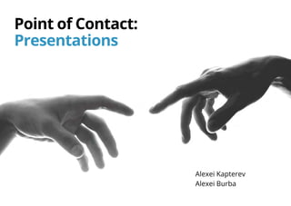
  • 3. Point of Contact: Presentations Alexei Kapterev and Alexei Burba Moscow, 2016
  • 4. You can buy this book at Amazon for $2.49
  • 5. Alexei Kapterev, Alexei Burba Point of Contact: Presentation / Alexei Kapterev, Alexei Burba ISBN 978-5-9908349-0-3 (Alexei Burba) ISBN 978-5-9908350-0-9 (Alexei Kapterev) Presentations are one of the most common and powerful communication mediums. The purpose of this book is to educate you about the structure, design and technique of successful presentations, including how to adjust your presentation for different venues and contexts. By the end of this book, you will have a variety of tools and information to help you become an engaging and persuasive speaker who can achieve the greatest results in your presentations. The book is printed in the Open Sans typeface designed by Steve Mattheson. All rights reserved. No part of this book may be reproduced for any purpose in any form or by any means whatsoever without express written permission from the copyright holders. © Alexei Kapterev, Alexei Burba, 2016 © Design SP A. Burba, 2016
  • 7. Table of contents Chapter 1 — p. 9 What is a Presentation? Chapter 4 — p. 29 Slides Chapter 2 — p. 18 Why Do We Need Presentations? Chapter 5 — p. 44 Stage Presence Chapter 3 — p. 22 Creating the Script Chapter 6 — p. 53 Strategic Positioning
  • 8. Introduction In 2009, BSSL, a Russian startup was entering the market with a new, unique tool for personnel evaluation and organizational diagnostics. Within a year of its launch, the company still did not have a single order. The market did not understand why the new tool was needed or how it could be used. After a thorough analysis, the main investor, Andrey Skvortsov, and the founder of the company, Andrey Larionov, decided that it’s time to do some marketing. They started giving “sort of lectures” for “sort of students” at universities. Why did they call them “sort of lectures”? Because there was an element of marketing in the lectures. While the overt content of the lectures had to do with the theory of personnel evaluation and organizational diagnostics, the lectures also provided exten- sive detail on the new psychometrical products that the company had developed. Why did they call the audience “sort of students”? Because many academic institutions were pleased to provide free classroom space for the lectures during evening hours, and to encourage their students to attend. In addition to the students, Mr. Larionov and Mr. Skvortsov invited journalists and potential clients to these events. This is what a presentation looked like: Larionov — a psychologist and a mathema- tician by training — would open the lecture by talking about the theory of social network analysis. Then Skvortsov, the CEO of a medi- um-sized company would take the stage to explain how the theory might play out in real- world business contexts. Real-world scenarios might include: how to predict the consequences of the dismissal of a top manager; how to sepa- rate out ineffective employees from workaholics; and how to reveal hidden conflicts in the team. This combination of theory and practical applica- tion turned out to be quite exciting. A journalist from The Trade Secret — a monthly business publication with a circulation of 65,000 copies — attended one of the lectures. Inspired by what she heard, the journalist wrote a substantial article about BSSL methods. As the founders put it, “That’s when we really went on a roll”. Today, Russian giants such as Sberbank, Gazpromneft, VTB24, and dozens of other compa- nies are among BSSL’s clients. This was achieved without anyadvertising, any PR — or even flyers in the subway. Even though we are talking about Russia, no kickbacks were involved. Everything was done almost for free and almost exclusively through presentations — that “sort of lectures” thing.
  • 10. Another synonym of the word “presentation” is “proposal” or “offer”. The purpose of a presen- tation is to offer the audience a certain product, strategy, or vision in order to convince the audi- ence to “buy” the proposed solution. Thus, a presentation is directly related to sales and marketing. We didn’t put the word “buy” here in quotation marks by accident. In the context of a presen- tation, to “buy” does not necessarily mean, “to buy for money”. A presentation often seeks to encourage buy-in to (adoption or acceptance of) an idea or a course of action. In many cases, buy-in may be more valuable in the long term than a single purchase. For example, if a jour- nalist attends a presentation on the new BMW car, a favorable magazine article on the new model may result. The article would indi- cate that the journalist bought in to the subject of the presen- tation (i.e. this is a great car and people should buy it). A presentation  is a form of communication between you and a group of people. It is usually conducted with the use of visual aids: slides, prints, flipcharts, or sample goods. The word “presentation” could be treated as a synonym to the word “introduction”. For example, “BMW introduced a new model at an auto show”. You can rephrase it as “BMW held a presentation of a new model”. It is important to understand right from the start what the subject of the presenta- tion is. What are we presenting? In the above example, the subject is a new model of a car. What is it in YOUR case? A common problem with presentations is that the presenter cannot artic- ulate the subject of the presentation in a concise and clear way. For example, if a speaker is giving a presentation on the status of a project, he or she should be able to define the project status — the topic of the presentation — in just a few words. Is the project going ok? If he or she is not able to boil down the subject of the presen- tation to that level of specificity and conciseness, then we are likely to be subjected to a long conver- sation about nothing. Let’s start with a definition 9What is a  Presentation?
  • 11. Types of Presentations Presentations can be divided into those with and without a speaker, and organized into four general types: Narrow audience Wide audience With a speaker Without a speaker Conference room Conference E-mail Web-site 10What is a  Presentation?
  • 12. Presentations for the Conference Room Conference room presentations usually take place at the (potential) client’s office or corporate campus. It is customary to accompany your verbal presentation with visual aids such as PowerPoint® slides projected on a screen or printed handouts. Usually there is a Question & Answer session, or discussion, included after your speech, often followed by an attempt to close the sale or other- wise move the execution of the project forward. Reasons for holding a conference room presentation A conference room presentation may serve as the first contact with a new or potential client. It may provide a roadmap at the begin- ning of a project, or provide a status report for an ongoing project. It may be the format in which you deliver a project design to a customer. Typical errors • Monologue: A common mistake in this kind of presentation is to talk at the audience for too long, making the presentation into a monologue. It is better to arrange for more information to be communicated in the Q & A period, which makes for a more interactive presentation. • Overuse of Supporting Materials: Visual aids should support your presentation. Too many will overload the viewers and undermine inter- action among presenter and viewer. • Lack of a Clear & Concise Message. If your presentation lacks a clear overall message then it will be unsuccessful in convincing your audience. Make sure that you are able to articulate the message of your presentation in a thesis statement of just a few words. 11What is a  Presentation?
  • 13. Presentations at a Conference A presentation at a conference usually addresses a large and diverse group of people. Generally, there is much less dialogue between the presenter and the audience, and a very brief (if any) Q & A session, as compared to a conference room presentation. It may be a speech at a conference where the majority of people do not know you; it may be a room assembled specifically for you. All the famous presentations by Steve Jobs were held in this format. Reasons for holding a presentation at a conference To introduce a new product or share unique knowledge. Typical errors • Poorly formatted visual aids: some presenters put so much information on a single slide, that audience members sitting in the second row are already unable to read the text. Make sure that all visual aids are legible throughout the conference room. • Imbalance between the theory and marketing aspects of the presentation: if there is too much theory or audience education, then the marketing goals are undermined. If on the other hand, the presenter shares too little valuable information (perhaps out of fear that the data will be “stolen” by competitors), then the audience may feel short-changed or disrespected, and be less likely to buy the product. 12What is a  Presentation?
  • 14. Presentations by E-mail In some cases, the presence of a speaker is not necessary. You may be able to deliver your message by sending a series of images accom- panied with some text — a task that comic books accomplish with great effect. Reasons to use an email presentation An email presentation may serve as a follow-up after a first call or meeting with a potential client, or you may send an email presentation on a new product or service to your existing client base. Typical errors The presentation doesn’t look like comic book at all. It looks like an unholy marriage of Excel spreadsheet and Word document. It is both badly designed and badly written, dull, boring and mean- ingless. 13What is a  Presentation?
  • 15. Website presentations are similar to the email presentations discussed above — there is no live presenter here as well. The difference is that website presentations are available to a much wider audience. A presentation may be hosted on the company’s website, or embedded from a separate website whose function is to host presentations (slideshare.com or prezi.com, among others). Reasons to use a website presentation A website presentation may describe a compa- ny’s work process or present a successful case study. In general, the goal is to convince the viewer of the company’s experience and emphasize its competences. Typical errors If you are designing a presentation to be included in a website, look out for the same mistakes covered in the Email Presentations section above. Presentations on Websites 14What is a  Presentation?
  • 16. Key differences between presentations with or without a speaker Without a speaker In an email or web presentation, the slides “speak” for themselves. Therefore, you have to include 2-3 times as much text per slide as you would in a verbal presen- tation. It would be a mistake to sacrifice images, since their simplicity and vibrancy are extremely important in communicating the message. In order to keep the presentation to a reasonable length, cut out any excessive or unnecessary text from the verbal version of the presentation. With a speaker The speaker’s words and presence are key, with visual aids playing a supporting role. Slides should be simple, visual, and colorful. “One picture — one sentence” is a good rule. During an on-site presentation, the main protagonist is you or the company you represent. By speaking about your experience (or the company’s), you should aim to get the audience to identify with you, and to see that they may use the same solution that you would use (the company’s product or service) to solve their problem. The tower of Babel collapsed because it had too many EDITORS! The tower of Babel collapsed because it had too many editors! 15What is a  Presentation?
  • 17. Why Do We Need Presentations? CHAPTER 2
  • 18. Marketing Speaking at conferences or in conference rooms, email presentations, publications on company websites or on slideshare.com, webinars, and content marketing. Presentations are central to the process of attracting, serving and retaining clients Pre-sale Presentations These include any communication with a potential client before the negotiations and closing of a sale. They may include an introduction to products or services, a follow-up letter after the introduc- tion, or a story or case history about the product or service. Presentations as Reports These include communications with the client regarding ongoing projects: reports on project implementation, the results of a completed study or data from an ongoing one, the results of an advertising campaign, or the results of the project itself. These presentations may be the most difficult because there’s often no clear goal or key message They can be used for: 17Why Do We Need Presentations?
  • 19. We polled a few of our clients to get their views: Yuliya Ivanchina, Director of Business Development, ADLABS: Our market, the market of internet advertising, emerged very recently, and it is still growing. We see new products and services appearing all the time. We have to educate clients and serve as “evangelists” [by bringing new products and technologies to their attention]. We cannot imagine how we can do this without presenta- tions. Ivan Borovikov, Managing partner, Mindbox: We do 70% of our presentations for the purposes of marketing. The rest are pre-sale presentations and reports for the clients. If we were to stop making good presentations, I think we would fail to convert at least half of our leads to customers. Business development is, in principle, impossible without properly designed promotional materials and presentations. Vsevolod Ustinov, General Director, IT-Agency: Presentations are the basis of our marketing communications. We use them both to attract new clients and to increase market share overall. They are a crucial component of our educational efforts. Without presentations, we would have lost almost all of the potential clients who did not come to us through recommendations. These potential clients account for almost half of our clientele. 18Why Do We Need Presentations?
  • 20. The most fundamental mistake that speakers make is inadequate preparation. There are no miracles. Great presentations require signifi- cant time, energy, and emotional investment. Poor presentations are prepared hastily just to get them “off one’s back”. While sufficient preparation does not give you a 100% guarantee of success, it vastly improves one’s success rate. Improvisation might work, but it is always better to come prepared. Typically, the preparation consists of three stages: creating the script, creating the slides, and, in the case of a live presentation, a rehearsal. The Most Common Mistake 19Why Do We Need Presentations?
  • 22. Most people skip this step. They believe that the purpose of the presentation is self-evi- dent: to inform or to sell. Let’s face it (and we’d rather that you hear it from us): to inform and to sell are pretty lame goals. Setting the goal of your presentation as “to inform” is like setting yourself a goal “to wake up in the morning” when you go to bed at night. Unless you’re dying, you are sure to wake up. It is not a goal. A goal should contain a challenge, a risk of failure. It is hard to fail in informing. You show up, talk for a while about something, and leave. Is there any chance to fail here? Defining your goal as “to sell” is way too general and vague to be helpful in preparing your presentation. “To sell” is pretty much the goal of every single presentation that ever takes place anywhere. The process of selling complex prod- ucts is long and thorny. A successful presentation seeks to move the sales process along to the next stage. The presenters should be quite clear about what that next stage is, and how success will be measured. As a rule, a successful sales process depends on certain changes in your clients’ thinking and understanding. For example, you want them to come to agree with the idea that your product or service can solve a problem that their company is experiencing. If you are not trying to change their thinking, then perhaps you do not need to give a presentation. Define Your Goal 21Crafting the Script
  • 23. Ask yourself specific questions about the purpose of your presentation. For example, “What changes in the beliefs of my audience do I want to inspire through this presenta- tion?” or “What do I want people to start or stop doing as a result of this presentation?” The answer is probably a good goal for your presentation. A good goal Nadezhda Shilova, director of ADLABS agency: In fact, we do not have any salespeople in the conventional sense. We have salespeople who are experts in our field, who educate clients. When an expert makes a presentation, the client feels more confident, he feels he is being heard and is being offered something that will help him achieve the desired results. It is precisely after such a sale that the client works with us for years. If we simply “sell” him something, he will keep working with us until the first mismatch between results and (often unfounded) expectations. This is the problem with “professional salespeople” — they sell that which cannot be implemented afterwards. Belief: Doing: With Tesla PowerWall battery, the sun is a source of stable energy. The purpose of the presentation Elon Musk “Tesla Powerwall”. Los Angeles, April 30, 2015 T One cannot rely on solar power because the sun does not shine at night. Pre-presentation After-presentation 22Crafting the Script
  • 24. Examples of good goals from well-known presentations To persuade viewers that global climate change is real, and to suggest that everyone work to prevent its consequences. Al Gore, “An Inconvenient Truth” To persuade the audience that our educational system destroys creativity — which is currently as important as literacy — and to encourage everyone to reform schools. Ken Robinson, a speech at TED2006 To persuade the audience that a phone with a big screen and no physical keyboard is a great idea and the future of phones, and to make jour- nalists publish positive reviews about the device. Steve Jobs, the presentation of iPhone, 2007 23Crafting the Script
  • 25. A much better structure for a presenta- tion would be a story: a statement of facts and a highlight of key points presented in such a sequence as to lead the audience through a change of emotional states, just like books and movies do. Structure When you have defined a goal, it is time to prepare the structure of the presentation. Rather than attempting to write the speech word for word, choose the most important points that you want to make, and decide in what order you would like to address them. If there is no structure, you will end up rambling, with your mind wandering out loud. Many of us have seen this in real life. Some of you have prob- ably even done it yourselves. A ramble is just a long list of diverse things presented randomly, without any sequence, logic, or meaning. When you listen to a rambling presentation you have but two ques- tions: “Lord, why am I listening to this?” and “I wonder when it will end”. Please, don’t ramble. Once bitten, twice shy. After people witness such a mess, they focus on creating a Complete, Defin- itive and Orderly list of facts and figures related to the subject. The mess disappears but then another problem manifests itself — it is difficult to empa- thize with facts and figures. People get bored, and it becomes hard to retain their attention. Face- book is more fun. They came to see a performance, but instead some dude is just reading them a laundry list of things. Please don’t do this either. 1. My name is... 2. As I was driving here ... 3. You see, in Africa ... 4. My company does X 5. My dog ... 6. Thank you 7. Any questions? 1. Current market 2. Our share on the N market 3. Market share of the competitors M 4. The potential of XXX regions 5. We’re investing Z in them 6. We plan an X increase 7. Thank you 8. Questions? 1. Current market 2. A competitor appeared 3. Sales decreased 4. Revenue decreased 5. However, there are oppor- tunities in the regions 6. We are investing Z in them 7. We can forecast X growth 8. Give us some money A rambling presentation An overly factual presentation A presentation in the form of a story 24Crafting the Script
  • 26. In contrast to a set of facts, a story contains subjective emotional descriptions (bad, good, cool, fast, slow, etc.) and connectors that explain the reasons for actions and events. Facts “We are releasing the second version of an appli- cation for merchandisers where user interface has been significantly redesigned.” The story “When we released the first version of our revolu- tionary application, we thought the interface was just perfect. But then we faced something that we somehow had not thought of earlier: the users. Apparently, things that were convenient for devel- opers were not very convenient for merchandisers, who (surprise, surprise!) are the ones that mostly use the application. Thus, we had to fundamen- tally retool the user interface. Today, we bring you the second version of our application, with a completely redesigned user interface, featuring [x, y, and z improvements…] Stories are more susceptible to criticism than dry facts. It is impossible to find fault with dry facts. A fact is a fact, right? There is just one problem: most facts don’t really speak for themselves. One has to interpret them, put them into context, make them actionable. A story provides that informa- tion, answering questions like “What do we do?” and “Why that, exactly?” A story is longer than a set of facts. A story contains many seemingly unnecessary and subjective words. Take, for example, the word “screamer”, the word Steve Jobs frequently used to describe fast processors. You can just say, “The CPU frequency is 2 GHz”. It’s a fact. You can also say, alternatively, “The CPU frequency is 2 GHz. That’s a screamer!”. The first example is impossible to find fault with. It is dry and accurate. However, the second example makes it clear why I needed to know about CPU frequency in the first place and what I can do about it now (run out and buy that processor, of course!). “A screamer” is not a very accurate word. It is a subjective assessment. It is fast compared to what? While it is fast for some, it may not be really fast for others. But until you utter this Tell a Story word, the audience does not understand what you feel about the numbers and what their take should be about this figure. Many people think that subjective assessments can be waived since “brevity is the soul of wit.” But it is not always the case. The vast majority of people do not need excessive precision. Natural language is not mathematics. Be emotional. Tell a story. 25Crafting the Script
  • 27. Presentations need a protagonist — someone with whom the people in the audience can iden- tify. When Steve Jobs was presenting the first iPhone, he asked, “How are we going to commu- nicate (meaning: operate a phone without any buttons), we’re not going to carry around a mouse, right? Oh, a stylus, right? We’re going to use a stylus! No! (laughter) Who wants a stylus? You have to get them and put it away, you lose them… Ew! Nobody wants a stylus”. At that point, Steve is the protagonist of the presentation. Like millions of other users, he has suffered from the problem of inconvenient styluses that constantly get lost. In the case of a non-speaker presentation of a product or service (i.e. an email or web presentation), we recommend making your client the protagonist of the presentation. “This is Michael. He is a logistics specialist and he has a bit of a problem...” Then you can describe his problem and how he solved it with your help. In this story, you play the role of an adviser or a fairy godperson. Who is the Hero? 26Crafting the Script
  • 28. A script is the basis for a good presentation or performance. Even a decent actor will look bad in a poorly written play. It is very difficult to present a jumble of thoughts and leave your audience with the intended message. Even if you succeed in getting some message across, the audience would still be left with the impression, “Cool, but what do we do?”. This chapter gives you some ideas for structuring your presentations effectively. We cannot cover all the nuances in one chapter. If you would like to continue learning about the structure of successful presentations, we recommend that you check out the book Presentation Secrets by Alexei Kapterev. The Structure of a Presentation-Story 1. Introduction The purpose of an introduc- tion is to establish emotional and intellectual contact, make sure that everyone understands the background and the vocabulary of the subject in question. It should be short; don’t stretch it. 2. Motivation The purpose of the motiva- tion is to lay out the challenges that the presentation will address, and to articulate the goal of over- coming these challenges. On second thought, the purpose is not just “to articulate” these challenges and goals, but rather “to sell” them — to make sure that people truly feel and understand them, not only on the intellectual level, but at a gut level. This is an absolutely essential part of the presentation yet many people omit it. This part answers the question, “Why should the audi- ence listen to all this talking?”. If you don’t have an answer to this, no one listens. Remember: Goals are positive motivation Challenges are negative motivation. We need both positive and negative motivation — goals and challenges. The absence of a challenge is one of the most common errors in presentations. The fact that there are challenges makes the subject — and your presentation — interesting. Definitely articulate the challenges. Your presentation will be boring without them. 27Crafting the Script
  • 29. 3. Solution The purpose of this part is to offer concrete solu- tions to the challenge(s) that you articulated in the motivation section. The solution section of the presentation contains the description of the change, product, or service that can address the challenge(s). The adoption of this change, product or service is what you are trying to “sell” to your audience. Depending on the presen- tation, you may be trying to get them to buy a product or service, or just trying to get them to “buy into” the idea that your solution can work. Typically, the solution section is the longest part of the presentation and is divided into several sub-sections to help the audience process and remember the information more easily. 4. Conclusion The purpose of the conclusion is to make sure people leave the presentation with a clear sense of what to do next. Summarize the story that you have just presented; stress the challenges and the goals that you have already articulated. Ask the audience to do something: offer them a concrete first step that they can take. 28Crafting the Script
  • 31. People Have Had Enough of Bad Slides People are really sick of bad presentations, and this fact has even caught the attention of academic science. In 2012, the “Frontiers in Psychology” journal (a highly-respected publica- tion that is included in the top twenty psychology journals worldwide) published an article “Power- Point® Presentation Flaws and Failures”. One of the authors of the article is Stephen M. Kosslyn, a highly respected psychologist and a former Professor at Harvard and Stanford. Having interviewed a few hundred managers in the US, a team of researchers under his lead- ership identified the most frequent and the most annoying problems with presentations. Drum roll... And here are three most common and most annoying problems: 1. The main point was obscured by lots of irrelevant detail. 2. One visual aid contained more information than could be absorbed before the next slide was presented. 3. The presentation was read word-for-word from notes or from the slides themselves. As you can see, problem No 1 has to do with the structure. There are too many unnecessary details — it’s a mess. Let’s assume that we have covered this. Now, do take a note of the other two points, which both contain the word “slide”. Both of these problems have the same root: there are too many words on a single slide. Please try not to put everything you have on a single slide. This is the key mistake. The information should be sparse enough on each slide that people have no problem reading it. 30Slides
  • 32. 1. An explanation of complex concepts where people need to see the entire “big picture” on the same page. Always ask yourself whether it is really necessary to articulate the “big picture”. It is likely that, since your goal is quite specific, you may only have to tell part of the story in your presentation. 2. A report that must include large amounts of data (for example, a report from a market research firm on consumer behavior). A report is not quite a presentation; it is a slightly different genre. Its purpose is not to persuade people to make any changes in their lives but to report information. Obviously, the more information that the report contains, the better. Makes it easier to understand what all the money has been paid for. Before you prepare a presentation that is filled with text — even if you e-mail it! — please ask yourself whether it is really necessary. We have clarified the issue about how much text to include. Now let’s move on to its appearance. According to SlideShare.com, the average number of words on a slide in 2012 was 41, while in popular presentations the number was consid- erably lower only 32 words per slide. In 2013, the average number of words dropped to 29. Count the number of words on some of your slides. Is it more than that? Less? Twenty-nine words is really not a lot of words. The decrease in the number of words is a response to the general increase in the amount of informa- tion that we are bombarded with, the reduction in average attention span, the increase in multi- tasking, which makes it hard to hold someone’s complete attention, and of course, the rise of smartphones, which are always threatening to steal away our audience’s attention. It is very difficult to read small letters on a projection screen from across the conference hall. In general, keep the number of words low on each slide. We understand the urge to put a lot text but there are very few contexts in which it would be appro- priate. Here are a couple of them: How Much Information is Enough? The ability to take in the slides The number of words on a slide 31Slides
  • 33. The Purpose of Slides Why do we need slides? Most people use slides only for one purpose — as a “cheat sheet”. This is a very important function indeed, but it is not the only one possible. If you use slides only as a “cheat sheet” then you are depriving yourself of a lotof opportunities to influence your audience. We believe that slides have four main functions: to remind, to impress, to explain, and to prove. You may present the same information on a slide in many different ways, depending on the function of that slide, and the result that you are looking for. To remind A slide’s purpose may simply be to remind the speaker what to say. To impress The purpose may be to make an impression on the audience. Large colorful photos or illustrations work great for this. To explain The slide may serve to explain important points through diagrams and charts. To prove The purpose of the slide may be to present statistics that prove the speaker’s point. In some contexts photographs work as a proof too. 32Slides
  • 34. The Hierarchy of Thoughts A messy slide is a slide without a focal point. It should be immediately clear what the audience is supposed to see first on a slide. There should be one focal point that naturally draws the eye. The subject line is often the main focal point: make sure it is bright and clear. 33Slides
  • 35. Where to Look? The subject line is an obvious focal point, but you should also seek to control the way the viewer moves through the rest of the slide. For example, if your header is purple while the rest of the text back, you can have another 3-4 smaller purple highlights on the slide. Color is not the only way to draw the viewer’s eye to the focal point. This could be achieved by manipulating sizes of the objects (bigger — more important), the font (bold — more important, and italics — less importance), and the position on the page (higher — more important if the slide’s composition is aligned to the left, center of the slide is another obvious focal point if the slide is centered). Where should one look? I see it right away! 34Slides
  • 36. Order In a sense, a slide is a picture and one should observe at least basic principles of composition. Unfortunately, people rarely do this, which is why slides often appear sloppy. Sloppy Neat 35Slides
  • 37. The Rule of Thirds The easiest way to create a composition on  a slide is through observing the “rule of thirds”. Draw lines that divide the slide horizontally and vertically into three equal parts — you will get a grid. Then arrange the objects by placing them: 1. Along the guide paths. 2. At the points of intersection of the guide paths. 3. Along the guide paths but so that the key point of the object would be at the point of intersection of the guide paths. 36Slides
  • 38. Corporate Identity Templates are not sacred, but the key elements of corporate identity: colors, fonts, and logos are. Slides may appear sloppy if you do not respect these elements of corporate identity. 37Slides
  • 39. Colors Stick to your brand colors and resist the temp- tation to use any other colors. Try to use as few colors as possible even within your corporate iden- tity guidelines. Watch out for PowerPoint®, which constantly offers you elements in its own colors. Charts and graphs are especially prone to this. Fonts As a rule, corporate identity guidelines specify two typefaces. The main typeface (e.g., FF DIN) is typi- cally not supplied with your operating system. One needs to buy and install it separately. This gives your printed materials an aura of exclusivity, but it also has its dark side. Since most people don’t have this typeface an additional substitute font is specified (e.g., Arial). The secondary font is, in fact, part of a standard package and that is used when the primary font is not available. Try to use only your corporate identity font — either the primary or the substitute one. There again, watch PowerPoint® as it defaults to Calibri wher- ever possible. A logo It is important not to distort the logo, or change the proportions and colors in any way. Do not place the logo close to other elements; there should always be some free space around the logo. It is common to see the corporate logo on every single slide of a presentation. This creates a number of problems: the logo takes up space, draws unnecessary attention to itself, and has to be taken into account in the composition of every single slide. Unless there’s a specific reason to have a logo on every slide, our advice put it on the first and the last slides only. Adding a logo does not work as copyright protection; it is very easy to remove it. As a rule, corpo- rate typeface and and color palette are sufficient for the purposes of branding. Elements of Corporate Identity 38Slides
  • 40. What if There is No Corporate Identity? We recommend that you solve the problem of font choice and color palette once and for all. Hire a graphic designer and ask them to define these elements of corporate identity for you. It is very affordable. This is a one-time invest- ment and it saves all the employees who need to prepare letters, proposals, presentations, or New Year’s greeting cards a huge headache. If you don’t have your own corporate identity yet, here’s a really quick fix: use white back- ground, black text, and one of these typefaces: PT Sans or Myriad on Mac OS X 10.8 or later, or Segoe UI on Windows 7 or later. As an accent color, use the eye color of the business owner (red, right?). 39Slides
  • 41. Photos and Icons Try to use photos for the illustration of specific events, images, objects, places, and human emotions. Use icons for diagrams, charts, graphs, and as bullet points. Size Photos work better when they are of good enough quality to display without pixilation on a big screen. It is always worth investing the time to find a photo that will display properly. Integrity Please do not use cliché stock photography or photos that you do not really believe in yourself. Ask yourself: “Which of the two photos really looks like teamwork to me?” Or: “Which photo portrays a manner in which I might behave in real life?” Teamwork? Really? Now this looks more like the truth 40Slides
  • 42. Diagrams Schematic diagrams are used to simplify the view- er’s understanding of complex concepts which include multiple steps or elements. Examples of such complex concepts are technological processes, chem- ical reactions, and chains of employee engagement in the company. Diagrams look really cool, and leave speakers bursting with pride, but watch out because these slides are often the most incomprehensible and boring for audiences. In the top slide on the right, it is difficult to immedi- ately understand the payment process for health care workers because the graph is presented as a model of cooperation between the funds, a health care worker, and health authorities. But the second diagram is presented as a process, which makes it much more simple. Step-by-step introduction through animation will further simplify the perception of the diagram. In the beginning, there is a provider, then the contract and the hospital... Therefore, when you want to insert a diagram, ask yourself, “What process (change) do I want to show step-by-step?” Then try to draw this process specifically, rather than a general model. T.Golikova’s Presentation «On the Results of the Work of the Ministry of Health and Social Development of the Russian Federation in 2011 and on the Tasks for 2012.» 41Slides
  • 43. Charts (Data Visualization) Diagrams and charts should be made as simple as possible. They should display the result and not necessarily all the analysis that led to that result. Simplicity is the absence of the unnecessary. On the first charts, you can see how the head- lines are duplicated. The phrase “number per 1000 people” is duplicated, while in fact it is the common name of the Y scale. Then there’s the gray shading. The borders of the graph create the effect of “a picture inside the picture”, which increases the overload. Elements of corpo- rate identity in the form of the blocks at the top and at the bottom are of questionable importance. Will the chart lose its meaning if those elements are removed? Focus on visualizing your point, your conclusion — not the data. The initial chart shows the values during the period of 10 years of statistical coverage. Are you sure you need to include all 10 years for the relation to be clear? Perhaps just five years would be sufficient? A slide from a presentation by the company Arbat Capital “Track Record of Moderniza- tion in China: the Possibility of its Application in Russia” 42Slides
  • 44. We recommend that you restrict yourself to a limited number of simple effects and make the speed of the effects faster rather than slower. As you gain more experience creating presentations, you can add other effects to your toolbox. The acceptable speed for slide tran- sitions is 0.8-1 seconds; the animation speed within one slide should be 0.4-0.5 seconds (“fast” or “very fast” in PowerPoint). Animation Animation can be a good way to show changes and to focus the attention of the audience. Please don’t use animation in a way that suggests that you are just trying to use all available effects. Also, please make sure that the animation is fast enough so that it does not take unnecessary time. Perhaps unsurprisingly, many people express great dislike for animation. However, we believe there are situations when animation is allowable and even necessary: 1. A complex graph. Animation allows you to present a complicated slide step by step, and to direct and hold the attention of the audi- ence in the right place at each moment. At the end of such an animated scheme, the audience will see the whole image in one single slide. Without the animation, you will have to show every- thing at once, lose the attention of the audience, and then focus their attention with a laser pointer. Who needs this torture? 2. Demonstrate the change. This is how it was, this is how it is. An object moves from one place on the slide to another. Or it disappears. You can do this without animation, just using two different slides. But then you run the risk of getting a “What has changed?” question. Animation visually high- lights the change. 43Slides
  • 46. Developing Confidence The “traditional” approach to public speaking — which we think descends from the ancient Greek Sophists — considers confidence to be the key to success. “The main thing is to speak confi- dently. People mainly react to how you look and how you sound. What you say is not as important!” This is the basic law of sophism. The “7-38-55% rule” is usually brought in to support that theory. According to that rule, “only 7% of information is transmitted through words, 38% through the tone of voice, and 55% through facial expressions and gestures”. Did you hear about this? We have seen a number of different variations on this rule. The figures may vary, but the essence remains: what is important is the form, not the content. It should be noted that, in contrast to the vast majority of urban legends, this one does indeed have a scientific source. There are two articles: “Decoding of Inconsistent Communications” and “Inference of Attitudes from Nonverbal Communication in Two Channels” published by American scientist Albert Mehrabian in 1967. However, there are a few “buts”. As you can see from the title of one of the articles, the rule applies only to inconsistent communication, situ- ations where messages transferred through different means do not coincide — for example, when a person says that everything is ok, and then undermines that statement by simultaneously turning his eyes away and frowning. In such a case, people will tend to believe the nonverbal indicators (gestures and facial expressions) over actual words. Secondly, the experiments focused only rela- tionships between people. In similar studies of American psychologist Nalini Ambady, students were able to accurately predict how studying with a particular teacher over a semester would appeal to them based on just 6 seconds of viewing a video of one of his or her lectures. Incred- ibly, the videos were shown without sound; so the students were basing their predictions on visuals alone. Only six seconds without sound and the students already knew with an accu- racy of more than 70% whether they would like this teacher or not! What they do not know is what they will learn during this semester and how this course will change their lives. All of these studies are really only about subjective perceptions and emotions; their applicability to presentations that seeks to impart factual information is questionable. 45Stage Presence
  • 47. It is true that we tend to buy from people whom we like. It is true that people are not entirely rational, and that emotions are often more convincing than facts. However, there are also ethics. If I believe I am talking nonsense, and if I am only feigning confidence, what kind of a person does it make me? (Successful, yes.) Learning to fake confidence is like buying a replica Rolex watch to make your business partners take you more seriously. We often hear, “So, what’s the problem? It works”. But not everything that works is worth doing. In addition to short- term results, there are long-term consequences as well. Is it possible to live a happy life while constantly deceiving others? We don’t think so. Sometimes people would say, “No, I truly believe in what I am saying. I’m just nervous and it makes me look insecure. That is my problem”. But what a strange coincidence — these are the same people who do not understand the subject well enough, are unable to answer questions about the sources of their information, and who never rehearsed their presentations. For some reason, it does not surprise us that they look insecure. Our idea is simple: in the long-term it doesn’t pay to fake confidence. True confidence comes when you know the subject well, and have answers to most of the important questions that may come up. Confidence comes when your knowledge is based on well-established facts and not on stories told by a friend of a friend. Confidence comes when you have rehearsed your presentation many times. Sincerity 46Stage Presence
  • 48. How to cope with stage anxiety? This is one of the most common questions people ask and it is directly related to the previous ques- tion about confidence. People who want to “cope with anxiety” are also trying to “present with confi- dence”. We suggest you think of it in a different way: not as “anxious vs. confident” but as “fake vs. authentic”. To look natural is not the same as to look confi- dent. Very often, it would actually be natural to be anxious because there are some real grounds for that. If the presentation is important, you actually should be anxious. You do care, right? Go ahead and be anxious. Once you think about the anxiety that way, you aren’t going to be overly anxious, just a little bit — which is perfectly ok. The problem with anxiety is not anxiety per se, but rather irrational anxiety. If you’re not prepared, you should be anxious and the audience deserves to know the truth. This is not a problem. However, if you are well-pre- pared but still hanging on the brink of a nervous breakdown, this is a problem. Here’s the first rule of coping with anxiety: accept that anxiety is normal. It is even helpful. Anxiety makes you more emotional and thus more interesting (please don’t fake the anxiety). The problem is that many people fall into an anxiety spiral: they notice that they are anxious, and so they start being anxious about being anxious. This is silly. Have you noticed that you are anxious? Remind yourself that being anxious is perfectly normal. What if it doesn’t help? Repeat it ten more times; some people need that. The second rule of working with anxiety: try to understand the reason for your anxiety. It may actually help you to improve the content of your presentation. One of the authors, Alexei Kapterev, was coaching a top executive for the important presentation to the Board of Directors. The exec- utive was way too anxious and at certain point asked: Client: Alexei, how do you deal with anxiety? AK.: It depends. Why are you anxious? What are they, your enemies or something? Client: No, I don’t think so. AK.: Well, what then? Client: I don’t know. AK.: Ok then, could you list me all the people who will be there. Client: Well, Rodionov, Rabinovitz, Zalihvatsky ... Oh, here. I may have a problem with Zalihvatsky. AK.: What’s the problem? Client: Well, you know, he ... etc. 47Stage Presence
  • 49. If you notice that you are very anxious, ask your- self, “What would be a Big Fatal Mistake in this case?” and write down the answers. You will very quickly find out that most of the possible errors are actually quite reparable. More- over, they are not even reparable sometime in the distant future. They are reparable imme- diately, on the spot, during the presentation. It is important to know what errors could happen, and how you could address them. Before truly-super-important presentations, experienced presenters actually rehearse the mistakes. What would I do if my soft- ware crashes? What if there were no Internet? What if the projector broke down? “The Only Chance” and “A Fatal Mistake” are terrible enemies of good presentations. Try not to go to the presentation where you will have “The Only Chance”. You will most likely make a Fatal Mistake there. Always create additional chances for yourself, and try to do so in advance. Lack of confidence in your text This is a situation where the speaker himself is not sure that his story is the truth and that he A conflict between the audience and the presenter Any conflict between the presenter and the audi- ence, whether overt or covert, should be identified and “worked out” on the story level. If the audi- ence is already disposed to have a negative view of the presenter or the presentation, it might be a good idea to start with that. For example, “I know that many of you are suspi- cious about marketers because you think that marketing is about selling snow to Eskimos. In winter. That does happen. However, a some- what opposite approach to marketing is also possible. It is precisely this difference I would like to talk about today”. The fear of making a big mistake If you find yourself thinking something like, “So, this is my Big and Only Chance, I just need to make sure I don’t miss it”, then it is immediately clear why you are anxious. The fear of making a mistake generates the “fear-of-losing” mindset, and as is well-known to athletic trainers, this mindset often leads to losing. Most frequent reasons for anxiety will be able to tell it. What can one do here? The answer is too simple: rehearse and check the information sources. If it is impossible to determine the veracity of certain statements, then just admit this. You will feel better immedi- ately. “I do not know if this is true — but I heard that sharks do not get cancer because... etc.”. (This is nonsense, sharks do get cancer, please check your sources.) If you are not 100% certain about something, this is normal. Doubts are a sign of a thinking person. The full version of Descartes’ famous saying, “I think, therefore I am” actually reads as “I doubt, therefore I think, therefore I am”. Thus, it comes to “I doubt, therefore I am”. Do have doubts — this is good for you. But try to achieve at least some certainty. How much do you doubt? OK, you’re not 100% certain, but what about 70%? Are you 70% certain? Yes? Really? That is great. The same Descartes was absolutely certain that he was in doubt. This is precisely what made him famous. 48Stage Presence
  • 50. Contact with the Audience In our opinion, the main problem during presen- tations is not that the speaker talks too hesitantly, or that he is not waving his arms vigorously enough, or that he aims his laser pointer poorly. The main problem is the loss of contact. Most people treat presentation as mono- logue. The greatest risk of a monologue genre is that people do the monologue but lose the audience. No one has been listening to the speaker for half an hour already, but he keeps talking, and talking... One must always maintain contact with the audi- ence. What does “maintain contact” mean? It means that you need to continuously receive signals from the audience about their attitude to what you’re saying. People usually send you these signals. You just need to see them. They can be nodding, uh-huhing, smiling, and exhib- iting other forms of approval or disapproval. Even if this is absent, you can still see people’s facial expressions and postures. Usually the responses are mixed, but if the whole audience is sitting and looking down into their phones, then they are most likely not listening to you. If this is the case, you need to do something about it. It is very difficult to focus on receiving feedback from the audience if you do not know the content of the presentation very well. This is why it is vitally important to practice. In a well-practiced presen- tation, you will be less reliant on your notes, and have more free time to look around the audi- ence and read their feedback. If you do not have enough feedback or if you are unsure whether you are reading it correctly, ask. It would be a good idea to ask questions to the audience. “Do you agree?”. “Please raise your hands if you feel the same”. “Yes ...?” etc. It is easiest with closed questions that provide for “yes” or “no” answers. As for open questions that require detailed answers, they are a risk because you may lose control of the way your presentation unfolds, and find it devolving into chaotic discussion. Discussions are not bad, but one needs to have the skill to manage them. Don’t let a discussion develop if you feel that you don’t have the strength and authority to control it. 49Stage Presence
  • 51. to honestly admit that this question should not be addressed to you. The second filter  is whether the question would be interesting to the group. If the group would not be interested, why waste their time on something that is interesting to just the two of you? If you are not sure, ask the group. “Let me just check: who else is interested in hearing the answer?” If you don’t see any hands, tell the person, “I think this question is not very relevant to the larger group. Please come up to me during the break and we’ll talk about it then”. If the question appears to be inter- esting and important to you but the group does not appreciate it, try to “sell” it to the group and explain its importance. Answers to the Questions A presentation is often — though not always — concluded with a Question & Answer session. Questions are not usually asked during the presentation itself but saved for a Question & Answer session (Q&A) at the end. This part may make you particularly anxious because this part is largely improvisational and it is very difficult to prepare for the Q&A. But “it is very difficult” does not mean “it is impossible.” Serious press conferences are rehearsed and the rehearsals are filmed for later analysis. During the rehearsal, the speaker is bombarded with the most uncom- fortable, loaded, and aggressive questions. Afterwards, the video is analyzed and a strategy is developed in case similar questions come up during the real press conference. But the most difficult task during the Q&A is not answering the questions. Most of the time the questions are rather friendly and benign. The challenge is to keep the atten- tion of the rest of the group. The big mistake speakers make when responding to ques- tions is that they answer the person who asked the question. Instead, the answer should be directed at the entire group. It would be disrespectful towards the other 30 (or 300) people to make them wait while you answer a boring question. Instead, make the information in your answer relevant to the group as a whole. How do you do this? The first thing to under- stand is that you do not need to answer every question. Keep thinking about what the group as a whole is interested in (the group is not inter- ested in everything). This is not about how to evade the question. This is about the fact that not all the questions that you might be asked would advance the debate. Many people — it’s about time we admit it openly — ask boring ques- tions or they ask just to show off or to humiliate you. It happens. Thus, the first decision you need to make is whether you are ready to answer the ques- tion. The first filter is whether the question is interesting to you. By “interesting” we do not mean one that sparks your immediate interest but one that is in the field of your inter- ests (such as strategic interests) in general. If the question is not interesting to the speaker, the answer will be weak. It is better 50Stage Presence
  • 52. The third filter is whether you can provide a good answer to this question. “Good” means one that would be useful for the whole group. If you can, then by all means answer it. But you don’t have to know everything. If in doubt, tell them that you do not know the exact answer but if they’re interested, you can try to think out loud. Or just tell them that this is an important question but you do not know the answer and you will get back to them with it. You do not have to answer right away. If you feel that you must answer right away, then you are putting your- self in the situation of The Only Chance, and this is exactly the situation that we are trying to avoid. Please remember this as it is the most important thing. 51Stage Presence
  • 53. Do I have to answer the question? Who is inter- ested in this issue in the group? Can I provide the answer right away? Can I think out loud? This is an important question, I do not know the answer, I will get back to you Answer! Is it my topic? Sorry, this is  not my topic I will answer you during a break Can I «sell» this question to the group? 52Stage Presence
  • 55. Not Everything is Measured in Numbers Presentations are always very easy to prepare if the company has a clear strategic positioning. Please forgive the hackneyed example but here’s strategic positioning of Apple Company: “We make consumer electronics that are easy to use, with innovative technology and great design that change the world”. This is why most of Apple’s hardware presen- tations follow the same pattern: start with the problem and then: the industrial design, the hardware design, the user interface. Most of them end with the same statement: only Apple. “Only Apple has this expertise”. Is this the only way? It is not. But if you don’t focus on your strategy, the perception of the product will be different: “It is yet another mp3-player, cell phone, or laptop”. And then there’s a very reasonable question, “If this is a cell phone, why not Motorola?” They’ve been making cell phones for ages now. “If this is a laptop, why not Dell?” After all, Dell is a computer company, just like Apple. Both companies produce laptops and desktop computers. But when we talk about Apple, we talk about things like attractive design, ease of use and inno- vation, while Dell simply makes affordable computers. When you strip away your strategic posi- tioning, the product becomes just “one of many” and differentiates in technical characteristics: more gigahertz, more memory, wider screen, lower weight and price. The story of the product is reduced to numbers, which means that the winner is the one who simply provides more gigahertz for fewer dollars. On the one hand, this is the way it should be, right? On the other hand, not everything that is valued by people can be measured. In the end, people do not pay money for the giga- hertz but for the subjective user experience, for the emotions that devices bring, for the feeling that when they buy the product, they become involved in something more than just hardware manufacturing. “I don’t think there’s another company that could do this, that could bring hardware design, industrial design, and application software design… all under one roof together”. iPod Presentation, 2001 54Strategic Positioning
  • 56. Simon Sinek who teaches a course in Stra- tegic Communications at Columbia University and is the author of the book Start with Why puts it this way: “Clients do not buy WHAT you do. Clients buy WHY you do it”. “Why” is a conver- sation about strategic positioning, about the company’s mission, its values and vision. Wait, but what if we are not Apple? Here is an example of a smaller company. A Russian developer needed a presentation to be sent via e-mail to potential clients. The purpose of the presentation was to convince compa- nies in the United States to outsource their programming work to Russia. However, this is what teams from India, Indonesia and China were doing as well. It did not make any sense to play on the field called “who is cheaper, faster, and more professional”. Therefore, they started to analyze the compa- ny’s expertise. It turned out that the team did a really great job with “problem” projects that were inherited from other teams (those with missed deadlines, or where the intended features had not been fully or properly implemented). Actu- ally, this was the way one of the Account Managers introduced the company to potential clients at trade shows and conferences: “We are a Rescue team for software development projects”. Thus, their point on strategic positioning became very simple: We are the ones who save projects that other companies cannot. The presentation also went on to demonstrate “how we do it”. Do you see the difference between “We’re just a good outsourcing team” and “We are the ones who rescue projects?” It is a lot easier to create a presentation from the vantage point of strategic positioning than create a “traditional” product presentation. You also don’t have problems with motivation and delivery: strategic presentations feel right, they feel worthy of being presented. Start with “Why” 55Strategic Positioning
  • 57. Presentations are a very democratic commu- nication channel. They require relatively little investment of time and money, as compared to other marketing strategies. Almost anyone can create a presentation. Unfortunately, it does not work well to delegate presentations and expect the underlings to crank them out. Designing and giving presentations is a creative activity with a high degree of emotional involve- ment. For the presentation to really work, the preparation process has to involve top managers or the company’s owners. Compared to TV ads, presentations are long- form. Presentations require the audience to give the most expensive things they have — time taken out of their lives and their undivided attention. Those are exactly the same things that presenta- tions require of those who prepare them. The key to creating a successful presenta- tion is to define its purpose and structure. Our authors’ experience has been that low-level employees are usually incapable of tackling the big-picture questions that a presentation designer must grapple with. If the structure and purpose of the presentation are not defined, you are likely to get a beautiful, albeit senseless, presentation at best. In the worst case, the presen- tation will end up being both senseless and ugly. The relative cheapness of presentations is largely an illusion. Presentations are expen- sive. Their costs are not always measured in money but always in time and effort, both intellectual and emotional. You may ask, “Then what’s the point of investing in them?” There is only one reason — a huge return on invest- ment. Yes, you invest a lot, but the return on the investment is big enough to warrant it. For one thing, good presentations make sales and marketing sincere by giving them a human face. Clients appreciate this enormously. If you can master sincere, authentic marketing, it will be easy to stand out among your competitors. Secondly, talking about how your business works gives you a better understanding of what you are doing. It has been said that, if you want a better under- standing of something, you should try to teach it to somebody else. Finally, great presentations “charge” us with energy and motivation. Applause, people’s enthusiasm, and thoughtful questions give us exactly what we so often miss — the feeling that the world needs us. The feeling that we are doing something worthy of people’s attention gives us a reason to get up in the morning. Given all this, we believe that creating and delivering presentations is abso- lutely worth it. Conclusion
  • 58. Alexei Kapterev Alexei Burba www.kapterev.com www.alexeyburba.com
  • 59. Alexei Kapterev, Alexei Burba Point of contact: Presentation Layout designer: Igor Shtang Desktop publishing engineer: Dmitry Arkhipov Photographers: Sergey and Katerina Mazin Illustrator: Svetlana Tokarenko Retoucher: Vladimir Beroev Translated by: Ekaterina Pukhovich Copy editor: Meredith Klein