Similaire à Evaluation Question 1 – In what way does your media product use, develop or challenge forms and conventions of a real media product? (Front page)
Similaire à Evaluation Question 1 – In what way does your media product use, develop or challenge forms and conventions of a real media product? (Front page) (20)
Evaluation Question 1 – In what way does your media product use, develop or challenge forms and conventions of a real media product? (Front page)
1. Evaluation Question 1 – In what way does your media product use,
develop or challenge forms and conventions of a real media
product? (Front page)
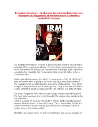
My magazine front cover features a bar code along with the issue number
and date of the magazines release. This therefore meets one of the many
main conventions of a magazine. However the front page does not contain
a website, but I decided that my contents page would be better to have
that convention.
It also has a feature cover line which in my case says 'Half full of infinity' it
tells the viewer what is going to be inside this issue and other articles in
the magazine that are also featured like on the left hand side I have other
images of things that are inside the magazine. They are in bold and in the
colour scheme to stand out to passers by, for example in a shop or store.
My music magazine 'IRM' has that has its logo it is presented throughout
the front page, contents and is mentioned in the double page spread within
the interview.
'IRM' is featured on the right hand side in a thick, bold contrasting colour
against the background of the main image. This is turn makes it clear and
easily seen from a distance to get possible buyers interested to take a
further look at the media product.
Bold titles or another name for them is mastheads are created and put on
2. magazines and such like to make the words stand out to the reader and
grab their attention. My music magazine follows this convention due to the
title 'IRM' being a bold, simple and straight to the point font. I did this to
compliment my style model, which is NME. I liked the three letter bold look.
I created a three-dimensional look on photoshop by duplicating the layer
and making it black then moving it slightly underneath to create the 3D
look.
My magazine consists of a main image that has not had the background
cut out as I thought it added needed mis en scene. It is eye catching due to
the guitar and the models clothing. It is obvious straightaway that it is a
rock/music magazine. I used my nikon D40 camera with my 50mm lens. I
used that particular lens to add depth of field onto the image as 50mm
allows you to choose where the main focus point of the photograph will be.
So I made sure the only person in total focus was 'Sophie' the front
member of the band and all the others where out of focus but still able to
be seen by the reader.
I made a strict colour scheme that is shown through all of my media
products. I used maroon, brown and blacks. I did this to add a professional
edge to the magazine.