
Recommandé
Contenu connexe
Tendances
Tendances (20)
En vedette
En vedette (10)
Similaire à Front cover analysis essay
Similaire à Front cover analysis essay (20)
Dernier
Dernier (20)
Front cover analysis essay
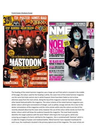
- 1. Front Cover Analysis Essay The heading of the metal hammer magazine uses a large san-serif font which is located in the middle of the page, the colour used for the heading is white, the cover lines of the metal hammer magazine use the same font style and are also in white however these have been faded as not to draw attention away from the main article. Along the top of the magazine a banner has been advertise other bands featured within the magazine. The colour scheme of the metal hammer magazine uses darker colours which give connotations of danger, such as yellow, orange and red, this is due to the darker connotations of the magazines and the niche articles within also the colours are that of the recently released album by the cover artist, however the use of the colour white stands out from the darker colours which will draw the audience towards the magazine. The mast head instantly identifies the target audience with the word ‘Metal’ referring to the music genre, whilst also conjuring up imagery of a hard, cold feel to the magazine , this is combined with ‘Hammer’ which is in adds the imagery of power and medieval battles. Metal hammer have repeated mastheads for each issue, the masthead is located in the primary optical area of the magazine. The cover artists are
- 2. within the primary optical area and the strong fallow area. Due to the magazine being well established the masthead of the metal hammer magazine is slightly covered by the cover artists, the band are show wearing black and follow the stereotypical heavy metal look (the front man is shown with a ginger beard this could be a link to the orange colouring, this may have been used to create a comedic effect). Several smaller images have also been used to show another article within the magazine and to show the free gifts within the magazine, such as a CD and posters, this has been combined with a badge which informs the reader of the free gifts. The target audience of the metal hammer magazine would be people who enjoy the more niche genre of Heavy metal and it’s sub- genres, the target age group would be from the age of 16 to a more older audience. The NME magazine is aimed towards a more of an upbeat mainstream audience and uses colours which reflect the happier attitudes such as pink and yellow, the font used in the NME is also san-serif which goes with the music, the target audience of the NME magazine would be people who prefer the more mainstream music such as pop/indie and are in a relatively younger age range. The name NME (New Musical Express) gives insight into the genre that the magazine is known for; this means the audience looking for newer music will find it easily identifiable. The cover artist is dressed in black however has a bright blue painted face this makes him stand out from the magazines colour scheme as the cover artist is known for his eccentric style and this has been incorporated into the cover. Along with this the cover is vertically balanced with the artist crouched down beside the text. The text uses the same colour styling as the masthead, with the same font being used repeatedly; however there is a second font used to show a quote from the cover artist. The Along the top of the magazine a banner has been used to show several smaller articles within the magazine, these banners both use the reoccurring colour scheme and font of the house style. On the NME cover the caver artist is found in the strong fallow area. The NME masthead has used the colour white to stand out amongst the other colourful text; this is similar to that of the metal hammers cover line. Another similarity between the two magazines is the use of other images to show other artists within the magazine meaning that the cover artist may not be liked by everybody so the magazine offers alternative stories. Both of the magazines target their audience through the use of colours which are strongly related to the genres with the modern pop and indie music being bright and friendly and the darker colours of metal hammer being used to create a darker, angrier atmosphere. Another similarity between the two magazines is that they both use banners and badges to display lesser articles and small points about what’s within the magazine.