
Recommandé
Contenu connexe
Tendances
Tendances (18)
En vedette
En vedette (20)
Similaire à Front Cover Analysis
Similaire à Front Cover Analysis (20)
Plus de AmyLongworth
Plus de AmyLongworth (20)
Dernier
Dernier (13)
Front Cover Analysis
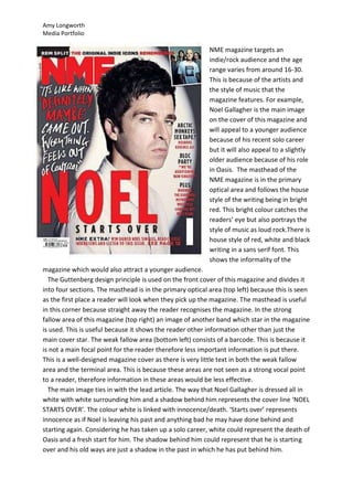
- 1. Amy Longworth Media Portfolio NME magazine targets an indie/rock audience and the age range varies from around 16-30. This is because of the artists and the style of music that the magazine features. For example, Noel Gallagher is the main image on the cover of this magazine and will appeal to a younger audience because of his recent solo career but it will also appeal to a slightly older audience because of his role in Oasis. The masthead of the NME magazine is in the primary optical area and follows the house style of the writing being in bright red. This bright colour catches the readers’ eye but also portrays the style of music as loud rock.There is house style of red, white and black writing in a sans serif font. This shows the informality of the magazine which would also attract a younger audience. The Guttenberg design principle is used on the front cover of this magazine and divides it into four sections. The masthead is in the primary optical area (top left) because this is seen as the first place a reader will look when they pick up the magazine. The masthead is useful in this corner because straight away the reader recognises the magazine. In the strong fallow area of this magazine (top right) an image of another band which star in the magazine is used. This is useful because it shows the reader other information other than just the main cover star. The weak fallow area (bottom left) consists of a barcode. This is because it is not a main focal point for the reader therefore less important information is put there. This is a well-designed magazine cover as there is very little text in both the weak fallow area and the terminal area. This is because these areas are not seen as a strong vocal point to a reader, therefore information in these areas would be less effective. The main image ties in with the lead article. The way that Noel Gallagher is dressed all in white with white surrounding him and a shadow behind him represents the cover line ‘NOEL STARTS OVER’. The colour white is linked with innocence/death. ‘Starts over’ represents innocence as if Noel is leaving his past and anything bad he may have done behind and starting again. Considering he has taken up a solo career, white could represent the death of Oasis and a fresh start for him. The shadow behind him could represent that he is starting over and his old ways are just a shadow in the past in which he has put behind him.
- 2. Amy Longworth Media Portfolio The majority of the lead article is set in the left third of the front cover, over Noel’s shadow in the background. The writing is in a large font and the colours stand out against the background as they follow the house style of red, white and black. The white writing used for the lead article is the only place where this same font is used in white on the page. This makes it stand out more and attracts the reader to reading the lead article. The short quote from Noel Gallagher that NME have used as the cover line is effective enough to interest the reader. The more important cover lines are set at the right side of the magazine cover and are wrote in a larger font than the cover lines at the very top/bottom of the page. This is because these are the articles in which the reader will be more interested in therefore they are made to stand out more. Mixmag magazine targets a slightly older audience than NME with the average age of Mixmag readers being around 24 years old. This means this magazine targets 20-30 year olds. The majority of Mixmag readers are male which is represented by the dark, simple colours on this front cover. As Mixmag is quite an expensive magazine, most of its readers only read this magazine and do not purchase others. This magazine features urban/dance music. The masthead uses the same font on each issue of the magazine so that it is recognisable by readers and gives continuity. The
- 3. Amy Longworth Media Portfolio masthead spreads right across the top of this magazine cover therefore stands out and attracts the reader to the magazine. The colour of the masthead follows the house style of this cover which is white, black and gold. These are the only three colours used on the cover and relate to the genre of music that this magazine features. The black background could represent the darkness of a nightclub where this sort of music would be played, while the white and gold could show bright lights. The Guttenberg design principle isn’t followed very well on this magazine. Both the primary optical area and the strong fallow area are taken up by the masthead alone. This is effective in a way because it is what the reader is most attracted to however they could be made better use of by leaving the strong fallow area for different information. The weak fallow area has no writing in it which is ideal however cover lines are written in the terminal area. As the reader isn’t attracted to the terminal area, it isn’t a convenient place to write a cover line. As it is the only kind of image on this cover, the main image is the insect shape outlined on the left side of the cover. This isn’t really effective and has no relevance to the title/genre of the magazine. The lead article is set in the centre of the page and the font follows the house style. The black and gold writing on the white background means it stands out against the black background of the cover. The most important words are in the largest font. This is because ‘DANCE ACT’ is interesting to the reader as it is linked to the genre of music that the magazine is based on. Having these words in a larger font make it appealing to the reader as it is a main focal point and encourages them to carry on reading. The cover lines are set to the right side of the page below the leading article. This is because they won’t appeal to the audience as much therefore are set below the more important information. Some of the cover lines are wrote in the terminal area, which isn’t as effective as it could be as this is the least attractive area of the page to the reader, meaning these cover lines will be the last thing they notice.