When the Developer Must Design

Any of these happen to you? * Tasked to develop a user interface with an incomplete design spec, so had to make guesses such as where to position on-screen elements? * Worked on a small team without a full-time designer, and requested to “just put a screen together for a demo”? * Been asked to consult with a user interface designer, but don’t know what types of questions to pose? Nowadays, everyone wants attractive, easy-to-use interfaces, so if you’re more comfortable sifting through Java or C# code than OmniGraffle or Visio mockups, learn about topics that can assist in creating more usable desktop applications, mobile apps, and websites. This talk provides easy-to-implement hints that can improve even a bad or “so-so” user interface. Areas of focus include the need for consistency; “negative space”; location, location, location (it’s crucial in screen real-estate, too!); contrasting colors; and the importance of action verbs.

Recommandé
Recommandé
Contenu connexe
Tendances
Tendances (20)
Similaire à When the Developer Must Design
Similaire à When the Developer Must Design (20)
Plus de Andrew Malek
Plus de Andrew Malek (9)
Dernier
Dernier (20)
When the Developer Must Design
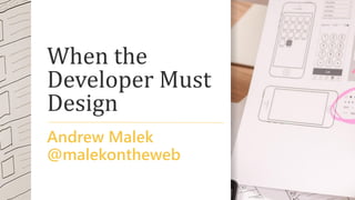
- 1. When the Developer Must Design Andrew Malek @malekontheweb
- 2. Programmers Here… AbstractSingletonProxyFactoryBean SimpleBeanFactoryAwareAspectInstanceFactory ListViewVirtualItemsSelectionRangeChangedEventHandler IDataGridColumnStyleEditingNotificationService $test =~ s/(bw+b)(?:s*1)+/$1/g; http://www.perlmonks.org/bare/?node_id=104565
- 4. Andrew Malek UI / UX Developer NCR Corporation, Retail Solutions Division @malekontheweb http://www.malektips.com/
- 5. A Vital Truth About Design “Nobody Wants To Use Your Product” - Goran Peuc, Principal UX Designer at SAP Dublin https://www.smashingmagazine.com/2016/01/nob ody-wants-use-your-product/
- 6. “[P]eople are more interested in the end result and in obtaining that result in the quickest, least intrusive and most efficient manner possible.” https://www.smashingmagazine.com/ 2016/01/nobody-wants-use-your- product/
- 7. “The Better the Design, the More Invisible It Becomes” - Jared M. Spool, usability guru https://articles.uie.com/experiencedesign/ “Good design is pretty much invisible.” - Carrie Cousins, chief writer, Design Shack http://designshack.net/articles/graphics/10- reasons-why-the-best-design-is-invisible/
- 8. Topics • Interface Consistency • Whitespace (Negative Space) and Simplicity • Dialogs and Error Messages • Propper Grammer and Speling • Icons • Perceived Performance Proper Grammar and Spelling
- 9. Consistency
- 11. “Don’t Make me Think” – also the name of a web UX book by Steve Krug
- 12. Spatial Memory
- 13. “In human-computer interfaces, knowledge of the spatial location of controls can enable a user to interact fluidly and efficiently, without needing to perform slow visual search.” - J. Scarr, A. Cockburn, C. Gutwin http://www.joey.scarr.co.nz/pdf/spatial review.pdf
- 14. “People don’t like to learn things. If they take the time to learn something, they expect to be able to apply that knowledge in many places. It follows that good designers conserve the number of things users need to learn to get stuff done.” - Scott Berkun, author and speaker http://scottberkun.com/essays/5-how-to- avoid-foolish-consistency/
- 15. UI Guidelines • iOS Human Interface Guidelines https://developer.apple.com/design/ (follow the link) • Google Material Design (used in Android) http://design.google.com/spec/ • Design applications for the Windows desktop https://dev.windows.com/en-us/desktop/design • OS X Human Interface Guidelines https://developer.apple.com/design/ (follow the link)
- 16. “When you mess with mental models, … you run a major risk of slowing down and annoying your customers, and potentially losing them all together.” -Liraz Margalit, Web Psychologist https://uxmag.com/articles/who- moved-my-virtual-cheese
- 17. “Nothing irritates a user more quickly than moving or disappearing navigational elements.” -Patrix Cox, User Researcher and Product Designer http://designshack.net/articles/graphi cs/maintaining-consistency-in-your- ui-design/
- 18. “… we inferred the location of the icon is more important than the visual imagery. People remember where things are, not what they look like.” -Jared M. Spool, usability guru https://www.uie.com/brainsparks/200 6/02/20/orbitz-cant-get-a-date/
- 19. “Keep in mind though that apps and users are different: one solution might work … well in an app and fail in yours. It’s not a one-size-fits-all thing.” -Zoltan Kollin, UX Director Ustream https://medium.com/@kollinz/misuse d-mobile-ux-patterns-84d2b6930570
- 20. Fonts
- 21. “A good principle to live by, whether you’re new to typography or a seasoned pro, is to keep it simple. Or to put it another way, don’t use too many fonts. … [M]ixing too many fonts on a page will probably result in a confused message” -Nigel French http://create.adobe.com/2013/12/1/eight_tips_ for_combining_typefaces.html
- 24. • 1 Ill ocean (Bauhaus 93) • 1 Ill ocean (Rockwell) • (Gill Sans® Monotype) -“5 Faces for UI Design” - Dan Eden http://typecast.com/blog/type-on- screen-5-faces-for-ui-design
- 25. “Type that is too small can be hard on the eyes and can even cause a headache.” -National Institute on Aging, U.S. Department of Human Services https://www.nia.nih.gov/health/public ation/making-your-printed-health- materials-senior-friendly
- 26. “Text must be the proper size for readability from desired distances, and must contrast clearly against the background.” -Paul Nini, Professor at The Ohio State University http://www.aiga.org/typography-and- the-aging-eye/
- 27. Colors
- 29. Screenshot from Microsoft Internet Explorer 5 Used with permission from Microsoft https://en.wikipedia.org/wiki/File:Internet_Explorer_5_on_Windows_98.png
- 30. TechCrunch - screenshot taken on iOS Safari
- 31. “Avoid using the same color in both interactive and noninteractive elements. Color is one of the ways that a UI element indicates its interactivity. If interactive and noninteractive elements have the same color, it’s harder for users to know where to tap.“ -iOS Human Interface Guidelines
- 34. “Flat designs must rely on color & contrast as the indicator of interaction in the interface. That’s not an easy task.” -Marcin Treder, UXPin CIO https://studio.uxpin.com/blog/5- dangers-of-flat-design/
- 37. Color Contrast • WebAIM Color Contrast Checker http://webaim.org/resources/contrastchecker/ • Check my Colours http://www.checkmycolours.com/ • Color Safe – Create accessible color palettes http://colorsafe.co/ • “Color Contrast for Better Readability” - Tom Osborne, Viget VP of Design https://viget.com/inspire/color-contrast
- 38. Simulate Colorblindness • Coblis – Color Blindness Simulator http://www.color-blindness.com/coblis-color- blindness-simulator/ • Color Blindness Simulator http://www.etre.com/tools/colourblindsimulator/ • iOS App Store: Chromatic Vision Simulator http://asada.tukusi.ne.jp/cvsimulator/e/
- 40. Whitespace
- 41. • "Out of clutter, find simplicity.“ - Albert Einstein • "The best way to find out what we really need is to get rid of what we don’t.“ - Marie Kondo, author and organizing consultant • “If your UI even vaguely resembles an airplane cockpit, you’re doing it wrong.” - John Gruber, Markdown inventor and writer http://daringfireball.net/linked/2008/12/01/fahey -bulk-rename-utility
- 44. “Poor use of white space does not impact reading performance. Higher satisfaction and preference of the better layout, should not be discounted, however, since such variables influence whether a user continues interacting with a website or simply moves on to one with better visual appeal.” http://usabilitynews.org/reading-online-text- with-a-poor-layout-is-performance-worse/
- 45. Whitespace can “break up various parts of content for easier absorption of information.” -Marc Schenker, writer http://www.webdesignerdepot.com/20 14/07/how-to-make-whitespace-work- on-the-web/
- 46. “Whitespace is essential for providing spatial relationships between visual items, and actually guides your eye from one point to another. Whitespace doesn't have to be large. Just a generous "gutter" between text and pictures can make a big difference…” - Carla Rose, photographer and writer http://www.informit.com/articles/article.aspx? p=174346&seqNum=3
- 47. “Make it easy for people to interact with content and controls by giving each interactive element ample spacing. Give tappable controls a hit target of about 44 x 44 points.” - iOS Human Interface Guidelines
- 48. “To ensure balanced information density and usability, touch targets should be at least 48 x 48 dp. In most cases, there should be 8dp or more space between them.” - Google Material Design guidelines
- 51. "Programming today is a race between software engineers striving to build bigger and better idiot-proof programs, and the Universe trying to produce bigger and better idiots. So far, the Universe is winning." -Rick Cook, author https://en.wikiquote.org/wiki/Rick_Cook
- 52. “You actually need to read the question.” – David Chisnall http://www.informit.com/articles/article.aspx?p=1146301
- 53. Suggestions from iOS Guidelines • “Avoid creating unnecessary alerts” • “Succinctly describe the situation” • “Avoid single-word titles” • “Use verbs and verb phrases”
- 54. Discussions on Alerts • iOS Human Interface Guidelines – Alert https://developer.apple.com/library/ios/docu mentation/UserExperience/Conceptual/Mobil eHIG/Alerts.html • “Should I use Yes/No or Ok/Cancel on my message box?” – UX Stack Exchange http://ux.stackexchange.com/questions/9946/
- 55. Grammar
- 56. Consistency • Title Case? Or sentence case? • End everything with punctuation – or don’t • Don’t use exclamation points unless really needed!!!! • Optional word spellings? Pick one. Login. Log in. Signup. Sign up. • You should keep the tone consistent, please.
- 57. Grammar and Microcopy • For Grammar’s Sake, Please Log In http://www.slideux.com/slideux/2014/11/14/log-in-vs-log-in • Does Bad Grammar Make Bad UX? http://www.sitepoint.com/bad-web-grammar-bad-ux/ • Five Ways to Prevent Bad Microcopy https://www.smashingmagazine.com/2013/06/five-ways-prevent- bad-microcopy/ • The Art of Writing Microcopy and Why it Matters http://www.smartinsights.com/persuasion-marketing/web- copywriting/the-art-of-writing-microcopy-and-why-it-matters/
- 58. Icons
- 59. Icons One Could Argue as “Standards” Save Search (or Zoom) Help Printout Home Screen Settings
- 60. “…I narrowed my results to the 131 people who selected the 18-25 age range.” “96% of respondents knew that the square icon with the notch cut out of the top right represented a floppy disk…” - Lis Pardi, Information Scientist http://boxesandarrows.com/icon-survey- results/
- 61. Potentially Confusing Icons Mailbox? In Every Country? http://www.curveagency.com/blog/usability-web-icons Like? Bookmark? Favorite? Learning? Intelligence? http://www.deseretnews.com/article/705370663/ Sign Out? Go Forward?
- 62. “The Microsoft Outlook toolbar is a good example: the former icon-only toolbar had poor usability and changing the icons and their positioning didn’t help much. What did help was the introduction of text labels next to the icons. It immediately fixed the usability issues and people started to use the toolbar.” http://uxmyths.com/post/715009009/myth- icons-enhance-usability
- 63. “In our study, we found that for icons with labels, users were able to correctly predict what would happen when they tapped the icon 88% of the time. For icons without labels, this number dropped to 60%. And for unlabeled icons that are unique to the app, users correctly predicted what would happen when they tapped the icon only 34% of the time.” - Hannah Alvarez, UserTesting https://www.usertesting.com/blog/2015/08/04/user- friendly-ui-icons/
- 64. “To help overcome the ambiguity that almost all icons face, a text label must be present alongside an icon to clarify its meaning in that particular context.” “Use the 5-second rule: if it takes you more than 5 seconds to think of an appropriate icon for something, it is unlikely that an icon can effectively communicate that meaning.” - Aurora Bedford, User Experience Specialist https://www.nngroup.com/articles/icon-usability/
- 65. Icon Libraries • FontAwesome https://fortawesome.github.io/Font- Awesome/ • FlatIcon http://www.flaticon.com/ • Bootstrap framework (Glyphicon Halflings) http://getbootstrap.com/
- 67. “As with so many things in life, perception is reality: if users see file copying as slower, it is slower.” -Jeff Atwood, Stack Overflow co- founder http://blog.codinghorror.com/actual- performance-perceived-performance/
- 68. 0.1 second Instantaneous feedback 1.0 second Noticeable delay 10 seconds Patience reached limit Response Times: The 3 Important Limits -Jakob Nielsen, Nielsen Norman Group https://www.nngroup.com/articles/respo nse-times-3-important-limits/
- 69. Please Wait…
- 71. Design
- 72. Design Tips • Be consistent • Whitespace is your friend • Explain dialog boxes and errors • Double-check spelling and grammar • Label icons • Perceived performance is important
- 73. Dawn Huczek on Flickr - “I think they need a few more signs!” https://creativecommons.org/licenses/by/2.0/
- 74. @malekontheweb