
Recommandé
Contenu connexe
Tendances
Tendances (20)
En vedette
Similaire à Advertisement drafts
Similaire à Advertisement drafts (20)
Plus de Anitahoxha
Plus de Anitahoxha (20)
Advertisement drafts
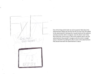
- 1. One of the things which both me and my partner liked about this advertisement design was the fact the the CD cover was also added to the advertisement. By doing this it would stand out the audience and they would be able to recognize how the album cover looks like if they ever come across it. Also if the audience was to see the advertisement they wouldn’t recognize who the artist is straight away so therefore by adding the album cover to the advertisement they would know who the advertisement is about.
- 2. This design used a medium close-up shot which is used for our CD cover so we came to a overall decision not to go on with the design as we wanted to include many different type of shot. One of the things which we liked about this cover was the type of front used. The name of the artist stand out making it clear to the audience who the advertisement is about.
- 3. This shot really grabbed out attention as it allow the audience to see the artist in full image. Also, by adding a image of the artist the audience would straight away know what the advertisement is talking about. The font was something which we wanted to add into our final advertisement .