Style Scope Mobile App Documentation
•
0 j'aime•287 vues

The document provides instructions for installing, configuring, and using the InetSoft mobile app on Android and iOS devices. It explains how to install the app from the app store or by downloading from a URL, configure the app by adding a server connection, log in, and access dashboards. It also describes how to interact with elements like charts, tables, calendars and selection lists within dashboards on the mobile app.

Recommandé
Contenu connexe
Tendances
Similaire à Style Scope Mobile App Documentation
Similaire à Style Scope Mobile App Documentation (20)
Dernier
Dernier (20)
Style Scope Mobile App Documentation
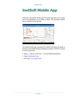
- 1. INTRODUCTION 1 of 1397 InetSoft Mobile App Welcome to the InetSoft mobile app! The mobile app allows you to easily access your dashboards on your tablet or phone. This document explains how to configure and use the app. The InetSoft mobile app is produced by InetSoft Technology, the leader in innovative and scalable Business Intelligence software. Feel free to contact us with any questions! • Phone: +1.888.216.2353 (US) / +1.732.424.0400 (International) • Email: info@inetsoft.com • Web: http://www.inetsoft.com/
- 2. STYLE SCOPE APP 2 of 1397 Using the InetSoft Mobile App The following sections explain how to use dashboards on a mobile device.
- 3. STYLE SCOPE APP 3 of 1397 Installing the InetSoft Mobile App on Android To install the InetSoft Mobile app on an Android tablet, follow the steps below: 1. Open the User Portal in a browser on your tablet. Your administrator can provide the URL. 2. Press the ‘Download InetSoft Mobile App’ link. This downloads the app to your tablet. 3. Install the app by following the appropriate method for your device. On a typical Android device, open the ‘Downloads’ page. Select the ‘InetSoft Mobile’ app and press ‘Install’.
- 4. STYLE SCOPE APP 4 of 1397
- 5. STYLE SCOPE APP 5 of 1397 Installing the InetSoft Mobile App on iOS To install the InetSoft Mobile app on an Apple device, download and install the app from the Apple App Store.
- 6. STYLE SCOPE APP 6 of 1397 Configuring the InetSoft Mobile App To configure the InetSoft Mobile app when starting the app for the first time, follow the steps below: 1. Start the InetSoft Mobile app from your main App screen. This opens the ‘Server Setting’ screen. 2. Tap the ‘Create New Server’ text field to open the ‘Server Editing’ page. 3. On the ‘Server Editing’ page, tap the ‘Name’ field to enter a name for this server connection. Tap the ‘URL’ field to enter the server URL. (Your administrator can provide you with the URL. Often this is the same URL you used in Installing the InetSoft Mobile App on Android.)
- 7. STYLE SCOPE APP 7 of 1397 4. When you have entered both name and URL, press ‘OK’ (at top left) to return to the ‘Server Setting’ page. 5. Press ‘OK’ (at top left) to access the login page. 6. Enter your login credentials and press ‘Log In’ to access the ‘Repository’ page. This page displays all available dashboards.
- 8. STYLE SCOPE APP 8 of 1397 7. Tap a desired folder to list the dashboards in that folder. 8. Tap a desired dashboard to open the dashboard.
- 9. STYLE SCOPE APP 9 of 1397 Starting the InetSoft Mobile App If you have not yet configured the app, see Configuring the InetSoft Mobile App. If you have already configured the app, follow the steps below to start the app. 1. Tap the InetSoft Mobile app on the App screen. This opens the login page. 2. Enter your login credentials and press ‘Log In’ to access the ‘Repository’ page. This page displays all available dashboards.
- 10. STYLE SCOPE APP 10 of 1397 3. Tap a desired folder to access the dashboards in that folder. 4. Tap a desired dashboard to open the dashboard.
- 11. STYLE SCOPE APP 11 of 1397 Changing Server Settings To add or modify server settings, follow the steps below: 1. Return to the main ‘Repository’ page by pressing the ‘Back’ (<) button at the top-left of the screen. (You may need to press more than once.) 2. On the ‘Repository’ page, tap the ‘Settings’ button to open the ‘Settings’ page. 3. Press the ‘Server Setting’ button to access the ‘Server Setting’ page. 4. To modify a server’s settings, tap the ‘Edit’ button next to the desired server.
- 12. STYLE SCOPE APP 12 of 1397 This opens the ‘Server Editing’ page. Proceed to edit the server ‘Name’ and ‘URL’ as described in Configuring the InetSoft Mobile App. 5. To add a new server, tap the ‘Create New Server’ button. This opens the ‘Server Editing’ page. Proceed to edit the server ‘Name’ and ‘URL’ as described in Configuring the InetSoft Mobile App. To delete a server connection, follow the steps below: 1. Press the ‘Edit’ button next to the server name on the ‘Server Setting’ page.
- 13. STYLE SCOPE APP 13 of 1397 This opens the ‘Server Editing’ page. Press the ‘Delete Server’ button on the ‘Server Editing’ page.
- 14. STYLE SCOPE APP 14 of 1397 Zooming a Dashboard Components on a dashboard may appear small if you are using the dashboard on a small device. In this case, you will often need to zoom into the part of the dashboard that you want to access. For example, the Selection Lists in the dashboard below are difficult to use because of their small size. To zoom into the desired area, use the standard spread-to-zoom gesture (the opposite of pinch-to-zoom). This will allow you to effectively make selections in the Selection List. When you have finished making selections, zoom back out using pinch-to- zoom-out.
- 15. STYLE SCOPE APP 15 of 1397 Filtering with a Selection List Selection components allow you to filter the data that is displayed in the dashboard and create custom views of the dataset. The following example illustrates how to use the Selection Lists in the sample ‘State Stats’ dashboard. 1. Open the sample ‘State Stats’ dashboard. 2. Zoom into the dashboard so that you can easily make selections in the ‘State’ Selection List. (See Zooming a Dashboard for more information about zooming.) 3. Tap to select a few states (e.g., ‘New Jersey’, ‘New York’, ‘Pennsylvania’, ‘Connecticut’) in the ‘State’ Selection List. Drag in the list to scroll the list, if necessary. 4. Zoom back out of the dashboard. Observe how the Selection List filters the data in the chart, and note that the ‘Division’ selection list now shows two items with green squares, ‘Mid-Atlantic’ and ‘New
- 16. STYLE SCOPE APP 16 of 1397 England’. The remaining divisions are listed under ‘Others’. The two green divisions are those that are compatible with the current ‘State’ selection. (The selected states are in the Mid-Atlantic and New England divisions.) 5. Filter the results further based on division. Zoom into the ‘Division’ list, and select ‘New England’. When you make this selection in the ‘Division’ selection list, the ‘State’ selection list automatically updates. Note the following features of the ‘State’ selection list: a. Connecticut is shown with a green check mark. This indicates that you explicitly selected ‘Connecticut’ and the records for Connecticut were returned in the result set. b. Three states are shown with gray check marks (New Jersey, New York, Pennsylvania). This indicates that you explicitly selected these states but their records are not included in the result set because of an incompatible choice in another selection list. In this case, you explicitly selected the ‘New England’
- 17. STYLE SCOPE APP 17 of 1397 division, so only records for New England states (i.e., Connecticut) are actually included. c. Five states are shown with empty boxes (Maine, Massachusetts, New Hampshire, Rhode Island, Vermont). This indicates that records for these states are not included, but these choices are compatible with your other selections. You can select these choices to widen your result set. d. All other states are listed under ‘Others’. This indicates that these records are not included and are not compatible with your other selections. 6. Tap to expand the ‘Others’ node in the ‘State’ selection list. Notice that all incompatible states have a gray ‘X’ icon. 7. Select ‘Delaware’. This clears the ‘New England’ selection from the ‘Division’ list. Whenever you make a selection from an ‘Others’ list, this resets any incompatible selections in other lists. In this case, the ‘Divi- sion’ list is reset to show only divisions compatible with the five currently selected states. For more information about the different icons in Selection Lists, see Selection Lists.
- 18. STYLE SCOPE APP 18 of 1397 Filtering with a Calendar The Calendar component provides a calendar interface that allows you to filter data based on a range of dates or a comparison of dates. The following example illustrates how to use the Calendar in the sample ‘Sales Breakdown’ dashboard. 1. Open the ‘Sales Breakdown’ dashboard. 2. Zoom into the dashboard so that you have easy access to the Calendar. (See Zooming a Dashboard for more information about zooming.) 3. Use the Calendar to compare sales for Feb. 2013 against sales for Feb. 2014. To do this, follow the steps below a. Press the arrow buttons next to the year labels to advance the left-side year to 2013 and the right-side year to 2014.
- 19. STYLE SCOPE APP 19 of 1397 b. Select Feb. 2013 and Feb. 2014 by tapping “2” on both sides of the calendar. Tap the ‘Apply’ button at the bottom of the screen to apply the month comparison. Observe that the chart updates to show a comparison between the selected months.
- 20. STYLE SCOPE APP 20 of 1397 4. Next, use the Calendar to restrict the data to sales between July 2013 and June 2014. To do this, follow the steps below: a. Tap on the Calendar title to enable the toolbar at the bottom. b. Tap the ‘Range’ button. c. Tap to select month “7” in year 2013 and month “6” in year 2014. d. Press ‘Apply’ in the bottom toolbar to filter the dashboard to display only data from the selected date range.
- 21. STYLE SCOPE APP 21 of 1397 5. Finally, use the Calendar to restrict the data to sales between the third week in June 2014 and the second week in July 2014. To do this, follow the steps below: a. Tap the Calendar title to enable the toolbar. b. Tap the ‘Month View’ button in the toolbar. c. Press the arrow buttons until June 2014 is displayed on the left side and July 2014 is displayed on the right side.
- 22. STYLE SCOPE APP 22 of 1397 d. Tap to select the third week in June and tap to select the second week in July. e. Tap the ‘Apply’ button to filter the dashboard to display only data from the selected date range.
- 23. STYLE SCOPE APP 23 of 1397 Interacting with Charts Charts offer several interactive features including brushing, zooming, and filtering. The following sections introduce these features. See Also Charts, for a concise list of chart features. Brushing a Chart Brushing is a powerful tool that helps you to quickly detect and understand relationships your data. Consider the following charts. Use brushing to answer the following question: “In what month did salesperson Sue Marston have peak sales?” 1. Zoom into the area of the top chart legend. 2. Double-tap the ‘Marston’ label in the legend to brush Sue Marston’s sales in both charts.
- 24. STYLE SCOPE APP 24 of 1397 It is now obvious that Marston’s greatest sales month was April of 2013, when she sold over $400,000. 3. Tap the ‘Clear Brushing’ button in the toolbar at the bottom to return to the normal view. Overall sales were high in August 2014. Use brushing to answer the following question: “Which state saw the greatest sales during this month?” 1. Tap on the second chart, and press the ‘Multi-select’ button in the bottom toolbar. 2. Drag across the data point for August 2014 to select it.
- 25. STYLE SCOPE APP 25 of 1397 3. Press the ‘Brush’ button on toolbar to highlight all the data corresponding to this month. It is clear that Texas had the majority of sales in August 2014. 4. Tap the ‘Clear Brushing’ button in the toolbar to remove the brushing. Zooming a Chart To zoom in on a particular region of a chart, follow the steps below: 1. Tap on the chart, and press the ‘Multi-select’ button in the bottom toolbar.
- 26. STYLE SCOPE APP 26 of 1397 2. Drag across the groups on the chart that you wish to zoom. 3. Tap the ‘Zoom’ button in the toolbar. 4. This zooms the chart to display only the data selected. 5. Repeat the above steps to zoom in further. 6. To return to the original chart view, tap the ‘Clear Zoom’ button in the toolbar at the bottom. The Zoom feature allows you focus in on a selected set of groups by specifying the groups to include in the zoomed view. In some cases, however, you might find it easier to create the desired view by specifying particular groups to exclude from the zoomed view. To exclude groups from a chart display, follow the steps below:
- 27. STYLE SCOPE APP 27 of 1397 1. Tap on the chart, and press the ‘Multi-select’ button in the bottom toolbar. 2. Drag to select the data on the chart that you wish to exclude from the zoomed view. 3. Tap the ‘Exclude Data’ button in the toolbar. This removes the selected data from the chart. 4. Repeat the above steps to exclude further data. 5. To return to the original chart view, tap the ‘Clear Zoom’ button in the toolbar. Sorting a Chart To sort chart groups based on a measure, tap the desired measure axis. This displays the ‘Sort’ button in the toolbar at the bottom of the screen. Tap once to sort the groups in ascending order by measure value, tap a second time to sort in descending order by measure value, and tap a third time to restore the original order.
- 28. STYLE SCOPE APP 28 of 1397 When multiple dimensions are represented on the chart (as in the image above), sorting operates on the innermost dimension. Drilling Down in Chart Data To drill-down into the data in a chart, follow the steps below: 1. Tap on the chart, and press the ‘Multi-select’ button in the bottom toolbar. 2. Tap the group into which you want to drill, or drag across a range of groups to select them.
- 29. STYLE SCOPE APP 29 of 1397 3. Press the ‘Show Details’ button in the toolbar below. This displays the detail data on a new screen. 4. Tap ‘OK’ to return to the dashboard.
- 30. STYLE SCOPE APP 30 of 1397 Interacting with Tables Tables can display a large amount of data in text format. The following sections explain some of the more common table features. Sorting a Table Note: Sorting actions for certain tables may be administratively restricted. To sort a table column or crosstab column, tap the column header and press the ‘Sort Column’ button in the toolbar below. Press the button once to sort in ascending (alphabetical) order. Press the button a second time to sort in descending (reverse-alphabetical) order. Press the button a third time to restore the original order. Modifying an Embedded Table An Embedded Table is a table that is based on an Embedded Table in the underlying Data Worksheet. Embedded tables allow you to modify data in all table cells. Data that you enter into the Embedded Table is automatically passed to the corresponding Embedded Table in the Data Worksheet. To enter data into an Embedded Table cell, simply tap the desired cell and enter the text.
- 31. STYLE SCOPE APP 31 of 1397 Data that you enter is stored with the current bookmark. Therefore, to save the data that you enter, you must save the current bookmark (or create a new bookmark). See Bookmarking a Dashboard for more information. Modifying an Editable Table An editable table is a table into which you can enter data for submission to the database (database write-back). The dashboard will usually provide a ‘Submit’ button to allow you to submit your changes. Note: Some columns may not be editable. To enter data into an editable table, follow the steps below: 1. Tap the cell of the table that you want to edit. 2. Press the ‘Edit’ button in the toolbar to enter editing mode. 3. Type the desired value into the cell.
- 32. STYLE SCOPE APP 32 of 1397 To add a new blank row into an editable table, follow the steps below: 1. Tap the cell of the table above which (or below which) you want to add a new row. 2. Press the ‘Insert Row’ button in the toolbar to add a row above the selected cell. Press the ‘Append Row’ button in the toolbar to add a row below the selected cell. 3. Repeat to add additional rows. To delete a row in an editable table, follow the steps below: 1. Tap a cell in the row that your want to delete. 2. Press the ‘Delete Row’ button in the toolbar. 3. Repeat to delete additional rows. Rows of the table that you have edited or added are highlighted as shown below.
- 33. STYLE SCOPE APP 33 of 1397 Drilling Down in Crosstab Data To drill-down into the data in a Crosstab, follow the steps below: 1. Tap on the Crosstab, and press the ‘Multi-select’ button in the bottom toolbar. 2. Tap the aggregate cell into which you want to drill, or drag across a range of cells to select them. 3. Press the ‘Show Details’ button in the toolbar below. This displays the detail data on a new screen.
- 34. STYLE SCOPE APP 34 of 1397 4. Tap ‘OK’ to return to the dashboard.
- 35. STYLE SCOPE APP 35 of 1397 Collaborating Dashboards support a number of features that make collaboration natural and easy. The following sections explain these features. Emailing a Dashboard To email a dashboard to other users, follow the steps below: 1. Open the dashboard for viewing. (See Starting the InetSoft Mobile App for instructions.) 2. Tap the ‘…’ button on the toolbar to expand it. 3. Tap the ‘Email’ button on the toolbar. This opens the ‘Email’ screen.
- 36. STYLE SCOPE APP 36 of 1397 4. On the Email tab of the ‘Email’ screen, make the following selections: a. Tap in the ‘Mail To’ field to open the ‘Mail To’ screen. In the ‘Users’ field, select the users to which the dashboard should be sent. To mail people who do not appear in the ‘Users’ list, enter a comma-separated list of emails in the ‘Others’ field. b. Tap the top ‘Email’ link to return to the ‘Email’ screen. c. Repeat the above step to enter the desired emails in the ‘CC To’ field. d. In the ‘From’ field, enter the email address that should be used to represent the sender. e. In the ‘Subject’ field, enter a message for the email subject line. f. In the ‘Message’ field, enter the body of the email message. 5. Select the Content tab, and make the following selections: a. Tap the ‘Format’ field to choose the export format: ‘Excel’, ‘PowerPoint’, or ‘PDF’.
- 37. STYLE SCOPE APP 37 of 1397 b. Turn on ‘Expand Tables and Charts’ to fully expand scrolling tables and charts in the emailed copy. c. Turn on ‘Current View’ to include the current state of the dashboard in the emailed file. d. Turn on ‘Include Link’ to include a URL link to the dashboard in the email. The email recipient can click the link to open the dashboard in a browser if they possess the appropriate permissions for that dashboard. e. Select the bookmarks that you want to include in the exported file. The selected views are converted to individual pages (PowerPoint and PDF) or sheets (Excel) in the exported copy. 6. Tap ‘OK’ to email the dashboard. Scheduling a Dashboard To schedule a dashboard for automatic generation and delivery, follow the steps below: 1. Open the dashboard for viewing. (See Starting the InetSoft Mobile App for instructions.) 2. Tap the ‘…’ button on the toolbar to expand it.
- 38. STYLE SCOPE APP 38 of 1397 3. Tap the ‘Schedule’ button on the toolbar to open the ‘Schedule’ screen. 4. Select ‘Create New Bookmark’ and provide a name for the new bookmark, or select ‘Use Current Bookmark’. (See Bookmarking a Dashboard for more information about bookmarks.)
- 39. STYLE SCOPE APP 39 of 1397 5. Tap the ‘Format’ field and select the format in which the dashboard should be delivered. 6. Turn on ‘Expand Tables and Charts’ to fully expand scrolling tables and charts in the emailed copy. 7. Tap in the ‘Emails’ field to open the ‘Mail To’ screen. In the ‘Users’ field, select the users to which the dashboard should be sent. To mail people who do not appear in the ‘Users’ list, enter a comma-separated list of emails in the ‘Others’ field. 8. Tap the ‘Period’ field and select a ‘Daily’, ‘Weekly’, or ‘Monthly’ option. Then press the top ‘Schedule’ link. 9. Tap the ‘Start Time’ field to specify the desired time. 10. Tap ‘OK’ to exit the ‘Schedule’ screen. This creates a new scheduled task that will automatically generate and email the dashboard on the schedule that you specified. The automatically generated dashboard will use the same parameter values that you entered when you originally opened the dashboard. Bookmarking a Dashboard Bookmarks do not store data, only set- tings. A bookmark allows you save your current dashboard settings (filter selections, menu choices, annotations, etc.) so that you can return to these settings at a later time. The following sections explain how to work with bookmarks. Saving a New Bookmark To save a dashboard configuration as a new bookmark, follow the steps below:
- 40. STYLE SCOPE APP 40 of 1397 1. Adjust the dashboard settings (filtering selections, menu choices, annotations, etc.) as desired to obtain the configuration that you want to save. 2. Tap the ‘…’ button in the top toolbar to expand it, and then tap the ‘Bookmark’ button. This opens the ‘Bookmark’ menu. 3. Tap the ‘Save as New Bookmark’ option. This opens the ‘Bookmark’ page. 4. Enter a name for the new bookmark in the ‘Name’ field. (The default bookmark name is the current date and time.) 5. Select ‘Private’ if you want the bookmark to be visible only to you. Select ‘Shared’ if you want other users of the dashboard to be able to use the bookmark that you have created. If you select ‘Shared’, select ‘All Users’ to share the bookmark with all dashboard users or select ‘Same Groups’ to share the book- mark only with users that belong to one or more of your current user groups. (User groups are configured by an administrator.)
- 41. STYLE SCOPE APP 41 of 1397 6. Enable the ‘Read-only’ option if you do not want other users to modify this bookmark. Otherwise, any user who shares this bookmark will be able to change the bookmark settings. 7. Tap ‘OK’ to save the bookmark. Restoring a Bookmark To restore a dashboard to the settings saved in a bookmark, follow the steps below: 1. Tap the ‘…’ button in the top toolbar to expand it, and then tap the ‘Bookmark’ button. This opens the ‘Bookmark’ menu. 2. Tap the bookmark you want to restore. The dashboard is updated with the settings saved in the bookmark. Updating a Bookmark To update a bookmark with new settings, follow the steps below: 1. Tap the ‘…’ button in the top toolbar to expand it, and then tap the ‘Bookmark’ button. This opens the ‘Bookmark’ menu.
- 42. STYLE SCOPE APP 42 of 1397 2. Tap the bookmark you want to update. This bookmark is now the active bookmark. 3. Make any desired changes to the dashboard settings (selections, input components, etc.). 4. Tap the ‘Bookmark’ button again and select ‘Save Current Bookmark’. This updates the active bookmark with the current dashboard settings. Note that you can only update a bookmark for which you have write permission. You can only update the default bookmark (the bookmark shown in italics or the ‘Home’ bookmark) if you have write permission for the dashboard. Deleting a Bookmark To delete a bookmark, follow the steps below: 1. Tap the ‘…’ button in the top toolbar to expand it, and then tap the ‘Bookmark’ button. This opens the ‘Bookmark’ menu.
- 43. STYLE SCOPE APP 43 of 1397 2. Tap the ‘–’ button next to the bookmark that you want to delete. Note that you can only delete a bookmark for which you have write permission. (The ‘Home’ bookmark cannot be deleted.) Modifying a Bookmark To change the name or sharing settings for a bookmark, follow the steps below: 1. Tap the ‘…’ button in the top toolbar, and then tap the ‘Bookmark’ button. This opens the ‘Bookmark’ menu.
- 44. STYLE SCOPE APP 44 of 1397 2. Tap the ‘i’ button next to the bookmark that you want to modify. This opens the ‘Bookmark’ page. 3. Make the desired changes to the bookmark name and sharing. See Saving a New Bookmark for more information about these settings. 4. Press ‘OK’ to update the bookmark name and sharing.
- 45. STYLE SCOPE APP 45 of 1397 Note that you can only modify a bookmark that you have created yourself. (The ‘Home’ bookmark cannot be modified.) Setting a Default Bookmark The default bookmark for a dashboard specifies the settings (filter selections, menu choices, annotations) that will be in effect each time you re-open the dashboard, i.e., the “starting state” of the dashboard. If you have not yet created the desired bookmark, see Saving a New Bookmark. To set an existing bookmark as the default bookmark, follow the steps below: 1. Tap the ‘…’ button in the top toolbar to expand it, and then tap the ‘Bookmark’ button. This opens the ‘Bookmark’ menu. The default book- mark is shown in ital- ics. 2. Tap the ‘D’ button next to the bookmark that you want to set as default. The dashboard will now open with the settings defined by this default bookmark.
- 46. STYLE SCOPE APP 46 of 1397 If you do not specify a default bookmark for a dashboard, the dashboard will open with the settings defined by the ‘Home’ bookmark. To remove the default designation from a bookmark, simply designate a different bookmark as the default. Exporting a Dashboard To export a static copy of the dashboard into Excel, PowerPoint, or PDF format, follow the steps below: 1. Tap the ‘…’ button in the top toolbar to expand it, if needed. Press the ‘Export’ button in the top toolbar to open the ‘Export’ page. 2. Tap the ‘Format’ field, and choose the export type: ‘Excel’, ‘PowerPoint’, ‘PDF’. Tap the top ‘Export’ link to return to the ‘Export’ page. 3. Enable ‘Match Layout’ to obtain the closest possible match between the appearance of the exported copy and the original dashboard. 4. Enable ‘Current View’ to include the current state of the dashboard in the exported file. 5. Tap to select the bookmarks that you wish to include in the exported file. The selected views are converted to individual pages (PowerPoint and PDF) or sheets (Excel) in the exported copy. 6. Press ‘OK’ to export the dashboard.
- 47. STYLE SCOPE APP 47 of 1397 Using Dashboard Components The following sections explain how to use individual dashboard components. Inputs You can enter values into a dashboard by using Input components. The following Input components are often use to dynamically adjust dashboard properties such as the data displayed on a chart, and can also be used to modify tables and variables in an underlying Data Worksheet. Slider: Tap and drag the handle to the desired value. Spinner: Tap and scroll the list to the desired value, or type a numerical value using the keyboard. CheckBox: Tap to select the desired item or items. RadioButton: Tap to select the desired single item. ComboBox: Tap and select the desired item from the menu. In some cases, you can also manually type values using the keyboard.
- 48. STYLE SCOPE APP 48 of 1397 TextInput: Tap and enter text into the box. Often a TextInput component is accompanied by a ‘Submit’ or ‘OK’ button to allow you to submit your text. Outputs Output components such as Gauges and Text display a single aggregate value, and do not allow input or manipulation. Selection Lists A Selection List filters the data displayed by data view components (Tables, Charts, etc.) and output components (Gauges, Thermometers, etc.). A Selection List can provide either single-selection or multiple- selection capability, and can be configured to submit selections immediately when you make the selection or on-demand when you press the ‘Apply’ button. To filter data using a Selection List, select the desired item(s) in the list. If an ‘Apply’ button is visible in the toolbar, press the ‘Apply’ button to submit your selections. If there is no ‘Apply’ button in the toolbar, each selection you make is submitted immediately. The Selection List toolbar allows you make convenient modifications to the current selection. Tap on the Selection List to see the toolbar.
- 49. STYLE SCOPE APP 49 of 1397 The following functions are available. Selection Lists make use of five different icons to designate the status of items in the list. Search Press the ‘Search’ button and enter a search term in the text field. As you type, the Selection List updates to display only items having a match for your search text (appearing anywhere in the item). Press the ‘X’ button in the text field to close the Search feature. Sort Press the ‘Sort’ button once to sort the items in ascending numerical or alphabetical order. Press the button again to sort in descending numerical or reverse alphabetical order. Press the button a third time to reset the original order. Reverse Press the ‘Reverse’ button to deselect all currently selected items and select all currently unselected items. Clear Press the ‘Clear’ button to deselect all items. Apply Press ‘Apply’ to submit the current selection. If the ‘Apply’ button is not visible, this means that your selections are submitted automatically. Data selected and included. The user has explicitly selected this item, and the corresponding records are included in the returned data set. Data selected but not included. The user has explicitly selected this item, but more recent explicit selections in other selection lists have now made this selection incompatible. The corresponding data is therefore not included in the returned data set.
- 50. STYLE SCOPE APP 50 of 1397 See Also Filtering with a Selection List, for a complete example of using Selection Lists. Selection Trees The Selection Tree is a hierarchical version of a Selection List that allows you to select items at multiple levels. See Selection Lists for operation of the toolbar and the meaning of the different selection icons. Range Sliders The Range Slider component allows you to select a date range or numerical range. To adjust the start-point or end-point of a range, drag the left or right handle. To slide the entire range, drag the slider body. To quickly set the right side of the range to its maximum, double-tap on the right handle. To quickly set the left side of the range to its minimum, Data included but not selected. The user has not explicitly selected this item, but has made other selections that implicitly select this item as well. The corresponding records are included in the returned data set (as a result of those other selections). Data compatible but not included. The user has not explicitly selected this item, and the item remains compatible with existing user selections. This item can therefore be selected to add additional records to the returned data set. Data incompatible. The user has not explicitly selected this item, and this item is incompatible with existing selections. (It appears listed under ‘Others’). Selecting this clears all other selections and starts fresh.
- 51. STYLE SCOPE APP 51 of 1397 double-tap on the left handle. To quickly set the slider to its full range, double-tap on the slider body. Calendars The Calendar component provides a calendar interface that allows you to filter data based on a range of dates or a comparison of dates. The following illustration shows some of the types of ranges that you can select by clicking on different regions in a Calendar. Note that the Calendar title bar indicates the selected range. Only available if ‘Day Selection’ is enabled by the designer. To select a column of days (e.g., all Thursdays in a month), tap the name of the desired day. To select an entire year, tap the name of the year.
- 52. STYLE SCOPE APP 52 of 1397 The Calendar component provides a toolbar that allows you make convenient modifications to the calendar. The buttons are described below. See Also Filtering with a Calendar, for a complete example of using a Calendar. Filtering a Range of Dates To filter a range of dates using the Calendar component, follow the steps below: 1. Tap the Calendar title bar to display the toolbar below. 2. If the Calendar is currently in ‘Comparison’ mode (indicated by an “=” symbol between the left and right calendar pages), press the ‘Range’ button to switch to ‘Range’ mode. 3. (Optional) To switch the Calendar from single-page to double-page display, press the ‘Range View’ button. To switch the Calendar Year View and Month View Press to alternate between year and month styles. Range View and Simple View Press to alternate between single- and double- calendar modes. In single-calendar mode, selections are applied immediately. In double-calendar mode, press the ‘Apply’ button to submit your selections. Comparison and Range Press to switch between date range selection and date comparison operations. Clear Calendar Press to remove the specified date information. Apply Press ‘Apply’ to submit the selection. If the ‘Apply’ button does not appear, this means that your selections are submitted automatically.
- 53. STYLE SCOPE APP 53 of 1397 from double-page to single-page display, press the ‘Simple View’ button. 4. (Optional) To switch the Calendar from displaying a single month to displaying the entire year, press the ‘Year View’ button. To switch the Calendar from displaying the entire year to displaying a single month, press the ‘Month View’ button. 5. Press the arrow buttons to display the appropriate calendar pages. 6. Tap a date on the Calendar to select the start date of the range. You can select a day, week, or month, depending on the how the Calendar has been configured. In a ‘Month View’ calendar, tap to select a day or week, or tap the name of the month at the top of the calendar to select the entire month. In a ‘Year View’ calendar, tap to select a month, or tap the year at the top of the calendar to select the entire year. 7. Tap another date on the Calendar to select the end date of the range. 8. If the Calendar is in double-page view, press the ‘Apply’ button in the toolbar to submit your selection. (If the Calendar is in single- page view, the selection is applied automatically.) The range that you select is used to filter all data view and output components that are based on the same Data Block as the Calendar component. See Also Filtering with a Calendar, for a complete example of using a Calendar. Comparing a Range of Dates To compare a range of dates using the Calendar component, follow the steps below: 1. Tap the Calendar title to display the toolbar below.
- 54. STYLE SCOPE APP 54 of 1397 2. If the Calendar is in single-page view, press the ‘Range View’ button to switch to double-page display. 3. If the Calendar is currently in ‘Range’ mode (indicated by an arrow symbol between the left and right calendar pages), press the ‘Comparison’ button. 4. (Optional) To switch the Calendar from displaying a single month to displaying the entire year, press the ‘Year View’ button. To switch the Calendar from displaying the entire year to displaying a single month, press the ‘Month View’ button. 5. Press the ‘Last Year’/‘Last Month’ buttons and ‘Next Year’/‘Next Month’ buttons to display the appropriate calendar pages for the comparison that you wish to make. 6. Select a date range to compare on the left page of the Calendar. You can select a day, week, or month, depending on the how the Calendar has been configured. The initial selection that you make will be mirrored on the right page of the Calendar, but you can change this in the next step. In a ‘Month View’ calendar, tap to select a day or week, or tap the name of the month at the top of the calendar to select the entire month. In a ‘Year View’ calendar, tap to select a month, or tap the name of the year at the top of the calendar to select the entire year. 7. Select a date range to compare on the right page of the Calendar. You can select a day, week, or month, depending on the how the Calendar has been configured. 8. Press the ‘Apply’ button to submit your selection.
- 55. STYLE SCOPE APP 55 of 1397 The date ranges that you select are used to generate comparisons in all Charts and Crosstabs that are based on the same data block. See Also Filtering with a Calendar, for a complete example of using a Calendar. Selection Containers A Selection Container provides convenient access to multiple selection elements. To display a selection component in a Selection Container, press the ‘Show’ button in the selection component title bar. This expands the selection component and its toolbar. (See Selection Lists, Selection Trees, and Range Sliders for information on how to use these selection components.) To collapse a selection component in a Selection Container, press the ‘Hide’ button. To clear the filters on all selection components in the Selection Container, tap the Selection Container title, and press the ‘Clear All Selections’ button on the toolbar. Charts Select one or more data groups in a Chart to view the full Chart toolbar at the bottom of the screen. To select a single group, simply tap the group. To select multiple groups, follow the steps below: 1. Tap on the chart.
- 56. STYLE SCOPE APP 56 of 1397 2. Press the ‘Multi-select’ button on the bottom toolbar. 3. Drag on the chart to select the desired groups. The following toolbar options may be available: • Maximize: Displays the chart full screen. • Show Data: Displays a tabular listing of the chart’s summarized data. • Show Details: Displays the detail records for the selected groups. See Drilling Down in Chart Data for more details. • Zoom: Zooms the chart to display only the selected groups. See Zooming a Chart for more details. • Exclude Data: Zooms the chart to exclude the selected groups (i.e., displays only the unselected groups). See Zooming a Chart for more details. • Brush: Highlights the selected data groups across all charts in which the data occurs. See Brushing a Chart for more information. See Also Interacting with Charts, for more information about how to use charts.