
Recommandé
Recommandé
Contenu connexe
Similaire à compsci
Similaire à compsci (20)
Dernier
Dernier (20)
compsci
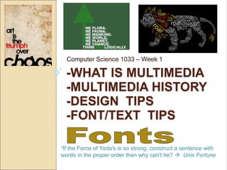
- 1. -WHAT IS MULTIMEDIA -MULTIMEDIA HISTORY -DESIGN TIPS -FONT/TEXT TIPS Computer Science 1033 – Week 1 “If the Force of Yoda's is so strong, construct a sentence with words in the proper order then why can't he? Unix Fortune
- 2. Slide 2 of 74 Overview of Today’s Topics A bit of a mishmash Overview of multimedia in general A bit of the history of multimedia A little bit about monitors and display Design tips Usage of text on a website
- 3. Slide 3 of 74 Textbook Readings Introduction ◦ All of it (it’s not very long!) Graphics ◦ What are Graphics? ◦ Basics of Graphics ◦ Design Principles and Considerations
- 4. Slide 4 of 74 Big Ideas for Today Big Idea 1: First Impressions Matter! ◦ Using senses to communicate ◦ How do we spread ideas ◦ Why use the Internet? Big Idea 2: What makes one design look better than another? ◦ CRAP Big Idea 3: Monitors and Needlepoint! Big Idea 4: Fonts ◦ Are you a font savant?
- 5. Slide 5 of 74 What is Multimedia? (term coined around 1962) Some definitions: ◦ Wikipedia “Multimedia is media and content that uses a combination of different content forms.” ◦ Merriam Webster Their definition is actually a multimedia definition http://www.merriam- webster.com/dictionary/multimedia ◦ Cambridge Dictionary “using a combination of moving and still pictures, sound, music and words, especially in computers or entertainment”
- 6. Slide 6 of 74 All the definitions encompass different ways (more than one) of expressing something. How do we express ourselves?
- 7. Slide 7 of 74 Exercise Find one or two other people in the room and take 2 minutes to introduce yourself Find out: ◦ Their favourite movie(s) ◦ Where they went to high school ◦ Farthest country from London, Ontario that one of their grandparents is from ◦ What one thing do they hope to learn in this class
- 8. Slide 8 of 74 Making an Impression How long do you think you have before someone makes a judgement about you? ◦ In her book The Four-Minute Sell, Janet Elsea says you have just 7 to 15 seconds to make a good first impression. ◦ You have about four minutes total for someone to decide if he or she wants to go beyond that first four minutes (therein lies the four-minute sell).
- 9. Slide 9 of 74 Now consider after you first arrive at a website… How long does it take you to decide if you want to stay or if you want to leave this site? QUESTION: What makes you want to leave a website rather than investing more time in it? ◦ http://vandelaydesign.com/blog/design- process/why-visitors-leave/
- 10. Slide 10 of 74 How can we communicate? Via the five senses: ◦ Sight ◦ Smell ◦ Sound ◦ Touch ◦ Taste QUESTION: Which ones can we utilize for communication on the web? Multimedia application an application that can be used to present text, sound, video, images and animation (technical definition)... http://www.simworx.co.uk/dimensions-4d5d- effects-theatres/
- 11. Slide 11 of 74 Multimedia Uses To Inform: ◦ http://www.cbc.ca/radio/ To Educate: ◦ How to parallel park To Sell and Run Businesses: ◦ http://www.chapters.ca ◦ http://www.monster.ca ◦ http://www.eharmony.ca To Entertain:
- 12. Slide 12 of 74 Why communicate via the web? QUESTION: What are the ways we can communicate or “spread a message” to other people? Can you name some ways? How did/does propaganda work? What did people used to do to spread a message? ◦ Other people ◦ Telephone ◦ Radio ◦ TV ◦ Newspaper/Magazines ◦ World Wide Web (Question: What are some of the benefits of the World Wide Web over the other methods mentioned above?) ◦ Tweeting (think Egypt or Hong Kong!) The World Wide Web is: ◦ Fast ◦ Cheap (sometimes free!) ◦ Usually Current ◦ Accessible by millions
- 13. Slide 13 of 74 The World Wide Web is the: Voice of Power! 1. Which area do you think has the most people? 1. Africa, 2. Asia 3. Europe, 4. Latin American/Caribbean 5. Middle East, 6. North America 7. Oceania/Australia 2. Which area do you think has the most Internet users? 3. Which area is the smallest, has the least users? Info from: http://www.internetworldstats.com/stats.htm
- 14. Slide 14 of 74 The Future Are you ready? https://www.youtube.com/watch?v=Y9FO yoS3Fag QUESTION: What is the difference between the World Wide Web and the Internet?
- 15. Great Moments in Multimedia History Before the 1800s 15,000 -13,000 BC Prehistoric humans paint images on the walls of their caves Grotte de Lascaux, France Also… •1041AD Bi Sheng invents movable type in China using clay letters. •1450 Johann Gutenburg introduces movable type (with steel letters), to Europe allowing mass production of books. •1702 England’s first daily newspaper starts publishing
- 16. Great Moments in Multimedia History between 1800 and 1900 1895 Louis and Auguste Lumiere make La Sortie ouviers de l’usine Lumiere, considered the first motion picture Also… •1814 Joseph Nicéphore Niépce achieves the first photographic image. •1837 Louis Daguerre invents the first practical form of photographic reproduction. •1858 Europe and North America are linked via a transatlantic telegraph cable. By 1866, news that had once taken months to travel, now took seconds •1877 Thomas Edison invents the phonograph •1877 Eadweard Muybridge invents high speed photography - creating first moving pictures that captured motion.
- 17. Great Moments in Multimedia History between 1900 and 1940 1940 Dorothy Kunhardt’s Pat The Bunny is published. First book to have multimedia and interactivity: We pat the soft fur of the bunny, play peek-a-boo, look in the mirror, and then do it all over again. Also… •1914 Animation created by tracing live action films (rotoscoping) •1926 First practical television system demonstrated •1927 The Jazz Singer is the first film to feature spoken dialogue in sync with the movie. •1928 Walt Disney debuts Steamboat Willie, first cartoon to use synchronized sound. •1939 The Wizard of Oz memorably shows the difference between the colour and black and white cinematography.
- 18. Great Moments in Multimedia History between 1940 and 1993 1991 Tim Berners Lee invents the World Wide Web. Also… •1962 Telstar, first communications satellite is launched into orbit. •1969 ARPANET (eventually the Internet) is established by the U.S. Department of Defence (more on this later) •1971 First email sent, @ picked as symbol to indicate address •1983 Internet is created when TCP/IP is adopted by all ARPANET users •1991 Tim Berners Lee has finished developing the World Wide Web(http) and html and URL. World Wide Web makes its debut •1993 Mosaic, first graphical web browser is released
- 19. Great Moments in Multimedia History between 1994 and 2001 1995 Disney releases Toy Story, first feature length computer generated movie.: 77 minutes, 4 years to make, 800,000 machine hours to render. Also… •1994The Rolling Stones become first major band to broadcast live over the internet. •1996 Affordable digital cameras become widely available •1999 Napster debuts •2001 Apple introduces iTunes and the iPod •2005 youTube.com launches •2006 First twitter message sent •2007 Search engine giant Google surpasses Microsoft as "the most valuable global brand," and also is the most visited Web site Information and dates from: http://www.webopedia.com/quick_ref/timeline.asp http://writing.atomicmartinis.com/moments.htm
- 20. Slide 20 of 74 Good Design Principles https://cheezburger.com/635909/funny- memes-images-that-prove-design-isnt- for-everybody What can we do to make our websites (or any marketing material) look a bit more professional? Remember design is all about CRAP! Most of this information and some of the examples are taken from an EXCELLENT book called: E ◦ The Non-Designer’s Design Book by Robin Williams
- 21. Both boxes above say the same thing. QUESTION: Which design do you like better: A or B? QUESTION: Can you put your finger on what makes one “Better” than the other. Good Design Is As Easy as 1-2-3 1. Learn the principles. They’re simpler than you might think 2. Recognize when you’re not using them. Put it into words – name the problem. 3. Apply the principles. You’ll be amazed. Good Design is as easy as … Learn the principles. They’re simpler than you might think Recognize when you’re not using them. Put it into words – name the problem. Apply the principles. You’ll be amazed. 1 2 3 Box A Box B
- 22. When designing a webpage think about CRAP! Element Contrast Repetition Alignment Proximity Overview Avoid making 2 elements just similar, either make them the same (same font, colour, etc…) or make them VERY different. Repeat some aspect of the design throughout the entire design i.e. Bold font, thick rule, bullet, colors, font types Items are aligned - creates stronger cohesive unit Group related items together
- 23. Slide 23 of 74 Contrast Cool Quotes •See everything, overlook a great deal, improve a little. •Between two evil, choose neither; between two good, choose both. •Give with no strings attached, and you will receive in the same manner See everything, overlook a great deal, improve a little. Between two evil, choose neither; between two good, choose both. Give with no strings attached, and you will receive in the same manner Cool Quotes
- 24. Slide 24 of 74 Contrast: Another Example General Rule: Don’t be wimpy, go bold or go home! Examples from: “The Non-Designer’s Design Book by Robin Williams
- 25. Slide 25 of 74 This: Is better than this:
- 26. Slide 26 of 74 Repetition Repetition of ◦ Bullet type ◦ Spacing ◦ Light text ◦ Heavy text ◦ Alignment ◦ Indentation Brad Pitt Movies Thelma and Louise Legends of the Fall Oceans Eleven Relationships Gwyneth Paltrow Jennifer Aniston Angelina Jolie Childhood Birthday: December 18, 1963 Born: Shawnee, Oklahoma References available upon request
- 27. Slide 27 of 74 Repetition: Another Example QUESTION: What repeated elements can you find in this webpage?
- 28. Slide 28 of 74 Alignment Fun Things for a Professor to do the First Day of Classes: Ask students to call you "Tinkerbelle" or "Surfin' Bird". Growl constantly and address students as "matey". Show a video on medieval torture implements to your calculus class. Giggle throughout it. Sneeze on students in the front row and wipe your nose on your tie. by Alan Meiss Fun Things for a Professor to do the First Day of Classes: Ask students to call you "Tinkerbelle" or "Surfin' Bird". Growl constantly and address students as "matey". Show a video on medieval torture implements to your calculus class. Giggle throughout it. Sneeze on students in the front row and wipe your nose on your tie. by Alan Meiss This is okay But this looks better!
- 29. Slide 29 of 74 Alignment: Another Example Examples from: “The Non-Designer’s Design Book by Robin Williams
- 30. Slide 30 of 74 Proximity QUESTION: What do you think when you look at the second box compared to the first box? Remember Physically grouping things together implies a relationship The Menu Eggs Benedict Pecan Crusted Trout Steak and Kidney Pie Apple Crisp Cheese Fondue Macaroni and Cheese Strawberry Cheesecake Lemon Mousse Caesar Salad Roast Chicken The Menu Eggs Benedict Pecan Crusted Trout Steak and Kidney Pie Apple Crisp Cheese Fondue Macaroni and Cheese Strawberry Cheesecake Lemon Mousse Caesar Salad Roast Chicken
- 31. Slide 31 of 74 Proximity: Another Example Examples from: “The Non-Designer’s Design Book by Robin Williams
- 32. Slide 32 of 74 Poster Finalist From 2007 QUESTION: Can you see examples of the four principles that worked well in this poster and what didn’t work well?
- 33. Slide 33 of 74 Which poster design do you think achieves the most CRAP principles? A B C D
- 34. Slide 34 of 74 Take a few minutes to think about how you would put these pieces onto a poster. 1. Hints for Success 2. Review you notes each night after class 3. Read over the lecture notes before you come to class 4. Don’t skip lectures or lab. 5. Every 2 weeks make a review sheet 6. Computer Science 1033 7.
- 35. Slide 35 of 74 Before we begin, let’s see how a monitor displays things visually! A monitor is just a rectangular area (the screen) broken down into very small pieces or dots where each piece/dot can take on a particular colour. Very similar to graph paper or cross- stitching, Obama and Owl are cross- stitched.
- 36. Slide 36 of 74 More on monitors Question: What are the dots/pieces on a monitor/screen called? We can use pixels (dots, thread) to represent ANYTHING (images, text, drawing) that we want to display visually on the screen (paper, fabric). This “E” has a size of 9 (9 pixels)
- 37. Slide 37 of 74 More on monitors QUESTION: On a 17 inch monitor, we could have 800 pixels (width) by 600 pixels (height) OR 1024 pixels by 768 pixels. Think about the size of the dots/pixels for a minute in BOTH cases. ◦ What is the terminology for the number of pixels across by the number of pixels down? ◦ Which resolution will have the bigger pixels? ◦ If we displayed this “E”, on which screen would it look bigger: the 800by600 resolution or the 1024by768 resolution? 17 inches 800 pixels 600 pixels 1024 pixels 768 pixels
- 38. Slide 38 of 74 More on monitors (and printers) A pixel is displayed using light on a monitor to create images or text. When printing text or images, we use ink to create the pixel but in printing, the pixels are called dots. Dots (in printing), are just like pixels in that: ◦ They can take on different colours ◦ They can be big, creating big images, or small, creating smaller images.
- 39. Slide 39 of 74 More on monitors and printers QUESTION: Which one will have bigger dots 72dpi or 300dpi (where dpi means dots per inch)? Think about 4 dpi vs. 16dpi. |--- 1 inch ---| |--- 1 inch ---|
- 40. QUESTION: Can any one guess the problem with bigger dots/pixels? 300 PPI 72PPI
- 41. LET’S SEE HOW TO REPRESENT TEXT Now that we have a basic understanding of ANYTHING is drawn on a monitor or on a piece of paper by a printer (just broken down into dots) ….
- 42. Slide 42 of 74 The Use of Text on a Website What do you need to know? Remember: ◦ Text can be used to serve two purposes: 1. It conveys information 2. It can be used as a graphical element of the page (i.e. it doesn’t have to be ugly or boring! ) You may have a cool font on your machine, but the person viewing your website might not have that font! Here are some “Websafe Fonts” QUESTION: What can you do if you really want to use an unusual font on your website? Choice 1 or Choice 2
- 43. Slide 43 of 74 Text can set a mood QUESTION: What type of restaurants are these?
- 44. Slide 44 of 74 Make your style of text choices based on: Your audience: ◦ QUESTION: What do you need to think about for each of the following groups? Children (what age group?) Teens Young Adults Older People The type of application: ◦ Educational? ◦ Entertainment? ◦ Business?
- 45. Slide 45 of 74 Text can set a mood You can completely change the look of your page by varying the: ◦ Text Attributes ◦ Text Placement Here is some text withdifferent attributes Here is some text with different: • Placement • Layout • Design The End United Nations Poster showing the power of text!
- 46. Slide 46 of 74 Some Examples From Print
- 47. Slide 47 of 74 Some Terminology Font Type (or Typeface or sometimes just Font) ◦ Characters that have a common design are grouped into families called Font Types ◦ QUESTION: Can you name two Font types? Arial Arial Black Chiller Times New Roman Comic Sans MS
- 48. Slide 48 of 74 Some Funky Fonts Examples from: “The Non-Designer’s Design Book by Robin Williams Try out these websites http://www.flamingtext.com/Font-Baby-Kruffy Free fonts from Google http://www.google.com/webfonts (remind me to show you how you can use all these cool fonts!)
- 49. Slide 49 of 74 Most typefaces or fonts are divided into one of two categories: Serif or Sans Serif ◦ Serif: has a fine line added to finish a letter stroke Always use serif fonts for large paragraphs of text. The human eye finds them easier to read! Examples: Times New Roman, Courier ◦ Sans Serif: no line added Best for headlines and headings Examples: Comic, Arial https://www.youtube.com/watch?v=Y50D mh3SWys (NOTE: the above video is just to get you thinking about fonts! Because Arial and Times Roman are standard on both Macs and Windows...it is FINE to use them )
- 50. Slide 50 of 74 Style ◦ Variations in the appearance that allows the writer to emphasis parts of the text. ◦ Some examples Bold Times New Roman Italics Times New Roman Underline Times New Roman Bold Comic Italics Comic Underline Comic
- 51. Slide 51 of 74 Case Why does case matter? QUESTION: What does this say? ◦ I LOVE YOU ◦ I love you ◦ CATS AND DOGS ◦ cats and dogs
- 52. Slide 52 of 74 Case ◦ In general it is much easier to read mixed case than all uppercase. Save uppercase for headlines.
- 53. Slide 53 of 74 Kerning ◦ What is wrong here? ◦ Adjusting the distance between pairs of letters ◦ In standard spacing distance between uppercase A and W seems farther than say H and N AW vs. HN We can use kerning to fix this OR to fix situations like I just showed QUESTION: Are you good at kerning? Take the test! Tracking
- 54. Examples from: “The Non-Designer’s Design Book by Robin Williams
- 55. Slide 55 of 74 Leading (pronounced Ledding) ◦ Amount of vertical space between lines of text ◦ As the length of a line increases, it is harder for the reader to jump to the next line, thus wide columns require greater leading. ◦ Tracking and leading are also related, see the next example:
- 56. Slide 56 of 74 Leading Examples Okay, that might be a bit subjective but lots of Western students, including computer science students say that one of the factors that made them decide to come to Western to study was seeing the campus. O k a y , t h a t m i g h t b e a b i t s u b j e c t i v e b u t l o t s o f W e s t e r n s t u d e n t s , i n c l u d i n g c o m p u t e r s c i e n c e s t u d e n t s s a y t h a t o n e o f t h e f a c t o r s t h a t m a d e t h e m d e c i d e t o c o m e t o W e s t e r n t o s t u d y w a s s e e i n g t h e c a m p u s . Loose Track More Leading
- 57. Slide 57 of 74 Leading Examples Okay, that might be a bit subjective but lots of Western students, including computer science students say that one of the factors that made them decide to come to Western to study was seeing the campus. O k a y , t h a t m i g h t b e a b i t s u b j e c t i v e b u t l o t s o f W e s t e r n s t u d e n t s , i n c l u d i n g c o m p u t e r s c i e n c e s t u d e n t s s a y t h a t o n e o f t h e f a c t o r s t h a t m a d e t h e m d e c i d e t o c o m e t o W e s t e r n t o s t u d y w a s s e e i n g t h e c a m p u s . Loose Track Less Leading
- 58. Slide 58 of 74 Leading Examples Okay, that might be a bit subjective but lots of Western students, including computer science students say that one of the factors that made them decide to come to Western to study was seeing the campus. Tight Track More Leading Okay,thatmightbeabitsubjectivebutlotsof Westernstudents,includingcomputerscience studentssaythatoneofthefactorsthatmadethem decidetocometoWesterntostudywasseeingthe campus.
- 59. Slide 59 of 74 Leading Examples Okay, that might be a bit subjective but lots of Western students, including computer science students say that one of the factors that made them decide to come to Western to study was seeing the campus. Tight Track Less Leading Okay,thatmightbeabitsubjectivebutlots ofWesternstudents,includingcomputer sciencestudentssaythatoneofthefactors thatmadethemdecidetocometoWestern tostudywasseeingthecampus.
- 60. Slide 60 of 74 Monospaced Fonts vs. Proportional Fonts ◦ QUESTION: Courier is Monospaced and Times New Roman is Proportional, can you see the difference? Courier Times New Roman WWWMMM IIIIII WWWMMM IIIIII
- 61. Slide 61 of 74 Review Typography
- 62. Slide 62 of 74 Font Size Font size can be measured in several different units: ◦ points, picas (as in MS Word, absolute length) ◦ pixels (relative to the screens resolution) ◦ percentage, ems (relative to the default browser font) ◦ inches, centimetres (absolute length)
- 63. Slide 63 of 74 Points (Absolute length) Points are a print unit Text that is 72 points is 1 inch tall QUESTION: then why is the word now in this image not 1 inch???
- 64. Slide 64 of 74 Points (Absolute length) Commonly text is 12 points, this is 1/6 of an inch. NOTE: A point size of 72, will always give you a font that is one inch high when printed. If you sent this MS Word Document to a printer and measured between the lines, it would be one inch. For print it doesn’t matter if you print from a Windows machine or a Mac, a 72 point font size on paper is always one inch high.
- 65. Slide 65 of 74 Pixels, ems, % (Relative length) When text is displayed in pixels, ems, %, it is relative to the default font size for the browser and to the screen resolution. 1 em is equal to the width of an M in the default font type and size of the browser ◦ E.g. Firefox Times New Roman, Fontsize 16 pixels
- 66. Slide 66 of 74 Experiment with Font Size If you are on your laptop go to: http://www.csd.uwo.ca/~lreid/cs033/FontTest1.ht ml Then try the following: ◦ Set the resolution to be the lowest: 800 pixels by 600 pixels ◦ Set the resolution to be the highest. ◦ View the page in IE and then pick View>Text Size and pick some of the different sizes. Notice the absolute fonts don’t change, the relative ones do. ◦ View the page in Mozilla Firefox, then pick Tools>Options then the Content Tab and change the Font Size.
- 67. Slide 67 of 74 Which Unit of Measurement to Use In general, don’t use points, it is for printing. If you are worried about: ◦ Accessibility use ems or % since they are relative to the browsers default font and the user can make the text more readable ◦ Control if you want the layout to be precise, use pixels.
- 68. Slide 68 of 74 Font Colour Colour ◦ If you look at the underlying html on a webpage you will see the colour for text is encoded in a strange way: http://www.csd.uwo.ca/~lreid/cs1033/fontcolours.ht ml ◦ Hexadecimal representation Hex Digits are: 0,1,2,3,4,5,6,7,8,9,A,B,C,D,E,F With TWO space holders 99 in decimal is big, 19 is small With TWO space holders FF in hex is big, 1F is small Colours must start with # Then you need 2 hex digits for Red, 2 hex digits for Green and 2 hex digits for Blue # F F 0 0 0 0
- 69. Slide 69 of 74 QUESTION ◦ How would you represent yellow? ◦ What colour do you think this is #222222? ◦ What colour do you think this is #CCCCCC? Answers: ◦ Yellow #FFFF00 ◦ Dark Gray #222222 ◦ Light Gray #CCCCCC Fun Game: http://yizzle.com/whatthehex/
- 70. Slide 70 of 74 Things to remember when using text: Is text the best choice? ◦ Use text when it is the best way to convey information Make sure it is readable ◦ Use a dark background with light text or a light background with dark text ◦ Don’t make the font too small ◦ Make sure the font is readable (be careful with weird fonts) ◦ Don’t use too many fonts (2 or 3 different styles is enough) ◦ Don’t crowd your text, have some white space ◦ Paragraphs are easier to read in serif, san serif for headings
- 71. Slide 71 of 74 More tips… Use text sparingly ◦ Remember it is sometimes hard to read on a computer screen ◦ Use bullets ◦ Break text up into sections ◦ Don’t be too wordy Be consistent ◦ Pick a colour, size, and style of font you like and stick with it on all the pages Spell check there is NO excuse for spelling mistakes!
- 72. Slide 72 of 74 More tips… Avoid offending ◦ Don’t use swear words or disrespectful language Set a mood ◦ Try to pick a font that goes with the tone of your site (for example comic font is great for kids) ◦ Make sure it coordinates/complements your images/graphics NEVER EVER EVER use underlining on a webpage WHY?
- 73. Slide 73 of 74 A Great Design Review in 50 Seconds! http://mattgreenwood.tv/ELEMENTS-OF- DESIGN
Notes de l'éditeur
- Lynda.com the single space practice Graphi Design Tips and Tricks Weekly.
- Kahoot lreid2@uwo.ca
- Resolution 800 by 600 800 by 600
- 72dpi Quality isnt as good