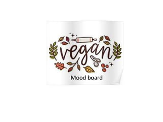
5. This is an idea of What I would like the
front cover to look like for my article.
For the colours I wanted them to be
pestle colours so represent nature
which could represent veganism.
Another reason was because I think it
looks professional and nothing it
dragging your attention away from it.
For the typography I wanted to use a
range of different text because it gives
it a unique look.
By having fruit circle around the text
your eyes directly look to what it has
to say.
I wanted to make the layout look
simple I have left a lot of white space
because I think it looks better not all
on top of each other.
For the vegetables I want to