
Recommandé
Contenu connexe
En vedette
En vedette (19)
Plus de BethTurner16
Dernier
Dernier (20)
Primary audience research
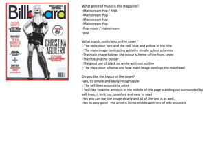
- 1. What genre of music is this magazine? -Mainstream Pop / RNB -Mainstream Pop -Mainstream Pop -Mainstream Pop -Pop music / mainstream -pop What stands out to you on the cover? - The red colour font and the red, blue and yellow in the title - The main image contrasting with the simple colour schemes -The main image follows the colour scheme of the front cover -The title and the border -The good use of black on white with red outline - The the colour scheme and how main image overlaps the masthead Do you like the layout of the cover? -yes, its simple and easily recognizable - The sell lines around the artist - Yes I like how the artists is in the middle of the page standing out surrounded by sell lines, it isn’t too squashed and easy to read -Yes you can see the image clearly and all of the text is as well. -Yes its very good , the artist is in the middle with lots of info around it
- 2. Do you like the layout? -No it looks to squashed -Looks like too much information on one page and difficult to read -There is too much detail in this for a contents page -No , to much info &details , not enough space , images and Colour -Cramped and hart to read. Do you like the fact the chart is featured? -Yes it gives the latest and the most popular songs out -Yes it is good information for the read especially if they are interested in music magazines -I suppose if you are into the charts and mainstream music. -It’s a good feature but not for the contents , it would be better suited on the next page -It should have its own page to free up some room on the contents page Do you like the colour scheme? -Plain blues and grays, suggest its dull and not very interesting -No it looks to plain -I don’t think the grey works well with the other colour, it’s too boring -There isn't enough other colours like red to make it stand out -No , its too dull -
- 3. Do you like the colour scheme? - Yes as the main figure of the magazine stands out - Yes it is very simple but in the good way, not too boring - Yes, the red, white and blue of the ‘Florence Welch’ all relate to the USA flag Yes Yes its good ( eye catching ) -yes, attractive and spacious Do you like the font used? - Yes as it looks very contemporary - Yes the bold font contrasts well with the feminine font that has been used -Yes the font is simple but adds a touch of feminine style to it. -Yes -Yes its very snazzy Do you like the layout? - Yes as it is not packed with information and there are images used -Yes the main image is interesting for the reader to look at and is a simple layout, not too squashed - Yes, the page is not cluttered and makes it interesting for the reader to look at. -The page is set out well -Good image on the left text on the right layout.