Understanding the right approach towards responsive web design
•
1 j'aime•20 vues

Responsive Web Design is the approach which allows a web design and its code to respond to the varying size of a device screen. Regardless of the device in use, the website can function in the similar manner. But a right approach towards RWD is vital. To Know More : https://www.biztechcs.com/blog

Recommandé
Recommandé
Contenu connexe
Plus de Biztech Consulting & Solutions
Plus de Biztech Consulting & Solutions (16)
Dernier
Dernier (20)
Understanding the right approach towards responsive web design
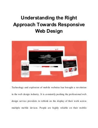
- 1. Understanding the Right Approach Towards Responsive Web Design Technology and explosion of mobile websites has brought a revolution in the web design industry. It is constantly pushing the professional web design service providers to rethink on the display of their work across multiple mobile devices. People are highly reliable on their mobile
- 2. phones and tablets to surf through websites. This paves the way for responsive web design services. What is responsive web design? A website with responsive web design (RWD) is a site that is able to adapt to any screen resolution. Regardless of the device in use, the website can function in the similar manner. The website automatically reformats to give the user a better experience. The user gets a well-deserved user experience and your site too becomes extensively useable. The days where a website had an exclusive design which would suit the desktop screen are over. In simple terms, an RWD is the approach which allows a web design and its code to respond to the varying size of a device screen. RWD exploits the fluid grids, flexible images and CSS styling. These works
- 3. together to solidify the site design in accordance of the width of the browser. This induces the responsiveness. What is the Right Approach towards Responsive Web Design? The staggering use of mobile devices in the recent time has made it the need of the hour to develop a RWD. Before choosing responsiveness in your web design, you must know the right approach towards it. Here are the few important points, which will guide you and help you in moving towards building an RWD. Navigation Needs Special Attention Your design is under certain limitations as you are also designing for smaller screens. You will have to simplify your navigational choices. You must also use icons which are in pair with text. Your design should have in-page links, collapsible menus and dropdown menus for letting
- 4. your users to go where they want to go. In addition, make sure that you give visual access to the core pages. You might have space just for four or five core links. Utilize the fruitfully. This affects not just the overall site’s navigation. But, it also affects the entire content strategy. Use the available space to allow the people go where you want to direct them. Stand Out Action Buttons The action buttons must pop out from the page both in color and style. The size and shape of the buttons have an equal importance as the buttons. The circular and rectangular buttons are the easiest buttons to recognize. Too much creativity tends to create confusion among the users. Moreover, the buttons ought to be finger friendly. Also make sure that on different devices the buttons and text links have a decent spacing in between them.
- 5. Liquid Layouts Liquid layouts can accommodate any screen size. It makes no sense to design a particular look for iPhone and another for android or one design for mobile phones and another for tablets. Keep it liquid. You will not have to design an intermediate screen size resolution for any particular operating system, browser or device. Use Limited Words Desktops allow for more text. This is not always beneficial. You need to be very careful when you also design for mobile devices. Here your website will work within the limits of smaller screen. Use least number of words to convey your message. Every word should be moving your story ahead. You may not be able to use the same write ups from the desktop site. It would need some editing.
- 6. Create Prototypes Creating prototypes and testing your content is extremely important. It allows you to know how to look and feel of your design is going to translate on different screen sizes. It allows you to know how well it functions. You should opt for a functional prototype on actual devices to ensure the website functions without any trouble. This would save you from any users complaining about a broken site. Use Responsive Images The images on your website should load quickly on every device. You should make sure that the images you use for smaller resolution not only scale virtually. But, they should also scale in terms of size. Large size images can take a longer time to load on the smaller devices. Responsive images on the other hand, offer a powerful and effective background.
- 7. Professional web design service providers can make the responsive image designing very easy.