
Recommandé
Contenu connexe
Tendances
Tendances (19)
Similaire à Magazine contents analysis
Similaire à Magazine contents analysis (20)
Plus de Browner97
Magazine contents analysis
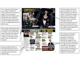
- 1. It is a convention of Kerrang to use a yellow on black text colour scheme on their contents pages. They contrast well together and immediately grasp the attention of an audience. The font has been used to stick in with the conventional feel of rick, as it is slightly distorted and looks messy. More images showing what else is featured in the magazine give the reader a taster so that they find out enough information to want to find out more. These images are small scale and just give a ‘taster’ of what else is included. A personal editors letter has been featured to give more of an insight into the issue. It has a more personal touch which audience like. The main image on the cover page is of Slash who’s name is featured clearly just under the image. This allows the reader to keep in with the issues theme and find out more about this particular artist. His clothing and style matches his personality and what rock is all about, it most likely relates to the image on the cover and will be conventional throughout the rest of the magazine. More images and potential competition prizes. All to persuade a customer to participate or continually purchase the magazine. And more lists of what is featured in the magazine as this is the main convention of any magazine contents page. The font and colour of text sub headings is inkeeping with the rest of the magazine contents theme.
- 2. House style, colour scheme and fonts. This makes the magazine feel familiar to the reader and stays on topic. The magazine title is featured to possibly promote the magazine more and to become a more recognisable logo. The date is a convention of a magazine contents page and also sometimes the issue number. The image also ties in with the music genre, it is main and central and immediately stands out. It may link to the cover and an article somewhere else in the magazine. Also their name and the relevant page number is featured to make it easier for the reader. Subheadings in bold so that the reader can pick out specific points of interest quickly and simply. Subheadings in bold so that the reader can pick out specific points of interest quickly and simply. Advertisements and deals featured to entice the reader perhaps. Also fills up space on the page. The whole layout is split into arguably three columns for order and easy navigation around the page and the rest of the magazine. The contents page explains what is inside the magazine and acts as a form of navigation around the magazine by featuring page numbers on where certain articles can be found. The whole page is very busy and there is little free space, this is very conventional of contents pages and could be due to the genre of music.