
Recommandé
Contenu connexe
Tendances
Tendances (20)
En vedette
Similaire à Visual composition slideshow - Terence Liew
Similaire à Visual composition slideshow - Terence Liew (20)
Dernier
Dernier (20)
Visual composition slideshow - Terence Liew
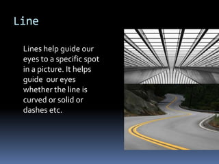
- 1. Line Lines help guide our eyes to a specific spot in a picture. It helps guide our eyes whether the line is curved or solid or dashes etc.
- 2. Shape (2D) Three basic type of shapes are natural, abstract, and geometric. Geometric: Basic shapes like circles and squares etc. Natural Shape: Natural shapes are like shapes from nature like leaves or water shapes for example a wave would be a natural shape. Abstract Shape: Different versions of natural shapes like a handicapped signs
- 3. Form (3D) Three-dimension shape that has a form and is capable of holding some type of solid, liquid, or gas.
- 4. Colour Colour has a tremendous effect on what the mood and setting is taking place in for example if you have a colorful scenery you can picture it as happy, but if you have the scenery in a dark place you can tell something is serious or a disaster is about to happen.
- 5. Texture Texture is design to characterize a photo to tell us what it looks like or what it could feel like from one point of view.
- 6. Depth (Perspective) Depth is the perspective of what we think we see from a picture. Size and vertical location: we see small in a photo is that the item is far away but when we see something close up we percept it as closer. Over Lapping: When we see something covered by something else, we see it as being further back because we cannot see the full object. Detail: This is to show us what we see from a distance and what the artist wants us to focus on with the addition of having a background Linear Perspective: Linear perspective having a certain pattern leading to a certain object that the artist wants us to focus on
- 7. Light Light is used to help us gain perception of the object from light to see how its shaped or to see the landscape and capture a certain area in a portrait
- 8. Direction (Motion) Anticipated Movement: Our eyes tell us what we think is going to happen and what we think is going to happen Fuzzy Outlines: Usually tells us something is going really fast Multiple Images: Shows us the same person but has multiple pictures to show motion Optical Movement: Forcing the eyes to move with the portrait Optical Illusions: Puts a lot of shapes together to make it look like its moving but really isn’t Rhythm and Movement: Rhythm and Movement shows the observant that if it is moving in a slow or dynamic way
- 9. Mass ( Visual Weight) Mass shows how we percept the weight of an object for example a feather is light because it dances in the wind or if it takes 20 people to lift up a car shows the car as very heavy
- 10. Tone (Black and White) Tone is used with light and dark to make something look exceptionally visual from having totally opposite components of the elements together.
- 11. Value (Colour) Value is given to see what is the centre of attention with one value of colour greater than the other like darkness and light too see what is emphasized.
- 12. Space (Positive and Negative) The space is represented by the object of a background, meaning that the area surrounding an object is not what we focus on but is the object that is covering the empty space also being called positive space for the object and negative space as the empty space.
- 13. Balance Using symmetrical, asymmet rical and radial designs to make a portrait or image to look neat and organized and spaced evenly to see how interesting it is
- 14. Emphasis Emphasis is designing a portrait or photo to show what the artists wants you to see most importantly
- 15. Proportion (Scale) Proportion is the relative size and scale of a design to show how big an image is or how small an image is like a sofa in a room with the size proportioned to your hand. The couch would have the centre of attention compared to the hand.
- 16. Repetition (Rhythm/Pattern) Repetition enhances readability, for example like page numbers at the end of the page or column widths so the article or paper is easier to read
- 17. Unity Proximity: Easiest way to see a group being together is to put them together like a family portrait Repetition: Using the same color and shape to see how they work together Continuation: Another method of repetition to make them look like they tie together
- 18. Contrast Contrast occurs when there are two elements of photos that are different and are used but in different shapes and sizes
- 19. Harmony Harmony is a visually satisfying effect of combining colours and shapes to entertain the eyes of the reader
- 20. Proximity This just shows that items that do not belong in a image are spaced apart and it shows the reader what’s really emphasized
- 21. Variety Variety means to change the character of an element to make it different because if does not have unity it is unreadable and if doesn’t have variety, it will be dull and boring