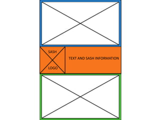
2. The top two images I have chosen
because they will be used for the top
section of my poster. This shows a
distressed and worried teenager that
homeless teens could relate to in the
same situation.
I have chosen this image for the
bottom section of my poster because
the woman looks friendly and inviting,
and is a great example of a volunteer
that would give a homeless teen a
spare room in their home.
4. I have chosen these images because…
The top one is an image of a “family” that is giving the impression of a
welcoming, friendly environment. The other images on this slide are of
young people which will be useful when making my product because I
can use them as examples of the people SASH has helped.
5. I have chosen these fonts
because…
Appleberry and LUNCH are
both quite different and less
close to something that you
would use for a body font.
LUNCH would be appropriate
for the title because it is
blocky and bold, which stands
out from the rest of the fonts
on the slide. The last three
fonts are quite basic and
simple, which is good
because I need the text to be
easy to read and understand.
6. Target Audience
• Young adults
• 16 – 24 year olds
• Volunteers
• General public (to make donations, etc.)
9. Schedule
Week 1 –
• Find all the images, fonts and information I need.
• Create my first poster.
Week 2 –
• Create my second product.
Week 3 –
• Contingency time to improve any errors or catch
up on things I have missed out.