The Different Types of Buttons and Best Practices to Achieve the Ultimate UX
•
1 j'aime•55 vues

The button, one of the most common and necessary features on a site and mobile app need to well thought out and tested to ensure the best user experience. A bad design on a button can result in a missed opportunity to convert a user. Don’t miss that opportunity and hire and UX design agency.

Recommandé
Contenu connexe
Dernier
Dernier (20)
En vedette
En vedette (20)
The Different Types of Buttons and Best Practices to Achieve the Ultimate UX
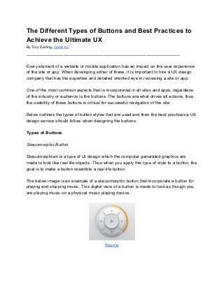
- 1. The Different Types of Buttons and Best Practices to Achieve the Ultimate UX By Tory Darling, Codal Inc ______________________________________________________ Every element of a website or mobile application has an impact on the user experience of the site or app. When developing either of these, it is important to hire a UX design company that has the expertise and detailed oriented eye in reviewing a site or app. One of the most common aspects that is incorporated in all sites and apps, regardless of the industry or audience is the buttons. The buttons are what drives all actions, thus the usability of these buttons is critical for successful navigation of the site. Below outlines the types of button styles that are used and then the best practices a UX design service should follow when designing the buttons. Types of Buttons Skeuomorphic Button Skeuomorphism is a type of UI design which the computer generated graphics are made to look like real life objects. Thus when you apply this type of style to a button, the goal is to make a button resemble a real life button. The below image is an example of a skeuomorphic button that incorporate a button for playing and skipping music. This digital view of a button is made to look as though you are playing music on a physical music playing device. Source
- 2. Flat Button The flat button is a result of the UI trend of flat design, where mobile app design companies emphasize minimum use of stylistic elements that give the illusion of three dimensions and focus on the use simple elements, typography and flat colors. The flat button removed the obvious cues of traditional buttons that were used to communicate clickability to the users. Since that is removed, the addition of visual signifiers need to be incorporated. To the right is the most common use of flat buttons, in which the colors and symbols indicate which areas are the screens are buttons. Calculator App for Apple Ghost Button Similar to the flat design buttons, a ghost button is one of a transparent and empty and just has the basic shape of a button. These buttons are outlined with a very thin line with the inclusion of simple text, emphasising the clean look. The benefits of a ghost button is that they are easy to design, creates a focal point, and improves aesthetics. Implementing the ghost button makes it easier for a mobile app design company to apply a particular layout to various types of sites or apps because of the transparent nature to the button. Source Best Practices for Buttons Although choosing a specific style of button to fit the design of site can be portrayed as a minor decision, it can have significant impact on the overall user experience of a site. Particularly, there are four areas that should be of focus when designing a button: shape, size, label and color.
- 3. Shape The shape of the button needs to resemble that of a button. In general, rectangular shaped buttons are well known and most users are educated in clickable ability to those shapes. If you decide on a different shape, there needs to be a clear indication to the user that it is a button. Size The size of a button is one that need requires critical thinking and testing, especially if there are multiple devices. In particular, a mobile app development agency needs to take in account the finger sizes of the users when developing a button. Label The label of the button needs to be short and concise while also clearing indicating what the action of the button does. As a general rule, the usage of action verbs are very effective when trying to get the user to click. Although, there are companies like InVision App that utilize witty sayings to entice the user to click. Color Finally the color of the button can do more than just exemplify the brand. A color can also be used in a way that alerts or draws the attention of the user with its bright qualities. For example, if you have a feature on the site that allows the user to report an issue, it may be beneficial to make the button red. Conclusion The button, one of the most common and necessary features on a site and mobile app need to well thought out and tested to ensure the best user experience. A bad design on a button can result in a missed opportunity to convert a user. Don’t miss that opportunity and hire and UX design agency. Looking for more insight on UX design services? Are you wanting to develop an app and you need to know the cost to develop an app is? Visit Codal’s blog, or come talk to us here! We’d love to hear from you. Codal Inc App Development & UX Design Agency www.codal.com