Inspire! Graphic design for non-designers mar 2014
•Télécharger en tant que PPT, PDF•
1 j'aime•629 vues

GRAPHIC DESIGN FOR NON-DESIGNERS Have you ever wondered what graphic designers know that makes their work look so great? Our panel shares their secrets so that you can make your own posters, brochures and other print materials. Anyone can make effective and attractive materials with the right knowledge. You'll come away with tips and advice that can noticeably improve your desktop publishing or do-it-yourself design and a get better sense of when to use the talents of a trained graphic designer. Panel: Amy Allen-Muncey, Cober Evolving Solutions Nathan Robertson, Communitech Brendan Waller, dsgn network

Recommandé
Recommandé
Contenu connexe
Tendances
Tendances (20)
En vedette
Similaire à Inspire! Graphic design for non-designers mar 2014
Similaire à Inspire! Graphic design for non-designers mar 2014 (20)
Plus de Communicate & Howe!
Plus de Communicate & Howe! (7)
Dernier
Dernier (20)
Inspire! Graphic design for non-designers mar 2014
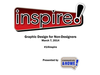
- 1. Graphic Design for Non-Designers March 7, 2014 #14inspire Presented by
- 2. Graphic Design Tips for Non-Designers Presented by Amy Allen-Muncey
- 3. How to keep your design looking 'current' What do I mean by “current”?
- 6. Grids! Why consistent spacing and grids are important • The grid is a series of invisible lines that makes up a pattern of white • Space which organizes your overall design. • It’s important to set margins, columns and grids in order to organize your content and keep spacing consistent. • Without first setting your grids, the overall design, (whether it be a poster, logo, letterhead, etc) could become messy and unbalanced. • Once you know the rules, feel free to get creative and bend them!
- 7. What is continuity? The unbroken and consistent existence or operation of something over a period of time.
- 8. How do we implement continuity? • the first stage of continuity is creating a brand and brand elements. • These elements are created with the intention that they are unchanging. • That means that whatever you do, whether it’s your business card, your website or as seemingly simple as an email footer, everything needs to contain the same fonts, styling and logo
- 9. We’re not all Starbucks • Ok, we don’t all have millions of dollars in our marketing budget but we can learn a lot from big brands. • We can learn a tasteful way to reinforce continuity without going overboard • We can learn that a great way to begin to earn trust from potential clients is to constantly display great values while linking those values with imagery (your brand and logo)
- 11. Imagery / Photography No Clip Art! Quality & affordable stock photography
- 12. Stock Photography • Affordable, hi-quality photos for under $50 • Try to find photos that are recently added and unique to your organization’s needs • Invest in a couple hi-quality photos and use throughout your marketing materials. eg. brochure, web, posters, etc. • istockphoto.com; shutterstock.com; stocksy.com
- 13. Take your own photos • your smartphone can snap better quality photos than older digital cameras • Use your phone’s filter effects & touch up tools • Be sure to use highest resolution photos as possible • Take a community class on smartphone photography - Cambridge Libraries
- 14. Telling stories with numbers • Find the stories in numbers. • Impact numbers can quickly demonstrate your organization’s successes • Infographics can make complex numbers and ideas easier to digest
- 15. Infographics • Use Powerpoint to create simple pie charts and graphs. Large numbers (%, $, ratios, etc) • Use simple icons to help tell your story. Find free stock photo icon sets online. • infographic web programs: http://infogr.am/; http://www.easel.ly/; http://create.visual.ly/ Free powerpoint templates: http://offers.hubspot.com/how-to- easily-create-five-fabulous-infographics-in-powerpoint
- 16. Typography Tips • Only use one or two fonts. Serif for titles & headings, sans serif for paragraphs • Move beyond system fonts installed on your computer. Many free / affordable fonts are online - just make sure they’re legible! • Unique fonts along with colour palates will help make your brand more memorable.
- 17. Typography Tips • Use the fonts consistently across all of your communication materials • Be sure to adhere to fonts that have been chosen for your organization’s brand. It’s not intended to kill your creativity, it’s intent is for consistency. • More info on typography rules: http://practicaltypography.com/ • Free / affordable fonts: http://www.myfonts.com/; http://www.dafont.com/; Google: best free fonts
- 18. graphic design for non-designers (A few quick tips)
- 19. efficiencies • Marketing and design doesn’t have to be complicated • We’re not robots, we all find unique ways to tackle problems • Let’s go through some quick tips for efficiencies for design in your own office…
- 21. power of the .png • Lossless compression – Save, re-save, quality saves the same • Colour-savvy • Transparency options, no “jaggies” • Various resolutions 72dpi (Web) to 300dpi (Print) • .png files are one of the best common formats for use in Word documents, PowerPoint presentations
- 22. So, how can you use the .png?
- 24. The DIY Letterhead • Letterhead is still an important business tool • By using a .png file you can create letterhead for inside or outside the office • Insert, scale and position a .png into something like a Word document header • You can set margins so text flows around the graphic • Displays as a watermark, but prints fully opaque
- 26. the info sheet internalized • In Guides, We Trust! • Print margins to match your office printer • .png files designed, inserted within those margins will result in a bordered design • Printing in the office doesn’t need to be complicated!
- 27. the info sheet internalized • “Bleed” is not as bad as it sounds! • 4/0, 4/1, 4/4 is not taking you back to fractions in math • Numbering system ensures no miscommunications and effective print re-ordering • Lots of great local Printers to help you make you look your best!
- 28. thank you! brendan waller founder, dsgn network bwaller@dsgnnetwork.com