Junnasandra Call Girls: 🍓 7737669865 🍓 High Profile Model Escorts | Bangalore...
Introduction to Web Publishing Paper #2
1. Devin Albertson
Web Publishing: Paper #2
March 8, 2018
Usability Test for Chefd.com
Test Preparation
I was familiar with Chefd.com because of our first assignment. I had no problems finding
Chefd.com’s Spoon University Meal Plans. I chose none to “I’m allergic to” section after
clicking start meal plan. I like my meals to include beef, poultry and pork. I did not like having
the scroll up to see how many meals I was going to add to my meal. I chose the one meal option.
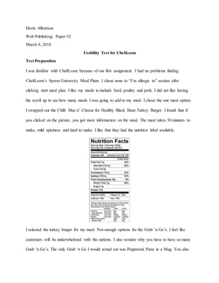
I swapped out the Chilli Mac n’ Cheese for Healthy Black Bean Turkey Burger. I found that if
you clicked on the picture, you got more information on the meal. The meal takes 30 minutes to
make, mild spiciness and hard to make. I like that they had the nutrition label available.
I selected the turkey burger for my meal. Not enough options for the Grab ‘n Go’s. I feel like
customers will be underwhelmed with the options. I also wonder why you have to have so many
Grab ‘n Go’s. The only Grab ‘n Go I would actual eat was Pepperoni Pizza in a Mug. You also
2. get 5 days worth of seasonal fruits and 5 healthy snacks, but I choose which fruits and snacks I
would receive. You have no idea what snacks you will receive and only five fruits.
I added my meal to my cart and entered 64468 into the zip code. Selected residential address, the
earliest delivery day was a week away. I selected the earliest date and hit continue. I then entered
all of my information until it asked for a payment. The total cost of my meal would be $62,
within budget. So for Task 2, I use the return to “insert last page” so that I could order a spicy
meal. When I went to add another meal, I had to go through the whole process again. I looked for
spicy meals. I even went back and added all the possible meal options to broaden my choices. I
settled on Chili Mac n’ Cheese, another mild spicy option. This also brought the total price up
$75. The one thing I noticed here was I got more Grab ‘n Go options as well, so I left that setting
going forward. I went on to Task 3, I noticed that sometimes if you click on the image to get
more information that sometimes nothing will happen and you have to refresh the page to get it
to work. Then you lose all of your progress. Anyways, the six choices that I wanted are shown
below:
3. I then clicked on the picture of each option and then clicked on nutrition facts to see if they were
under 450 calories each. The Four Cheese Mac’n’Cheese in a Mug froze the page every time I
tried to get more information. I ended up having to swap out the Pepperoni Pizza in a Mug (480
calories) and Quaker Chocolate & Peanut Butter Overnight Oats (450 calories). I switched those
these out for Quaker Peanut Butter & Banana Overnight Oats (400 calories), Kale and Apple
Salad (210 calories) and Cheese and Green Chile Tamale with Casera Salsa (350 calories). This
task was easy because I had already done this with Task 2. Familiarity with the site helped a lot.
4. I then went to task 4, I proceeded to checkout like I did in task 1. I entered my zip code and
residential address again. I want the food to be delivered in five days according to the task, but
the earliest delivery date is seven days away. I clicked continue. I tried to unclick free shipping
to see if I could get the meal plan shipped faster, but that option was not available. So I could not
complete the task.
Choosing Participants
Tester 1: Andrea Muller
Andrea is a 20-year-old female college student at Northwest Missouri State University majoring
in Psychology. Andrea is a full-time student and a part-time worker at Walmart. She is
unfamiliar with online food shopping and Chefd.com. Andrea estimated that she is on the
internet 35-45 hours per week, with 70 percent of that time being spent on social media and 30
percent on other activities (browsing, homework, etc.). Andrea is a reasonable test subject
because she is a college student who loves food, but is new to Chefd.com.
Environment for Tester 1: Andrea Muller
The test was conducted in Andrea’s apartment in Fox Alley in Maryville. She chose this location
because it was where she felt the most comfortable and where she did most of her online activity.
I sat next to her on the coach in her living room. A television was on, but on mute. She was
playing 1980s rock music on her phone through an app (she said it helped her relax). The blinds
were closed to keep out the sunlight, but the lights in the room provided adequate lighting.
During the test, Andrea would constantly check her phone because she was planning on going
out with her friends after we finished. The test took place in the evening around eight. Andrea
used her Northwest laptop and the browser FireFox. She was connected through Wi-Fi that
5. worked perfectly throughout the test. I could not tell if she had any browser add-ons that would
have effected the test.
Tester 2: Luke Sanders
Luke is a 22-year-old male college student at Northwest Missouri State University majoring in
Psychology and is on track to graduate in April. Luke’s first major was education, then business
before choosing Psychology. Luke is a full-time student, but does not have a part-time job
because of a massive scholarship that pays for his tuition and then some. He is unfamiliar with
online food shopping and Chefd.com. Luke estimated that he is on the internet 55-65 hours per
week, with 705 percent of that time being spent on social media and 25 percent on other
activities (browsing, homework, etc.). Luke is a reasonable test subject because she is a college
student who loves food, but is new to Chefd.com. He also differs from Andrea because of his
age, gender and financial situation, making him a unique tester.
Environment for Tester 2: Luke Sanders
The test was conducted in the Student Union on the campus of Northwest Missouri State
University in the afternoon around 3 pm. We found an empty table on the 3rd floor on the west
side of the building near the giant windows facing Brown Hall. We chose that location because
Luke waits there between classes. It was the most convenient time and location for him. There
was not a whole lot of foot traffic during the test, it helped that we did it on the 3rd floor. Only a
couple people in the area, most were studying with headphones in. While the sun was shining
through the windows, we were sitting towards the windows so the sun was not shining on his
laptop. Luke was checking his phone periodically for Snapchats and to make sure he would not
miss his next class. Luke also used his Northwest laptop and a Google Chrome browser. While
Northwest Missouri State Wi-Fi is sometimes a bit spotty, it worked fine for our test.
6. Test Results
Initial Site Thoughts
Both testers said the site looks like meals can be ordered and mailed to the consumer. Both noted
different celebrities listed on the site. Andrea noted the Chef of the Month Sammy Hagar while
Luke noted Kim Kardashian. Andrea liked the personalization options on the main page. The
slide show also drew her attention: “Oh s**t, look food!” Luke echoed this by saying the food on
the site looked delicious and like the food he would eat. Luke also mentioned that the meals look
like they could be a bit pricy. Andrea did not mention anything about the price. Luke mentioned
the site looked legitimate because of the well-known partners and sponsors on the site. Luke also
liked that they had an app, Andrea did not notice or care about the app.
Task 1: Build a Spoon University meal plan and determine the total weekly cost
Summary for Both Testers
Andrea Luke Average
Average Satisfaction 2 3 2.5
Success Rate 100% 100% 100%
Highlights
Andrea had no trouble finding Spoon University under the Meal Plans navigation on the home
page. Luke used the search navigation to find Spoon navigation. Both chose no allergies, but that
is where they went in different directions. Andrea wanted to select beef, poultry, fish and pork
for the meals to include. She could not tell if black meant select or deselect so she left what she
wanted in black. So that was confusing for her. “Is that what they what?” So she clicked next, the
meals that showed up were not what she wanted. “Well that’s confusing.” Andrea then hit the
7. back button to change her choices. She made sure what she wanted was in orange and what she
did not want in black. “Chilli Mac n’ Cheese is the only meal? Why? What if I do not want
that?” Then she saw the swap meal underneath the picture and found more options. Andrea
thought a few meals looked tasty: Chili Mac ‘n’ Cheese, Smokey Buffalo Chicken Grilled
Cheese and Chicken Queso. Other meals looked NASTY: Fish Taco with Cabbage Slaw and
Lemon Herb Salmon. Andrea wanted to change her fruit and snacks options, was not allowed to.
She clicked the fruits and saw the options. She did not want mango or grapefruit, but you cannot
remove them for your order. She also wanted snacks info, none available. She saw the total at the
end of $62 for one meal, 6 Grab ‘n’ Go’s and 5 fruits and snacks. She wondered why she had to
get Grab ‘n’ Go’s, fruits and snacks if all she wanted was the meal. In her own words, “This is
way to f***ing expensive for a college student like me.”
Luke chose was not picky with his meals and just left all of the meals selected. Had to scroll up
to see how many meals he could choose. He did not like that; he said it was confusing to
navigate. He chose just one meal so he could get a baseline of the meal plan prices. He scrolled
down to the bottom and saw the that the meal cost $62 with Grab ‘n’ Go’s and other
fruits/snacks. “Not a lot of food for $62. Only one true meal? Really? Glad I did not chose four
or five meals then.” Clicked add to cart. Entered 64468 into the zip code. “Do I have to pay
this?” (I then reassured him that he would not have to go through with the purchase). “The
earliest date of arrival is eight days? I could want something different by then, seems like a long
time to wait for food.” Luke was not worried about what meal he ordered in the task. The first
options were good enough for him.
8. Biggest Problem
The biggest problem with task one was the page not starting at the top of the page after choosing
the protein. It was not a huge problem, but Andrea and Luke both stated that it was annoying. I
feel like that would be an easy problem to fix and would make navigation a little smoother for
the consumer. Both also complained about the price, but not much we can do about that is user
experience department.
Alignment to Heuristic
Error prevention. The issue of the page starting halfway down can be easily prevented by simply
having the page load to the top after clicking continue after the protein selections. This can
prevent the error from occurring in the first place..
Task 2: You have the budget to cover one extra meal per week, but you want it to be a spicy
meal. Determine your spicy meal options and choose one meal you are willing to prepare.
Summary for Both Testers
Andrea Luke Average
Average Satisfaction 1 3 2
Success Rate 0% 100% 50%
Highlights
Both testers used the backspace to get back to the meal plans to add another meal. Andrea could
not figure out how to find out if a meal was spicy or not. See scrolled up and down the page
multiple times, selected switch meals and could not find where the meal details were at. She was
getting extremely frustrated and I think the site lost her a bit at this point. She eventually chose
Quinoa Fried Rice as her spicy meal (not a spicy meal) out of frustration. She all but gave up
9. after five minutes of searching. Luke had more success completing the task. Luke went back and
added another meal to his order. His first meal was Chili Mac ‘n’ Cheese so he left it be. He then
clicked swap meal on the second meal so he could choose a spicy option. “How do I know what
is spicy?” After scrolling a couple times, he clicked on one of the images and the meals info
popped up. “Ahh! There we go!” He looked for a meal with a spicy rating higher than mild but
there was none. So he chose Smokey Buffalo Chicken Grilled Cheese.
Biggest Problem
The biggest problem by far was not knowing how to find the meals information. Andrea never
figured out that you need to click the image and it took Luke (and myself) awhile to figure it out
ourselves. It was the difference in completing the task for Luke but not Andrea. Also the page
froze occasionally for both testers when certain products were selected. I think it was a coding
issue, but it added to the tester’s frustrations.
Alignment to Heuristic
Recognition rather than recall as well as consistency and standards. The images need something
like a magnifying glass on it so that the consumer knows that if you click on the image more
information will pop up.
Task 3: Ensure none of your meals, “Grab ‘n’ Go’s” or snacks is more than 450 calories per
serving. If the calorie count is too high, swap the item for another.
Summary for Both Testers
Andrea Luke Average
Average Satisfaction 4 5 4.5
Success Rate 100% 100% 100%
10. Highlights
In the middle of this task, Andrea accidently clicked on one of the Grab ’n’ Go’s and saw the
extra information pop up. “Oh THAT is how you figure out a meal in spicy or hard to make. I
guess that makes sense now. Luke caught on pretty quick and clicked on the Grab ‘n’ Go’s and
saw the nutrition tab on the right side to find the calorie count for the item. Andrea ended up
selecting Quaker Peanut Butter and Banana Overnight Oats, Kale and Apple Salad, Mini
Chocalte Muffin by KNOW Foods, Baked Pasta in a Mug, Cheesy Eggs and Spinach Burrito in a
Mug and Cheese and Green Chile Tamale with Casera Salsa. She selected these after selecting
all food options available because she had a hard time finding six items under 450 calories that
looked good. Luke went item by item and selected six items that were under 450 calories using
the same process as Andrea. Luke chose Mini Chocolate Muffins (70 calories), Quaker Peanut
Butter and Banana Overnight Oats (400 calories), Chicken Tamale in Green Sauce (360
calories), Baked Pasta in a Mug (330 calories), Smoked Turkey Breast and Havarti Cheese Wrap
(420 calories) and Quaker Apple Pie Overnight Oats (310 calories). Both liked having the
nutrition label image there under more information. It is familiar and easy to read.
Biggest Problem
Andrea and Luke both had issues finding information on Four Cheese Mac ‘n Cheese because
the page would freeze after selecting the image. Forcing them both to have to refresh the page
and start from scratch. Very frustrating. I think that was a technical issue and not a UX problem,
so the biggest UX problem is still the images not having an indication that they have more
information if you click on them.
Alignment to Heuristic
11. Recognition rather than recall as well as consistency and standards. The images need something
like a magnifying glass on it so that the consumer knows that if you click on the image more
information will pop up. Should be an easy fix.
Task 4: Assume/pretend that it is Monday at 3:30 p.m., and you plan to prepare the spicy meal
on Saturday night. Will the meal arrive on time?
Summary for Both Testers
Andrea Luke Average
Average Satisfaction 1 1 1
Success Rate 25% 25% 25%
Highlights
This task was redundant because both testers found the answer in the first task. Andrea’s test
showed the earliest date of arrival was seven days away while Luke’s was eight days away.
Since the tasks asked for the food to be delivered within 5 days, neither one could fully complete
the task. Both testers went through the process of adding their meals to the cart, clicked
checkout, inputted zip code/selected residential address, and then the earliest available delivery
date. Both hit continue and then stopped because there was no reason to put in their personal
information because they were not actually buying anything. So technically they completed the
task, but not to the specificity of the task which is why I gave them both 25 percent. Both were
unsatisfied because they would have wanted their food earlier, not wait an entire week.
Biggest Problem
As I said in the highlights, way too much time for deliveries to be delivered. There is no option
for consumers to have food shipped faster for more money. The current shipping in free, which is
12. great. However, I think if you came consumers an option to ship quicker for a small charge it
would be a real asset to the site. It would look something like the image below:
Alignment to Heuristic
Flexibility and efficiency of use. While this usually pertains to filters and sorting tools, it can
also pertain to adding more options for a consumer. In this case, adding an option could lead to
more sales because people can get their meal plans faster.
Recommendations to improve user experience
Single Problem being fixed:
The single problem I am going to fix is the consumer knowing that there is information behind
the image of the meals. Andrea, Luke and I all I had issues finding the extra meal information
because of this issue. I believe by adding just a little more information or a key to the image, it
could assist the tester in both Task 2 and Task 3. This is how the images show up right now.
13. Problem Improvement:
While I showed you how the current site looks before you click on the image, I want to reiterate
that the information after you click on the image works well and is not a pressing issue. What I
would want to do add an magnifying glass icon in the top right corner of each picture like in the
screenshot below.
This would consumers to recognize that if you click on the image, more information will pop up.
This helps fix a couple heuristics for the images. It matches the system and real world because
the magnifying icon would be placed in a natural and logical spot in the right corner of a picture.
This also keeps the design consistent and within standards by using a magnifying glass instead of
some other whacky symbol. Finally, this design leaves the images aesthetic and minimalist. The
design is not clunky or use extra space outside the image to get the point across. It is simple and
easy to see while not overpowering the food underneath the icon.