Understanding Mobile SEO by Cindy Krum, CEO & Founder of MobileMoxie LLC
•Télécharger en tant que PPTX, PDF•
1 j'aime•1,708 vues


Recommandé
Recommandé
Contenu connexe
Similaire à Understanding Mobile SEO by Cindy Krum, CEO & Founder of MobileMoxie LLC
Similaire à Understanding Mobile SEO by Cindy Krum, CEO & Founder of MobileMoxie LLC (20)
Plus de Affiliate Window
Plus de Affiliate Window (7)
Dernier
Dernier (20)
Understanding Mobile SEO by Cindy Krum, CEO & Founder of MobileMoxie LLC
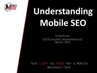
- 1. Understanding Mobile SEO Cindy Krum, CEO & Founder, MobileMoxie LLC Winter, 2013 Text CINDY to 70259 for a Mobile Business Card
- 6. Mobile Stats You Should Know The number of US smartphone subscribers has increased 99% from 2 years ago – and it is not all iPhones!
- 7. Mobile Stats You Should Know
- 8. Mobile is Important for PPC
- 9. Mobile is Important for SEO
- 10. Stuff is Changing with Google Mobile • In the Past 18ms, Google Announced: – A New Smartphone Crawler (December 15, 2011) – A ‘Preference’ for Responsive Design (August 2, 2012) – A New Protocol for Passing Desktop SEO Value to Mobile Pages (August 2, 2012)
- 11. Separate Mobile Pages Responsive Design Mixed Solution (RESS) Mobile Site Design Options: These are the 3 different mobile site architectures that the search engines recognize and offer recommendations for. Most basic SEO rules are the same. What changes is how content is crawled & indexed
- 13. • Everything Happens on Existing Urls – NO ‘m.’ • Way Less Taxing on Google’s Resources • Lots of Stuff to Put on One Mobile Page – Risks High Bounce Rate • Harder to Target Mobile Specific Keywords With One Set of Content • For Google to Know it is Responsive ALL Googlebot User Agents must Crawl the Same Page Assets (CSS, JavaScript & Images) Responsive Design: One Url
- 15. Responsive Design with Server Side Components • Most Complicated & Still New – Fewer Standard Practices • Slightly Harder for Google to Crawl & Index than Responsive, but not Much • Responsive Design SEO Rules Apply But Add in the ‘Varies’ HTTP Header • Smartphone Bot will get Whatever you are Sending to an iPhone • Navigation, Links, SEO Elements RESS:
- 16. HTTP HEADER: GET /page-1 HTTP/1.1 Host: www.example.com (...rest of HTTP request headers...) HTTP/1.1 200 OK Content-Type: text/html Vary: User-Agent Content-Length: 5710 (... rest of HTTP response headers...) RESS: Responsive Design with Server Side Components
- 18. • Most Taxing on Google’s Resources • Not All Content must be Mobilized • Mobile Site Structure Mimics Desktop or Can be Different • Easiest for Targeting Mobile-Specific Keywords • SEO Elements can be Duplicated bt. Desktop & Mobile or can be Different Separate Mobile Pages: ‘m.’ Pages
- 19. DESKTOP PAGES: <link rel="alternate" media="handheld" href="http://m.example.com/page-1" > MOBILE PAGES: <link rel="canonical" href="http://www.example.com/page-1" > SITEMAP: <url> <loc>http://www.example.com/page-1/</loc> <xhtml:link rel="alternate" media="only screen and (max-width: 640px)" href="http://m.example.com/page-1" /> </url> </urlset> Separate Mobile Pages: ‘m.’ Pages
- 20. Cool Mobile Marketing Tools You Should Certainly Know About! Text CINDY to 70259 for a Mobile Business Card
- 22. Search Simulator
- 26. Mobile Page Code Grader
- 27. Free Mobile Tools: Register at MobileMoxie.com with the Promo Code: DenverMeetUp
Notes de l'éditeur
- https://developers.google.com/webmasters/smartphone-sites/details
- mobile_moxie_ppt_template_Clean
- mobile_moxie_ppt_template_Clean
- mobile_moxie_ppt_template_Clean
- mobile_moxie_ppt_template_Clean
- mobile_moxie_ppt_template_Clean