1. Evidence of masthead development
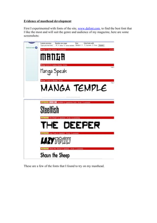
First I experimented with fonts of the site, www.dafont.com, to find the best font that
I like the most and will suit the genre and audience of my magazine, here are some
screenshots:
These are a few of the fonts that I found to try on my masthead.
2. I then tried the Manga font (at the top of this list to) see what it would look like.
The sentence above that is written in the ‘Manga’ font uses all the letters of the
alphabet in one sentence, so this makes it possible to see what my future masthead
would look like.