House Style In Existing Products And My Own
•Télécharger en tant que PPTX, PDF•
0 j'aime•472 vues
This SlideShare shows the house style in my own product as well as an existing media product.
Signaler
Partager
Signaler
Partager

Recommandé
Contenu connexe
Plus de EGladders
Plus de EGladders (7)
Dernier
Dernier (20)
Genuine Escort ℂaℓℓ Giℜℓs In DoubleTree by Hilton Hotel Gurgaon - New Delhi N...
Genuine Escort ℂaℓℓ Giℜℓs In DoubleTree by Hilton Hotel Gurgaon - New Delhi N...
Call Girls In Vasant Kunj ☎✔ 9871031762 ☎✔ Russion Escorts Service In Delhi Ncr
Call Girls In Vasant Kunj ☎✔ 9871031762 ☎✔ Russion Escorts Service In Delhi Ncr
Enjoy Night ≽ 8448380779 ≼ Call Girls In Gurgaon Sector 67 (Gurgaon)
Enjoy Night ≽ 8448380779 ≼ Call Girls In Gurgaon Sector 67 (Gurgaon)
Enjoy Night ≽ 8448380779 ≼ Call Girls In Gurgaon Sector 54 (Gurgaon)
Enjoy Night ≽ 8448380779 ≼ Call Girls In Gurgaon Sector 54 (Gurgaon)
Busty Desi⚡Call Girls in Vasundhara Ghaziabad >༒8448380779 Escort Service
Busty Desi⚡Call Girls in Vasundhara Ghaziabad >༒8448380779 Escort Service
Busty Desi⚡Call Girls in Vasundhara Ghaziabad >༒8448380779 Escort Service
Busty Desi⚡Call Girls in Vasundhara Ghaziabad >༒8448380779 Escort Service
Sector 8, Noida Call girls :8448380779 Model Escorts | 100% verified
Sector 8, Noida Call girls :8448380779 Model Escorts | 100% verified
Dubai Call Girls Jumeirah O525547819 Call Girls Dubai Sibling
Dubai Call Girls Jumeirah O525547819 Call Girls Dubai Sibling
Busty Desi⚡Call Girls in Pari Chowk Escorts, Noida >༒8448380779 Escort Service
Busty Desi⚡Call Girls in Pari Chowk Escorts, Noida >༒8448380779 Escort Service
Sector 62, Noida Call girls :8448380779 Model Escorts | 100% verified
Sector 62, Noida Call girls :8448380779 Model Escorts | 100% verified
Enjoy Night ≽ 8448380779 ≼ Call Girls In Gurgaon Sector 68 (Gurgaon)
Enjoy Night ≽ 8448380779 ≼ Call Girls In Gurgaon Sector 68 (Gurgaon)
Sector 10, Noida Call girls :8448380779 Model Escorts | 100% verified
Sector 10, Noida Call girls :8448380779 Model Escorts | 100% verified
Busty Desi⚡Call Girls in Vasundhara Ghaziabad >༒8448380779 Escort Service
Busty Desi⚡Call Girls in Vasundhara Ghaziabad >༒8448380779 Escort Service
call girls in Indirapuram (Ghaziabad) 🔝 >༒8448380779 🔝 genuine Escort Service...
call girls in Indirapuram (Ghaziabad) 🔝 >༒8448380779 🔝 genuine Escort Service...
Enjoy Night ≽ 8448380779 ≼ Call Girls In Gurgaon Sector 49 (Gurgaon)
Enjoy Night ≽ 8448380779 ≼ Call Girls In Gurgaon Sector 49 (Gurgaon)
call girls in Indirapuram (Ghaziabad) 🔝 >༒8448380779 🔝 genuine Escort Service...
call girls in Indirapuram (Ghaziabad) 🔝 >༒8448380779 🔝 genuine Escort Service...
Busty Desi⚡Call Girls in Sector 15 Noida Escorts >༒8448380779 Escort Service
Busty Desi⚡Call Girls in Sector 15 Noida Escorts >༒8448380779 Escort Service
Sector 4, Noida Call girls :8448380779 Model Escorts | 100% verified
Sector 4, Noida Call girls :8448380779 Model Escorts | 100% verified
Jual Obat Aborsi Palembang ( Asli No.1 ) 085657271886 Obat Penggugur Kandunga...
Jual Obat Aborsi Palembang ( Asli No.1 ) 085657271886 Obat Penggugur Kandunga...
Dubai Call Girls Centerfold O525547819 Call Girls Dubai Cfnm
Dubai Call Girls Centerfold O525547819 Call Girls Dubai Cfnm
House Style In Existing Products And My Own
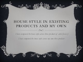
- 1. HOUSE STYLE IN EXISTING PRODUCTS AND MY OWN I have compared the house style across three products of artist Jessie J. I have compared the house style across my own three products .
- 2. THE HAIR Jessie J keeps the same hair cut across all three products, this is a black short ‘bob’ . This has been done in order to create continuity so the audience can link/relate all the products together. The black also helps for the gold writing to stand out. This is also an iconic feature for this artist. The black colour can also be seen as a symbol of rebellion.
- 3. GOLD THEME The gold theme is shown across all three products. In the poster and the album it is used in the text to symbolise wealth and luxury. However the music video does not conform to this connotation as Jessie J appears to be taking off her gold jewellery. The items of clothing she is wearing also reinforces this interpretation of Jessie J showing who she really is.
- 4. THE NAILS The artist is wearing the same colour nail varnish across each product. I think this is really effective as it reinforces the rebellion statement she is trying to recreate. The album is about being allowed to express yourself and by wearing bold nail varnish it is representing this. Stereotypically black nail varnish represents goths/ emos however Jessie J has broken this stereotype so show that you don’t have to conform to a particular stereotype to fit into society.
- 5. ARTIST Jessie J appears across all three of her products to show continuity. The audience can therefore relate each product to the artist. Each products then links in well will each other as the artist can be easily recognised.
- 6. CLOTHING The artist is wearing the same clothes across all three products. These are a long brown coat, a brown mixed scarf and leather gloves. In my music video the artist wears a hat but this can not be seen in my ancillary texts. The reason why I kept the same costume choice is because it creates a continuity across all three of my products and the audience can link the products together.
- 7. THE BEACH I have ensured that the location which I have used appears across of my products. This location is of the beach which represents the young girl being free and at one with herself. I have added effects to my two ancillary texts in order for them to stand out and catch the attention of the audience. The beach appears at the end of my music video to show a transformation in the young girl. The beach symbolises peacefulness hence why the colour scheme is very basic and minimal.
- 8. WALKING I have tried to capture the girl walking towards the camera in all my products. This is effective as the same image can be found in each product which links them all well together (creating an effect house style). This is the most dominant part of my music video as it symbolises the artist is now free and can be who see wants to be.
- 9. ARTIST The artist is the same across all three products in order for the audience to make a connection between each one. It also helps in the continuity of my products as the artist appears in the same clothing, same hair cut etc. If I used different images I don’t think it would have conveyed a strong message of the girl being free.