Electric gas-summer-2013
•
0 j'aime•433 vues

Esri News for Electric & Gas Utilities Summer 2013 newsletter

Recommandé
Recommandé
Contenu connexe
Tendances
Tendances (20)
En vedette
En vedette (6)
Similaire à Electric gas-summer-2013
Similaire à Electric gas-summer-2013 (20)
Plus de Esri
Plus de Esri (20)
Dernier
Dernier (20)
Electric gas-summer-2013
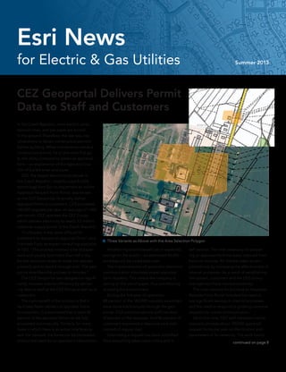
- 1. for Electric & Gas Utilities Summer 2013 Esri News In the Czech Republic, most electric wires, telecom lines, and gas pipes are buried in the ground. Therefore, the law requires landowners to obtain construction permits before building. When a landowner needs a construction permit, he or she must first go to the utility company to obtain an appraisal form—an explanation of the type and loca- tion of buried wires and pipes. CEZ, the largest electricity producer in the Czech Republic, recently used ArcGIS technology from Esri to implement an online Appraisal Request Form Portal, also known as the CEZ Geoportal, to quickly deliver appraisal forms to customers. CEZ processes 160,000 requests per year, an average of 1,000 per month. CEZ operates the CEZ Group, which delivers electricity to nearly 3.5 million customer supply points in the Czech Republic. “In the past, it was quite difficult for customers to request an appraisal form,“ said Frantisek Fiala, an expert consulting specialist at CEZ. “The process involved a lot of paper- work and usually took more than half a day for the common citizen to make the request properly and to send it through mail. The web portal simplified the process to minutes.“ The CEZ Geoportal was designed to signifi- cantly increase internal efficiency by deliver- ing data to staff at the CEZ Group as well as to customers. The main benefit of the solution is that it facilitates faster delivery of appraisal forms to customers. It is estimated that at least 30 percent of the appraisal forms can be fully processed automatically. Similarly, for many cases in which there is an actual interference with the network, the forms can be processed without the need for an operator‘s intervention. CEZ Geoportal Delivers Permit Data to Staff and Customers Another important benefit lies in expected savings for the public—an estimated 84,000 workdays will be saved each year. The implementation of automatic electronic communication eliminates paper appraisal form requests. This means the company is saving on the use of paper, thus contributing to saving the environment. During the first year of operation, 88 percent of the 160,000 requests submitted were done electronically through the geo- portal. CEZ customer service staff handled 12 percent of the requests. And 96 percent of customers requested a response via e-mail instead of regular mail. Submitting a request has been simplified. Now everything takes place online and is self-service. The time necessary for prepar- ing an appraisal form has been reduced from hours to minutes. All that has been accom- plished only by increasing the effectiveness of internal processes. As a result of establishing this system, customers and the CEZ Group management have reacted positively. The main reasons for building an Appraisal Request Form Portal included the need to see significant savings in internal processes and the need to respond to growing customer requests for online communication. Up to this time, CEZ staff members had to manually process about 120,000 appraisal request forms per year on the location and parameters of its networks. The work had to continued on page 8 Three Variants as Above with the Area Selection Polygon
- 2. 2 Esri News for Electric & Gas Utilities Summer 2013 Summer 2013Contents Cover 1 CEZ Geoportal Delivers Permit Data to Staff, Customers Case Study 4 Greenville Utilities Commission Builds iOS Apps 6 Union Power Adds Mobile Apps Esri News 3 The Four Goals of a Successful Utility and How Location Analytics Can Help 9 Advance Your Network: Come to the Esri Electric and Gas GIS Conference Tech Corner 10 Lidar for Electric Transmission Corridor Management The information contained in this work is the exclusive property of Esri or its licensors. This work is protected under United States copyright law and other international copyright treaties and conventions. No part of this work may be reproduced or transmitted in any form or by any means, electronic or mechanical, including photocopying and recording, or by any information storage or retrieval system, except as expressly permitted in writing by Esri. All requests should be sent to Attention: Contracts and Legal Services Manager, Esri, 380 New York Street, Redlands, CA 92373-8100 USA. The information contained in this work is subject to change without notice. The Geographic Advantage, Esri, the Esri globe logo, 3D Analyst, ArcAtlas, ArcCatalog, ArcData, ArcDoc, ArcEditor, ArcExplorer, ArcGIS, the ArcGIS logo, ArcGlobe, ArcIMS, ARC/INFO, ArcInfo, ArcLogistics, ArcMap, ArcNetwork, ArcNews, ArcObjects, ArcPad, ArcPress, ArcReader, ArcSDE, ArcSurvey, ArcToolbox, ArcTools, ArcUser, ArcView, ArcVoyager, ArcWatch, ArcWeb, ArcWorld, ArcXML, Business Analyst Online, BusinessMAP, CommunityInfo, EDN, Geography Network, GIS Day, MapData, MapObjects, Maplex, MapStudio, ModelBuilder, MOLE, NetEngine, RouteMAP, SDE, Sourcebook•America, StreetMap, Tapestry, @esri.com, esri.com, arcgis.com, geographynetwork.com, gis.com, and gisday.com are trademarks, service marks, or registered marks of Esri in the United States, the European Community, or certain other jurisdictions. Other companies and products or services mentioned herein may be trademarks, service marks, or registered marks of their respective mark owners. Copyright © 2013 Esri. All rights reserved. Printed in the United States of America. Esri News for Electric & Gas Utilities is a publication of the Electric & Gas Group of Esri. To contact the Esri Desktop Order Center, call 1-800-447-9778 within the United States or 909-793-2853, ext. 1-1235, outside the United States. Visit the Esri website at esri.com. View Esri News for Electric & Gas Utilities at esri.com/electricgas or scan the code below with your smartphone. Advertise with Us E-mail ads@esri.com. Submit Content To submit articles for publication in Esri News for Electric & Gas Utilities, contact Jessica Wyland at jwyland@esri.com. Manage Your Subscription To update your mailing address or subscribe or unsubscribe to Esri publications, visit esri.com/publications. International customers should contact an Esri distributor to manage their subscriptions. For a directory of distributors, visit esri.com/distributors. Circulation Services For back issues, missed issues, and other circulation services, e-mail requests@esri.com; call 909-793-2853, extension 2778; or fax 909-798-0560.
- 3. 3Summer 2013 esri.com/electricgas Russ was one of my favorite bosses. He was the president of the utility where I ran electric opera- tions several years ago. Russ was an accountant, a bean counter, as he described himself. I am an electrical engineer. Yet we agreed on almost everything about running a gas and electric utility. Russ once told me that there are only four goals you have to achieve to be successful at running a utility: (1) make money, (2) keep the customers happy, (3) keep the employees safe and happy, and (4) stay out of trouble. “But,“ Russ warned, “you can‘t separate those four goals. They all relate. If you simply cut costs to make more money, employees would balk, custom- er service would suffer, and something bad could happen—like a dog gets electrocuted from utility wiring and the story ends up on the front page of the Boston Globe.“ Russ said that you must balance those four things to be successful. In effect, Russ defined the mission of the company. As a proper bean counter, Russ made sure he could measure how well the company complied with his rules. Each rule defined a critical stakeholder in the utility: the shareholder, the customer, the employee, or members of the community. Metrics—such as earnings per share, operations and maintenance spending, capital spending, and overtime compared to budget— defined what Russ meant when he said “make money.“ When Russ needed to gauge how well the company was able to “keep customers happy,“ he looked at reliability, power quality, and customer service. He looked at accidents, union grievances, and employee turnover to measure whether the utility was succeeding at its goal to “keep em- ployees safe and happy.“ Finally, he made sure the company did in fact “stay out of trouble“ by reviewing negative press, customer satisfac- tion ratings, complaints to the public utility commission, and fines for ruined vegetated wetland or other nasty environmental violations. We all recognize these metrics as key performance indicators—what consultants like to call KPIs. However, Russ clearly understood the relationship that metrics have to one another. He needed a good set of analytics to create real business insight, to enrich the KPIs so they were more than dials on a dashboard. Russ wanted to fully understand the relationship of cause and effect. Russ understood that most metrics are averages. The best exam- ple is the most common metric for reliability, called system average interruption duration index (SAIDI). It is equal to the total number of minutes all customers are out of power during the year divided by the total number of customers. The average SAIDI in the United States is roughly 120 minutes, or about two hours, per year. What SAIDI doesn‘t The Four Goals of a Successful Utility and How Location Analytics Can Help By Bill Meehan, Esri Director of Utility Solutions tell you is whether customers are happy. The unanswered question is, Where are the unhappy customers, and why are they unhappy? Also, is there a correlation between customer satisfaction and reliability? Probably. Even if the SAIDI for a utility is above average (lower than 120), there may be pockets of the territory that have terrible reliability. So even if reliability is good on average, there could be an angry mob of custom- ers at a town meeting demanding to know why service is so bad. Russ actually sent me to meet an angry mob of customers once. An angry mob at a town meeting always made the newspapers, thus violating Russ‘s fourth rule, “stay out of trouble.“ What does this have to do with geospatial technology? It proves that location really matters. Simply plotting SAIDI on a granular level, using geospatial technology, reveals the location of big problems, hence advising you of where angry mobs are likely to lie in ambush. When we take business intelligence data (such as KPIs) and spatially enable it, we gain new insight. Location analytics is that insight. When I look at Russ‘s metrics, nearly all of them have something to do with location. Where are we spending the most on operations and maintenance? Where are there the most employee motor vehicle accidents? Where are we getting the most complaints from contractors? Where are the high-bill complaints? Where are people not paying the bills? Where is the highest area of theft? Location analytics answers the question, Where? It also sheds light on why. If SAIDI is poor in a small area, it may help to look at additional data, such as tree trimming history, maintenance spending, or age of equipment. More data leads to better clarity. Finally, location analytics helps utilities make the right decisions about what to do to improve metrics. Location analytics is about where the problems are located, why they might be that way, and what we can do to fix the problems. Averages are fine to get started, but honing in on where the problems are most severe will lead to resolution. Russ was a numbers guy, but he fully understood that to run a power company you need insight beyond what the numbers tell you. What Russ knew was that averages don‘t always tell the full story. Sure, we were above average in reliability, but customers still complained. Russ knew that it was the relationship of factors that really told the story. Location analytics allows utilities to see the relationships among customers, employees, communities, and assets across the service territory. It‘s not surprising that location analytics helped Russ achieve the four goals of making money, keeping customers happy, keeping employees safe and happy, and staying the heck out of the Boston Globe. Esri News
- 4. 4 Esri News for Electric & Gas Utilities Summer 2013 New iOS apps, developed by Greenville Utilities Commission (GUC) in North Carolina, provide staff with real-time information on the go. GUC, which provides electric, water, sewer, and natural gas services to the city of Greenville and most of Pitt County, has issued 200 mobile devices to employees. Now every- one, from the CEO to the maintenance crews, can easily view and update the company‘s data and maps. The GUC iOS apps include Asset Viewer, Markup Tool, SCADA Dash, and Outage Map. “Our employees aren‘t chained to a desk, nor do they have time to boot computers in their trucks,“ said Sean Hawley, GIS systems coordinator at GUC. “They want to look at the asset data while standing near the field asset. They also want to be able to communicate effectively about assets.“ When the IT and GIS teams at GUC decided to develop mobile apps, they had three focus points. They wanted to increase the usage and value of GIS, increase awareness about data quality issues, and clean up the organiza- tion‘s data. So far, they report success on all three points. Greenville Utilities Commission Builds iOS Apps “In addition to a dramatic improvement in our data, processes at GUC have become far more efficient,“ said Todd Rouse, chief oper- ating officer at GUC. “Our employees recently used our applications when deployed in the northeast, where they were assisting residents to restore power after Hurricane Sandy. Our crews were the talk of the area. Our engineers were making design decisions right in the field and communicating those designs and sketches directly to field crews who were ready to perform work.“ In Greenville, crews are able to look at asset information on an iPad while loading their trucks with supplies, allowing them to gain a full understanding of the asset they are going to service before they even arrive on site. Using the GIS as the backdrop, engineering assistants are communicating with vendors and subcontractors on the job site. “Most of all, our main goal was accom- plished,“ said Hawley. “Employees are finally realizing the value of GIS.“ Access to the GIS has been surging. The company‘s ArcGIS for Server has sustained increased usage to a level almost 10 times the original load. Meanwhile, field crews and engineering staff are able to use GIS as the informational backdrop to suggest system changes, communicate issues, and even align or schedule repair work within the system. With more eyes than ever on the data, the quality is steadily improving. A new data services group is receiving markups from field personnel and making updates to the GIS. Because field crews have live data in their hands, they now see how their contributions are taken into account. The old cycle—not using the data because the data is incorrect and not correcting the data because no one is using the data—has been broken. “Our initiative demonstrates that a highly organized ArcGIS implementation and an internally focused application store can be used to create a truly self-service mobile GIS that is available anytime and anywhere,“ said Redlines can be saved and e-mailed to customers or coworkers directly from the application.
- 5. 5Summer 2013 esri.com/electricgas Todd Cannon, systems analyst at GUC. Users build informational maps as the need arises, trade information based on those maps, and communicate changes to a new group that is ready to correct system-wide issues. No more laptop upgrades or stale information. GUC employees now have the information they want in a form they like on a device they love, all while utilizing skills they perfect on their own time. GUC operators see the GIS, used anywhere in a self-service manner, as an exemplary deployment that delivers true business value to the investments made by GUC. From management to field crews, all GUC employees now have unrestricted access to query the GIS and suggest corrections. Internal Application Store and Mobile Device Management To distribute the technology in a secure manner, GUC had to implement a mobile device management (MDM) system. Along with the need to apply system-wide security policies, it also desired the convenience of an internal application store. GUC found that solution in AirWatch, a leader in enterprise mobility management. The infrastructure and security teams sprang into action by setting up these systemwide policies and distributing devices used predominantly for e‑mail, brows- ing, and phone calls. The applications team focused much of its attention on constructing an internal applica- tion store. The outcome of those efforts was a simple yet innovative way for users to acquire the applications they needed. Nearly all employees had experience in using either the Apple App Store or the Android Market, but the concept of employing this strategy in the office was foreign and exciting. The GUC App Store follows the same approach as the Apple and Android markets. The store is entered by tapping an icon on a mobile device, where applications can be selected and installed by a simple touch. With valuable tools that are conducive to workplace quality and efficiency literally at employees‘ fingertips, GUC has quickly evolved into a high-tech environment. The Markup menu allows the user to send the redline or make adjustments. There are also multiple drawing functions for change of shape, color, and added dimensions. The Asset Viewer allows searching with a general feature/address search. Case Study
- 6. 6 Esri News for Electric & Gas Utilities Summer 2013 Last year, Union Power operators used ArcGIS technology from Esri to create a customized operations dashboard that provides real-time and historical outage information, data from the advanced metering system (such as volt- age and momentary interruptions), up-to-the- minute work order type and location details, and meter tampering indications. The dashboard gives Union Power Cooperative managers and executive direc- tors an up-to-the-minute understanding of how utility systems are performing, where employees are focusing their efforts, and how customers are affected. The automated processes are also saving the utility time and money. All staff members have access to data from across the company merged into one real-time, easy-to-use map called Union Power Operations Dashboard. Union Power Adds Mobile Apps recycle the map services we developed for the dashboard.“ The new series of mobile apps enables utility crews to complete much of the previ- ously time-consuming work in the field. Utility engineers report a significant improvement in productivity with very little additional investment. “We had to purchase the tablets, but we didn‘t have to purchase anything else,“ Harrington said. “We are using the core technology and tools we already have in place. We are a co-op and always aware that we are spending member money. We want to maximize the value of the time and money we put into it.“ Harrington used ArcGIS Online and ArcGIS Explorer to build the JavaScript Object Notation (JSON) to translate queries and information back and forth. The group used a mobile content folder to make data available to mobile devices in a secured environment. New mobile apps include the following: Phase Inconsistencies Union Power crews are using a mobile app to fix inconsistencies in the field where phases In late 2012, the team deployed the Esri ArcGIS mobile application available in the Apple App store or Google Play Store to complement the dashboard. The app has been installed on smartphones and tablets throughout the company with great acceptance. “The operations dashboard moved us in that direction—it made us want more informa- tion in the field,“ said Todd Harrington, GIS administrator at Union Power. “We decided it was easier to use tablets in the field and Union Power linemen use an Esri app to locate equipment in real time while in the field. Work Order Inspection Form for Union Power Engineers
- 7. 7Summer 2013 esri.com/electricgas Case Study features turned on so field crews can see right away which switch should be on or off. This app, requested by a contractor, makes it easier to carry out switching orders. Mobile Dashboard Crews get where they need to go more quickly by using a mobile version of the operations dashboard that displays system outages. The app allows crews to search by any feature—tags for equipment, customer name or address, meter number, and work order number. They can also view items such as identify features and gate codes. The app also enables crews to use smartphones to locate outages without relying on the dispatcher for that information. They can quickly see the location of outages, predicted outages, and customers affected. Phase Mismatch Another mobile app allows crew members to create a point on the map where data in the GIS does not match data in the automated metering infrastructure (AMI). This triggers an e-mail to be sent to the engineering and GIS departments so the information can be updated. Work Order Inspections Work orders are now entered on SharePoint. Instead of taking paper in the field, crews can access that information on the tablets. “We have to inspect completed work orders each month,“ said Matt Baucom, Union Power system planning engineer. “In the past, I pulled so many each month and took paperwork with me. Now I can load up the work orders on a tablet and take it into the field. I perform each inspection and update the database record accordingly.“ All work orders are loaded into the GIS and appear as points on the map. This makes it simple for Baucom to determine the most efficient route. In the past, he would have to spread 50 or 60 work orders on his desk to determine the route to take. Fault Current Union Power staff can now search fault values on any tablet instead of waiting for one person to complete the search on the one computer equipped with the appropriate soft- ware. Readings from substations are plugged into the GIS via iPad, and crews can then go immediately to the location of the fault. “If a tree brushes the line, the lights will blink,“ said Baucom. “We know where that fault will be on the line, and we can go to that spot and look for any damage—a tree or a dead squirrel or an insulator damaged. We don‘t have to ride miles and miles of line to locate the fault. We are now getting informa- tion to the field crews much faster than before.“ do not match. For example, some of the company‘s underground facilities are mapped correctly but labeled in the field incorrectly. With the app, workers can mark what they see in the field and track problem areas to resolve. Before the app, they could never be sure of accuracy and had no way of tracking, docu- menting, and verifying. Union Power crews can now create a point on the map to record the location where phases do not match. Switching On the tablets, crews can view a map that shows only important equipment during a switching procedure. The map on the mobile app shows the electric distribution system with most layers turned off and only important Many maps are available to mobile users.
- 8. 8 Esri News for Electric & Gas Utilities Summer 2013 be done within 30 days of the request. Those tasks were handled by expertly and techni- cally skilled GIS operators. The new system is implemented so that, in the future, more than 90 percent of such requests can be processed automatically, without an operator‘s manual interaction. The CEZ Geoportal is also used to facilitate online data sharing and communication with government officials and emergency manage- ment centers and other stakeholders. Users enter their requests via the portal in several steps. At their disposal, they have advanced locating functions for looking up the area of interest and tools for drawing request polygons and submitting necessary information for follow-up communication. Submitted requests are consequently han- dled by a set of tools that, via e-mail, confirm to requesters the enrollment of their requests into processing. Thanks to the use of ArcGIS for Server, it is possible to automatically generate reports on interference (or noninter- ference) with the network and produce output CEZ Geoportal Delivers Permit Data to Staff, Customers continued from cover prints or digital data. After comparison with records from SAP databases, the resultant appraisal form gets finalized as a digital docu- ment, or its print is forwarded to the courier service in cases where the user insists on a paper form. The process is fully automatic, while users have, by means of a web application or a thick client, instant access to up-to-date informa- tion on the current state of the processing of their requests. CEZ is implementing GIS as a core enter- prise system. The CEZ Geoportal is one of the results of the synergy of GIS and enterprise resource planning (ERP) systems. It performs geoprocessing tasks that were formerly carried out by large groups of operators. The response time was then cut to the minimum, changing from a couple of hours to a few min- utes, dramatically saving the operating costs and time of everyone involved. Data sharing is essential for enterprise and government cooperation, and the CEZ Geoportal is a solu- tion designed to distribute spatial information to support the government decision-making process. Map Showing Existing CEZ Infrastructure in the Requested Area Title Page of the CEZ Geoportal
- 9. 9Summer 2013 esri.com/electricgas Esri News One exciting event draws more than 500 electric and gas utility profes- sionals who are eager to build and maintain better networks. At the Esri Electric and Gas GIS Conference, to be held October 20–23 at the Henry Gonzalez Convention Center in San Antonio, Texas, you can work on your networks. Advance Your Network Come to the Esri Electric and Gas GIS Conference Focus on your utility network to gain real situational awareness and take GIS from the office to the field to the cloud for better asset management and customer service. Strengthen your social network when you build relationships with your cohorts at other utilities and Esri experts, the people you can call on for advice and ideas. Integrate and modernize your IT network to get the most from your location analytics, incorporate lidar, deal with big data, and create apps and better maps. This conference is a major resource for professionals from all types and sizes of electric and gas utility organizations. Whatever your position or level of technology expertise, bring your team and find out how geospatial innovation can advance your network. Visit esri.com/events/electric-gas. SAFE? Fully 35% of the nation’s gas pipelines were built in the 1950’s or before. Some are deteriorated, approaching a danger point. But, which lines need repair, renewal, or replacement? The answer – Intrepid™ – Esri®-based technology for the pipeline industry. Visit our website; we’ll show you the answer. www.col-col-geospatial.com This year, the conference will be held in San Antonio, Texas.
- 10. 10 Esri News for Electric & Gas Utilities Summer 2013 Image 1 The AVERAGE cell assignment type is best for bare-earth points when producing a DEM. The Sampling Type parameter allows you to decide the output cell size for the DEM. I recommend one to three times the average point spacing of the LAS data. This will create a high-resolution surface while allowing filling and interpolating across voids (cells for which there are no samples). Most electric transmission companies, in efforts to meet North American Electric Reliability Corporation (NERC) requirements, collected vast amounts of lidar data for risk analysis on high-voltage lines. Many operators are starting to realize that this highly accurate geographic information can serve many other critical business needs beyond this one regulatory requirement. Within ArcGIS, you can learn more about the corridors you manage using the lidar point cloud data and geoprocessing tools. This Lidar for Electric Transmission Corridor Management By Joe Holubar, Electric and Gas Technology Lead, Esri article will outline how you can create multiple derivative surfaces from the point cloud to help you make better decisions. These new outputs will give you a much better under- standing of the characteristics of the entire corridor you’re managing, in addition to the detailed information of the physical assets (structures and conductors) for which the data was originally collected. For the best results in creating the different surfaces from the lidar point cloud, you’ll want it classified into categories that include at least ground and nonground, ideally with categories for vegetation and the electric facilities. This way, you can filter out the un- necessary points for the surface generation. Begin with creating a digital elevation model (DEM) from the LAS dataset. To gener- ate this surface, use the LAS Dataset To Raster tool located in the Conversion Tools > To Raster toolset. Set up the tool to appear like image 1. Image 2 From here, you will have a high-resolution DEM that you’ll use as an input for the other surface tools.
- 11. 11Summer 2013 esri.com/electricgas Image 3 Aspect (image 3) identifies the downslope direction of the maximum rate of change in value from each cell to its neighbors. It can be thought of as the slope direction. Image 4 Contours (image 4) are lines that connect locations of equal value in a raster dataset that represents continuous elevation. Contours are a great resource to see the elevations of the corridors to help determine the topography and accessibility of the right-of-way. Image 5 Hillshade (image 5) obtains the hypothetical illumination of a surface by determining illumination values for each cell in a raster. It can greatly enhance the visualization of a surface for analysis or graphical display, especially when using transparency. A hillshade is extremely powerful when combined with other datasets, like slope or imagery, to give you the perception of a 3D surface. Image 6 Slope (image 6) calculates the maximum rate of change in value from that cell to its neighbors. Slope maps are wonderful for determining where a vehicle can travel along the corridor. For example, when traveling between two towers, can a truck go straight to the next tower or does it need to travel up to the next access point and come back? These new surfaces should help give you a different view and a better understanding of the corridors you manage using the powerful point cloud data you’ve collected. Tech Corner With the newly created DEM, you can create the following surfaces using the corresponding tools in the Spatial Analyst Tools > Surface toolset:
- 12. Presorted Standard US Postage Paid Esri 380 New York Street Redlands, California 92373-8100 usa 135650 27.5M7/13sp 30-day free trial: esri.com/agol Creating your own map from maps published by other users is just one of many ways to take advantage of the rich collection of data and resources ArcGIS SM Online makes available to you. Welcome to the new frontier in geographic information systems. ArcGIS Online Copyright © 2012 Esri. All rights reserved. 30-day free trial: esri.com/agol Creating your own map from maps published by other users is just one of many ways to take advantage of the rich collection of data and resources ArcGIS SM Online makes available to you. Welcome to the new frontier in geographic information systems. ArcGIS Online Maps made better. (Some assembly required.) Copyright © 2012 Esri. All rights reserved.