Is anatomy of_an_email
•
0 j'aime•915 vues

This document discusses the anatomy and components of an effective email marketing campaign. It describes typical email components like the sender name and address, subject line, preheader, header, table of contents, main call to action, secondary/tertiary calls to action, social sharing/connecting options, and footer. For each component, examples are provided and tips are given for optimization, like testing different subject lines or placement of calls to action. The goal is to understand how to craft emails that get customers' attention and guide them towards a desired action.

Recommandé
Recommandé
Contenu connexe
Tendances
Tendances (19)
Similaire à Is anatomy of_an_email
Similaire à Is anatomy of_an_email (20)
Dernier
Dernier (20)
Is anatomy of_an_email
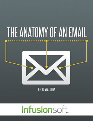
- 1. THE ANATOMY OF AN EMAIL by DJ WALDOW
- 2. E mail marketing campaigns have become an excellent way to foster and maintain relationships with customers, but only if done correctly. The anatomy of an email is similar to that of the human body in that there are many parts that need to work together in order to achieve a successful result. Whether the goal of your email campaign is an open, click-through, social share or a conversion, each email component should guide readers through the message toward your desired action. The following descriptions and explanations of email components should help to send you on your way to creating an email campaign that gets your customers’ attention and business.
- 3. Sender Name & Address Subject Line TYPICAL Preheader Header (image and/or text) COMPONENTS Table of Contents* Main Call to Action OF AN EMAIL Secondary & Tertiary Calls to Action Social Sharing & Connecting Footer *Table of contents are only found in certain types of emails
- 4. Sender Name & Address The sender’s name and address is one of the most important components of the entire email message. Seeing a recognizable, trusted name in the “from” line of an email can create warm fuzzies, resulting in an opened email. If an unknown sender appears, it can spell trouble if your intended reader chooses to ignore, delete or, worst of all, mark your email as “spam.” Sender names and addresses come in many flavors. A random snapshot of my inbox shows a wide variety of senders:
- 5. S ometimes the same company can use a different sender name based on the content of the email and/or the intended audience. MarketingProfs, a marketing resource company, does this quite often. Below is a sampling of some of its various sender names from past emails: 1. MarketingProfs 2. MarketingProfs Today 3. MarketingProfs Support 4. MarketingProfs Events Team 5. MarketingProfs Social Media Newsletter 6. MarketingProfs Email Newsletter 7. Sharon, MarketingProfs 8. Corey, MarketingProfs 9. Ann, MarketingProfs Which sender name is the best? Simple and direct (1), detailed and specific (5), or individual name with company name (7-9)? The answer - of course- is that it depends. Be sure you are testing your sender names and addresses to uncover what works best for your audience. There are recommended practices, but nothing is set in stone. TEST, TEST, TEST!
- 6. F or an event, the team at MarketingProfs decided to get really creative, some might say “risky,” with its sender name. Subscribers to the MarketingProfs list were greeted with an email from none other than “Mad Men’s” own Don Draper. Combining the unique sender with an equally creative and risky subject line- “Why I’m Not Attending MarketingProf’s B2B Forum”- this email definitely stood out in my inbox. However, what if, like me, you had never seen an episode of Mad Men and did not know who Don Draper was? Would you have opened the email? Tip: Choose your sender name wisely but test and experiment, too! While the sender’s name was foreign to me, the subject line included MarketingProfs, a company I trust and love. Additionally, the subject line was creative and eye-catching, so I just had to know why this Don Draper guy was not attending a MarketingProfs event – especially one that I was speaking at (How DARE he?). I am glad I opened the email because the copy was compelling, contained three calls to action in the body of the email, one in the preheader, and one in the footer – for a total of five, and all links pointed to the event registration page on the MarketingProfs website. On the flipside, a recipient might see a foreign name connected to MarketingProfs and assume that MarketingProfs sold their email list to this Don Draper guy, and simply delete the email before even opening it. According to an Epsilon study from 2009, 68% of North American consumers surveyed said that they base their opening of an email on the sender’s name. Being creative in your email marketing campaigns can be risky, but without taking that risk, you never know if a huge jump in answered calls to action is even possible!
- 7. Subject Line Like the sender name, the subject line of an email is one of the most important components of the entire message. In most inboxes, it is one of the first two visible items, the other being the sender name and address, and when subscribers scan their inboxes, the subject line can be the difference between an open, delete, ignore, or mark as spam action. Subject lines can wear a variety of costumes: • Lengthy • Extremely brief • Cryptic and intriguing • Direct and straight to the point
- 8. Long Subject Line One Oil Change, Three Oil Changes with Inspections, or a Four-Wheel Alignment (Up to 78% off) ; 10 or 20 Gym Passes (Up to 69% Off) Salon Package with Cut, Style, and Two-Color Highlights; Shellac Manicure; or Acrylic Nails (Up to 51% Off) Coming in at a whopping 42 words and 241 characters, this subject line from a Groupon email is one of the longest I’ve ever seen. The upsides of long subject lines? There’s no question as to what this email is about. The downside? In most email clients and smartphones, this subject line will be truncated. Short Subject Line So One word. Two characters. This subject line from a Barack Obama email is one of the shortest I’ve ever seen. The benefit of using such a short subject line is that it can stand out in the inbox and leave a subscriber wondering what the contents of the email are all about, thus leading to an opened email. The risk is that it gets lost in the inbox, simply scanned over. Additionally, senders have to ensure that this type of subject line is not too misleading. Creative and Obtuse Subject Lines 5, 4, 3, 2, 1... Urban Outfitters (UO) is known for its unique subject lines, imagery and email copy. This one is no exception. Any guesses as to what the contents of this email contained? Sent on December 31, UO used this subject line as a “countdown” to the New Year. The somewhat cryptic nature of this subject line can cause it to stand apart in the inbox, leading curious minds to open in order to find out what it means. Direct and Straightforward Subject Lines Almost Timely News from @cspenn for 8/5 Chris Penn sends out a weekly email newsletter called the “Almost Timely News” and the subject line is the same each and every week, with the exception of the date at the end. While one could argue this approach is bland, consistency means the email can become more recognizable in a crowded inbox. Penn also enjoys above average open and click-through rates. Some subject lines even break the rules of email marketing by using: • ALL CAPS Tip: • Words and phrases like ‘free” or “deal” or “limited time offer” Try out various • Special characters subject lines Contrary to what some purists or search results will tell you, breaking any of these email marketing to see what subject line “rules” will NOT automatically land your emails in the spam folder. works best for your subscribers.
- 9. Preheader The Preheader, sometimes called the “snippet text,” is the section of the email just above the header image or the text. Often, it’s the first text a reader sees when he or she opens an email and in several email providers, including Gmail, the preheader text is visible before the email is even opened.
- 10. Basic: View email in browser When a subscriber clicks this link, the email opens in a browser tab or window ensuring a better chance of images rendering properly. Since most email clients and applications display images differently, by opening an email in a browser, readers are ensured a more consistent experience. Basic & Social: View email in browser and social connecting This particular preheader is similar to the basic in that subscribers have the option to view the email in a browser, however, as can be seen in the two examples below, “share with a friend” and/or social connecting icons like “follow us” on Facebook and Pinterest can be included. Tip: Try including a clickable call to action in your preheader, one that’s consistent with the subject line and main call to action.
- 11. Advanced: View email in browser, view on mobile, call to action text and links A more advanced option for the preheader space is to not only include “view in browser” but also to provide an option to view the email on a reader’s mobile device. With more and more emails being viewed on smartphones, this really is a “smart” option. In this Pottery Barn preheader example, you can also see a text call to action “Don’t miss up to 60% off during the Summer Clearance Event” followed by a clickable call to action – SHOP NOW. If one of your email goals is to have user click through to a landing page and purchase something, this approach is advisable. Breaking the rules: Unsubscribe at the top Some marketers even break “the rules” of email marketing by including an option to unsubscribe in the preheader! Many who have tested this tactic have reported fewer spam complaints and, believe it or not, fewer people who opt out. Maybe if folks know it’s easy to unsubscribe, they are less likely to do so. It is certainly worth testing!
- 12. Header Assuming a preheader does not exist, the header is the first part of an email that readers see when they first open an email. In many ways, it’s the first impression and we all know that you only get once chance to make it a good one!
- 13. The header can be as simple as your company logo, but do keep in mind that most email clients still block images by default. One way to encourage your subscribers to enable images is to add some alternate text. Keep it light, but still relevant. Notice how The Home Depot also includes a prominent “opt-in” call to action in its preheader. If you want to take things up a notch, take advantage of the header space by including links to specific pages on your website. While not 100% consistent with its website, this header’s example from The Home Depot shows how an “advanced” header might look. Home furnishings design company, chiasso, takes a similar approach to The Home Depot’s header, however, the main difference is that they include links of all kind highlighted in red, which makes it pop off the page. chiasso gives easy access to its homepage, the ability to “forward to a friend” and to the sale center, which all bring customers and potential customers deeper. Tip: Remember that most email clients do not show images by default. Consider including some alternate text informing readers what happens when they enable images. Don’t be afraid to get creative!
- 14. Table of Contents Not every email has a table of contents (TOC) because not every email needs one. We typically see TOCs on emails that are either long (think: scroll) or those from more traditional publishers. TOCs allow for a quick “preview” of the email’s content, and most often you are redirected to that section of the email when you click on the link.
- 15. The most basic of TOCs can be seen in this example from the weekly Zappos “digest” email. It’s TOC is simply a plain text listing of what’s “IN THIS ISSUE.” Simple, straight- forward and a bit old school. A more advanced and actionable approach to TOCs is to include links that redirect to a specific article, blog post or landing page related to a specific call to action. MarketingProfs uses this approach and has found much success. According to the MarketingProfs team, in the first quarter of 2012, the top-ten content links in terms of unique website page views were all from the table of contents links. Tip: Test having your table of contents linked to a specific article, blog post or other landing page on your website.
- 16. Main Call to Action The call to action is most often the reason you send an email in the first place. It’s the action you want your subscribers to take after reading your email. It should be clear, obvious and, in some cases, in your face. If a reader has to guess what your main call to action is, there is a strong chance that you’re doing it incorrectly.
- 17. Most emails we see include a main call to action at the top of the email, which is also known as “above the fold.” This is the main story, article or content you want your consumers to consume and click on. The main call to action is usually larger than other calls to action in the email, as can be seen in the example from National Geographic. Other emails, typically of the “deal a day” variety, send messages that only have one single call to action. The major advantage of this approach is that, assuming a subscriber opens the email, there is usually little doubt about the sender’s desired action: “Shop Now,” “View This Deal,” “Keep Reading,” and “Go” are some of the most common calls to action. Don’t be afraid to have a little bit of fun with your main call to action. In this example from Starbucks, animated stars are included in the online version and they appear as if they are falling from the sky. It implies action and gives a sense of urgency to the reader so that they will sign up to earn rewards from their Starbucks purchases. Tip: Don’t be afraid to send out single call to action emails. Our attention span is getting shorter and shorter so keep it simple!
- 18. Second & Tertiary Calls to Action Secondary & Tertiary Calls to Action are normally located below the main CTA. Additionally, they can often be found on the right or left sidebars. While most marketers would love subscribers to read this content and click through, it is, as the name suggests, a secondary or tertiary objective.
- 19. As previously discussed, many “deal a day” emails have a single call to action, but that doesn’t always have to be the case. In the following Angie’s list email, notice the main call to action at the top, followed by secondary CTAs specific to the San Francisco Bay Area. If your email has a theme, like the “backpacking” example from REI below, try keeping all calls to action consistent. Notice the main CTA is to shop all backpacking collections while the other CTAs also relate to backpacking. Tip: If you are selling a product of service, test making your secondary and tertiary calls to action something complimentary to your service.
- 20. Social Sharing & Connecting Social sharing and social connecting icons can be located anywhere within the body of an email; however, most often they are near the bottom. Social sharing icons – “share this email on Facebook and Twitter” – help extend the reach of your emails while social connecting icons help grow your social media profiles.
- 21. Though they don’t have to be, many social sharing and connecting icons are located just above an email’s footer. Some, like Mint, separate the social sharing icons (on the right side) and the social connecting icons (on the left side). Others, like Barnes & Noble, put them all together at the bottom of the email. The issue with this approach is that it can be unclear to the subscriber what action the sender wants them to take. Some marketers put the social sharing and connecting icons at the top of the email. An advantage of this approach is that they are more likely to be seen as they are “above the fold.” The downside is that you are asking subscribers to share an email that they have yet to read. Putting social connecting icons at the top encourages subscribers to connect immediately.
- 22. Asking your email subscribers to share your email or connect with you on your social networks does not have to be an afterthought of an email campaign. As can be seen in these two Copyblogger examples, you can send an email that is dedicated to growing your social following. The advantage to this approach is similar to the single call to action idea previously mentioned; it is hard to miss the intended action. Tip: Try separating your social sharing and connecting icons. Test them in various locations throughout your email and see which placement drives the most clicks. Due to their eccentric, quirky, but effective subject lines and email marketing campaigns, Urban Outfitters reappears as an excellent example of effective email marketing, this time while encouraging connecting on social networks. Their dedicated “Let’s Get Social” email campaign uses humor, as well as animation to encourage its subscribers to connect with them on Pinterest, Facebook, Twitter and Instagram.
- 23. Footer At last, we meet the “feet” of an email marketing message.
- 24. Similar to subject lines, email footers come in all shapes and sizes, ranging from very, very long (see the JetBlue footer) to the very short (see the Chris Brogan footer) and typically contain the following items: • Disclaimers and “fine print” • A company’s physical address (required by the CAN-SPAM Act) • Email preferences center • Unsubscribe link In addition to the standard footer inclusions, we often see a “sent to” list, privacy policies, email preference options, links to FAQs and store information for business to consumer companies. Take a look at the Ibex Outdoor Clothing example below, which shows a simple, yet comprehensive, footer example. Tip: Test moving the unsubscribe link to the top of the email. If someone wants off your list, don’t make them hunt for the link and risk being marked as spam!
- 25. Conclusion If leveraged effectively, email marketing can not only have an impressive return on investment (ROI), but also become a very powerful force for marketers. Understanding the various components of an email message and the role that each plays is essential to realizing your email marketing goals. Whether success metrics are tied to opens, click- throughs, social shares or conversions, testing and tweaking each part of an email can be the difference between a dull, boring campaign and one that has your subscribers saying, “Wow! This is unbelievable.”
- 26. DJ Waldow is an email marketing consultant, writer, blogger, speaker and co-author of The Rebel’s Guide to Email Marketing. He is the founder and CEO of Waldow Social, a company that helps organizations think strategically about email marketing, moving from dull to “wow.” DJ has spent over 7 years in the email, social and community-building world, advising ABOUT clients on how to optimize their email marketing campaign and, on occasion, break some of the “best practice” rules. DJ can be found on most social networks under the handle “djwaldow” or by search “DJ Waldow.” THE DJ is an alumnus of the University of Michigan (Go Blue!), a knowledge craver, a sponge and a lover of beer, coffee and people. AUTHOR About Infusionsoft is the only all-in-one sales and marketing software built for small businesses. Visit us at: www.bigideasblog.infusionsoft.com or www.infusionsoft.com Follow us on Twitter @bigideasblog Check us out on Facebook at: http://www.facebook.com/Infusionsoft