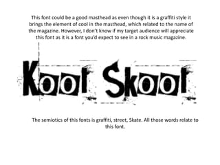
1. This font could be a good masthead as even though it is a graffiti style it
brings the element of cool in the masthead, which related to the name of
the magazine. However, I don’t know if my target audience will appreciate
this font as it is a font you’d expect to see in a rock music magazine.
The semiotics of this fonts is graffiti, street, Skate. All those words relate to
this font.
2. This font seems like a better masthead than the first one, as it seems more
child friendly. Children used to write in bubble writing so this font could
relate to them. It also seems like a more informal way of writing school and
I think it goes with how the font is spelt incorrectly.
When you see this font you think of children as children write in
bubble writing when writing a title, that is another good reason
why this is a suitable masthead.