
Recommandé
Contenu connexe
Tendances
Tendances (19)
En vedette
En vedette (16)
Similaire à Magazine screenshots
Similaire à Magazine screenshots (20)
Plus de Hannah Chyriwsky
Plus de Hannah Chyriwsky (20)
Dernier
Dernier (20)
Magazine screenshots
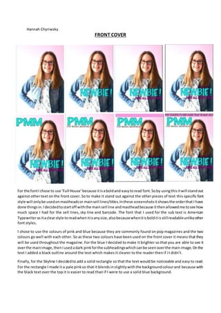
- 1. Hannah Chyriwsky FRONT COVER For the fontI chose to use ‘Full House’because itisaboldand easytoread font.Soby usingthisitwill standout against other text on the front cover. So to make it stand out against the other pieces of text this specific font style will onlybe usedonmastheadsor mainsell lines/titles.Inthese screenshotsitshowsthe orderthat I have done thingsin.Idecidedtostartoff withthe mainsell line andmastheadbecause itthenallowedme tosee how much space I had for the sell lines, sky line and barcode. The font that I used for the sub text is American Typewriterasitaclearstyle toreadwhenitisanysize,alsobecausewhenitisbolditisstillreadableunlikeother font styles. I chose to use the colours of pink and blue because they are commonly found on pop magazines and the two colours go well with each other. So as these two colours have beenused on the front cover it means that they will be used throughout the magazine. For the blue I decided to make it brighter so that you are able to see it overthe mainimage,thenIusedadark pinkforthe subheadingswhichcanbe seenoverthe mainimage.Onthe text I added a black outline around the text which makes it clearer to the reader then if it didn’t. Finally, for the Skyline I decidedto add a solid rectangle so that the text would be noticeable and easy to read. For the rectangle I made it a pale pinkso that it blendsinslightlywiththe backgroundcolourand because with the black text over the top it is easier to read than if I were to use a solid blue background.
- 2. Hannah Chyriwsky Just like the subheadings I used the same font and colour for the sell line titles.Thisisbecause theyare all sell lines sotheydothe same jobastheyare tryingtoattractpeople into buying the magazine. By making the text pink it is noticeable tothe readerbecause itisoverthe mainimage whichis blue alsobecause the textisnearto the mainsell line and masthead I don’t want it looking to similar because thenall of the textonthe frontcoverwill be blue. Thenfor the small descriptionsof the sell linesImade the text colour blue so that it the audience can see the difference between the sell lines and description. However,Ididuse adifferentblue becausethesepiecesof textaren’tasimportantasthe otherpiecesof textthatare in blue. Most magazineshave the barcode onthe righthandside of the magazine sothat’swhyI placedmine onthat particularside.Toput the barcode inI savedthe image so that I was able toput it ontothe magazine asa separate layerwhichmeantthatI could move it aroundeasier.The reasonwhyIput it ona pinkrectangle issothat the detailsaround it will be cleartoread,I put the price by the barcode because itis a noticeable place on where somebodywill lookforaprice if theyare goingto buy the product.
- 3. Hannah Chyriwsky CONTENTS PAGE For the subheadings the font I used was American Typewriter. The reason I used this font is because it is the same font as the sell lines and I only want to use two different fonts throughout the magazine. When writing the contents for my contents page I used the same font as it is a clear font to read, also because if I were to use ‘full house’ the font won’t look as good small because it is a bold style font so it will be hard to read. As descriptions are given on the contents page I made the subheadings larger and in capital letters so that it is clear to the reader where one piece of information starts and ends. So for the descriptions of what the page is about the text is smaller but still clear to read. For the contents pageI opened up a new document that was the same size as the front cover. Just like the front cover I have a pale pink rectangle at the top of the page. Then for the title I used the same font as I did for the masthead on the front cover. This is because in magazines the same font is used for the masthead and the title. Then for the title it is a similar size to the main sell line, which allows it to standout against the other pieces of text.
- 4. Hannah Chyriwsky DOUBLE PAGE SPREAD For the contentspage I needtoadd an image on soI chose one that linked inwiththe sell lines.Ipaceditovera pinkrectangle sothat it will have a borderaroundIt to make it more noticeable above the paintsplats.Forthe paintsplatsI usedpink andblue as theyare the mostcommoncolours usedthroughoutmymagazine.Iaddeda subscriptionbox asthatis a commonfeature ona contentspage.I createda secondcoverquicklyjust to add to the subscriptionbox tomake itclearthat there wouldbe a secondissue tocome out at the specificdate. For the double page spreadIdecidedtoputthe article and photosonseparate pages,mainlysothatthe layoutisclear.For the questionstobe clearagainst the answersI made thempinksothe readerwill know where one questionstartsandone ends.Toadd my article ontoInDesignIaddedthree textcolumnsand copy andpastedit fromthe word document. Imade the pull quote the same as the maintitle sothat it standsout againstthe textthat isaround it. Thenfor the mainimage because itismade up of fourseparate photosI made the mainimage on Photoshopsothatit will now be one image.