
Recommandé
Contenu connexe
Tendances
Tendances (17)
En vedette
Similaire à Progress towards my final magazine
Similaire à Progress towards my final magazine (20)
Dernier
Dernier (20)
Progress towards my final magazine
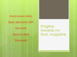
- 1. Progress towards my final magazine Hand drawn plans Basic electronic DTP First draft Second draft Third draft
- 2. Hand drawn front cover This is what I plan the magazine to look like. I will have two people (one girl and one boy) on the front cover with a prop being a guitar. The masthead will take up a large proportion of the space. I have included most of the sell lines that I will be using and have included some band names that will be featured.
- 3. Hand drawn contents This is how I plan for my contents to look like. The title will be slanted and will take up quite a lot of the page. I will have an editor’s letter in the left hand side which will make the magazine engage with the audience more and seem friendlier. I have a competition which would entice people into buying the magazine and an advertisement which would further show the interests of the audience. I will have various thumbnails so that the contents will not look plain as this may bore people.
- 4. Hand drawn double page This is how I plan to have my double page spread. I will have the title spread across both pages as this is quite conventional and I will also have many images so that the audience doesn’t lose interest quickly.
- 5. First draft of the magazine I will need to take a different picture as it is blurred and a little too dark. It does not suggest that they are in a band and so I have decided that it will be easier to just have a solo picture. I will take the picture with a different location.I also need to take a picture of a guitar and make sure that it does not look pixelated or blend in with the background, I will do this by taking a picture of my guitar. I also need to find a better barcode and change some of the colouring of the heading as they too blend in with the background.
- 6. DTP of Front Cover I felt that having two people on the front cover did not work as well as I wanted it to. Therefore I have decided to only have one person on the front cover. I have also changed where the textbox with all the bands will go as it was overlapping the artist too much. I have also chosen to not have a plain background and instead use the Leas Cliff Hall as this is were many concerts take place. I will have the sign on show so people will be able to link the artist to the venue.
- 7. DTP of Contents This is my contents page. I have not changed much but I feel that there is a lot of empty space that I could fill. I have taken out the advertisement and have replaced it with a space for a bigger contents image as it is quite conventional for a contents page to have a bigger image that focuses on the artist on the front cover.
- 8. DTP of Double Page This is my improved plan for the double page spread as I felt the other one did not have room for plenty of text.
- 9. Second draft I have changed the picture to one that may be more suitable and have moved around some of the headings. (The edges of the page have been cut off by publisher.) I have also moved around the headings to fill up all the empty space and lightened them to make them more readable.I decided to take the image in an underground tunnel to match the slogan; uncovered. This setting also had better light.Therefore I have decided to use the other images that I took outside of the Leas Cliff hall to put into my double page spread.
- 10. First Contents page I added a Editor's letter into the contents page as this seemed a popular feature with the Questionnaires. In the Editor's letter I have included many social networks that the magazine would use to get hold of unsigned bands. Mentioning the different social networks establishes how the magazine would get hold of the bands to do the interviews and allows the magazine to promote themselves online also.I added in a section about what is going on in the next issue. I used the Artic Monkeys as they were unsigned but now are not. This allows the readers to see what happens when bands do become signed.
- 11. Second Contents page I added in the images to the contents page and also changed the colouring of the text so that it would be more readable
- 12. Third front cover I decided to remain with my original idea of taking the photograph outside the Leas Cliff Hall as it had more music connotations. I moved the text box so that it did not obstruct the artist and enabled me to change the sell lines so that they would appear less crowded. I also changed the colour of the tag line so that it could be seen more and also so I could include red in my house style; a colour my audience wanted.
- 13. First double page This is the first complete draft of my double page spread. I have followed the DTP plan quite a lot.