
Recommandé
Contenu connexe
Tendances
Tendances (19)
En vedette
En vedette (9)
Similaire à Double page analyisisi
Similaire à Double page analyisisi (20)
Plus de Harryateccles
Dernier
Dernier (20)
Double page analyisisi
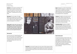
- 1. Salford City College Eccles Centre AS Media Studies Foundation Portfolio Colour This page uses a mainly monochromatic colour scheme for images and , as well as quite a high contrast, this gives the left model a slightly washed out and very flat white look, as well as making them stand out well against the brick background that is a deep black. Masthead The main title uses a bolb sans serif font to create a simplistic and clear title, a fade has been used on it to sart from a dull orange to a bright white. The title “Best of Both Worlds” is equallyspread over the two pages. Typefaces this magazine uses mainly sans serif fonts for titles, headers and pull quotes, but uses a more formal serif (similar to times new roman) for the main body of text, this is because serif is easierto read and for a large article needs to be easily accessible Main image The main image on this page depicts two male figures who are spread over the two pages and are quite distant, the image is also in black and white, adding simplicity andcontrasting agasint the masthead Photography Lighting the lighting on this page is mainly very harsh light, mainly from the front. This creates few shadows for the majority of the models but gives contrast around eyes and facial feautres, it also helps the image to be more in focus and defined, however this seems to’ve been edited out. Model creditThe model credit in this image shows two people, one of which is using direct address to look specifically at the readers, this makes them most likely to read the article as it appeals more greatly. The other model is giving a side profile of his face, this contrasts agasint the black brick background. Design Principles Used? The guttenburg design principle has been used in some ways for this page, the text starts in the strong fallow area, as does the left models head, leading to the weak fallow area we see information from the text and the lower half of the right model, this gives us enough to understand the given image while remaining clear and effective. Main cover line the main cover line of “abandoning their day jobs” has been placed in the strong fallow area and is very close to the model on the left, this has been done as it falls just under the masthead, and being similar colours, links them together House StyleThe house style of this page is the colour scheme of blacks oranges and whites, as well as a bold sans serif font which has been used both in the mast head and cover lines, as well as pull quotes, this highlights the most important areas of the text. The house style would also include the layout, two text columns have been used with the models filling the gaps on the end.
- 2. Salford City College Eccles Centre AS Media Studies Foundation Portfolio