1. FSPU
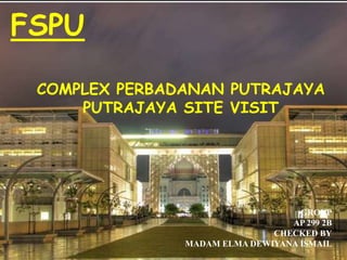
COMPLEX PERBADANAN PUTRAJAYA
PUTRAJAYA SITE VISIT
GROUP
AP 299 2B
CHECKED BY
MADAM ELMA DEWIYANA ISMAIL
2. PURPOSE
As we can see, visual information is everywhere. Television, computer
screens, signs, symbols, books, magazines, movies, and even body
language provide visual messages.
The purpose of this report is to discuss the design elements that we found from the
site visit at Complex of Perbadanan Putrajaya located near to the Persiaran Perdana
at Precinct 3. We observe the elements of this building by taking pictures with
cameras and compare the architectural parts also decorative motifs that used in the
building architecture from Classical times to the Modern age presently. Our
objectives to learn about design elements is now clearer for the visitation of the
complex.
3. INTRODUCTION
Our project is located at Precinct, the building of Complex Perbadanan
Putrajaya.It’s one of the symbols of Putrajaya heritage design. From the west
corner, located a mosque and at the east side of the building, is the Persiaran
Perdana, Judiciary complex The Istana Kehakiman.
Designed as a complex with attached reciprocal space that reflects a different
existence in Precinct 3, it’s a reflection of Islamic traditional architecture. The
main feature of the design is the gate with an area on top of the floor for the
guest that gives the most enchanting views throughout the nearer area including
the Judiciary complex and also the mosque. It’s also functioning as a an angle of
views for the guest for any events such as marching on the Independent day.
The main building consists of 4 main part that had been integrated with the
garden along the Persiaran Perdana, the open arcade is combined to be a
landscape “Laluan Qiblat” or known as Qiblat Walk. Along the Qiblat walk are
located the meeting and conference room that virtually looks like floating giving
the enchanting scenery. There is also, “The hanging Garden” that decorate the
top of the gallery giving a natural views from the ground area to the west of the
complex along the water garden spot.
5. DESIGN ELEMENTS
POINT
The point is the first and simplest element of visual
design. The point serves as the focus of a visual,
highlighting or drawing attention to important
information. Several points in combination may
showing a more complicated object or thought. For
example, constellations can be thought of as points in
the sky representing the figure we "see.“ A series of
points can attract attention, especially as they move
closer together.
6.
7. DESIGN ELEMENTS
LINE
Line is a identity that form by a point, its can
be in various shape. Power of horizontal line;
it can stop eye movement and its symbolize
relaxing and restoration. Other than that, line
can acts as a border, quickly visualize a shape
and produce a simple structure.
9. DESIGN ELEMENTS
SHAPE
Shape is form by the connection of the lines, and
defined as area that stand for color, texture, and
aesthetic value.
Shapes can vary endlessly and can suggest physical
form and direct eye movement.
Simple shapes are remembered and understood more
easily than complex shapes. The complex is roughly in
rectangular shape.
11. DESIGN ELEMENTS
VALUE
Value is the relative degree of lightness and darkness in a
design element. line, color, texture, and shape all need value
contrast in order to be seen. Value is used to describe objects,
shapes, and space.
Line, colour, texture, and shape all need value contrast
in order to be seen.
13. DESIGN ELEMENTS
TEXTURE
Texture is defined as the surface
characteristics of a material that can be
experienced through the sense of touch or
the illusion of touch.
In visual images, actual textures can be
used, such as cloth, boxes, small objects,
and natural items.
14. The finishing of the wall.
Steel Structure that decorates the Complex
at the Main gate.
15. DESIGN ELEMENTS
COLOUR
Colour is the part of light that is reflected by the object we see.
Colour is the part of light that is reflected by the object we see.
Colour appeals to children as well as adults.
The primary colours are red, yellow, and blue. They are called primary
because they are not mixtures of other colours.
Mixing any two primary colours results in a secondary colour.
The colour wheel is created when the primary and secondary colours are
placed in a circle.
16. COMPLEX PERBADANAN
Silver and Grey White and soft yellow a
giving a exclusive
sight
PUTRAJAYA good matching of color.
Green giving the peaceful
and fresh sight.
17. CONCLUSION
From our site visit at Putrajaya we can
determine the many of design, shape,
colour and more design element of
Complex Perbadanan Putrajaya. We also
can know about the architecture element
in building.