Falcon Invoice Discounting: The best investment platform in india for investors
Maga
1. Unit 01
A02 - describe the structure of media products
A03 - Explore and describe how meaning is created
ʻStructure and meaning of coversʼ
A good cover should
• Be recognizable from issue to issue
• Emotionally irascible
• Magnetic and curiosity arousing
• Intellectually stimulating
• Efficient, fast, easy to scan
• Logical
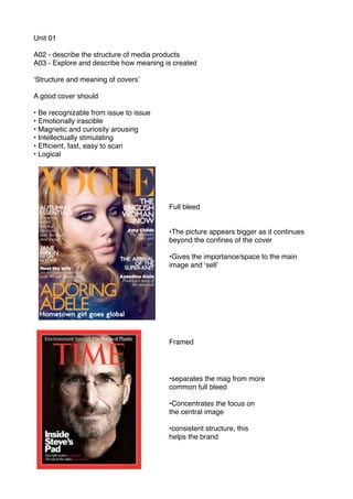
Full bleed
•The picture appears bigger as it continues
beyond the confines of the cover
•Gives the importance/space to the main
image and ʻsellʼ
Framed
•separates the mag from more
common full bleed
•Concentrates the focus on
the central image
•consistent structure, this
helps the brand
2. Multiple hit
•more cover hits appears to be
broader audience
•The importance is connected to the
size of the cover
•Logo and cover hits dominate the
design
•The content and brand is more
important than of the content
featured in one particular issue
The LOGO cover
•Cluttered and multi-hit cover
•little sense of content
•hierarchy- suggest enthusiasm and
passion
The compromise
3. The picture appears
bigger as it continues
beyond the confines
of the cover. Gives
the importance/space
to the main image
and ʻsellʼ
overlaid superman
over the masthead,
then also cover the
cover-hit with his fist.
Meant to create an
emotional
connections as there
they are attractive
people, then there
stance makes them
look powerful. The
ʻline time for changeʼ
is for people for
people who did not
like superman before
Masthead dose not
change from
issue to issue
Barcode goes in the
bottom left, to be out
of the way, the
publishers name also
goes here
The main cover-hit
has a typeface of its
own, this draws your
attention to it then
also looks 3D/stands
Exclusive makes the
reader feel like a part
of a club whoʼs
knows this
information
Multiple hit cover also with this bit at the
top for the people who already know
they donʼt like superman this shows
4. Meant to create an
emotional
connections as there
they are attractive
people, then there
stance makes them
look powerful. The
ʻline time for changeʼ
is for people for
people who did not
like superman before
Main title in the white
spot, this is the same
issue to issue
This shows that its a
movie review
magazine, but then
also the saying truth
builds trust.
They have put the barcode the in there logo this is
strange as itʼs meant to be the ugly but looks good
how they have done it
The image of
superman is really
well designed, you
can tell its him from
the hair, the neck and
the cape on the
shoulders. The way
its top lit you see no
eyes so this makes
him look mysterious,
but then also
powerful, and gives
you the sense that he
is looking at you
The type face is
important as it its
simple and the only
other piece of text on
the image
All of the cover that
appears blue is foil-
wrapped (shinny) this
makes it look really
nice and gives the
effect its expensive;
which it is for a
magazine, it cost £6
and is a monthly issue
They are not selling man of steel but using it
as a selling point, compared to the totalfilm
covert that tries to through so much
information about the film that you just want
to buy it because of that, but this cover
grabs your attention from the design