SlideShare une entreprise Scribd logo
1  sur  6
The yellow background generally  represents joy, in this case its used ironically, and contrasts with the grey representing the truth Connotations imply this is president bush Only real life image, perhaps insinuating that everything else around him is fake The film reveals the sketchy, shoddy work within the government, this font also presents that as it looks rushed. I am instantly attracted to this poster due to the strong meaning it already represents just from the pictures, it looks like an interesting film with a strong opinion to it  The use of animated images helps give the creator of the poster freedom to portray  any image however they like
The font is very understated and lets focus shift more to the main image of the penguins The images are very stereotypical for a documentary – depicting the main feature of the film The images are very realistic and reflect the realism of the film The colours used in the background are very dull and dreary, it could reflect the nature of the film, or more simply just the environment  the penguins live in. Again as stated with the title being understated, the layout draws attention to the main picture of the penguins
The tagline uses irony to create humour and hold the viewers attention. The purpose of this poster is to utilize the ironic humour to entice people to find out more about the film. The key image is very ironic as it shows the two holding hands, when the film is of Michael Moore criticizing president bush. The font used stands out easily as it juxtaposes the other colours in the poster I find the poster very humorous and bold, it shows the director is not afraid to mock the most powerful man in the country
The colours used pre-empt danger and misery with the grey monotone colours The font used is all very average, but a warning sign is used to make the word stand out and have much more effect The smoke is used to  portray what it is causing on a larger scale. The poster is laid out into two separate halves.  One with the main image, and the other with the text. The layout doesn’t work too well as the side with text looks rather bare and incomplete. I personally have little reaction to this, the colours don't catch my attention and the red font doesn't look good with the grey.
The poster is definitely aimed at an older audience, the word murder and the eerie picture clearly  show this is not child appropriate The main colours used are black and blue, often the colours  the viewer would associate with the police. The main picture shows a pair of worried eyes, in a clock that is at near midnight. The connotations of this are perhaps this person is running out of time for their life. The title text is all in blue, except the actually word blue. This uses irony to portray that not everything is what it seems. I feel the poster is laid out qite well, there are very few blanks spaces but at the same time its not overcrowded and too much.
The font is very cartoon-like, it makes it apparent already that this film is a comedy The white background used is very conventional for a comedy. It also insinuates its not a serious film, and even perhaps a little low budget. For me the poster doesn't particularly stand out, but by featuring Michael Moore on the front it would already draw attention, more than another director would on the poster. The pictures are all real and it gives the poster quite an organic feel, its very minimal and stripped back but does the job. The layout is very simple, with many blank spaces, none of which are particularly noticeable. The minimalistic feel of it makes it enticing as the average viewer can walk past, take a quick glance and take it all in.

Contenu connexe

Tendances

Tendances (20)

Movie poster research
Movie poster researchMovie poster research
Movie poster research
 
Film poster analysis
Film poster analysisFilm poster analysis
Film poster analysis
 
Psychological Thriller Poster + Website analysis
Psychological Thriller Poster + Website analysisPsychological Thriller Poster + Website analysis
Psychological Thriller Poster + Website analysis
 
The woman in black
The woman in blackThe woman in black
The woman in black
 
Woman in black poster
Woman in black posterWoman in black poster
Woman in black poster
 
Woman in black poster evaluation (1)
Woman in black poster evaluation (1)Woman in black poster evaluation (1)
Woman in black poster evaluation (1)
 
Textual analysis of a poster
Textual analysis of a poster Textual analysis of a poster
Textual analysis of a poster
 
Poster analysis
Poster analysisPoster analysis
Poster analysis
 
Poster evaluation
Poster evaluationPoster evaluation
Poster evaluation
 
That thing.. laura croft
That thing.. laura croftThat thing.. laura croft
That thing.. laura croft
 
Title Research
Title ResearchTitle Research
Title Research
 
Poster Analysis
Poster AnalysisPoster Analysis
Poster Analysis
 
Presentation2
Presentation2Presentation2
Presentation2
 
Film poster analysis
Film poster analysisFilm poster analysis
Film poster analysis
 
Deconstruction of Horror Posters
Deconstruction of Horror PostersDeconstruction of Horror Posters
Deconstruction of Horror Posters
 
Film noir poster research
Film noir poster researchFilm noir poster research
Film noir poster research
 
The conventions of a thriller poster and magazine cover
The conventions of a thriller poster and magazine coverThe conventions of a thriller poster and magazine cover
The conventions of a thriller poster and magazine cover
 
Film poster analysis
Film poster analysis Film poster analysis
Film poster analysis
 
Horror Movie Poster Deconstruction
Horror Movie Poster DeconstructionHorror Movie Poster Deconstruction
Horror Movie Poster Deconstruction
 
Film poster presentation
Film poster presentationFilm poster presentation
Film poster presentation
 

Similaire à Posters (20)

Poster Analysis
Poster AnalysisPoster Analysis
Poster Analysis
 
Poster Analysis
Poster AnalysisPoster Analysis
Poster Analysis
 
Further Research Into Film Posters
Further Research Into Film PostersFurther Research Into Film Posters
Further Research Into Film Posters
 
Poster analysis
Poster analysisPoster analysis
Poster analysis
 
Poster analysis me and hollz
Poster analysis me and hollzPoster analysis me and hollz
Poster analysis me and hollz
 
Poster Analysis x14
Poster Analysis x14Poster Analysis x14
Poster Analysis x14
 
Poster analysis
Poster analysisPoster analysis
Poster analysis
 
Media presentation
Media presentationMedia presentation
Media presentation
 
Bullet boy film poster analysis
Bullet boy film poster analysisBullet boy film poster analysis
Bullet boy film poster analysis
 
Bullet boy film poster analysis
Bullet boy film poster analysisBullet boy film poster analysis
Bullet boy film poster analysis
 
Ancillary task (film poster) research
Ancillary task (film poster)   researchAncillary task (film poster)   research
Ancillary task (film poster) research
 
Poster Analysis
Poster AnalysisPoster Analysis
Poster Analysis
 
3 Poster Analysis'
3 Poster Analysis'3 Poster Analysis'
3 Poster Analysis'
 
3. research(1)
3. research(1)3. research(1)
3. research(1)
 
Textual analysis film posters
Textual analysis film postersTextual analysis film posters
Textual analysis film posters
 
Film poster dirty, pretty things film analysis
Film poster  dirty, pretty things film analysisFilm poster  dirty, pretty things film analysis
Film poster dirty, pretty things film analysis
 
Ancillary task 1 posters
Ancillary task 1 postersAncillary task 1 posters
Ancillary task 1 posters
 
Ancillary Task 1 : Poster Analysis
Ancillary Task 1 : Poster AnalysisAncillary Task 1 : Poster Analysis
Ancillary Task 1 : Poster Analysis
 
Film poster analysis
Film poster analysisFilm poster analysis
Film poster analysis
 
Film poster analysis
Film poster analysisFilm poster analysis
Film poster analysis
 

Plus de JoeRobert

Object costume arrangement
Object costume arrangementObject costume arrangement
Object costume arrangement
JoeRobert
 
Unfinished double page spread
Unfinished double page spreadUnfinished double page spread
Unfinished double page spread
JoeRobert
 
Find your tribe
Find your tribeFind your tribe
Find your tribe
JoeRobert
 
Model organisation
Model organisationModel organisation
Model organisation
JoeRobert
 
Questionaire
QuestionaireQuestionaire
Questionaire
JoeRobert
 
Magazine analysationnnn
Magazine analysationnnnMagazine analysationnnn
Magazine analysationnnn
JoeRobert
 
Magazine analysationnnn 2
Magazine analysationnnn 2Magazine analysationnnn 2
Magazine analysationnnn 2
JoeRobert
 
Magazine analysationnnn
Magazine analysationnnnMagazine analysationnnn
Magazine analysationnnn
JoeRobert
 
Evaluation pp
Evaluation ppEvaluation pp
Evaluation pp
JoeRobert
 
Joe production log
Joe production logJoe production log
Joe production log
JoeRobert
 
Joe production log
Joe production logJoe production log
Joe production log
JoeRobert
 

Plus de JoeRobert (20)

Object costume arrangement
Object costume arrangementObject costume arrangement
Object costume arrangement
 
Unfinished double page spread
Unfinished double page spreadUnfinished double page spread
Unfinished double page spread
 
Find your tribe
Find your tribeFind your tribe
Find your tribe
 
Flat plan
Flat planFlat plan
Flat plan
 
Media pack
Media packMedia pack
Media pack
 
Model organisation
Model organisationModel organisation
Model organisation
 
Flat plan
Flat planFlat plan
Flat plan
 
Brain storm
Brain stormBrain storm
Brain storm
 
Logo
LogoLogo
Logo
 
Questionaire
QuestionaireQuestionaire
Questionaire
 
Magazine analysationnnn
Magazine analysationnnnMagazine analysationnnn
Magazine analysationnnn
 
Magazine analysationnnn 2
Magazine analysationnnn 2Magazine analysationnnn 2
Magazine analysationnnn 2
 
Magazine analysationnnn
Magazine analysationnnnMagazine analysationnnn
Magazine analysationnnn
 
Decades
DecadesDecades
Decades
 
Reflection
ReflectionReflection
Reflection
 
Analysis pp
Analysis ppAnalysis pp
Analysis pp
 
Evaluation pp
Evaluation ppEvaluation pp
Evaluation pp
 
Joe production log
Joe production logJoe production log
Joe production log
 
Joe production log
Joe production logJoe production log
Joe production log
 
Day 1
Day 1Day 1
Day 1
 

Posters

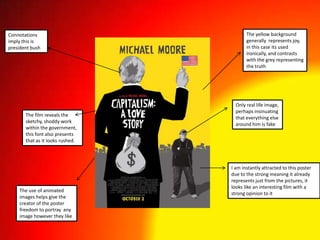
  • 1. The yellow background generally represents joy, in this case its used ironically, and contrasts with the grey representing the truth Connotations imply this is president bush Only real life image, perhaps insinuating that everything else around him is fake The film reveals the sketchy, shoddy work within the government, this font also presents that as it looks rushed. I am instantly attracted to this poster due to the strong meaning it already represents just from the pictures, it looks like an interesting film with a strong opinion to it The use of animated images helps give the creator of the poster freedom to portray any image however they like
  • 2. The font is very understated and lets focus shift more to the main image of the penguins The images are very stereotypical for a documentary – depicting the main feature of the film The images are very realistic and reflect the realism of the film The colours used in the background are very dull and dreary, it could reflect the nature of the film, or more simply just the environment the penguins live in. Again as stated with the title being understated, the layout draws attention to the main picture of the penguins
  • 3. The tagline uses irony to create humour and hold the viewers attention. The purpose of this poster is to utilize the ironic humour to entice people to find out more about the film. The key image is very ironic as it shows the two holding hands, when the film is of Michael Moore criticizing president bush. The font used stands out easily as it juxtaposes the other colours in the poster I find the poster very humorous and bold, it shows the director is not afraid to mock the most powerful man in the country
  • 4. The colours used pre-empt danger and misery with the grey monotone colours The font used is all very average, but a warning sign is used to make the word stand out and have much more effect The smoke is used to portray what it is causing on a larger scale. The poster is laid out into two separate halves. One with the main image, and the other with the text. The layout doesn’t work too well as the side with text looks rather bare and incomplete. I personally have little reaction to this, the colours don't catch my attention and the red font doesn't look good with the grey.
  • 5. The poster is definitely aimed at an older audience, the word murder and the eerie picture clearly show this is not child appropriate The main colours used are black and blue, often the colours the viewer would associate with the police. The main picture shows a pair of worried eyes, in a clock that is at near midnight. The connotations of this are perhaps this person is running out of time for their life. The title text is all in blue, except the actually word blue. This uses irony to portray that not everything is what it seems. I feel the poster is laid out qite well, there are very few blanks spaces but at the same time its not overcrowded and too much.
  • 6. The font is very cartoon-like, it makes it apparent already that this film is a comedy The white background used is very conventional for a comedy. It also insinuates its not a serious film, and even perhaps a little low budget. For me the poster doesn't particularly stand out, but by featuring Michael Moore on the front it would already draw attention, more than another director would on the poster. The pictures are all real and it gives the poster quite an organic feel, its very minimal and stripped back but does the job. The layout is very simple, with many blank spaces, none of which are particularly noticeable. The minimalistic feel of it makes it enticing as the average viewer can walk past, take a quick glance and take it all in.