
Recommandé
Contenu connexe
Tendances
Tendances (20)
En vedette
Similaire à Steps in creating my main article
Similaire à Steps in creating my main article (20)
Steps in creating my main article
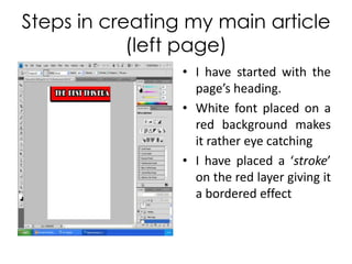
- 1. Steps in creating my main article (left page) I have started with the page’s heading. White font placed on a red background makes it rather eye catching I have placed a ‘stroke’ on the red layer giving it a bordered effect
- 2. Page reference I have used two layers to create this; firstly the textual layer and the background layer I have once again applied the ‘stroke’ feature to border the page number
- 3. Magazine’s web address is shown below giving readers the chance to catch up with more exclusives on potential websites
- 4. The intro into my double page spread’s main article
- 5. And following the intro is the interview with my artist. Question and answer structure Questions are in red and are in ‘italics’ making them stand out, also size of the font is ‘11’ The artist’s responses are followed, and are in black, as to distinguish the questions and answers.
- 6. A single image of the artist is applied. Rather large, capturing the readers attention. I have used digital manipulation to have the picture blended in seamlessly with the background
- 7. Image description is given, I have emulated what several iconic music magazines do in their products.
- 8. Steps in creating my main article (right page) Firstly the continuation of the header on both pages is needed. I have got the background and have placed it in the same location
- 9. The same font is applied to the text to get the same continuity. Same size ‘stroke’ is placed
- 10. Additional information such as the page number and the magazine’s web address is added to the page
- 11. The remaining article is inserted into the page
- 12. The composition of the article allows me to place an additional image of the artist Another image description is applied to let the audience know what is happening
- 13. I’ve added a flying quote into my main article as it is usually seen in magazines. Following from the response of the artist