
Recommandé
Contenu connexe
Tendances
Tendances (20)
En vedette
En vedette (19)
Similaire à Front cover analysis[1]
Similaire à Front cover analysis[1] (20)
Plus de Joshua-M
Plus de Joshua-M (20)
Dernier
Dernier (20)
Front cover analysis[1]
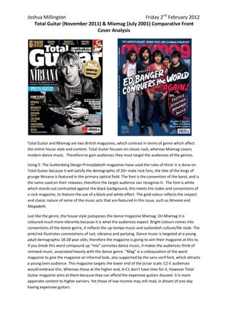
- 1. Joshua Millington Friday 2nd February 2012 Total Guitar (November 2011) & Mixmag (July 2001) Comparative Front Cover Analysis Total Guitar and Mixmag are two British magazines, which contrast in terms of genre which affect the entire house style and content. Total Guitar focuses on classic rock, whereas Mixmag covers modern dance music. Therefore to gain audiences they must target the audiences of the genres. Using The Guttenberg Design Principleboth magazines have used the rules of third. It is done on , Total Guitar because it will satisfy the demographic of 20+ male rock fans, the title of the kings of grunge Nirvana is featured in the primary optical field. The font is the convention of the band, and is the same used on their releases; therefore the target audience can recognise it. The font is white which stands out contrasted against the black background, this meets the codes and conventions of a rock magazine, to feature the use of a black and white effect. The gold colour reflects the respect and classic nature of some of the music acts that are featured in this issue, such as Nirvana and Megadeth. Just like the genre, the house style juxtaposes the dance magazine Mixmag. On Mixmag it is coloured much more vibrantly because it is what the audiences expect. Bright colours comes into conventions of the dance genre, it reflects the up-tempo music and outlandish culture/life-style. The pink/red illustrates connotations of lust, vibrancy and partying. Dance music is targeted at a young adult demographic 18-28 year olds; therefore the magazine is going to aim their magazine at this to. If you break this word compound up “mix” connotes dance music, it makes the audiences think of remixed music, associated heavily with the dance genre. “Mag” is a colloquialism of the word magazine to give the magazine an informal look, also supported by the sans-serif font, which attracts a young teen audience. This magazine targets the lower end of the jicnar scale; C2-E audiences would embrace this. Whereas those at the higher end, A-C1 don’t have time for it, however Total Guitar magazine aims at them because they can afford the expensive guitars disused. It is more apporiate content to higher earners. Yet those of low income may still read, in dream of one day having expensive guitars.
- 2. Joshua Millington Friday 2nd February 2012 Total Guitar (November 2011) & Mixmag (July 2001) Comparative Front Cover Analysis Every use of font on the front cover of Mixmag is sans-serif to make the magazine seem more fun and more about style/image than actual context, like Total Guitar. The use of the colour pink/red connotes a cheeky, sexy and mischievous atmosphere. Dance music is a much more niche genre compared to universal rock music. However the magazine can use this to their advantage as many young people of today are attracted to the idea of being unique and individual, this magazine offers that by giving a range of bands/artists. The other intention of doing this is to attract as many people as possible because these acts are not bankable ones, one of them won’t sell 1000s of copies. However the renowned Nirvana are extremely popular and bankable and would attract a very large demographic to the magazine. When the audience’s eyes move to the left, a large photograph of the rock icon, Kurt Cobain takes up the majority of the page. Total Guitar’s intentions here are to inform that this issue is heavily focused on him and his nineties band. It will be expected to be about two double page spreads inside. Cobain is stereotypically framed, from the mise en scene, it is evident the genre of this magazine, his: costume, facial expression, props, positioning and lighting is what the readers will expect. It is there preferred response. If he wasn’t: wielding a customised fender jaguar electric guitar, jaded facial expression, leather jacket, sat informally and in a black and white effect – readers will be confused and not purchase the magazine. For example, if he was: wearing a red sports jacket, in high key lighting, happy facial expression etc. Like the dance band Ed Bangers of the front cover of the dance magazine Mixmag (July 2011) audiences will be confused and perhaps not buy the magazine.