SlideShare une entreprise Scribd logo
1  sur  9
Detailed Analysis of Music Magazine
Front Cover
Typography
Withinthismagazine,the fonttypesusedare sansserif.Thisis
usedthroughoutthe coveras it’sseenasa fontthat isof a more
relaxedstyle whichisappealingtothe eye.Itconnotesa freshvibe
to the magazine tooas it looksverymodern. Thistype of font
standsout as it issimple,yeteffective.The writingisquite bold
whichengagesthe readertothe mastheadmore as the cover lines
are ina smallerfont,sowouldnotbe where the route of the eye
wouldgoto first. Anexample of thisis‘MILEY CYRUS’ as thiswould
engage the readersintomaybe buyingthismagazine todiscover
similarartiststoherself. The name of the magazine usesadifferent
style of fontto all the otherfonts on the magazine whichagain,lets
the mastheadsstandout.The fontusedisthinand wide which
givesthe magazine achic and fashionable look.The fontsalso
relate tothe targetaudience of women.All of the significantcover
linesare outlinedincapitalswhichhelptogive the magazine more
variety.The typographyusedisconventional forapopmagazine aimedatwomenas it’sbrightand
glamourous.All of the textusedisinblockcapitals,givingitamore engagingfeel.
Colour
The backgroundcolouris purple,implying agirlyatmosphere,however,thiscolourthengradually
fadesawaytowardsthe bottomof the magazine intoMiley’sdarkclothing.Thiscouldconnote
dangerand mysterywithinher.The Billboardlogoisincontrastwiththe backgroundcolourand is
silver.Usingthisbalancesthe magazine out.Thiscouldconnote glitzandglamourlike girlswouldlike
ina magazine.Usingthe blue andgreencolourinthe 0’s of the logomake the logostand outmore
as thiscolourisn’tusedanywhere elseonthe magazine cover.The colourgoldisusedwhich
connotesrichnessandglamour,like Mileyhas.The yellow mastheadsof the coverlinesandthe
advertisementonthe topleft,standoutamongstthe maincolour scheme,andsodrawsthe
audience toan importantpartof the frontcover, defined as‘don’tmiss’.The coverstoriesare
writtenina white colour,whichisincontrastto the title of the magazine andstandsout amongst
the rest of the colour onthe page.Thishelpstodisplaythe importance of the waythe coloursare
used. The coloursusedare conventional forthismagazine aspurple isassociatedtoafun,feminine
colourand, as the targetaudience are mainlyfemales,theywouldappreciatethiswhenlookinginto
buyinga musicmagazine fortheirselves.
Layout
The layoutof thismagazine istypical asit usedthe route of the eye andthe rule of
thirds.The mastheadisfirstat the top, whichisconventional aswiththe route of the
eye,thisiswhere the readerslookfirst.Thishelpthe audience recognise whattype
of magazine itis,thenthe mainimage (inthiscase MileyCyrus)tohelpthe readers
identifywhattype of contentiswithinthismagazine,withthe restof the coverlines
and textaroundthe edges toengage the readerevenmore.The rule of thirdsisused
too,havingthe face of the artist rightin the centre of the page.The leftthirdisseen
as the most dominantasishas the official musicchartlogoon show,whereasthe
rightthirdonlydominatesthe barcode.The magazine hasthe coverlinespositionedaroundthe
artist.Thisis conventional asthismakesthe artistlookmore superiortothe reader. The masthead
too ispositionedwithin,andoverthe leftthird.The reasonforthisisso whenthe readersare
lookingtobuya musicmagazine,theycansee all whattheyneedlike the masthead,cover
linesandthe content, suchas the musicfestival placedinthe leftthird, ata firstglance.
Thisis conventionalasthe readerswill be able tosee the mostinformativepartsof the
magazine,before evenpickingitupfromthe shelf. The layoutisn’tcluttered,it’sasiseasy
to navigate aroundwhilstreading. The orderedlayoutmakesitlookmore professional and
organised. Thismakesitmore invitingforthe targetaudience. The contentof the magazine
istypical as it relatestothe targetaudience beingmainlywomenwhowouldwanttoread
aboutthe artistsinthe contentlike JustinBieber.The musicfestival advertisementalso
relatestothe psychographicsanddemographicsof the channel asfemaleslike goingtofestivalsand
the musicwouldappeal tothemtoo,as well asbeingheavyinternetusersandpeoplewhoalways
keepupwiththe latestgossip/trendswhilstonsocial networks.Thisadvertisementbeinginthe
colouryellowmakesitstandoutfromthe restof the magazine cover. The rule of thirdsisused
placingthe artistMiley rightin the centre of the magazine as itdraws all the attentiontohermaking
herthe mainfocal point.Hereyesare focusedstraighton the reader,thiscouldsignifythatif you
readthe article,youcouldfindoutmore. Thismagazine hasa house style asit hascertainfeatures
and elementsthatthe readerwouldexpectforthismagazine.
Image
The image usedappealstothe target audience asit’sa youngfemale,MileyCyrus.The reasonthis
appealsisdue to mostof the targetaudience beingof afemale gender.Thismeanstheywould
engage withthe photoandwant to buythe magazine to be able to findoutmore about it.This
image would influencethe wayyoungwomensee themselvesineverydaylife fromtheirstyleof
outfits, astheyare fashionable, tothe make-upthattheyare wearingontheirface. The shottype
usedinthismagazine isa mediumclose up,muchlike apassportphoto. Thiscouldhave beenused
for the readerstoengage withthe celebrity. The imagesare conventionalforamusicmagazine as
the artist performedpopmusicwhenthismagazinewasout onsale.The target audience reading
thismagazine wouldalsobe veryfamiliarwiththe artist. The artistiswearingblackthough(mise-en-
scene),whichsignifiesdeath.Thisisunconventionalforthistype of musicmagazine.
Language/Mode of Address
The language usedonthe frontcoveris informative,andchallengesthe audience astowhetherthey
wantto findout more.Anexample of thisis‘What’sreallybehindthe DOJ’SITunesinquiry’.This
makesthe audience wanttoread more and findoutaboutthisevent.Thistype of coverline fitsin
withthe target audience astheywouldmostlybe aware withthe software of ITunes. These cover
linesare conventionalformusicmagazinesasitmakesthe frontcoverlookmore finishedandmore
excitingtoreadwhenshowingshortsnippetsof anarticle.The mode of addressisinformal as there
isthe use of the words‘biz’and‘tween’. Although,thisisconventional forapopmagazine asthe
target audience will relatetothese wordsandtheywill be able tofamiliarise them whichiswhythis
magazine haschosenuse thisspecificdialect.The magazine isverylaidback,yetinan order.This
couldrelate tothe type of people reading thismagazineastheyare feminine.Femalesare seenas
the more organisedgendersothisconnectioncanbe clearlymade. Thisalsohelpstoconvey the
‘pop’ vibe towardsthe reader.The tone of thisspecificmagazine isone whichusesexcitement.The
waythis hasbeenconveyedisthroughthe colourssuchas purple andblackas theycontrast well
togetherinorderfor the frontpage to stand out. As there isonlyone image,thishelpsthe audience
to engage withthe covermore and as well,the publishers,PrometheusGlobal Media, have chosen
to use appealingcoverlinesinwhatthe targetaudience wouldbe interestedinsuch as‘ITunes’and
‘JustinBieber’.Thiscanalsobe classedasintertextualitythatthe readerswouldbe more familiar
with.
Conventions
I have chosento mentionmostof the conventionsforthismusicmagazine throughoutmyanalysis,
such as the layoutof the magazine inthe ‘route of the eye’and‘rule of thirds’,aswell asthe colours
used.The frontcover associatestothe popmusicgenre as there are bright,girlycoloursused
throughout,basicallycancellingthe blackof MileyCyrus’outfitout andpurple beingthe
predominantcolourdue tothe targetaudience beingmostlyfemales.Itisalsoseenasa magazine
whichcouldbe quite exciting. Thisisshownthroughthe image usedonthe frontasthe target
audience mayidoliseherorknowher. One of the bestconventionsisthe mode of address.Thisis
because itreallydeterminesthe type of audience,andwhetherthey wouldliketoreadthe magazine
as theyneedtobe intriguedin the contenttheywouldbe reading. If MileyCyruswastalkingabouta
topicthat the readerswouldnotbe interestedin,thenthere wouldbe nopointingivingthe article a
place inthe magazine.
ContentsPage
Typography
The fontson thispage are a mixture of serif andsans-
serif.Thismakessome of the textstandout more than
otherssuch as ‘contents’, ‘No1’and‘home front’.This
bringsan elementorseriousness,yetexcitementto
thispage,whichwouldmake the readermore excited
to start readingthe magazine asthere are so many
interestingthingstoreadabout,such as the musicin
the charts, to the latestgossipfrommajorselling
artists. The mastheadhas a stencil effectforwhich
givesita modern,standingouteffectandisinblock
blackcolourto make itengage the reader. All this
relatestothe target audience of femalesastheyare
encouragedtoreadit. However,the fontsdoseem
more male relatedtothat on the frontpage,so are
more unconventionalthanusual. The wayinwhichthe
imagesandarticle typesare numbered,give thispage
more of a life andfun-filledfeel towardsthe audience
as theywouldwantto readon. The ‘contents’textis
writtenatthe topof the page,as thisis where peoplewouldnormallylookfist.Itconnotesasense
of superiorityandwealth/originalitytothe magazine,aswell asrelatingtothe targetaudience,
wantingtoread a magazine thatis fun,butinformative atthe same time. Itconnotesa sense of
independencetooasthisis one of the onlytypesof magazine thatusesthistype of fontina
magazine thatismainlytargetat women. Itremindsthe audience thateventhoughthisis
stereotypicallyassociatedwithwomen,mencanreadit too. There are alsosome kickersusedand
pull quoteswhichare usedtograb the readerintothe contentspage,justlike the onesthatwere
usedon the initial magazine. The use of a subheadinginthe bottomrightcoverconnotesasense
that typographyisveryimportantforthismagazine asit helpsthe readerintopointingintoareas
whichtheyshouldreadintofirst.
Colour
The colourson the inside contentspage donot follow the conventional colourscheme of yellow,
silver,purple andblack.Instead, theyuse white,black,blue andgrey.The greycolourisusedforthe
musiccharts, on the leftside of the page,whilstthe white isusedasthe backgroundcolourandthe
blackand blue are usedfor emphasisoncertainpartsof the page and forthemto stand
out/contrast.These coloursare usuallyassociatedwithmalessodonotrelate tothe targetaudience
at all.The contentspage hasa whole differentfeel andvibe tothe frontcover.Italmostfeelsasif
theyare fromtwocompletelydifferentmagazines. The white bringsinasense of freshnessand
puritywhichcouldlinkintoall the articlesbeingnew andonesthathave neverbeenseenbefore.
Thisis whatpeople wouldwanttosee withinthistype of magazine.The blue couldrepresent
happinessasit’sa lightblue.Thiscouldbe whatthe publisherswantthe readerstofeel whenthey
are lookingatthe magazine. The black,again,represents death, soit’sprobablyonlyusedforthe
certainparts of the page to standout more than the rest. The highlightedarticlesandimagesare
clearlythe mostimportantpartsof thisspecificmagazine,withthe restof the articlesbeingina
smallerblackfontas theyare lessimportant.Usingthese differenttypesof colourshelptodraw in
the audience froma distance away.
Image
Some of the imagesusedappeal tothe targetaudience,howeversome of themdonot.This isdue
to the target audience whowouldbe readingthis,wouldn’t alwaysbe familiarwiththe artists
featured.I,asa girl,donot have a clue whoany of these artistsare and itdoesn’tgive any
informationonthe contentspage asto whotheyare either. Thismagazine isanAmericanbased
one,therefore thisartists mustbe more famousinAmerica,thaninthe UK musicindustry. From
whatI know,theymustbe or a musicbackgroundoriginas if theywasn’t,theywouldn’tevenbe
featuredwithinthisarticle.The publishersof thisarticle have chosentovarythe shot typesof the
images.Thismakesitmore excitingtolookatfor the readeras it isn’tjusta plain,boring,style.
Examplesof thisare that theyhave useda wide shotwithinthe image onthe leftof the magazine to
showthe personand theirsurroundings.The nexttwoimagesare more of a close-upshot.This
engagesthe characterwiththe person/artistastheyare able tosee theiremotionandhow theyare
feeling. A lastshottype usedisa mediumclose-up.Thisshowsthe whole bodyof the personandis
almostcentredinthe middle of the page.Thiscouldhave beenusedtomake sure that the reader
seesthisimage first,andthenthe onesforthe cover stories. However,usingthistype of shotis
unconventional foramusicmagazine asthe readerslike toquicklyidentify whothe people are,yet
usingthisshotmakesit more difficultforthemtodo this. The mise-en-scene usedonthisimagesis
high-keylightingas thishelpstomake all the imagesstandout.The image of the man in a close up
makeshimlookquite dominantashe lookslike he’spokingoutatthe screen. The costume thatall
the people are wearingare all seenascontemporaryandmodern.Theyare all fashionable and
wouldappeal tothe target audience astheywouldrelate tothe clothesandmightevenwanttobuy
them. The imagesare conventional forthisgenre of magazine asthese artistsandconventional to
the pop musicindustry.
Layout
The contents page has an orderedlayout.Thisfollowsthe patternof the
frontcover beingorderedtoo.Thisgivesafeel thatthe publishersof this
magazine wantedittobe a verymodern,yetsophisticatedmagazine. It
wouldappeal tothe target audience astheywouldeasilybe able toread
and navigate aroundthe page due to certainparts of the page,having
certainplacesto be. The route of the eye isused.Firstly,the readerssee the
masthead,inthiscase thisis the ‘contents’.However,due tothe sizing,they
mightalsosee the ‘No.1’.Thisisusedto helpthemrecognise whatpage
theyare onand to recognise the magazine even
more,than justfromthe front cover. Then,itgoes
throughto what ison eachpage of the magazine in
orderto helpthe readersnavigate arounditeasily.
Withinthis,the chartspart of the magazine whichis
positionedtothe leftof the page,comesinto eye line.The publishershave
usedthistechnique inorderforthe readerto now engage onthat too,and
not justskipoverit.Lastly,there are some longerfeaturespositionedatthe
verybottomof the contentspage. Thisgivesasneakpreview intowhatthe
magazine will include andgivesthemadditional information.Subheadings
are usedabove eachsectioninorderto space out the writingandgive itan
organisedfeel toit. Thiswill encourage the readerstowantto readthe full
article,sotheywill readon. All of these positionsare conventional asthey
start fromthe mostimportant,toleastimportantpart of the page. The rule of thirdsprinciple isalso
used.The mainpart of the contentspage isin the verycentre third.Thisisconventional forthispage
as it’smeantto be an informative page sothe readerscanfindout exactlywhatwill be featuredin
thisspecificmagazine. The route of the eye alsogoesstraightthroughthe middle of the page sothis
isanotherreasonwhythe mostinformative partsare positionedthere. The thirdleftatthe topof
the page,has beenused forthe chart billboard.Thisrelatestothe real magazine name.Thisinforms
the readersaboutthe hottestcharts/singlesof the week.Thisisconventional asit’samusic
magazine soshouldinclude thingsaboutthe charts.Choosingtouse alayoutof a billboardto
achieve this,reallygivesafeel tothe magazine asitmakesthe readersfeel thatthe magazine has
reallybeenthoughtaboutandnotjuststuck together. Thisisthe mostdominantside of a page,
hence whythe publisherschose topositionit there. Whenthe readersopenthismagazine,thisis
the side whichtheywill see firstsowill like this. The magazine name ispositionedinthe thirdleft
too. The writinghasbeenplacedina veryspecificwayaroundthe image of the womantoo.As she is
crouchingdown,theyhave chosentoplace the writingaroundher.Thismakesthe contentmore
interestingandintriguingforthe audience.
Language/Mode of Address
The language usedonthe contentspage isquite formal.Thiscouldbe due tothe magazine
publisherswantingthe reader’s firstimpressionstobe goodones,especiallywiththe target
audience beingmainlyworkingwomen. Itincludescoverlineslike‘upfront’and‘features’which
wouldn’tbe usedineverydayconversation/language.Thiswould make the audience wanttoread
intoit more as the language isverysophisticatedandmodern.The languageusedvariesassodothe
coverlinesinorderforit to appeal toany person,as differentpeople have differenttastessothere
needstobe somethingforeveryone.Examplesof thisare ‘countrymusic’and‘Latinmusic’.These
are twoverydifferentcontrastinggenresof music,therefore the publishershave done theirjobto
give somethingforeveryone.The mode of addressismore formal onthe contentspage than itis on
the front coverof the magazine.Thisisdue tousingthe wordsthat I have alreadyspokenabout
earlieroninthisparagraph. It is conventional forthistype of magazine asitrelatestoall the genres
inwhichthisAmericanmagazine portrays. Italsohas to appeal toa target audience thatismainly
women,however,the contentspage failstodothisas not all womenwouldwant toread intoso
much detail,theywouldjustwanttoknow the facts. It failstouse the dialectthatthe target
audience wouldbe familiar.It’smore eccentricandover-the-topthansome magazinesusuallyare of
thisgenre. The magazine speakstoitsaudience inaveryinformative manner,like all of theirreaders
are seenasimportantto them.Thiscouldbe due to these kindsof wordsrelatingtothe professions
that theirreadersdosuch as workinginan office.Theycouldfeel asense of securitywhilstreading
this,feel athome andin an environmentinwhichtheyfeel comfortable in. Thismagazinehasavery
informative tone toitthroughthe use of primary,contrastingcoloursandby usingveryspecific
image shotsas well asappealingfontsandwordslike ‘Ineveryissue’and‘Live fromPuertoRico’.
Conventions
I have chosento mentionmanyof the conventionalelementsof thiscontentspage
throughoutmyanalysis.However,one of the conventionsisthatthe publishershave chosen
to keepthe Billboardlogoonthe lefthandside of the page. Thisistraditional tohave ona
contentspage,therefore itsignifiesthatBillboardisaveryprofessionalcompany. Thisis
conventional asthisiscarryingthe mastheadonfrom the frontcoverintothe contentspage.
The contentspage is less conventional thanthe actual frontpage of this magazine asit
doesn’tuse the conventional coloursthatare associatedwithfemaleslike pinkandpurple
etc.It is also conventional due tothe layoutasithas contentslistingsandsmallerimages
whichhelpindicate smallerarticles. All the imagesusedrelateto the genre of the magazine
and the articles tooas theyall relate tothe widergenre of itjustbeingaboutmusicitself.
Thismakesit more eye catching. The layoutiswell orderedandstructured meaningthatitis
easyfor the readerto navigate around.Thisconnotessophistication.
Double Page Spread
Typography
The fontsusedacross thisdouble
page spreadare serif andsans
serif.Sansserif isusedasthe
mastheadof the spread.This
couldhave beenusedasit’sa
more relaxedfontandismore
appealingtothe eye.Itconnotes
a freshand youngvibe toit.The
boldtextof the font usedfor
‘PrimaryColours’andthe red
colourusedbehindithelpsitto
be more appealingtothe eye
and helpsthe audience be more
engagedwithinwhatthisarticle
mightbe about. The serif fontis usedfor the standfirstinorderforthe audience tosee itand read
more informationonthe article before readingthe whole of it. Aswell asthis,the Byline isinthe
same font,but isinitalicsso can be seenevenmore clearlywhilstthe restof the otherfontsare
aroundit. The whole article isinthe sansserif fontwhichhelpsthe readerengage intoitagain,as,if
it wasin an olderlookingfont,like serif,thentheywouldn’twanttoreadthe article as much as it
wouldn’tlookverymodernorsophisticatedlike articlesinthe Billboardmagazine shouldbe. The
publishershave alsocleverlychosentocall the article ‘primarycolours’.Thiscontrastswiththe
coloursthat are presentonthisdouble page spreadastheyare red andblue.The typographyis
bright,cheerful andfun. Thissubconsciouslyallowsthe targetaudience tofindthisstyle of font
more appealingtotheireye. The typographyisconventional foramainlypopmagazine genre as
theyhave an energetic,funkyfeeltothem. The whole of the mastheadiscapitalised, once again
givingitan energeticfeel. The ‘Billboardbiz’ logointhe bottomrightof the page isalsoassociated
withthe restof the page as it’swritteninaprimarycolour again. A kickerisalsousedat the start of
the copy witha ‘T’.This has beenusedtograb the readersin,yet,alsoitcouldrelate to the artist,
withhername being‘Taylor’.
Colour
The main coloursusedare red,blue andblack forthe article.The reasonthe publishershave chosen
to use these coloursonthisdouble page spreadisdue to thembeing‘primarycolours’thatrelate to
the mastheadof thisarticle. RedcouldlinktoTaylor Swift,the artist’s,album.Yellow couldconnote
happinessandfun,whichiswhatthe readerwouldwantto feel whenreadingthisarticle.The grey
backgroundbringsa sense of sophisticationtoitas greyis associatedwithbusinesswomenwho
wearsuitsetc. The mastheadiswrittenina differentcolourtothe mainarticle,makingitbe the first
thingthat the audience looksatonthispage. Thisclearlydisplayswhatismore importantand
attractive to the readers. Theylookat the keycomponents,beforethe rest. The coloursusedare
conventional asthismagazine like tocreate a funand energeticfeel toall theirarticles,inhope that
people willalwaysgetthe nextmagazineafterreadingtheircurrentone.
Image
The image usedappeal tothe targetaudience asthe personinthe image isa celebritywhothe
target audience of thismagazine will be familiarwith,(TaylorSwift).Thisimage will influence the
target audience of mostlywomen,due totheirstyle,make-up,ortheirline of business.Inthiscase,
a musiciananda fashionicon. The shottype usedis a wide shot.Iknow thisas it showsthe
surroundingsandbackground of the artist,as well asshowingherwhole body. Thisenablesthe
audience toreadaroundthe artistand recognise themfromfarawayeasily. The clothesshe has
chosento wearare quite casual,however,theyare quite fashionable atthe same time. Taylorisalso
seentobe quite youthful,confidentandgood-looking.Thisup-to-dateoutfithelpstoconnote the
modernvibe of thismagazine,aswell asimage consciouspeople. Thisisaconventionalwayto
displaythe artistas ithelpsgrabthe readerin. Thiscan encourage girlsthattheydon’thave to wear
the most fashionableclothestobe able tostand out fromthe crowd. The image usedisconventional
as the artist performsmusicsorelatestothe overview of the Billboardmagazine.TaylorSwiftisalso
recognisedbymanypeople,socanbe identifiedreallyeasily.
Layout
The layoutof thisdouble page spread hasa simple,yetorderedlayouttomake itmore
sophisticated.Thiswouldappeal tothe Targetaudience asitconnotesa more organisedmannerto
it.This double page spreadusesroute of the eye,drawingthe
audience acrossthe mastheadtohelpthemrecognise whatthe
article will be about,thentothe coverartist,to intrigue theminto
readingthe article,andthen across to the contentsof the actual
article,whichencouragesthe wideraudienceassomeone may be
intriguedintowhatthe contentistalkingabout. The masthead isn’t
veryconventional.Thisisbecause theyare usuallyinthe topleft
corner,howeverthisisinthe right.Thiscouldbe because the
publisherswantthisspecificarticle tostandout. The neatorganisationof the textonthe right hand
side of the spreadconnotessophistication. The principleof thirdsisalsoused.Thisisbecause onthe
vertical lines,boththe image of TaylorSwiftandthe copyare there forthe readersto clearlysee.
Alongthe horizontal lines,the same thingsare there,inordertoyetagain,give the spreada sense of
sophisticationandmodernity. The publishershave alsochosentoplace the image of TaylorSwifton
one complete side of the double spread.Thisengagesthe audience withthe artist theyare reading
due to the organisedlayoutof thisspreadasit’sseenas more eye-catchingandoriginal.The vertical
textof the article andthe horizontal image contrasttogethertoletthe reader’s eyeseasilytravel
across the page,lettingthemviewthe entire article.
Language/mode of address
The language usedonthe frontcoveris sophisticatedandmightexcite the audience intowantingto
readthe copy.For example the caption‘The storybehindTaylorSwift’sblockbuster‘Red‘,makes
the audience wanttoread itand challenge whatitsays,as it’slikelytheywillbe able tofindout
more about thiswhenreading onfromthe standfirsttothe copy. Thisstandfirstisusedwell asit
exaggeratesthe mostinformative partsof the copy,makingmore readerswanttofullyreadon.The
mode of addressis formal, withthe use of the words‘palette’and‘experiences’.Thisisseenas
unconventional forthe Billboardmagazine asit’smeanttoseem‘hip’and‘downwiththe kids’kind
of style,howeverthisspecificarticle ismore formal whichwill be able tointriguemore thanone
type of specificaudience. The double spreadspeaksinaverymodernandsophisticatedmanner,
whichrelatestowhatthe targetaudience wouldwant.The spreadalsoaddressesthe audiencein a
conventional way,byusingastandfirsttostart the copy/article off.The tone of the magazine is
intriguingandsophisticated.Thisisshownthroughthe use of brightprimarycolours,abig clear
image andappealingwordsthatrelate tothe artist suchas ‘emotions’and‘songwriters’.
Conventions
I have chosento mentionmostof the conventionsforthisdoublepage spread,throughoutmy
analysis.Examplesof conventionsae the brightuse of typographyandthe imagesusedrelatingto
the musicgenre.TaylorSwiftwill be afamiliarfigure thatthe targetaudience will know,like or
idolise.The magazineassociatesitself throughthe predominantuse of primarycolourswhichrelate
to the target audience.A keyconventionisthe mode of address,whichplaysakeyparton whether
people willchoose toreadthisspecificarticle ornot.Anotherconventionisthat the content
includedinthisarticle issomethingthatthe audience will be able torelate toquite easily. A last
conventionisthatthe copy/article textisarrangedincolumns.Thismakesthe texteasiertoread
and lookmore professional,aswell asmakingthe audienceinterestedtoreadon.
Detailed analysis of music magazine

Contenu connexe

Tendances

Audience Feedback On My Production Improvements
Audience Feedback On My Production ImprovementsAudience Feedback On My Production Improvements
Audience Feedback On My Production ImprovementsKatieWoodcock1
 
Audience Feedback on my Pitch and Planning
Audience Feedback on my Pitch and PlanningAudience Feedback on my Pitch and Planning
Audience Feedback on my Pitch and PlanningKatieWoodcock1
 
College Media Evaluation
College Media EvaluationCollege Media Evaluation
College Media Evaluationgueste0c63f
 
Magazine Research
Magazine ResearchMagazine Research
Magazine Researchkdhcsgo
 
Media Evaluation
Media EvaluationMedia Evaluation
Media Evaluationkdhcsgo
 
Evaluation question 5
Evaluation question 5Evaluation question 5
Evaluation question 5Will Kearse
 
As media magazine evaluation
As media magazine evaluationAs media magazine evaluation
As media magazine evaluationImoMoody
 
Keiron bradbury
Keiron bradburyKeiron bradbury
Keiron bradburyafrench14
 

Tendances (18)

Audience Feedback On My Production Improvements
Audience Feedback On My Production ImprovementsAudience Feedback On My Production Improvements
Audience Feedback On My Production Improvements
 
Audience Feedback on my Pitch and Planning
Audience Feedback on my Pitch and PlanningAudience Feedback on my Pitch and Planning
Audience Feedback on my Pitch and Planning
 
Question 1
Question 1Question 1
Question 1
 
Question 2
Question 2Question 2
Question 2
 
College Media Evaluation
College Media EvaluationCollege Media Evaluation
College Media Evaluation
 
Evaluation 5
Evaluation 5Evaluation 5
Evaluation 5
 
Front cover analysis
Front cover analysisFront cover analysis
Front cover analysis
 
Front cover analysis
Front cover analysisFront cover analysis
Front cover analysis
 
Front cover analysis
Front cover analysisFront cover analysis
Front cover analysis
 
Front cover analysis
Front cover analysisFront cover analysis
Front cover analysis
 
Front cover analysis
Front cover analysisFront cover analysis
Front cover analysis
 
Front cover analysis
Front cover analysisFront cover analysis
Front cover analysis
 
Magazine Research
Magazine ResearchMagazine Research
Magazine Research
 
Evaluation
EvaluationEvaluation
Evaluation
 
Media Evaluation
Media EvaluationMedia Evaluation
Media Evaluation
 
Evaluation question 5
Evaluation question 5Evaluation question 5
Evaluation question 5
 
As media magazine evaluation
As media magazine evaluationAs media magazine evaluation
As media magazine evaluation
 
Keiron bradbury
Keiron bradburyKeiron bradbury
Keiron bradbury
 

En vedette

En vedette (15)

Promotional Package Analysis
Promotional Package AnalysisPromotional Package Analysis
Promotional Package Analysis
 
Comparison Of A Real Music Magazine And My Own
Comparison Of A Real Music Magazine And My OwnComparison Of A Real Music Magazine And My Own
Comparison Of A Real Music Magazine And My Own
 
Content Analysis
Content AnalysisContent Analysis
Content Analysis
 
Risk Assessment
Risk AssessmentRisk Assessment
Risk Assessment
 
Production Schedule
Production ScheduleProduction Schedule
Production Schedule
 
Shot List
Shot ListShot List
Shot List
 
Abandoned Script
Abandoned ScriptAbandoned Script
Abandoned Script
 
Abandoned Script 2
Abandoned Script 2 Abandoned Script 2
Abandoned Script 2
 
Abandoned script 2
Abandoned script 2Abandoned script 2
Abandoned script 2
 
Abandoned script
Abandoned script Abandoned script
Abandoned script
 
Magazine Analysis
Magazine AnalysisMagazine Analysis
Magazine Analysis
 
Real draft text for magazine double page spread
Real draft text for magazine double page spreadReal draft text for magazine double page spread
Real draft text for magazine double page spread
 
Production Plan Grid
Production Plan GridProduction Plan Grid
Production Plan Grid
 
Mood board
Mood boardMood board
Mood board
 
Draft layout for front cover
Draft layout for front coverDraft layout for front cover
Draft layout for front cover
 

Similaire à Detailed analysis of music magazine

Market research
Market researchMarket research
Market researchKaris Hays
 
Format research of music magazines
Format research of music magazinesFormat research of music magazines
Format research of music magazinesellisputnam
 
Market research
Market researchMarket research
Market researchKaris Hays
 
Media evaluation- Question 3
Media evaluation- Question 3Media evaluation- Question 3
Media evaluation- Question 3lucy_richmond
 
Detailed analysis of music magazine
Detailed analysis of music magazineDetailed analysis of music magazine
Detailed analysis of music magazineginagoodall
 
Task 3 research bmth
Task 3 research bmthTask 3 research bmth
Task 3 research bmthasmediae15
 
Magazine analysis
Magazine analysisMagazine analysis
Magazine analysismillerjess
 
Magazine analysis
Magazine analysisMagazine analysis
Magazine analysismillerjess
 
Media evaluation - Question 3
Media evaluation - Question 3Media evaluation - Question 3
Media evaluation - Question 3lucy_richmond
 
Anna rockall media evaluation
Anna rockall media evaluationAnna rockall media evaluation
Anna rockall media evaluationarockall
 
Music magazine research
Music magazine researchMusic magazine research
Music magazine researchbroganl4
 
Task 3 music magazine analysis, Front cover and Contents pages
Task 3  music magazine analysis, Front cover and Contents pagesTask 3  music magazine analysis, Front cover and Contents pages
Task 3 music magazine analysis, Front cover and Contents pageseleanorwardmedia
 
Initial introductory task 1
Initial introductory task 1Initial introductory task 1
Initial introductory task 1asmediad14
 
Contents page analysis
Contents page analysisContents page analysis
Contents page analysisMina Yaqin
 

Similaire à Detailed analysis of music magazine (20)

Market research
Market researchMarket research
Market research
 
Format research of music magazines
Format research of music magazinesFormat research of music magazines
Format research of music magazines
 
Market research1
Market research1Market research1
Market research1
 
Market research
Market researchMarket research
Market research
 
Media evaluation- Question 3
Media evaluation- Question 3Media evaluation- Question 3
Media evaluation- Question 3
 
Front cover overview
Front cover overviewFront cover overview
Front cover overview
 
We Love Pop Overview
We Love Pop OverviewWe Love Pop Overview
We Love Pop Overview
 
Detailed analysis of music magazine
Detailed analysis of music magazineDetailed analysis of music magazine
Detailed analysis of music magazine
 
Task 3 research bmth
Task 3 research bmthTask 3 research bmth
Task 3 research bmth
 
Magazine analysis
Magazine analysisMagazine analysis
Magazine analysis
 
Magazine analysis
Magazine analysisMagazine analysis
Magazine analysis
 
Media evaluation - Question 3
Media evaluation - Question 3Media evaluation - Question 3
Media evaluation - Question 3
 
Task 1 + 2
Task 1 + 2Task 1 + 2
Task 1 + 2
 
Contents page analysis
Contents page analysisContents page analysis
Contents page analysis
 
Anna rockall media evaluation
Anna rockall media evaluationAnna rockall media evaluation
Anna rockall media evaluation
 
Music magazine research
Music magazine researchMusic magazine research
Music magazine research
 
Task 3 music magazine analysis, Front cover and Contents pages
Task 3  music magazine analysis, Front cover and Contents pagesTask 3  music magazine analysis, Front cover and Contents pages
Task 3 music magazine analysis, Front cover and Contents pages
 
NME ANALYSIS
NME ANALYSISNME ANALYSIS
NME ANALYSIS
 
Initial introductory task 1
Initial introductory task 1Initial introductory task 1
Initial introductory task 1
 
Contents page analysis
Contents page analysisContents page analysis
Contents page analysis
 

Dernier

Barangay Council for the Protection of Children (BCPC) Orientation.pptx
Barangay Council for the Protection of Children (BCPC) Orientation.pptxBarangay Council for the Protection of Children (BCPC) Orientation.pptx
Barangay Council for the Protection of Children (BCPC) Orientation.pptxCarlos105
 
call girls in Kamla Market (DELHI) 🔝 >༒9953330565🔝 genuine Escort Service 🔝✔️✔️
call girls in Kamla Market (DELHI) 🔝 >༒9953330565🔝 genuine Escort Service 🔝✔️✔️call girls in Kamla Market (DELHI) 🔝 >༒9953330565🔝 genuine Escort Service 🔝✔️✔️
call girls in Kamla Market (DELHI) 🔝 >༒9953330565🔝 genuine Escort Service 🔝✔️✔️9953056974 Low Rate Call Girls In Saket, Delhi NCR
 
Judging the Relevance and worth of ideas part 2.pptx
Judging the Relevance  and worth of ideas part 2.pptxJudging the Relevance  and worth of ideas part 2.pptx
Judging the Relevance and worth of ideas part 2.pptxSherlyMaeNeri
 
HỌC TỐT TIẾNG ANH 11 THEO CHƯƠNG TRÌNH GLOBAL SUCCESS ĐÁP ÁN CHI TIẾT - CẢ NĂ...
HỌC TỐT TIẾNG ANH 11 THEO CHƯƠNG TRÌNH GLOBAL SUCCESS ĐÁP ÁN CHI TIẾT - CẢ NĂ...HỌC TỐT TIẾNG ANH 11 THEO CHƯƠNG TRÌNH GLOBAL SUCCESS ĐÁP ÁN CHI TIẾT - CẢ NĂ...
HỌC TỐT TIẾNG ANH 11 THEO CHƯƠNG TRÌNH GLOBAL SUCCESS ĐÁP ÁN CHI TIẾT - CẢ NĂ...Nguyen Thanh Tu Collection
 
Earth Day Presentation wow hello nice great
Earth Day Presentation wow hello nice greatEarth Day Presentation wow hello nice great
Earth Day Presentation wow hello nice greatYousafMalik24
 
Field Attribute Index Feature in Odoo 17
Field Attribute Index Feature in Odoo 17Field Attribute Index Feature in Odoo 17
Field Attribute Index Feature in Odoo 17Celine George
 
Computed Fields and api Depends in the Odoo 17
Computed Fields and api Depends in the Odoo 17Computed Fields and api Depends in the Odoo 17
Computed Fields and api Depends in the Odoo 17Celine George
 
Gas measurement O2,Co2,& ph) 04/2024.pptx
Gas measurement O2,Co2,& ph) 04/2024.pptxGas measurement O2,Co2,& ph) 04/2024.pptx
Gas measurement O2,Co2,& ph) 04/2024.pptxDr.Ibrahim Hassaan
 
USPS® Forced Meter Migration - How to Know if Your Postage Meter Will Soon be...
USPS® Forced Meter Migration - How to Know if Your Postage Meter Will Soon be...USPS® Forced Meter Migration - How to Know if Your Postage Meter Will Soon be...
USPS® Forced Meter Migration - How to Know if Your Postage Meter Will Soon be...Postal Advocate Inc.
 
Incoming and Outgoing Shipments in 3 STEPS Using Odoo 17
Incoming and Outgoing Shipments in 3 STEPS Using Odoo 17Incoming and Outgoing Shipments in 3 STEPS Using Odoo 17
Incoming and Outgoing Shipments in 3 STEPS Using Odoo 17Celine George
 
ENGLISH 7_Q4_LESSON 2_ Employing a Variety of Strategies for Effective Interp...
ENGLISH 7_Q4_LESSON 2_ Employing a Variety of Strategies for Effective Interp...ENGLISH 7_Q4_LESSON 2_ Employing a Variety of Strategies for Effective Interp...
ENGLISH 7_Q4_LESSON 2_ Employing a Variety of Strategies for Effective Interp...JhezDiaz1
 
ACC 2024 Chronicles. Cardiology. Exam.pdf
ACC 2024 Chronicles. Cardiology. Exam.pdfACC 2024 Chronicles. Cardiology. Exam.pdf
ACC 2024 Chronicles. Cardiology. Exam.pdfSpandanaRallapalli
 
GRADE 4 - SUMMATIVE TEST QUARTER 4 ALL SUBJECTS
GRADE 4 - SUMMATIVE TEST QUARTER 4 ALL SUBJECTSGRADE 4 - SUMMATIVE TEST QUARTER 4 ALL SUBJECTS
GRADE 4 - SUMMATIVE TEST QUARTER 4 ALL SUBJECTSJoshuaGantuangco2
 
Choosing the Right CBSE School A Comprehensive Guide for Parents
Choosing the Right CBSE School A Comprehensive Guide for ParentsChoosing the Right CBSE School A Comprehensive Guide for Parents
Choosing the Right CBSE School A Comprehensive Guide for Parentsnavabharathschool99
 
DATA STRUCTURE AND ALGORITHM for beginners
DATA STRUCTURE AND ALGORITHM for beginnersDATA STRUCTURE AND ALGORITHM for beginners
DATA STRUCTURE AND ALGORITHM for beginnersSabitha Banu
 
Keynote by Prof. Wurzer at Nordex about IP-design
Keynote by Prof. Wurzer at Nordex about IP-designKeynote by Prof. Wurzer at Nordex about IP-design
Keynote by Prof. Wurzer at Nordex about IP-designMIPLM
 
What is Model Inheritance in Odoo 17 ERP
What is Model Inheritance in Odoo 17 ERPWhat is Model Inheritance in Odoo 17 ERP
What is Model Inheritance in Odoo 17 ERPCeline George
 
Q4 English4 Week3 PPT Melcnmg-based.pptx
Q4 English4 Week3 PPT Melcnmg-based.pptxQ4 English4 Week3 PPT Melcnmg-based.pptx
Q4 English4 Week3 PPT Melcnmg-based.pptxnelietumpap1
 
Science 7 Quarter 4 Module 2: Natural Resources.pptx
Science 7 Quarter 4 Module 2: Natural Resources.pptxScience 7 Quarter 4 Module 2: Natural Resources.pptx
Science 7 Quarter 4 Module 2: Natural Resources.pptxMaryGraceBautista27
 

Dernier (20)

Barangay Council for the Protection of Children (BCPC) Orientation.pptx
Barangay Council for the Protection of Children (BCPC) Orientation.pptxBarangay Council for the Protection of Children (BCPC) Orientation.pptx
Barangay Council for the Protection of Children (BCPC) Orientation.pptx
 
call girls in Kamla Market (DELHI) 🔝 >༒9953330565🔝 genuine Escort Service 🔝✔️✔️
call girls in Kamla Market (DELHI) 🔝 >༒9953330565🔝 genuine Escort Service 🔝✔️✔️call girls in Kamla Market (DELHI) 🔝 >༒9953330565🔝 genuine Escort Service 🔝✔️✔️
call girls in Kamla Market (DELHI) 🔝 >༒9953330565🔝 genuine Escort Service 🔝✔️✔️
 
Judging the Relevance and worth of ideas part 2.pptx
Judging the Relevance  and worth of ideas part 2.pptxJudging the Relevance  and worth of ideas part 2.pptx
Judging the Relevance and worth of ideas part 2.pptx
 
HỌC TỐT TIẾNG ANH 11 THEO CHƯƠNG TRÌNH GLOBAL SUCCESS ĐÁP ÁN CHI TIẾT - CẢ NĂ...
HỌC TỐT TIẾNG ANH 11 THEO CHƯƠNG TRÌNH GLOBAL SUCCESS ĐÁP ÁN CHI TIẾT - CẢ NĂ...HỌC TỐT TIẾNG ANH 11 THEO CHƯƠNG TRÌNH GLOBAL SUCCESS ĐÁP ÁN CHI TIẾT - CẢ NĂ...
HỌC TỐT TIẾNG ANH 11 THEO CHƯƠNG TRÌNH GLOBAL SUCCESS ĐÁP ÁN CHI TIẾT - CẢ NĂ...
 
Raw materials used in Herbal Cosmetics.pptx
Raw materials used in Herbal Cosmetics.pptxRaw materials used in Herbal Cosmetics.pptx
Raw materials used in Herbal Cosmetics.pptx
 
Earth Day Presentation wow hello nice great
Earth Day Presentation wow hello nice greatEarth Day Presentation wow hello nice great
Earth Day Presentation wow hello nice great
 
Field Attribute Index Feature in Odoo 17
Field Attribute Index Feature in Odoo 17Field Attribute Index Feature in Odoo 17
Field Attribute Index Feature in Odoo 17
 
Computed Fields and api Depends in the Odoo 17
Computed Fields and api Depends in the Odoo 17Computed Fields and api Depends in the Odoo 17
Computed Fields and api Depends in the Odoo 17
 
Gas measurement O2,Co2,& ph) 04/2024.pptx
Gas measurement O2,Co2,& ph) 04/2024.pptxGas measurement O2,Co2,& ph) 04/2024.pptx
Gas measurement O2,Co2,& ph) 04/2024.pptx
 
USPS® Forced Meter Migration - How to Know if Your Postage Meter Will Soon be...
USPS® Forced Meter Migration - How to Know if Your Postage Meter Will Soon be...USPS® Forced Meter Migration - How to Know if Your Postage Meter Will Soon be...
USPS® Forced Meter Migration - How to Know if Your Postage Meter Will Soon be...
 
Incoming and Outgoing Shipments in 3 STEPS Using Odoo 17
Incoming and Outgoing Shipments in 3 STEPS Using Odoo 17Incoming and Outgoing Shipments in 3 STEPS Using Odoo 17
Incoming and Outgoing Shipments in 3 STEPS Using Odoo 17
 
ENGLISH 7_Q4_LESSON 2_ Employing a Variety of Strategies for Effective Interp...
ENGLISH 7_Q4_LESSON 2_ Employing a Variety of Strategies for Effective Interp...ENGLISH 7_Q4_LESSON 2_ Employing a Variety of Strategies for Effective Interp...
ENGLISH 7_Q4_LESSON 2_ Employing a Variety of Strategies for Effective Interp...
 
ACC 2024 Chronicles. Cardiology. Exam.pdf
ACC 2024 Chronicles. Cardiology. Exam.pdfACC 2024 Chronicles. Cardiology. Exam.pdf
ACC 2024 Chronicles. Cardiology. Exam.pdf
 
GRADE 4 - SUMMATIVE TEST QUARTER 4 ALL SUBJECTS
GRADE 4 - SUMMATIVE TEST QUARTER 4 ALL SUBJECTSGRADE 4 - SUMMATIVE TEST QUARTER 4 ALL SUBJECTS
GRADE 4 - SUMMATIVE TEST QUARTER 4 ALL SUBJECTS
 
Choosing the Right CBSE School A Comprehensive Guide for Parents
Choosing the Right CBSE School A Comprehensive Guide for ParentsChoosing the Right CBSE School A Comprehensive Guide for Parents
Choosing the Right CBSE School A Comprehensive Guide for Parents
 
DATA STRUCTURE AND ALGORITHM for beginners
DATA STRUCTURE AND ALGORITHM for beginnersDATA STRUCTURE AND ALGORITHM for beginners
DATA STRUCTURE AND ALGORITHM for beginners
 
Keynote by Prof. Wurzer at Nordex about IP-design
Keynote by Prof. Wurzer at Nordex about IP-designKeynote by Prof. Wurzer at Nordex about IP-design
Keynote by Prof. Wurzer at Nordex about IP-design
 
What is Model Inheritance in Odoo 17 ERP
What is Model Inheritance in Odoo 17 ERPWhat is Model Inheritance in Odoo 17 ERP
What is Model Inheritance in Odoo 17 ERP
 
Q4 English4 Week3 PPT Melcnmg-based.pptx
Q4 English4 Week3 PPT Melcnmg-based.pptxQ4 English4 Week3 PPT Melcnmg-based.pptx
Q4 English4 Week3 PPT Melcnmg-based.pptx
 
Science 7 Quarter 4 Module 2: Natural Resources.pptx
Science 7 Quarter 4 Module 2: Natural Resources.pptxScience 7 Quarter 4 Module 2: Natural Resources.pptx
Science 7 Quarter 4 Module 2: Natural Resources.pptx
 

Detailed analysis of music magazine

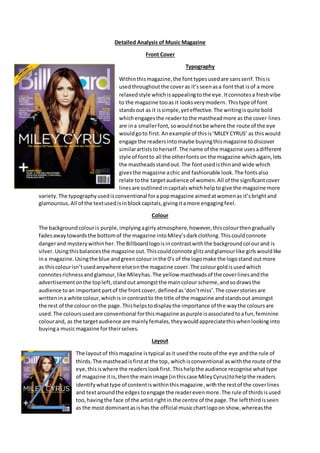
  • 1. Detailed Analysis of Music Magazine Front Cover Typography Withinthismagazine,the fonttypesusedare sansserif.Thisis usedthroughoutthe coveras it’sseenasa fontthat isof a more relaxedstyle whichisappealingtothe eye.Itconnotesa freshvibe to the magazine tooas it looksverymodern. Thistype of font standsout as it issimple,yeteffective.The writingisquite bold whichengagesthe readertothe mastheadmore as the cover lines are ina smallerfont,sowouldnotbe where the route of the eye wouldgoto first. Anexample of thisis‘MILEY CYRUS’ as thiswould engage the readersintomaybe buyingthismagazine todiscover similarartiststoherself. The name of the magazine usesadifferent style of fontto all the otherfonts on the magazine whichagain,lets the mastheadsstandout.The fontusedisthinand wide which givesthe magazine achic and fashionable look.The fontsalso relate tothe targetaudience of women.All of the significantcover linesare outlinedincapitalswhichhelptogive the magazine more variety.The typographyusedisconventional forapopmagazine aimedatwomenas it’sbrightand glamourous.All of the textusedisinblockcapitals,givingitamore engagingfeel. Colour The backgroundcolouris purple,implying agirlyatmosphere,however,thiscolourthengradually fadesawaytowardsthe bottomof the magazine intoMiley’sdarkclothing.Thiscouldconnote dangerand mysterywithinher.The Billboardlogoisincontrastwiththe backgroundcolourand is silver.Usingthisbalancesthe magazine out.Thiscouldconnote glitzandglamourlike girlswouldlike ina magazine.Usingthe blue andgreencolourinthe 0’s of the logomake the logostand outmore as thiscolourisn’tusedanywhere elseonthe magazine cover.The colourgoldisusedwhich connotesrichnessandglamour,like Mileyhas.The yellow mastheadsof the coverlinesandthe advertisementonthe topleft,standoutamongstthe maincolour scheme,andsodrawsthe audience toan importantpartof the frontcover, defined as‘don’tmiss’.The coverstoriesare writtenina white colour,whichisincontrastto the title of the magazine andstandsout amongst the rest of the colour onthe page.Thishelpstodisplaythe importance of the waythe coloursare used. The coloursusedare conventional forthismagazine aspurple isassociatedtoafun,feminine colourand, as the targetaudience are mainlyfemales,theywouldappreciatethiswhenlookinginto buyinga musicmagazine fortheirselves. Layout The layoutof thismagazine istypical asit usedthe route of the eye andthe rule of thirds.The mastheadisfirstat the top, whichisconventional aswiththe route of the eye,thisiswhere the readerslookfirst.Thishelpthe audience recognise whattype of magazine itis,thenthe mainimage (inthiscase MileyCyrus)tohelpthe readers identifywhattype of contentiswithinthismagazine,withthe restof the coverlines and textaroundthe edges toengage the readerevenmore.The rule of thirdsisused too,havingthe face of the artist rightin the centre of the page.The leftthirdisseen as the most dominantasishas the official musicchartlogoon show,whereasthe
  • 2. rightthirdonlydominatesthe barcode.The magazine hasthe coverlinespositionedaroundthe artist.Thisis conventional asthismakesthe artistlookmore superiortothe reader. The masthead too ispositionedwithin,andoverthe leftthird.The reasonforthisisso whenthe readersare lookingtobuya musicmagazine,theycansee all whattheyneedlike the masthead,cover linesandthe content, suchas the musicfestival placedinthe leftthird, ata firstglance. Thisis conventionalasthe readerswill be able tosee the mostinformativepartsof the magazine,before evenpickingitupfromthe shelf. The layoutisn’tcluttered,it’sasiseasy to navigate aroundwhilstreading. The orderedlayoutmakesitlookmore professional and organised. Thismakesitmore invitingforthe targetaudience. The contentof the magazine istypical as it relatestothe targetaudience beingmainlywomenwhowouldwanttoread aboutthe artistsinthe contentlike JustinBieber.The musicfestival advertisementalso relatestothe psychographicsanddemographicsof the channel asfemaleslike goingtofestivalsand the musicwouldappeal tothemtoo,as well asbeingheavyinternetusersandpeoplewhoalways keepupwiththe latestgossip/trendswhilstonsocial networks.Thisadvertisementbeinginthe colouryellowmakesitstandoutfromthe restof the magazine cover. The rule of thirdsisused placingthe artistMiley rightin the centre of the magazine as itdraws all the attentiontohermaking herthe mainfocal point.Hereyesare focusedstraighton the reader,thiscouldsignifythatif you readthe article,youcouldfindoutmore. Thismagazine hasa house style asit hascertainfeatures and elementsthatthe readerwouldexpectforthismagazine. Image The image usedappealstothe target audience asit’sa youngfemale,MileyCyrus.The reasonthis appealsisdue to mostof the targetaudience beingof afemale gender.Thismeanstheywould engage withthe photoandwant to buythe magazine to be able to findoutmore about it.This image would influencethe wayyoungwomensee themselvesineverydaylife fromtheirstyleof outfits, astheyare fashionable, tothe make-upthattheyare wearingontheirface. The shottype usedinthismagazine isa mediumclose up,muchlike apassportphoto. Thiscouldhave beenused for the readerstoengage withthe celebrity. The imagesare conventionalforamusicmagazine as the artist performedpopmusicwhenthismagazinewasout onsale.The target audience reading thismagazine wouldalsobe veryfamiliarwiththe artist. The artistiswearingblackthough(mise-en- scene),whichsignifiesdeath.Thisisunconventionalforthistype of musicmagazine. Language/Mode of Address The language usedonthe frontcoveris informative,andchallengesthe audience astowhetherthey wantto findout more.Anexample of thisis‘What’sreallybehindthe DOJ’SITunesinquiry’.This makesthe audience wanttoread more and findoutaboutthisevent.Thistype of coverline fitsin withthe target audience astheywouldmostlybe aware withthe software of ITunes. These cover linesare conventionalformusicmagazinesasitmakesthe frontcoverlookmore finishedandmore excitingtoreadwhenshowingshortsnippetsof anarticle.The mode of addressisinformal as there isthe use of the words‘biz’and‘tween’. Although,thisisconventional forapopmagazine asthe target audience will relatetothese wordsandtheywill be able tofamiliarise them whichiswhythis magazine haschosenuse thisspecificdialect.The magazine isverylaidback,yetinan order.This couldrelate tothe type of people reading thismagazineastheyare feminine.Femalesare seenas the more organisedgendersothisconnectioncanbe clearlymade. Thisalsohelpstoconvey the ‘pop’ vibe towardsthe reader.The tone of thisspecificmagazine isone whichusesexcitement.The waythis hasbeenconveyedisthroughthe colourssuchas purple andblackas theycontrast well
  • 3. togetherinorderfor the frontpage to stand out. As there isonlyone image,thishelpsthe audience to engage withthe covermore and as well,the publishers,PrometheusGlobal Media, have chosen to use appealingcoverlinesinwhatthe targetaudience wouldbe interestedinsuch as‘ITunes’and ‘JustinBieber’.Thiscanalsobe classedasintertextualitythatthe readerswouldbe more familiar with. Conventions I have chosento mentionmostof the conventionsforthismusicmagazine throughoutmyanalysis, such as the layoutof the magazine inthe ‘route of the eye’and‘rule of thirds’,aswell asthe colours used.The frontcover associatestothe popmusicgenre as there are bright,girlycoloursused throughout,basicallycancellingthe blackof MileyCyrus’outfitout andpurple beingthe predominantcolourdue tothe targetaudience beingmostlyfemales.Itisalsoseenasa magazine whichcouldbe quite exciting. Thisisshownthroughthe image usedonthe frontasthe target audience mayidoliseherorknowher. One of the bestconventionsisthe mode of address.Thisis because itreallydeterminesthe type of audience,andwhetherthey wouldliketoreadthe magazine as theyneedtobe intriguedin the contenttheywouldbe reading. If MileyCyruswastalkingabouta topicthat the readerswouldnotbe interestedin,thenthere wouldbe nopointingivingthe article a place inthe magazine. ContentsPage Typography The fontson thispage are a mixture of serif andsans- serif.Thismakessome of the textstandout more than otherssuch as ‘contents’, ‘No1’and‘home front’.This bringsan elementorseriousness,yetexcitementto thispage,whichwouldmake the readermore excited to start readingthe magazine asthere are so many interestingthingstoreadabout,such as the musicin the charts, to the latestgossipfrommajorselling artists. The mastheadhas a stencil effectforwhich givesita modern,standingouteffectandisinblock blackcolourto make itengage the reader. All this relatestothe target audience of femalesastheyare encouragedtoreadit. However,the fontsdoseem more male relatedtothat on the frontpage,so are more unconventionalthanusual. The wayinwhichthe imagesandarticle typesare numbered,give thispage more of a life andfun-filledfeel towardsthe audience as theywouldwantto readon. The ‘contents’textis writtenatthe topof the page,as thisis where peoplewouldnormallylookfist.Itconnotesasense of superiorityandwealth/originalitytothe magazine,aswell asrelatingtothe targetaudience, wantingtoread a magazine thatis fun,butinformative atthe same time. Itconnotesa sense of independencetooasthisis one of the onlytypesof magazine thatusesthistype of fontina magazine thatismainlytargetat women. Itremindsthe audience thateventhoughthisis
  • 4. stereotypicallyassociatedwithwomen,mencanreadit too. There are alsosome kickersusedand pull quoteswhichare usedtograb the readerintothe contentspage,justlike the onesthatwere usedon the initial magazine. The use of a subheadinginthe bottomrightcoverconnotesasense that typographyisveryimportantforthismagazine asit helpsthe readerintopointingintoareas whichtheyshouldreadintofirst. Colour The colourson the inside contentspage donot follow the conventional colourscheme of yellow, silver,purple andblack.Instead, theyuse white,black,blue andgrey.The greycolourisusedforthe musiccharts, on the leftside of the page,whilstthe white isusedasthe backgroundcolourandthe blackand blue are usedfor emphasisoncertainpartsof the page and forthemto stand out/contrast.These coloursare usuallyassociatedwithmalessodonotrelate tothe targetaudience at all.The contentspage hasa whole differentfeel andvibe tothe frontcover.Italmostfeelsasif theyare fromtwocompletelydifferentmagazines. The white bringsinasense of freshnessand puritywhichcouldlinkintoall the articlesbeingnew andonesthathave neverbeenseenbefore. Thisis whatpeople wouldwanttosee withinthistype of magazine.The blue couldrepresent happinessasit’sa lightblue.Thiscouldbe whatthe publisherswantthe readerstofeel whenthey are lookingatthe magazine. The black,again,represents death, soit’sprobablyonlyusedforthe certainparts of the page to standout more than the rest. The highlightedarticlesandimagesare clearlythe mostimportantpartsof thisspecificmagazine,withthe restof the articlesbeingina smallerblackfontas theyare lessimportant.Usingthese differenttypesof colourshelptodraw in the audience froma distance away. Image Some of the imagesusedappeal tothe targetaudience,howeversome of themdonot.This isdue to the target audience whowouldbe readingthis,wouldn’t alwaysbe familiarwiththe artists featured.I,asa girl,donot have a clue whoany of these artistsare and itdoesn’tgive any informationonthe contentspage asto whotheyare either. Thismagazine isanAmericanbased one,therefore thisartists mustbe more famousinAmerica,thaninthe UK musicindustry. From whatI know,theymustbe or a musicbackgroundoriginas if theywasn’t,theywouldn’tevenbe featuredwithinthisarticle.The publishersof thisarticle have chosentovarythe shot typesof the images.Thismakesitmore excitingtolookatfor the readeras it isn’tjusta plain,boring,style. Examplesof thisare that theyhave useda wide shotwithinthe image onthe leftof the magazine to showthe personand theirsurroundings.The nexttwoimagesare more of a close-upshot.This engagesthe characterwiththe person/artistastheyare able tosee theiremotionandhow theyare feeling. A lastshottype usedisa mediumclose-up.Thisshowsthe whole bodyof the personandis almostcentredinthe middle of the page.Thiscouldhave beenusedtomake sure that the reader seesthisimage first,andthenthe onesforthe cover stories. However,usingthistype of shotis unconventional foramusicmagazine asthe readerslike toquicklyidentify whothe people are,yet usingthisshotmakesit more difficultforthemtodo this. The mise-en-scene usedonthisimagesis high-keylightingas thishelpstomake all the imagesstandout.The image of the man in a close up makeshimlookquite dominantashe lookslike he’spokingoutatthe screen. The costume thatall the people are wearingare all seenascontemporaryandmodern.Theyare all fashionable and wouldappeal tothe target audience astheywouldrelate tothe clothesandmightevenwanttobuy them. The imagesare conventional forthisgenre of magazine asthese artistsandconventional to the pop musicindustry.
  • 5. Layout The contents page has an orderedlayout.Thisfollowsthe patternof the frontcover beingorderedtoo.Thisgivesafeel thatthe publishersof this magazine wantedittobe a verymodern,yetsophisticatedmagazine. It wouldappeal tothe target audience astheywouldeasilybe able toread and navigate aroundthe page due to certainparts of the page,having certainplacesto be. The route of the eye isused.Firstly,the readerssee the masthead,inthiscase thisis the ‘contents’.However,due tothe sizing,they mightalsosee the ‘No.1’.Thisisusedto helpthemrecognise whatpage theyare onand to recognise the magazine even more,than justfromthe front cover. Then,itgoes throughto what ison eachpage of the magazine in orderto helpthe readersnavigate arounditeasily. Withinthis,the chartspart of the magazine whichis positionedtothe leftof the page,comesinto eye line.The publishershave usedthistechnique inorderforthe readerto now engage onthat too,and not justskipoverit.Lastly,there are some longerfeaturespositionedatthe verybottomof the contentspage. Thisgivesasneakpreview intowhatthe magazine will include andgivesthemadditional information.Subheadings are usedabove eachsectioninorderto space out the writingandgive itan organisedfeel toit. Thiswill encourage the readerstowantto readthe full article,sotheywill readon. All of these positionsare conventional asthey start fromthe mostimportant,toleastimportantpart of the page. The rule of thirdsprinciple isalso used.The mainpart of the contentspage isin the verycentre third.Thisisconventional forthispage as it’smeantto be an informative page sothe readerscanfindout exactlywhatwill be featuredin thisspecificmagazine. The route of the eye alsogoesstraightthroughthe middle of the page sothis isanotherreasonwhythe mostinformative partsare positionedthere. The thirdleftatthe topof the page,has beenused forthe chart billboard.Thisrelatestothe real magazine name.Thisinforms the readersaboutthe hottestcharts/singlesof the week.Thisisconventional asit’samusic magazine soshouldinclude thingsaboutthe charts.Choosingtouse alayoutof a billboardto achieve this,reallygivesafeel tothe magazine asitmakesthe readersfeel thatthe magazine has reallybeenthoughtaboutandnotjuststuck together. Thisisthe mostdominantside of a page, hence whythe publisherschose topositionit there. Whenthe readersopenthismagazine,thisis the side whichtheywill see firstsowill like this. The magazine name ispositionedinthe thirdleft too. The writinghasbeenplacedina veryspecificwayaroundthe image of the womantoo.As she is crouchingdown,theyhave chosentoplace the writingaroundher.Thismakesthe contentmore interestingandintriguingforthe audience. Language/Mode of Address The language usedonthe contentspage isquite formal.Thiscouldbe due tothe magazine publisherswantingthe reader’s firstimpressionstobe goodones,especiallywiththe target audience beingmainlyworkingwomen. Itincludescoverlineslike‘upfront’and‘features’which wouldn’tbe usedineverydayconversation/language.Thiswould make the audience wanttoread intoit more as the language isverysophisticatedandmodern.The languageusedvariesassodothe coverlinesinorderforit to appeal toany person,as differentpeople have differenttastessothere needstobe somethingforeveryone.Examplesof thisare ‘countrymusic’and‘Latinmusic’.These
  • 6. are twoverydifferentcontrastinggenresof music,therefore the publishershave done theirjobto give somethingforeveryone.The mode of addressismore formal onthe contentspage than itis on the front coverof the magazine.Thisisdue tousingthe wordsthat I have alreadyspokenabout earlieroninthisparagraph. It is conventional forthistype of magazine asitrelatestoall the genres inwhichthisAmericanmagazine portrays. Italsohas to appeal toa target audience thatismainly women,however,the contentspage failstodothisas not all womenwouldwant toread intoso much detail,theywouldjustwanttoknow the facts. It failstouse the dialectthatthe target audience wouldbe familiar.It’smore eccentricandover-the-topthansome magazinesusuallyare of thisgenre. The magazine speakstoitsaudience inaveryinformative manner,like all of theirreaders are seenasimportantto them.Thiscouldbe due to these kindsof wordsrelatingtothe professions that theirreadersdosuch as workinginan office.Theycouldfeel asense of securitywhilstreading this,feel athome andin an environmentinwhichtheyfeel comfortable in. Thismagazinehasavery informative tone toitthroughthe use of primary,contrastingcoloursandby usingveryspecific image shotsas well asappealingfontsandwordslike ‘Ineveryissue’and‘Live fromPuertoRico’. Conventions I have chosento mentionmanyof the conventionalelementsof thiscontentspage throughoutmyanalysis.However,one of the conventionsisthatthe publishershave chosen to keepthe Billboardlogoonthe lefthandside of the page. Thisistraditional tohave ona contentspage,therefore itsignifiesthatBillboardisaveryprofessionalcompany. Thisis conventional asthisiscarryingthe mastheadonfrom the frontcoverintothe contentspage. The contentspage is less conventional thanthe actual frontpage of this magazine asit doesn’tuse the conventional coloursthatare associatedwithfemaleslike pinkandpurple etc.It is also conventional due tothe layoutasithas contentslistingsandsmallerimages whichhelpindicate smallerarticles. All the imagesusedrelateto the genre of the magazine and the articles tooas theyall relate tothe widergenre of itjustbeingaboutmusicitself. Thismakesit more eye catching. The layoutiswell orderedandstructured meaningthatitis easyfor the readerto navigate around.Thisconnotessophistication. Double Page Spread Typography The fontsusedacross thisdouble page spreadare serif andsans serif.Sansserif isusedasthe mastheadof the spread.This couldhave beenusedasit’sa more relaxedfontandismore appealingtothe eye.Itconnotes a freshand youngvibe toit.The boldtextof the font usedfor ‘PrimaryColours’andthe red colourusedbehindithelpsitto be more appealingtothe eye and helpsthe audience be more engagedwithinwhatthisarticle mightbe about. The serif fontis usedfor the standfirstinorderforthe audience tosee itand read more informationonthe article before readingthe whole of it. Aswell asthis,the Byline isinthe
  • 7. same font,but isinitalicsso can be seenevenmore clearlywhilstthe restof the otherfontsare aroundit. The whole article isinthe sansserif fontwhichhelpsthe readerengage intoitagain,as,if it wasin an olderlookingfont,like serif,thentheywouldn’twanttoreadthe article as much as it wouldn’tlookverymodernorsophisticatedlike articlesinthe Billboardmagazine shouldbe. The publishershave alsocleverlychosentocall the article ‘primarycolours’.Thiscontrastswiththe coloursthat are presentonthisdouble page spreadastheyare red andblue.The typographyis bright,cheerful andfun. Thissubconsciouslyallowsthe targetaudience tofindthisstyle of font more appealingtotheireye. The typographyisconventional foramainlypopmagazine genre as theyhave an energetic,funkyfeeltothem. The whole of the mastheadiscapitalised, once again givingitan energeticfeel. The ‘Billboardbiz’ logointhe bottomrightof the page isalsoassociated withthe restof the page as it’swritteninaprimarycolour again. A kickerisalsousedat the start of the copy witha ‘T’.This has beenusedtograb the readersin,yet,alsoitcouldrelate to the artist, withhername being‘Taylor’. Colour The main coloursusedare red,blue andblack forthe article.The reasonthe publishershave chosen to use these coloursonthisdouble page spreadisdue to thembeing‘primarycolours’thatrelate to the mastheadof thisarticle. RedcouldlinktoTaylor Swift,the artist’s,album.Yellow couldconnote happinessandfun,whichiswhatthe readerwouldwantto feel whenreadingthisarticle.The grey backgroundbringsa sense of sophisticationtoitas greyis associatedwithbusinesswomenwho wearsuitsetc. The mastheadiswrittenina differentcolourtothe mainarticle,makingitbe the first thingthat the audience looksatonthispage. Thisclearlydisplayswhatismore importantand attractive to the readers. Theylookat the keycomponents,beforethe rest. The coloursusedare conventional asthismagazine like tocreate a funand energeticfeel toall theirarticles,inhope that people willalwaysgetthe nextmagazineafterreadingtheircurrentone. Image The image usedappeal tothe targetaudience asthe personinthe image isa celebritywhothe target audience of thismagazine will be familiarwith,(TaylorSwift).Thisimage will influence the target audience of mostlywomen,due totheirstyle,make-up,ortheirline of business.Inthiscase, a musiciananda fashionicon. The shottype usedis a wide shot.Iknow thisas it showsthe surroundingsandbackground of the artist,as well asshowingherwhole body. Thisenablesthe audience toreadaroundthe artistand recognise themfromfarawayeasily. The clothesshe has chosento wearare quite casual,however,theyare quite fashionable atthe same time. Taylorisalso seentobe quite youthful,confidentandgood-looking.Thisup-to-dateoutfithelpstoconnote the modernvibe of thismagazine,aswell asimage consciouspeople. Thisisaconventionalwayto displaythe artistas ithelpsgrabthe readerin. Thiscan encourage girlsthattheydon’thave to wear the most fashionableclothestobe able tostand out fromthe crowd. The image usedisconventional as the artist performsmusicsorelatestothe overview of the Billboardmagazine.TaylorSwiftisalso recognisedbymanypeople,socanbe identifiedreallyeasily. Layout
  • 8. The layoutof thisdouble page spread hasa simple,yetorderedlayouttomake itmore sophisticated.Thiswouldappeal tothe Targetaudience asitconnotesa more organisedmannerto it.This double page spreadusesroute of the eye,drawingthe audience acrossthe mastheadtohelpthemrecognise whatthe article will be about,thentothe coverartist,to intrigue theminto readingthe article,andthen across to the contentsof the actual article,whichencouragesthe wideraudienceassomeone may be intriguedintowhatthe contentistalkingabout. The masthead isn’t veryconventional.Thisisbecause theyare usuallyinthe topleft corner,howeverthisisinthe right.Thiscouldbe because the publisherswantthisspecificarticle tostandout. The neatorganisationof the textonthe right hand side of the spreadconnotessophistication. The principleof thirdsisalsoused.Thisisbecause onthe vertical lines,boththe image of TaylorSwiftandthe copyare there forthe readersto clearlysee. Alongthe horizontal lines,the same thingsare there,inordertoyetagain,give the spreada sense of sophisticationandmodernity. The publishershave alsochosentoplace the image of TaylorSwifton one complete side of the double spread.Thisengagesthe audience withthe artist theyare reading due to the organisedlayoutof thisspreadasit’sseenas more eye-catchingandoriginal.The vertical textof the article andthe horizontal image contrasttogethertoletthe reader’s eyeseasilytravel across the page,lettingthemviewthe entire article. Language/mode of address The language usedonthe frontcoveris sophisticatedandmightexcite the audience intowantingto readthe copy.For example the caption‘The storybehindTaylorSwift’sblockbuster‘Red‘,makes the audience wanttoread itand challenge whatitsays,as it’slikelytheywillbe able tofindout more about thiswhenreading onfromthe standfirsttothe copy. Thisstandfirstisusedwell asit exaggeratesthe mostinformative partsof the copy,makingmore readerswanttofullyreadon.The mode of addressis formal, withthe use of the words‘palette’and‘experiences’.Thisisseenas unconventional forthe Billboardmagazine asit’smeanttoseem‘hip’and‘downwiththe kids’kind of style,howeverthisspecificarticle ismore formal whichwill be able tointriguemore thanone type of specificaudience. The double spreadspeaksinaverymodernandsophisticatedmanner, whichrelatestowhatthe targetaudience wouldwant.The spreadalsoaddressesthe audiencein a conventional way,byusingastandfirsttostart the copy/article off.The tone of the magazine is intriguingandsophisticated.Thisisshownthroughthe use of brightprimarycolours,abig clear image andappealingwordsthatrelate tothe artist suchas ‘emotions’and‘songwriters’. Conventions I have chosento mentionmostof the conventionsforthisdoublepage spread,throughoutmy analysis.Examplesof conventionsae the brightuse of typographyandthe imagesusedrelatingto the musicgenre.TaylorSwiftwill be afamiliarfigure thatthe targetaudience will know,like or idolise.The magazineassociatesitself throughthe predominantuse of primarycolourswhichrelate to the target audience.A keyconventionisthe mode of address,whichplaysakeyparton whether people willchoose toreadthisspecificarticle ornot.Anotherconventionisthat the content includedinthisarticle issomethingthatthe audience will be able torelate toquite easily. A last conventionisthatthe copy/article textisarrangedincolumns.Thismakesthe texteasiertoread and lookmore professional,aswell asmakingthe audienceinterestedtoreadon.