
Recommandé
Contenu connexe
Plus de Kirstin816
Dernier
Dernier (20)
Analysis
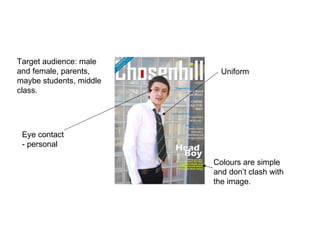
- 1. Target audience: male and female, parents, maybe students, middle class. Eye contact - personal Uniform Colours are simple and don’t clash with the image.
- 2. Target audience: students, male and female. Eye contact - personal Masthead doesn’t stand out Colours are very dark.
- 3. Target audience – students, male and female. Simple colours, but the red clashes a bit. Sporty pictures suggests that the magazine is about sport
- 4. Red and blue clash Picture is faded. It would look better if it wasn’t. Each subheading is a different colour. They probably should have stuck with one or two colours. The masthead doesn’t stand out. Target audience: students, male and female.