
Recommandé
Recommandé
Contenu connexe
Similaire à You can build an infographic
Similaire à You can build an infographic (20)
Dernier
Dernier (20)
You can build an infographic
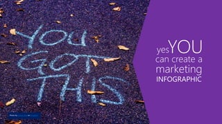
- 1. can create a YOUyes marketing INFOGRAPHIC Photo by sydney Rae on Unsplash
- 2. Think creating a marketing infographic is beyond you? It’s not. A few months ago, I was asked to build an infographic for work. Panic set in. I’m artistic, yes, but I hadn’t done something like this before. My art tools are paint brushes and canvases…Physical ones. Not the digital kind. After some trial and error and many expert tips from my friend and colleague, Suzanne Ross from the Marketing SureStep team at Microsoft, I created not just one infographic….but TWO! And I turned them in on time. If I can do it, you can too. Let’s get started.
- 3. Step 1: Decide who you are building it for, why you are building it and what you want them to do Determine your target audience Decide on your sales goal Decide on your call-to-action (what should they do next?)
- 4. Example I want to educate SMB customers on why they need Microsoft 365 Business/my services to help keep their businesses safe from cyber criminals. • Target audience: • SMB decision makers (not IT) currently using Office 365 • Sales goal: • Microsoft 365 Business to new or existing Office 365 customers • Call to action: • Download an eGuide/Sign-up for a free security assessment
- 5. Step 2: Collect and organize your content and relevant data Use a spreadsheet or table for organizing the data you collect. OneNote is great for storing visuals. Spreadsheet columns to include: • Item/Description • Source URL • Use/Don’t Use • Data date • Final copy • Images
- 6. Example After adding your data points, you might find that you have enough information to create several different infographics that you can use over time, or with different target audiences, etc. Pro tip: Don’t make one infographic do too much. Your infographic tells a story. Stay on topic.
- 7. Step 3: Choose your infographic style There are several different styles to choose from. Which one you pick depends on the data set/content you are presenting. Some ideas for my infographic on cybersecurity might include: • Timeline - A history of cyber attacks over time, to show increases in cybercrime and drive the reader to want to learn more • Comparison - Compare on-premise vs. cloud security issues Pro Tip: Discover more about infographic style types • https://venngage.com/blog/9-types-of-infographic-template/ • https://infogram.com/blog/12-types-of-infographics/
- 8. Step 4: Pick a platform Do a web search and you’ll find options galore for platforms you can use to build/design your work-of-art infographic. https://blog.bufferapp.com/infographic-makers I chose Canva for my first attempt. It’s free and has ready-to-use templates. I found it to be a little clunky to use at first, but it got easier the more I played with it. https://www.canva.com/ For my second infographic, I used PowerPoint - yep, PowerPoint - and built one from scratch. There are templates too. Try Creative Market (small fee) or 15 free infographic templates in PowerPoint (Hubspot). I’ll talk about using these platforms a little later on. But it’s good to pick your platform at the start, because it will dictate some choices you make about what to include in your infographic.
- 9. Step 5: Write the headline and messaging points Decide on your infographic theme. Hook the reader in with interesting headline that grabs their attention Write 10-15 headline options, pick your favorite two, then test with colleagues. You can change your mind later, but knowing concept and headline upfront helps with decisions about your data. Pull in data points and copy from your spreadsheet for your messaging points.
- 10. Example 1 – Messaging for Canva Infographic Messaging for a Microsoft 365 Business cybersecurity infographic focused on SMBs who think they are too small to be a target of cybercrime. Headline: Think you don’t have to worry about cybersecurity? Think again. Body copy points to support my headline: • 43% of cyber attacks target small business. The bad guys don’t care how big or small you are • 60% of small companies go out of business within six months of a cyber attack • 90% of data leaks are caused by user mistakes • Most companies use weak or default passwords • It takes an average of 286 days to detect an intrusion • It takes 80 more days for damage control
- 11. Example 2 – Messaging for PowerPoint Infographic Messaging for a Microsoft 365 Business cybersecurity infographic focused on SMBs who are struggling with how to best support today’s mobile, collaborative workforce while keeping their company secure. Headline: There’s a Sea Change at work. Is your business ready? Body copy points to support my headline: • 51% of employees use personal email for work • 16% use unapproved public sharing tools • Only 38% consider data security when working w people outside their company • 69% of small businesses do not recover from a cyberattack • Microsoft 365 Business has all of the productivity tools you are used to, with tailored enterprise-grade security you need
- 12. Step 7: Decide on color Color is powerful and it’s personal. One person may bond with blue, another with green. Women and men prefer different colors. Different cultures assign different meanings to colors, too. Read on, for some suggestions to help you decide which colors will work for your design. Pro tip: Explore these ideas on color and marketing • Color and target audience • 10 colors that increase sales and why
- 13. Red = power, energy, danger, love, fear Blue = trust, security, loyalty, tranquility Pink = feminine, happy, playful Yellow = look here, optimistic, fun Green = wealth, goodwill, earth, fresh Most people prefer simple combinations of 2-3 colors.** It’s OK to play and push the boundaries with your infographic. It takes just a few seconds to make a subconscious judgment about a design 62% - 90% of that assessment is based on color alone Emotional impact of color (North America)* How many colors? *http://www.business2community.com/marketing/10-colors-that-increase-sales-and-why-0366997#5cHzZLX3QPFmriQi.97 https://blog.kissmetrics.com/color-psychology/ **University of Toronto study http://www.dgp.toronto.edu/~donovan/color/colorcomp.pdf *Color Psychology in Marketing: The Complete Guide http://www.socialmediatoday.com/content/color-psychology-marketing-complete-guide#meanings Purple = royalty, calm, wealth Gold = prestige; with purple or green infers wealth/pedigree Orange = energy, confident, fun Brown = earthy, conservative Black = drama, power, sleek, fear
- 14. Choosing color combinations Try using your brand palette or pick colors from your website Do an online search and get palette inspiration from others
- 15. Pro tip: Enlist expert help to pick your color combinations • https://color.adobe.com • https://www.canva.com/colors/combinations Choosing color combinations If you are using an infographic platform with pre-designed templates, like Canva, you might just use one of their templates as your starting point. • Test it out – do you see a template you like? • Can you change the colors?
- 16. Remember the color wheel? A little about color pairings Colors directly across from each other are complimentary colors Colors adjacent to each other are analogous or monochromatic
- 17. Complementary Colors Opposites Attract • When the eye has been looking at a lot of the same color, it wants to see the opposite. • So using a complementary color is the easiest way to get something to stand out. Try a complimentary color for your CTA. • Use carefully to keep your content from being aesthetically jarring. These colors paired together create visual tension. Analogous and Monochromatic Colors Subtle and Relaxed • They aren't jarring, opposite, or clashing. • But colors don't stand out from one another. • In an analogous or monochromatic palette, try using a complementary color to get any particular item (like your CTA) to pop.
- 18. Which would you click on? Which would you click on? Colors of similar value (light/dark) blend together A little about color pairings
- 19. Step 8: Select some fonts Serif: Serif fonts have little “feet” Considered traditional Baskerville Sans-Serif: No “feet” Considered modern Calibri Brush Script Showcard gothic Serifs are usually small and thin, they lead the eye from letter to letter and word to word, but don’t read as well on screens as they do in print. Use sans-serif font for small size text in your infographic. Save statement-making script and display fonts for headlines and special impact.
- 20. Picking fonts for your infographic is like choosing an outfit to wear – make a good first impression. Make fonts work FOR you Dressing Yourself Dressing Your Infographic Avoid plaids with flowers and stripes Don’t wear a bathing suit to a job interview Limit yourself to 1-2 fonts in a few sizes Use fonts appropriate for your purpose Tips • Fonts should complement the purpose and mood of your design. • Should be easy to read and not distracting. • When combining fonts don’t make them too similar but avoid wildly clashing pairs. • Use fonts to create a visual hierarchy throughout your design • Learn more about fonts: https://designschool.canva.com/font-design/
- 21. Step 9: Choose your images A picture is worth a thousand words. So make sure it is the right picture. If you are using a pre-designed template, do you like the images they have? Can you replace them if you don’t like them? Try these links for free/inexpensive art this is released for commercial use*. Noun project icons https://thenounproject.com PowerPoint icons https://pixabay.com https://unsplash.com/ https://www.123rf.com/ * Always check image rights before using
- 22. Step 10: Bring it together into your infographic platform Now all that hard work is about to pay off! Open up your infographic platform Decide which, if any, pre-existing template you are using Or open up a blank template and build from scratch Each platform is unique and will have it’s own set of instructions on how to use
- 23. Canva
- 24. I scrolled through Canva’s Infographic layouts for ideas You can pick one and replace the copy and visuals Or you can create one from scratch with a blank layout
- 25. I reviewed the elements menu My template Elements
- 26. • Lots of free shapes, illustrations, photos • Handled basic search “cybersecurity” “buildings” “protect” • Scrolling through choices was time consuming • I could purchase additional inexpensive images BUT I wasn’t finding the icon images I had in mind. I decided to use Noun Project for my icons.
- 27. The Canva layout template I chose allows for only a few pieces of content – I will save the rest for a 2nd infographic and pick data points that best support my concept and headline I shortened and simplified my copy to make it fit the Canva template Found Noun Project icons to pair with my copy/stats Told story using facts to dispel common objections, provided a resolution via CTA Added fact/source info at bottom to give credit and lend credibility Added my logo How I built my infographic in Canva
- 28. COLOR • Analogous palette • Color value doesn’t detract from legibility • Emotion = trust, goodwill GRAPHICS • Simple icons • Visuals enhance the message • Helps navigation FONTS • Basic, since there is a lot going on • Provides visual hierarchy • Easy to read CONTENT • Simplified, conversational • Addresses disconnect/’won’t happen to me’ • Use facts to dispel misconceptions • This creates unease/problem • Use CTA to “fix” the problem CTA • Contrasting color draws the eye • Black band draws the eye • Repetition of circle shape draws the eye and connects with top My Microsoft 365 Business cybersecurity marketing infographic built with Canva
- 29. PowerPoint
- 30. Since I am creating from scratch, I have a lot of space. To begin: Open a new PowerPoint deck, changed the layout to Blank and changed the slide size by clicking Design > Slide Size > Custom Size > 8.5 inches by 56 inches. • The longest you can make your infographic is 56 inches. The recommended size is 8.3 inches by 25 inches. • If you aren’t sure what size your infographic will end up, you can change it later. The easiest way I found is to create a new slide with the right proportions, then select all and paste into the new slide (this avoids oddness with the content fitting in the right place). How I built my infographic in PowerPoint
- 31. I used a lot of Microsoft product-specific copy points, so I added a conversational tone to the rest of the copy. Also added nautical language references to tie-in with overall theme. Used humor to lighten a potentially overwhelming situation Used a friendly palette to make the topic less “scary” Found Noun Project icons and PowerPoint icons to pair with my copy/stats Told story using facts, resolving with CTA choices suitable both for those who want to explore more and those who are ready for more serious engagement Added fact/source info at bottom to give credit and lend credibility Added my logo How I built my infographic in PowerPoint
- 32. Venngage Hubspot Creativebloq I like these palettes and the friendly, informal style. I like the “Sea Change” concept – fits with Microsoft 365 Business as a solution for small businesses facing changing needs/concerns. Design inspiration
- 33. PowerPoint icons
- 34. Select circles and rectangle/Format/Merge Shapes/Subtract Pro Tip: Watch a video on how to create icons in PowerPoint Building waves in PowerPoint
- 35. • If you download free images, make sure you include an attribution and image link in your credits • Viking boat bottom from an icon by Yanti Anis, Noun Project • Pirate ship by Oksana Latyshevak, Noun Project • Octopus by B Farias, Noun Project Noun Project icons
- 36. My Microsoft 365 Business marketing infographic built with PowerPoint COLOR • Muted, complementary palette • Color value doesn’t detract from legibility • Emotion = optimistic, fun, trust GRAPHICS • Icons • Visuals enhance the message • Help navigation FONTS • Basic, since there is a lot going on • Provides visual hierarchy • Sans-serif to aid readability CONTENT • Conversational, humorous twist • Outlines competing need to both enhance modern workforce productivity while maintaining • security in an ever-increasing threat landscape (tension) • Resolves with product/partner solution CTA CTA • Darkest value draws the eye • Repetition of arrow shape draws the eye and ties the bottom in with the top
- 37. Thank you!