Brand Book: Escape the Space
•
0 j'aime•675 vues

Upon introduction to our newest client, this booklet was created with the goal of capturing the essence of the brand for future reference. Much of the copy originated from my group's inventive copywriter.

Recommandé
Contenu connexe
Similaire à Brand Book: Escape the Space
Similaire à Brand Book: Escape the Space (19)
Dernier
Dernier (20)
Brand Book: Escape the Space
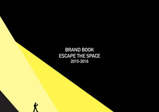
- 1. t BRAND BOOK ESCAPE THE SPACE 2015-2016
- 2. 07 08–10 CONTENTS ABOUT The Company So that You Can Remem- ber it TYPOGRAPHY DIN Alternate LOGO IDENTITY Final Logo COLORS COLORS Breakdown w/ Tints MERCHANDISING T-Shirt Design 04–05 03 06
- 3. ABOUT A new, creative form of local entertainment testing the intellect and team-working abili- ties of any and all that dare attempt Focusing on cognitive skills, Escape The Space challenges teams to work together to solve the puzzle and escape the space 03
- 5. t DIN alternate exemplifies the innovative structure of this blossoming company by combining a technical look with sleek, fluent curves. The combination of technical exper- tise, meticulous planning, and the creative flow of the organization coincides with the company’s structure and mission 05
- 6. rt LOGO IDENTITY 06 LOGO The combination of striking complementary colors and the arrow represent an exciting, innovative company, perfectly poised for bold direction and growth in the local business marketplace
- 7. BRAND COLORS BLACK FOR WEB R: 35 G: 31 B: 32 FOR PRINT C: 0 M: 0 Y: 0 K: 100 WHITE FOR WEB R: 255 G: 255 B: 255 FOR PRINT C: 0 M: 0 Y: 0 K: 0 YELLOW FOR WEB R: 255 G: 241 B: 0 FOR PRINT C: 4 M: 0 Y: 94 K: 0 Electric, high ener- gy atmosphere that the engaging staff and participants exploit to handle the next challenge Mystery and un- certainty that every challenge holds for each person in the space Fresh, new form of entertainment en- lightening Athens
- 8. SHIRT08
- 9. ESCAPE THE SPACE Athens, GA ESC APETHE SPACE Athens, GA ESCAPE THE SPACE Athens, GA ESCAPE THE SPACE Athens, GA
- 10. ESCAPE THE SPACE Athens, GA ESCAPE THE SPACE Athens, GA ESCAPE THE SPACE Athens, GA
- 11. FIN FOR NOW