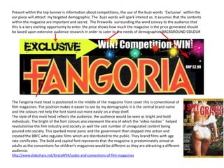
1. Present within the top banner is information about competitions, the use of the buzz words ‘Exclusive’ within the
ear piece will attract my targeted demographic. The buzz words will spark interest as it assumes that the contents
within the magazine are important and secret. The fireworks surrounding the word convey to the audience that
this is a very exciting opportunity to enter. the price shows how much the magazine is the price generated should
be based upon extensive audience research in order to cater to the needs of demographic. BACKGROUND COLOUR
The Fangoria mast head is positioned in the middle of the magazine front cover this is conventional of
film magazines. The position makes it easier to see by my demographic it is the central brand name
and the colours red help the font stand out more easily on a shop shelf.
The style of this mast head reflects the audience, the audience would be seen as bright and bold
individuals. The bright of the font colours also represent the era of which the ‘video nasties ’ helped
revolutionise the film industry and society as well the vast number of unregulated content being
poured into society. This sparked moral panic and the government then stepped into action and
created the BBFC who regulate films which are distributed to the public. They brand films with age
rate certificates. The bold and capital font represents that the magazine is predominately aimed at
adults as the conventions for children’s magazines would be different as they are attracting a different
audience.
http://www.slideshare.net/KirstyW94/codes-and-conventions-of-film-magazines
2. The film reel is conventional of the film magazine Pre-modifier of ‘Legendary’ portrays to the audience
Fangoria I decided to keep this to make the product that the director of the film is very good and that it is
more authentic . The reel acts as a guide which worth continuing further into magazine and reading
presents more features within the magazine, each the articles. The contrast of yellow on a background
image has a anchorage text which gives some of black really helps the text stand out and can be
information on the contents of the article. The read more easily , it is consistent with the brand
symbol of the film reel also acts as a sign to the identity of the magazine as it follows the yellow and
targeted demographic to show that this is a film red colour scheme. The names of the directors are a
magazine. I also kept the original images again to common of trailers this assumes that the regular
make the magazine more realistic, the images are readers and targeted audience for this type of
very gory and supernatural these types of images magazine would know the names of the directors.
would fit in perfectly the audience would be able to
identify with them more easily and so be attracted
more to the film magazine.
3. The main image on a film magazine should reflect the audience and what they
would enjoy. They will consist of main characters of a film being featured, this
will be the unique selling point of the magazine and will attract the targeted
demographic. Sometimes in magazines the characters image will be covering
the mast head, this translates that the image of that particular celebrity is
more likely to sell the magazine more than the title of the magazine itself.
This makes the main image the biggest attraction, images are normally mid-
shot giving the face of the contemporary actor/actress more interaction with
the audience.
I manipulated the actors eyes and changed them to red, this represents the
anger and danger of his actions within the film. I also enhanced the contrast
of blood on the knife this helps it to be appreciated better the knife also
reveals a small content of the film and gives information on what happens.
There is the same font which is present on the poster s and also within the
trailer this helps create a brand identity which is reinforced throughout all
media products. This will help make it easier for my targeted demographic to
identify the magazine amongst other rivals. The anchorage text below the
main title introduces what the main feature is about. The bar code is a
specific features which all magazines uphold it differentiates between
posters and magazine front covers., and gives information about the issue and
the date also websites might be featured.
BACKGROUND COLOUR/SEMIOTICS/MISE-EN-SCENE
4. The bottom banner is conventionally in the middle and covers the front of the magazine front cover. It will also
contain much more information on what contents is inside. The caption ‘special never seen before features’
will attract my targeted demographic as they assume that they are being revealed into a exclusive information
which is not available to anyone else, this also acts as an incentive to invest within the magazine.
It is also reinforces the brand identity by following through the colour scheme. The arrow containing the word
‘inside’ makes it easier for the audience and helps them navigate around the magazine easier.
The bottom banner consists of other features that would appeal to my targeted demographic . This would
include other feature films that are of the same genre. The font of the bottom banner is a different font this is
very convention of film magazines the reason for the varied fonts is to separate the amount of attention that is
given to each story, if the font is bright and bold it will be more attractive to read, smaller more softer fonts will
be recognised less.
5. On the top of my billboard poster I included information on our production company this is important to
reinforce my brand identity
I used various effects and filters such as changing the contrast when I added the blue filter it gives a sense of
the cold ness of the monster. I also darkened his eyebrows to make him look more animalistic to portray more
of his characteristics within the film, this also restricts the focus on the rest of the poster and makes the
audience focus attention on his eyes which are red to show his anger the direct image of his eyes consumes
the majority of the poster this creates a rapport with the audience and engages them more easier the
colour contrast together blue and red.
6. The top of this poster has the a line from the trailer, quotes from films are a convention of film posters they reinforce
scenes that may have been seen in the trailer as an example the line ‘Its all fun and games until someone gets hurt’ is
heard being said by the benefactor within the trailer when these elements are reinforced the targeted audience find it
easier to identify with the text.
The typography used in this poster is recurrent through all my media products including my magazine this also further
reinforces the brand identity .
In other forms of film posters it is not necessarily important to have quotes from the film but they do
normally contain taglines , contain the contemporary stars name or have information relating to the film
within itself such as directors these are added to attract the audience. Again if these are present they would
be intact with their brand identity.
7. The main image of my poster is the main character who is the monster within this photo I manipulated the image I
darkened his hair in order to give a more definition to his features. I also added the out of focus effect around his
face , and also added a darkened edge s of the page this helps narrow focus to his face and also the knife, the
typography on the knife are the same contrast to the blood at the bottom of the knife , this again will reinforce the
idea of the slasher film genre.
The name of film is directly in the middle of the face where the knife is positioned in the centre of the page this
attracts the most attention and inflicts the relationship between the text and the character which translates to
the audience. The conventional sign of the knife conveys the features of a slasher film, his concealed identity
also inflict fear within my targeted audience .
8. Here at the bottom of the banner contains the further information about the film when it is released or may
contain the specific date this would be positioned in a cinema or a bus stop it would be a stationary advertisement
plug.
The information is about the characters who are involved the first character present is the star of the film in my case
‘Heather Ross’ this is added in as a Unique selling point , as she is a contemporary star she is relevant and my targeted
audience would be attracted to this. This information also contains everyone who were involved in the production this
may attract other audiences for example , the director would be of interest to his audience and may attract that
particular demographic.
At the bottom of the poster contains information on the production team, distribution company and also the age
certificate rating. The distribution company I used was Fox searchlight It focuses on independent and British films,
and horror and is variously involved with the production and/or distribution of these films. This fits in perfectly with
my film as it is a low budget production. The age rating will be decided by the BBFC which dedicate their time to
assess what events in a film are appropriate for each age.