
Recommandé
Contenu connexe
Tendances
Tendances (20)
En vedette
En vedette (20)
Similaire à Drafting
Similaire à Drafting (20)
Plus de Lewis Thickpenny
Plus de Lewis Thickpenny (17)
Dernier
Dernier (20)
Drafting
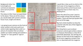
- 1. Background colour has to be bright and summery to represent some sort of summer house. The colours id like I have narrowed down to the above. These are all the colours you would relate with summer and also house music, bright and vibrant. I would like a close up of an artist on the front cover of my magazine as that is what many of the current house music magazines have on them now. It is keeping form. Down the side of my cover I want to have smaller articles that will attract readers. These will have pull quotes that sick out of the page. I am going to put a picture on the front of either another artist and a pull to an article inside regarding them and/ or a picture of a location that can attract readers as it looks inviting and could be a “top tips” or “your guide to” type of article. One thing that is sure to attract customers and also give artists a chance to showcase themselves is a free CD or potentially download. This will big and obvious on the front of the magazine. A lot of music magazines include a free item or download with the magazine. Big main article headline to show the customer who the star of the magazine is this month.
- 2. I want the contents page to be symmetrical and squared off. Keeps it simple and easy to navigate. Simplicity is key to the design. The same as the other house music magazines I have analysed. I want to incorporate images that relate to the more main articles and interesting columns. This is another way of attracting the reader. For the background I want a dark colour that helps the text stand out and does not distract from the content. This is the same for many of the music magazines I have looked at. Each section of the contents page will have a subheading in a bright colour, possible linking to the main cover colour. The subheadings will categorise each section of content within the magazine. For example I will have a fashion category then under that heading will be all the articles relating to fashion. The images that I use to showcase articles will have the page numbers on them and a small bit about the article. At the top I will have the title of my magazine in big and next to it in a slightly smaller font, contents.
- 3. The double page spread will ideally have one main image that takes up the full page but does not distract from the writing. I want the colour from the image to be bright and rich in colour as I want to follow the theme on the cover of summer house. The initial introduction lines will be big and bright with larger text. I want it to stand out and inform the reader before they start reading. The main character will preferably be on the left page so the body of text does not go over him. I will keep my text in columns as it is standard. I will start off with a drop cap and try to include at least 3 pull quotes. The text will have a transparent background so it appears clearer on the page. At the top corners I will have the magazine ident and the bottom corners will have page number and date. Again this is formal and standard with all magazines. I don’t want to go over the top with the DPS I would like to keep it simple and clean with good symmetry.